


Display color accuracy depends on both the monitor and the lighting your eyes adapt to. For reliable gaming visuals, design work, office review, or portable-screen productivity, pair a neutral display target with stable, glare-free room lighting.
Does your carefully calibrated screen look clean at noon, then slightly yellow, blue, or dull after sunset? A stable setup can make grays, skin tones, charts, and game shadows look repeatable instead of driven by your desk lamp. Here is how to control the room, the screen, and your expectations so color stays useful.
The Core Relationship: Your Eyes Adapt to the Room First
A monitor can measure accurately and still look wrong if the room lighting pushes your visual system in another direction. If your desk is lit by a very warm lamp, a neutral white screen can appear cool or bluish. If your workspace is flooded with cool daylight or high-Kelvin LED light, the same screen may look warmer or flatter by comparison.

Color temperature describes the perceived warmth or coolness of light, and it is measured in Kelvin; lower values look warmer, while higher values look cooler, as this color temperature reference notes. That matters because display calibration also uses a white-point target. For most computer, web, SDR gaming, and productivity work, the practical anchor is around 6500K, often called D65.
The goal is not to make your room identical to your monitor. It is to keep the room from fighting the monitor. A 6500K screen under a dim, warm 2700K bulb can make whites feel harsh and blues exaggerated. A 6500K screen in direct window glare can look washed out even if the panel itself is accurate.
What “Color Accuracy” Really Means on a Display
Color accuracy means the monitor reproduces colors and shades close to a known standard, usually sRGB for web content, office visuals, most games, and everyday media. Common testing methods measure accuracy against sRGB, including grayscale balance, color temperature, gamma, and color difference.
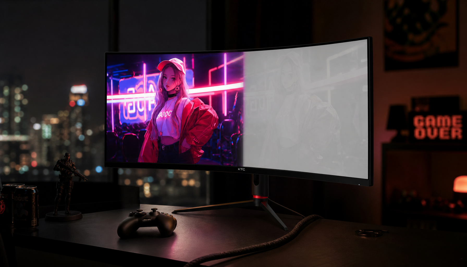
That gives you a practical way to think about accuracy. A monitor is not accurate because it looks vivid. It is accurate when neutral grays stay neutral, red does not overshoot into neon, shadows remain visible without being lifted into fog, and whites stay close to the intended target. This is why many factory presets can mislead you. Vivid, FPS, Movie, Cool, and Eye Care modes often change several things at once, including saturation, gamma, white point, and contrast.
For office productivity, accuracy protects charts, brand colors, dashboards, presentation images, and long-session readability. For competitive gaming, accuracy is not always the priority, because some modes brighten shadows to reveal opponents. For content creation, online product images, or print previewing, accuracy becomes a cost issue because a wrong screen can lead to wrong edits.
Why Room Lighting Color Temperature Changes What You See
Room lighting changes color judgment through adaptation, reflection, and contrast. Your eyes adapt to the dominant light in the environment, so a neutral monitor may appear tinted when the room is strongly warm or cool. Light also reflects off glossy screens, matte coatings, desks, walls, and nearby objects, adding subtle color contamination.
Illuminance matters too. A lighting experiment with 67 participants found that both brightness and correlated color temperature affected comfort, while productivity was strongest when illumination was above 500 lux and equivalent melanopic lux exceeded 150 in the tested setting. The study’s office lighting conditions also showed that participants tended to prefer intermediate color temperature with bright illumination when they could adjust the lighting themselves.
For a real desk example, imagine a 27-inch 4K IPS monitor set to sRGB, 6500K, gamma 2.2, and moderate brightness. At 10:00 AM beside a window, the room is bright and cool, so the image may look less punchy unless the monitor is bright enough. At 9:00 PM under a warm lamp, the same white screen can feel blue, so you may be tempted to warm the monitor. If you edit photos that way, you can overcorrect the image and make it look too cool on other screens.
The Practical Baseline: D65, Gamma 2.2, and Brightness Matched to the Room
For most users, start with a neutral or sRGB mode, target 6500K, use gamma 2.2, and adjust brightness to match the room. Monitor setup advice says brightness should rise in bright rooms and fall in dark rooms, while color temperature around 6500K is the common accuracy target.
Gamma deserves special attention because it controls midtones and shadows, not just overall light output. In a bright room, a darker gamma curve can make shadow detail disappear. In a dim room, overly bright midtones can look flat and washed out. Gamma 2.2 is the dependable default for SDR desktop work, web content, productivity apps, and most games.
Brightness should be matched to ambient light rather than maxed out. One eye-fatigue resource recommends roughly 100 to 150 cd/m² for regular office environments around 300 to 500 lux, and its practical display brightness test is to compare a white screen with white copy paper under the same lighting. If the screen glows much brighter than the paper, it may fatigue your eyes and distort perceived contrast. If it looks duller than the paper, your whites and highlights may feel muddy.
Use Case |
Display Starting Point |
Room Lighting Goal |
Watch For |
Office productivity |
6500K, gamma 2.2, moderate brightness |
Even light, low glare |
Eye fatigue, gray UI panels looking tinted |
Web/design review |
sRGB, 6500K, gamma 2.2 |
Stable neutral light |
Oversaturated wide-gamut color |
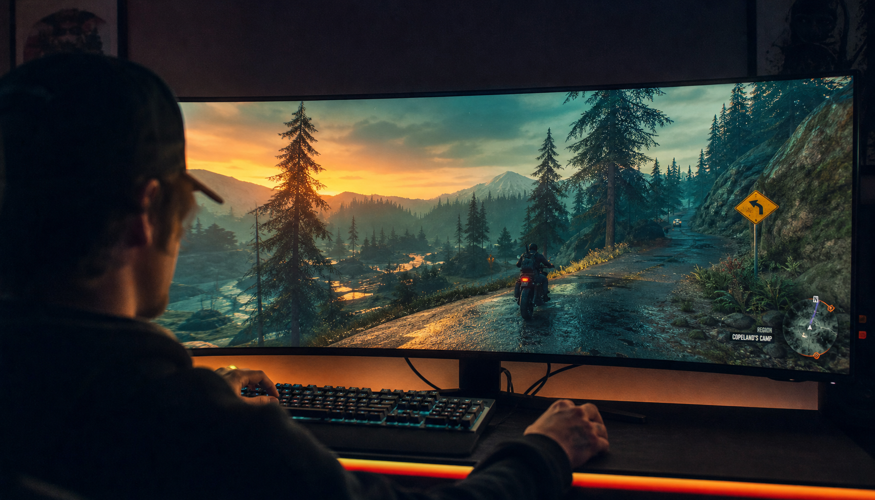
SDR gaming |
Standard or calibrated game mode |
Enough light to avoid eye strain |
FPS modes lifting shadows unnaturally |
Print/photo preview |
Hardware-calibrated profile |
Dim, consistent, neutral surroundings |
Warm lamps causing overcool edits |
Portable monitor work |
Native resolution, neutral temperature |
Avoid direct sun and reflections |
Battery drain from excessive brightness |
Pros and Cons of Matching Room Light to the Monitor
A controlled lighting setup gives you repeatability. Neutral room lighting makes it easier to judge white balance, compare multiple displays, review creative work, and avoid chasing color shifts that are really caused by the environment. It also helps reduce visual strain because the screen is not competing against glare or dramatic brightness differences.
The downside is that perfect control can be inconvenient. A shared office, dorm, living room, or travel setup may not let you choose wall color, window placement, or overhead lighting. Portable screens are especially vulnerable because they move between cafés, hotel rooms, outdoor shade, and airplane trays. In those cases, prioritize consistency during important work sessions rather than trying to create a permanent studio everywhere.
There is also a workflow tradeoff. Warm evening lighting can be comfortable, but it is risky for final color decisions. Cool office lighting may feel alert and clean, but if it is too bright or uneven, it can wash out the image. The practical approach is simple: use comfort lighting when comfort is the goal, and switch to a controlled neutral setup when color judgment matters.
Calibration Still Matters, Even With Good Lighting
Room lighting cannot fix an inaccurate monitor. It can only stop a good monitor from being visually undermined. Calibration advice for screen-to-print workflows emphasizes that monitors and printers produce color differently, and a stable workspace with no glare is part of getting monitor output to predict final results more closely.
A hardware colorimeter is the most reliable route because it measures the actual screen instead of relying on your eyes. Software tools can help with basic brightness, contrast, and gamma, but visual judgment is easily biased by the room. If color affects client approval, print cost, product images, or brand consistency, hardware calibration is worth it.
Recalibration is not a one-time ritual. KTC’s calibration guidance recommends monthly recalibration for color-sensitive work and longer intervals for general productivity or gaming; it also notes that monitor behavior can drift because of panel aging, brightness habits, firmware, GPU settings, room lighting, and dust. A practical recalibration schedule is every 4 to 6 weeks for professional color work, about every 2 months for hybrid creator and office use, and about every 3 months for general productivity or gaming.
Monitor Type Changes the Margin for Error
IPS panels are often the safest productivity choice because they usually offer stable viewing angles and consistent color. OLED can deliver exceptional contrast and deep blacks, which is powerful for immersive games, video, and creative review, but static office layouts and long desktop sessions require more care because of burn-in risk. VA panels can offer strong contrast, but off-angle color and gamma shifts may matter if you move around or share the screen.
Resolution and size also affect perceived accuracy because clarity changes how easily you evaluate detail. A 27-inch 4K monitor is around 163 pixels per inch, which makes text and fine UI edges look crisp at normal desk distance. A 32-inch 4K monitor gives more physical canvas but lower pixel density, which may be more comfortable if you sit farther back. For color work, sharpness does not replace accuracy, but it reduces visual noise when judging edges, text, and fine tonal transitions.
Factory calibration is valuable when it is real unit-by-unit calibration, especially for brightness, gamma, color temperature, panel uniformity, and color-space presets. Dependable color comes from individually adjusted monitors, not generic model settings. Still, even a factory-calibrated screen should be checked in your actual room because your lighting, brightness level, and software profile determine the final experience.
A Desk Setup That Works in the Real World
For a reliable work-and-play setup, place the monitor so windows and lamps do not reflect directly on the panel. Use a matte or low-reflection display when possible. Keep the wall or backdrop behind the monitor visually neutral if you do color work, because saturated wall colors can bias your eye.

Set the monitor to sRGB, Standard, Custom, User, or a creator mode rather than Vivid or Movie. Let it warm up for about 20 to 30 minutes before judging color. Set white point near 6500K, gamma to 2.2, and brightness so a white document does not overpower white paper in the same room. If your monitor locks brightness in sRGB mode and the room is too bright, either reduce room glare or use a more adjustable accurate mode if available.
For portable monitors, resist the urge to run maximum brightness all day. Portable screen advice notes that many portable screens sit around 200 to 500 nits, with higher-end models going brighter, and its portable monitor guidance points out that lowering brightness can materially improve battery life. For a laptop-and-portable-screen setup in a hotel room, a neutral 6500K preset, native resolution, moderate brightness, and a lamp placed off-axis usually beats a maxed-out screen under harsh overhead light.
FAQ
Should My Room Lighting Be Exactly 6500K?
Not necessarily. For serious color work, neutral and consistent lighting near the display white point is helpful, but exact matching is less important than avoiding glare, direct sunlight, strong warm lamps, and changing light throughout the session. If the room shifts constantly, your color judgment shifts with it.
Is Warm Lighting Bad for Monitor Work?
Warm lighting is not bad for comfort, reading, or evening relaxation. It becomes a problem when you make final color decisions under it, because it can make a neutral display look too cool and push you toward incorrect edits.
Should Gamers Care About Color Temperature?
Yes, but with context. A neutral 6500K and gamma 2.2 baseline gives games their intended SDR look, while FPS or cool presets may improve visibility at the cost of accuracy. Use separate modes for competitive play and accurate viewing instead of trying to make one preset do everything.
Can I Copy Calibration Settings From Another Monitor?
No. Even identical models can vary by panel, backlight, coating, age, and firmware. Use shared settings only as a rough starting point, then adjust your own display in your own room.
A high-performance display is only as trustworthy as the environment around it. Set the monitor to a neutral target, keep the room stable and low-glare, and reserve special gaming or comfort modes for the moments when accuracy is no longer the priority.


