


Color shifts in Picture-in-Picture, Picture-by-Picture, and split-screen modes usually come from mixed signal processing across inputs, HDR states, color profiles, presets, brightness behavior, and panel zones. A few simple tests can show whether the mismatch comes from the monitor mode, the graphics driver, or the source device.
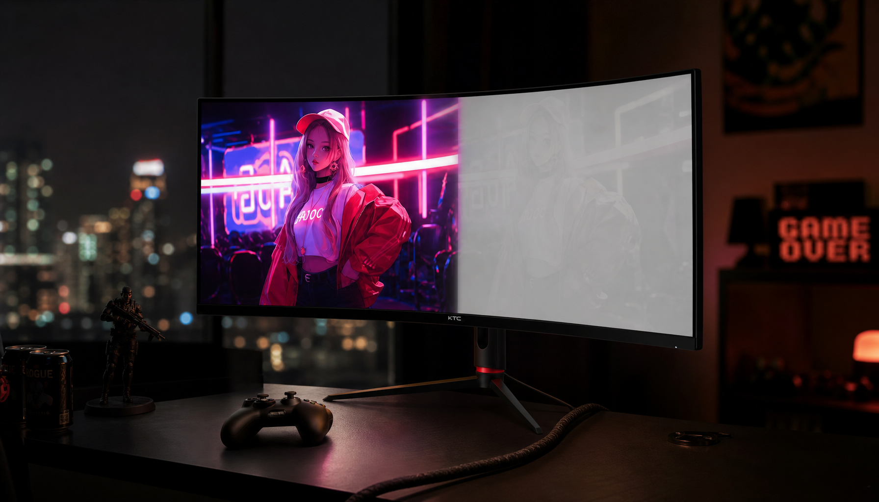
Does one half of your screen look cooler, flatter, brighter, or oddly saturated while the other looks correct? A side-by-side white image, matched brightness check, and stable SDR preset can often reveal whether the problem is the monitor mode, the graphics driver, or the source device. You’ll get a practical way to diagnose the issue and decide whether PIP/PBP is good enough for your workflow or whether you need a calibrated multi-monitor setup.

Why PIP and Split-Screen Color Problems Happen
Picture-in-Picture and Picture-by-Picture modes ask one display to handle two image pipelines at the same time. Each source may arrive with a different resolution, refresh rate, dynamic range, color range, gamut, gamma behavior, and metadata. The monitor then has to scale, tone-map, and present both images inside one physical panel.
The most common real-world symptom is not dramatic “bad color.” It is a small but annoying mismatch: one window looks a little green, one side has crushed shadows, one input looks too bright, or the white point shifts when HDR is enabled. That matters if you are editing product photos, comparing design proofs, monitoring a game stream, or using a portable smart screen as a second workspace.
For gaming and productivity buyers, the tension is clear. Modern monitors prioritize smoothness, quick response, USB-C convenience, HDR, and multitasking features, while color-critical work needs stable, measured output. A gaming display can be excellent for play and daily work, but professional visual production still benefits from displays built and calibrated for accuracy.

The Core Color Variables: White Point, Gamma, Gamut, and Brightness
Color accuracy starts with the basics. White point determines whether white looks neutral, warm, or cool. Gamma shapes midtone brightness between black and white. Gamut defines the range of colors the display can reproduce. Brightness determines how much light comes off the screen in your actual room.
When PIP or split-screen mode changes one of these variables for one source but not the other, the two views stop matching. For example, a laptop connected over USB-C may send limited-range RGB or a different HDR state, while a desktop connected over DisplayPort may send full-range SDR. Even though the monitor is the same physical panel, each source can be processed differently before it reaches your eyes.
A clean baseline is usually gamma 2.2 for SDR desktop work, gaming, and office use. If you raise gamma or use a darker cinema preset, midtones deepen and shadow detail can disappear. If you lower gamma, dark areas become more visible but the image may look washed out. Brightness and contrast should be set with black-level and white-level patterns, because brightness and contrast controls vary widely across monitors and portable screens.
HDR Is a Major Trigger
HDR is one of the biggest causes of split-screen mismatch. HDR does not just make the picture brighter. It can change tone mapping, signal format, peak brightness behavior, local dimming, color volume, and how the graphics system sends the image.

A practical example: your main PC may run the operating system in HDR while a console or laptop sends SDR. In PBP mode, the monitor may apply HDR tone mapping to one input and SDR processing to the other. The HDR side can look punchier, but desktop whites may appear gray or overly bright, while the SDR side looks more controlled. If the monitor cannot apply fully independent image settings per input window, one side becomes the compromise.
This is why stable signal settings matter. Switching presets can force the display, graphics driver, or operating system to reapply HDR, refresh rate, scaling, color mode, and brightness behavior. For performance-first users, the best daily setup is often SDR for work, HDR only for HDR games or video, and one consistent refresh rate where possible.
Graphics Drivers and Color Accuracy Modes Can Interfere
The display is not the only actor. The graphics driver can change color output before the signal ever reaches the monitor. Driver control-panel settings, operating system color management, HDR toggles, ICC profiles, and driver-level correction tools can all affect the final image.
A useful field example comes from a calibration forum thread where a user saw two identical 27-inch monitors fail to match. The mismatch persisted even after using default monitor settings, default graphics driver settings, deleted color profiles, and the same DisplayPort 1.4 cable. The reported clue was the driver’s color accuracy mode, where one display showed “Enhanced” behavior; reinstalling the driver temporarily fixed the mismatch, but HDR brought the issue back.
That thread does not prove a universal driver bug, and it does not give a permanent fix. Its value is diagnostic: when HDR or a driver state changes, two otherwise similar displays or two screen regions can stop behaving the same way. If your mismatch appears only after enabling HDR, changing refresh rate, or waking the system from sleep, the graphics path deserves as much attention as the monitor menu.
PIP and PBP May Limit Independent Calibration
Many monitors do not expose the same full set of picture controls in PIP or PBP that they offer in normal full-screen mode. A display might lock brightness, disable local dimming, gray out color temperature, force a wide-gamut mode, or apply one global preset across both source windows. That design keeps the feature simple, but it limits precision.
This matters most when one source is color-managed and the other is not. A photo editor on a calibrated desktop may rely on an ICC profile, while a streaming box, game console, or work laptop may ignore that profile completely. Calibration advice is especially relevant here: ICC profiles describe how individual devices reproduce color, but they only help when the operating system and application actually use them.
For creative work, calibration and profiling are separate steps. Calibration moves the display toward a target; profiling records how that calibrated display behaves. If you change monitor presets, HDR state, graphics settings, or PBP input behavior afterward, the old profile may no longer describe the actual screen state. That is why serious workflows use measured calibration instead of trusting factory defaults.
Cause |
What You See |
Practical Fix |
HDR on one source only |
One side looks brighter, flatter, or differently saturated |
Use SDR for comparison work; enable HDR only for HDR content |
Different input paths |
HDMI and DisplayPort do not match |
Check RGB range, bit depth, refresh rate, and color format in graphics settings |
Locked PIP/PBP controls |
Color menu options disappear |
Use the most neutral preset available, usually Standard, Custom, or sRGB |
Mixed presets |
One source looks warmer or sharper |
Disable dynamic contrast, gaming enhancers, eco modes, and HDR simulation |
Unmatched profiles |
Apps disagree on color |
Verify ICC profiles and use color-managed apps for creative work |
Panel Type and Viewing Angle Still Matter
Not every color issue is caused by software. Panel behavior matters, especially in split-screen workflows where your eyes view the left and right sides of a large screen from different angles.
IPS panels are favored for color consistency and wide viewing angles. VA panels often deliver stronger contrast but can shift more with angle. TN panels are fast and inexpensive but are usually weaker for color and off-axis consistency. For large ultrawide monitors, this can be obvious: the far left and far right edges are not viewed from the same angle, so the same gray or white can look slightly different across the width.
That is one reason high-quality office and creative monitor recommendations emphasize ergonomics, panel choice, and resolution instead of only size. A 27-inch 4K display can deliver sharp text and a controlled workspace, while a 49-inch ultrawide can replace two screens but also makes viewing geometry more important. Home office guidance often points to sharp text and strong ergonomics, glare control, broad connectivity, and useful workspace as key buying priorities.
Multi-Monitor Setups Can Be More Accurate Than One Split Screen
PIP and PBP are convenient, but they are not always the most accurate way to compare color. Two calibrated monitors can sometimes be easier to tune because each display has its own controls, profile, and input pipeline. The tradeoff is desk space, bezels, cable management, and the time needed to match both screens.
For productivity, multiple displays have a real advantage because they reduce window switching and keep related work visible. Developers can keep code on one display and logs or documentation on another. Editors can keep a timeline on one screen and a preview on another. Finance users can separate dashboards, spreadsheets, and live data. The practical value is keeping related information visible at the same time, which is exactly why color mismatch becomes so noticeable.
The best reliability move is to use identical monitors when possible, then calibrate each one independently. If you are mixing a 32-inch gaming monitor, a laptop display, and a portable USB-C screen, expect more variance. You can improve the match, but you should not expect three different panels to behave like one reference display.
How to Diagnose the Problem Without Guesswork
Start with the simplest test: show the same pure white document or test image on both PIP/PBP regions or both monitors. Sit in your normal position and compare brightness first, not color. If one side is visibly brighter, fix luminance before chasing RGB sliders.

Next, use a black-level pattern and a white-level ramp. Near-black details should be barely visible without turning blacks gray, and near-white steps should remain distinct instead of merging into a flat block. Run the test after the display has warmed up for about 20 to 30 minutes, because calibration sources commonly recommend warm-up time before serious adjustment.
Then stabilize the signal. Use native resolution, the same refresh rate if possible, SDR for baseline testing, and one neutral picture mode. Turn off eco mode, dynamic contrast, HDR simulation, black equalizers, eye-care color shifts, and game genre presets while diagnosing. Those features can be useful later, but they hide the cause while you are trying to match color.
Finally, check the operating system and graphics driver. Confirm the correct ICC profile is assigned to the display, remove stale profiles only if you know they are wrong, and inspect output settings for RGB range, bit depth, color format, and HDR state. If the mismatch appears after a driver update or HDR toggle, driver cleanup may help, but it should be treated as a troubleshooting step rather than a normal calibration method.
When PIP Is Good Enough and When It Is Not
PIP and PBP are excellent for monitoring a secondary source. They work well when you want a laptop dashboard beside a desktop workspace, a console feed beside chat, a security camera view in the corner, or a compact trading/news layout. In those cases, small color differences are usually acceptable.
They are less ideal for judging final color. If you are soft-proofing prints, grading video, matching brand colors, or comparing product images for an online marketplace listing, you need a controlled display state. Color workflow advice follows the same principle: a monitor profile describes a specific monitor in a specific calibration state, so changing display or video card settings can invalidate the profile.
For competitive gaming, the priority may be different. You may accept less accurate gamma for better dark-area visibility, or use a fast preset that changes overdrive and contrast behavior. That is a performance choice. Just do not use that same preset to approve color-sensitive content.
Comfort Also Affects Perceived Accuracy
Eye fatigue can make color judgment worse. A screen that looked neutral in the morning may feel harsh at night if the room light changes. Glare, reflections, high brightness, and poor posture all make subtle comparison harder.
A practical office target is to match screen brightness to the room instead of running every display at maximum. Eye-fatigue guidance recommends balancing room lighting with screen brightness and avoiding large brightness differences that force constant visual adaptation. For a split-screen user, that means your PIP window should not be a glowing HDR island inside a dim SDR desktop unless that is intentionally part of the content.
A Reliable Setup Strategy
For a performance-driven desk, build two modes. Use a stable SDR productivity mode for documents, design review, coding, office work, and color comparison. Use a separate HDR or gaming mode for HDR games, streaming, and immersive media. Keep the signal-level settings as consistent as possible inside each mode.
If your monitor supports PBP with independent picture controls, set each input to the closest neutral preset and match brightness with a white document. If it does not, treat PIP/PBP as a convenience feature rather than a reference tool. For color-critical work, move the image to the calibrated main view or a dedicated calibrated monitor.
The reliable answer is not to avoid PIP or split-screen modes. It is to understand that they combine multiple signal paths inside one visual workspace. Stabilize HDR, presets, profiles, and brightness first; then decide whether the remaining mismatch is small enough for the job in front of you. A fast screen should still serve your eyes, your workflow, and your final output.


