


Colors shift off-center because panel light reaches your eyes at a different angle, changing perceived brightness, contrast, gamma, and color balance.
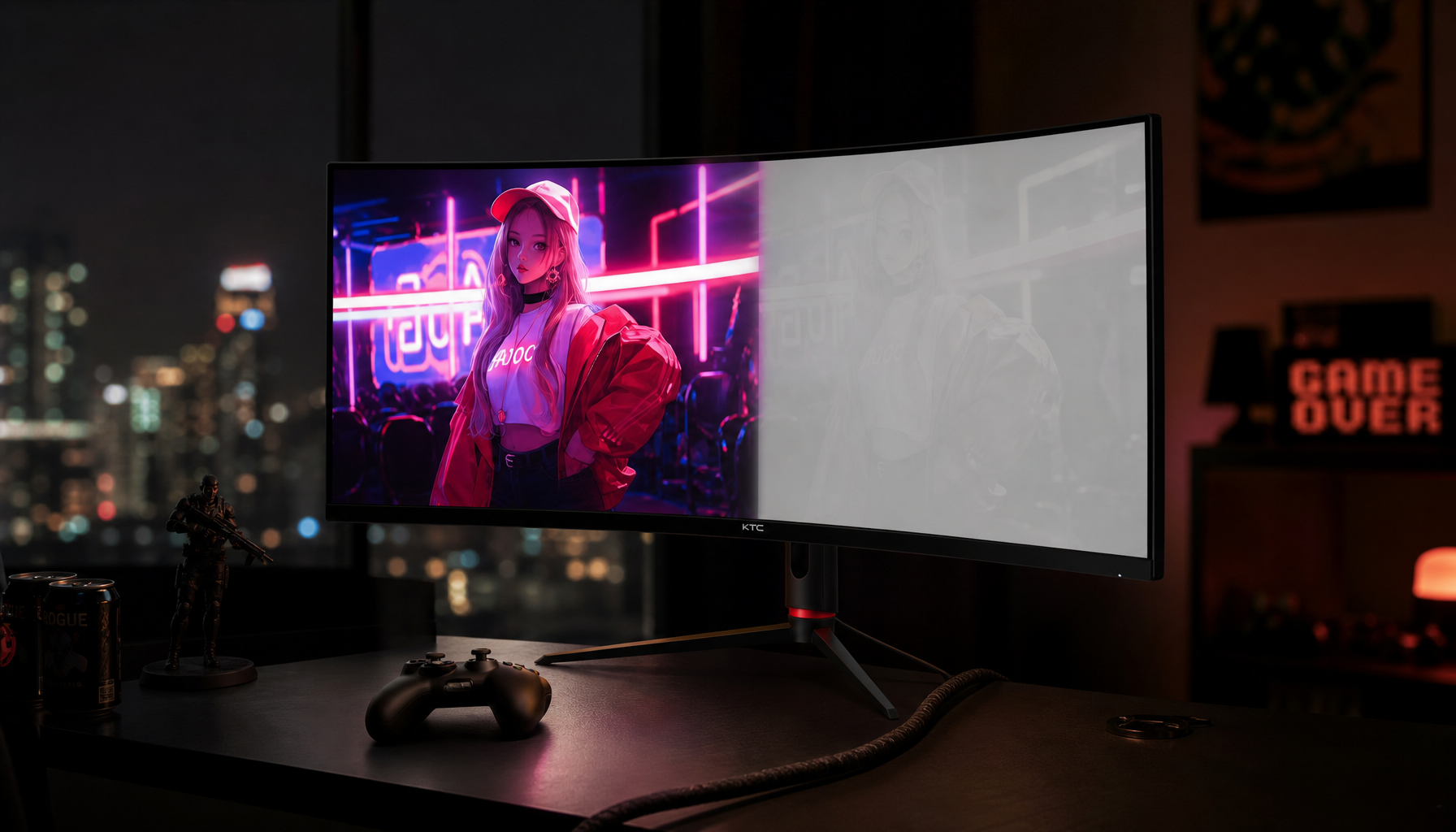
Does your game look rich from the middle seat but washed out when you lean toward a side monitor or show a client the screen from beside you? A practical fix is testable in minutes: center the main panel, tilt it toward eye level, and compare the same image before and after. You’ll learn why the shift happens, which panels handle it best, and how to set up a monitor so colors stay more trustworthy.
The Short Answer: Viewing Angle Changes the Light Path
A monitor’s viewing angle describes how far you can move horizontally or vertically before image quality visibly degrades, and many modern displays advertise values like 178°/178° viewing angles. That number is useful, but it does not mean the image looks identical from every seat. It usually means the image remains viewable within a broad tolerance.
The real-world symptom is color shift. Reds may look duller, grays may lean warmer or cooler, blacks may turn gray, and shadows may flatten. In gaming, this can make dark scenes harder to read from the edge of an ultrawide. In office work, it can make a presentation background look different to the person sitting next to you. In design, it can make a product photo look approved from one chair and questionable from another.
What Is Actually Happening Inside the Screen?
Most desktop monitors are LCD-based, which means a backlight shines through liquid crystal layers that control how much red, green, and blue light reaches your eyes. Because screens rely on RGB light, the display’s color depends on how accurately it can balance those light channels.
When you sit off-axis, you are no longer looking straight through the panel structure. The light path changes, so some tones leak, compress, or lose separation. This is why the same wallpaper can look punchy in the center and faded from the side. The panel has not changed the image file; your viewing position has changed how the emitted light is filtered and perceived.

Color Shift, Gamma Shift, and Contrast Loss
Color shift is the most obvious term, but gamma shift is often the hidden offender. Gamma affects midtones, so an off-center view can make faces, maps, game environments, and product photos look flatter even when the hue does not dramatically change. Contrast loss is the other major issue: black areas brighten, white areas dim, and the image loses depth.
That matters because contrast is not just about “nice blacks.” It separates enemy silhouettes from dark backgrounds, spreadsheet gridlines from white cells, and subtle edits from overcorrection. A monitor can claim a strong straight-on contrast ratio and still look weaker from a side seat.
Panel Type Is the Biggest Hardware Factor

Panel technology sets the baseline for off-center color stability. The most common choices are TN, VA, IPS, and OLED, each with different strengths.
Panel type |
Off-center color behavior |
Main advantage |
Main tradeoff |
TN |
Weakest consistency, more color inversion and dimming |
Fast and affordable for competitive gaming |
Poor viewing angles and color accuracy |
VA |
Strong straight-on contrast, moderate side-angle shift |
Deep blacks for movies and immersive play |
Gamma and contrast can shift off-center |
IPS |
Strong color consistency from the side |
Reliable for work, creators, and multi-monitor desks |
Lower contrast than many VA panels |
OLED |
Excellent off-angle contrast and color stability |
Pixel-level light control and deep blacks |
Premium price and static-image care concerns |
For productivity, portable screens, collaborative reviews, and multi-monitor layouts, IPS is usually the safest value pick because IPS is recommended for most productivity work. For solo cinematic gaming in a darker room, VA can look excellent head-on, but you should be more careful with side viewing. For esports on a budget, TN can still make sense when speed matters more than color. For premium gaming and media, OLED is the strongest off-angle performer because each pixel emits its own light rather than relying on a backlight shutter system.
Why Large, Ultrawide, and Multi-Monitor Setups Expose the Problem
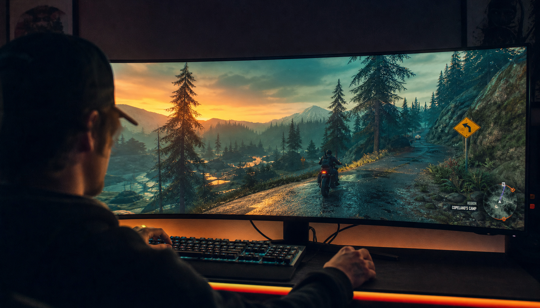
Viewing-angle flaws become easier to see as screen width grows. On a 24-inch office display, your eyes may stay close to the center axis. On a 34-inch ultrawide, 32:9 super ultrawide, or triple-screen laptop extender, the far left and far right edges naturally sit at more aggressive angles.
This is why large displays should be chosen by workflow, desk depth, and viewing distance rather than size alone. Typical monitor sizes range from compact office screens to ultrawide models, and larger monitors can improve productivity only when the setup gives your eyes enough room to scan comfortably.
For example, if you sit too close to a wide flat display, the center may look accurate while the edges appear slightly dimmer or less saturated. A curved monitor can help by turning the edges toward you, especially on ultrawides. It does not upgrade the panel’s off-axis performance, but it can reduce how far off-axis the edges are from your seated position.
Why Two Identical Monitors Can Still Look Different
Even if two monitors use the same model, they can still look mismatched if one is angled differently, set to another brightness level, or running a different picture mode. Multiple-display setups are valuable because they keep apps, documents, dashboards, and references visible at once; multiple monitors improve productivity mainly by reducing window switching. The tradeoff is that every extra panel adds another color and angle variable.
A practical example: put your main display directly ahead for editing, coding, or gameplay, then angle secondary displays inward for chat, notes, scopes, or reference material. If a side monitor is left flat while you view it from 30 degrees off-center, its white background may look different even if the settings match.

For creative and product work, identical models help, but calibration matters too. Monitor-to-printer and monitor-to-monitor mismatches happen partly because devices use different color behavior, and hardware calibration is the more accurate route when repeatable color matters.
Setup Fixes That Improve Color Consistency
Start with geometry before buying anything. Sit centered on the display you trust most. Keep the top bezel at or slightly below eye level, tilt the screen slightly toward your eyes, and place the primary work area straight ahead. For wide displays, increase viewing distance until the left and right edges stop looking obviously different from the center.

Brightness also needs control. A screen that is too bright in a dim room exaggerates contrast perception, while a dim screen under strong overhead lighting looks washed out. For eye comfort, display brightness should be adjusted to match room lighting rather than left at factory defaults.
Use the same color mode across displays when possible. Avoid judging color in FPS, movie, vivid, racing, or eye-comfort modes unless that is the exact experience you are optimizing for. Those modes can be useful, but they are not neutral references. For web content and e-commerce images, sRGB is usually the practical baseline, while wide-gamut modes need proper color management to avoid oversaturation.
How to Test Your Own Monitor in Five Minutes
Open a familiar image with skin tones, neutral grays, saturated reds, and dark shadows. Sit in your normal position and look at the center, then lean left and right without changing settings. Watch whether grays tint, shadows lift, or colors lose saturation. Then move back and tilt the monitor toward your eyes. If the image improves, placement was part of the issue.
Next, drag the same image across your monitors. If it changes dramatically from one screen to the next, match brightness, white point, and picture mode first. If it still differs, the panels or calibration profiles are likely different. For serious photo, video, product, or brand work, use one calibrated primary display as the decision screen and treat phones, laptops, and side monitors as preview devices.
Buying Advice: What to Choose for Your Use Case
For competitive gaming, fast TN or Fast IPS can still be attractive, but color-critical players should lean toward modern IPS or OLED if budget allows. A 24- to 27-inch screen is easier to keep centered, which helps consistency during fast play.
For office productivity, a 27-inch QHD IPS monitor is a balanced choice because it combines sharp text, wide viewing angles, and reasonable cost. If you use dual monitors, match size and resolution where possible, then angle both inward so your eyes meet each panel closer to straight-on.
For creators, analysts, streamers, and portable workstation users, prioritize IPS, OLED, or a strong calibrated main display. If your workflow depends on side-by-side comparison, client review, or vertical screens, viewing angle is not a spec-sheet extra. It directly affects whether the person beside you sees the same result you are approving.
For immersive ultrawide setups, VA and OLED can look spectacular, but test edge behavior. A curved VA panel may feel deeper and more cinematic from the center seat, while IPS may be more predictable for mixed work. OLED is the premium answer for off-angle contrast, but static desktop elements require more care.
FAQ
Does a 178° viewing angle mean perfect color from the side?
No. It means the image remains usable across a wide arc under the manufacturer’s tolerance. Color, gamma, and contrast can still shift before the image becomes “unviewable.”
Can calibration fix off-center color shift?
Calibration improves color accuracy from the measured position, usually straight on. It cannot fully eliminate the physical viewing-angle limits of the panel.
Is IPS always better than VA?
No. IPS is usually better for off-center color consistency, while VA often delivers stronger straight-on contrast. Choose IPS for shared work and consistency; choose VA when deep contrast matters more and you sit centered.
Do portable monitors need wide viewing angles?
Yes, especially if they are used beside a laptop, rotated vertically, or shared during meetings. Portable screens are often viewed off-axis, so IPS-style consistency is a practical advantage.
The reliable path is simple: choose the right panel for the job, sit centered on the screen that matters most, angle secondary displays toward you, and calibrate when color decisions affect money, design, or delivery. Color consistency is not just a creator luxury; it is part of a faster, more confident display setup.


%20and%20setup%20are%20the%20cause,%20offering%20fixes%20for%20more%20consistent%20color.
)