


Rendered materials change because your monitor, color profile, resolution, file format, lighting, and output medium all interpret the same scene differently. The fix is not one magic setting; it is a controlled workflow from viewport to final delivery.
Does your brushed metal look premium in the viewport, then flat in the final export, or does a warm wood floor turn orange after printing? A calibrated workflow can reveal practical errors before delivery, such as screens running too bright or drifting away from a D65 white point. You’ll learn how to diagnose the mismatch and lock down a more reliable render-to-output pipeline.
The Core Problem: Your Display Is Not the Final Output
A monitor is an interpreter, not a neutral window. It has its own brightness, white point, color gamut, panel behavior, viewing angle, and profile. Your final output may be a compressed web image, a 4K video, a print proof, a billboard, or a client’s uncalibrated laptop screen. Each one can shift the way glass, fabric, paint, plastic, stone, and metal appear.
For rendering work, that matters because materials are built from subtle cues: reflection strength, glossiness, roughness, texture scale, shadow depth, and color temperature. A polished concrete floor that reads as elegant on a bright monitor can become muddy in print. A satin wall finish can look too glossy on a wide-gamut screen if the file is not color managed. A black gaming desk render can lose all edge detail if contrast clips the shadows.

The practical goal is consistency, not perfection. You want a predictable chain where your display, render settings, file format, and delivery target are close enough that decisions made during editing still hold up at output.
Calibration Versus Profiling: The Difference That Saves Rework
Monitor calibration means adjusting the display toward a target for brightness, white point, gamma, and contrast. Profiling records how that monitor actually behaves so color-managed software can translate colors correctly. That distinction is central because an ICC profile stores the display’s gamut, white point, and tone response behavior, allowing applications to convert color values with intent instead of guessing.
For most rendering and design work, a sensible starting target is a D65 white point, gamma 2.2, and luminance around 100 to 120 nits, depending on room brightness. Accurate calibration matters because inaccurate displays create unreliable editing environments, and color management must translate values across devices rather than assuming one RGB number means the same thing everywhere.
The everyday example is simple: if your display is too bright, you may darken your render to compensate. The exported image can then look underexposed on a calibrated display or in print. Default monitor brightness is often noticeably too bright, which is enough to make a material judgment wrong before the render ever leaves your workstation.
Why Materials Shift: Reflection, Texture, and Lighting Are Display-Sensitive
Rendered materials are not just colors. They are light behavior. A wood veneer depends on grain scale and anisotropic highlights. A powder-coated metal depends on controlled reflections and edge contrast. Glass depends on refraction, sky treatment, and interior visibility. When the monitor exaggerates saturation or hides shadow detail, the material itself seems to change.
Realistic rendering depends on material behavior under light, and reflection and glossiness maps are often more believable than purely diffuse surfaces because real-world materials usually reflect at least some light. If your screen is in a vivid or gaming preset, those reflections can appear punchier than they are. If your final export compresses highlights, the same material can look dull.
Texture resolution adds another trap. A leather grain that looks crisp in a 4K viewport can turn soft in a 1080p export. A marble vein pattern that looks balanced on a 32-inch monitor may alias or shimmer in video. This is why material reviews should happen at the target output size, not only in a zoomed-in render preview.

Resolution and Viewing Distance Change the Truth
Resolution is not a quality badge by itself. It is a match between pixel count, viewing distance, and output size. Practical render-resolution guidance separates total image resolution from print density: high resolution preserves detail, but it also increases render time, cost, and turnaround.
For a practical calculation, a 4K image is 3,840 by 2,160 pixels, which gives you about 8.3 million pixels. A 1080p image is 1,920 by 1,080 pixels, or about 2.1 million pixels. That means a 4K render carries four times the pixel detail, but it does not automatically make a poor material look better. It simply exposes more of what is already there.
Output Target |
Practical Material Risk |
Better Choice |
Website preview |
Compression can flatten subtle roughness and gradients |
Test at final web size before approval |
4K monitor presentation |
Fine texture and reflection errors become obvious |
Render enough detail for close inspection |
Small print |
Color and density matter more than extreme resolution |
Use proper ICC profiles and proofing |
Large display or signage |
Viewing distance hides some pixel limits but reveals contrast issues |
Balance resolution with legibility and brightness |
A strong workflow uses 2K for quick previews, 4K for most final stills and standard display work, and 8K only when the output genuinely needs it, such as large-format print, aerial scenes, or heavy cropping. Rendering everything at the maximum size wastes time without solving color mismatch.
File Format Can Change Dynamic Range and Detail
The final format can also betray your materials. A high-end render pipeline may preserve highlight detail, subtle shadow transitions, and layered passes during compositing, then lose nuance when exported to a limited delivery format. For motion graphics, CGI, and VFX, EXR instead of PNG is often the better modern choice because EXR preserves high dynamic range and production flexibility.
This matters for reflective surfaces. Chrome, glass, glossy tile, and polished stone often rely on bright highlights and soft falloff. If your file format clips or compresses that range too early, the material may look plastic or harsh in the final output.
The tradeoff is workflow complexity. EXR is excellent for professional compositing and render passes, but clients usually need JPEG, PNG, MP4, or another delivery-friendly format. The practical answer is to work in a robust format upstream, then export a client-ready file only at the end.
Print Is a Different World From Screen
A calibrated monitor improves your odds, but it does not guarantee print accuracy. Print depends on paper, ink, press conditions, humidity, lighting, and vendor profiles. In other words, print color depends on more than the monitor, so a proof is still the responsible move when color accuracy matters.
RGB and CMYK are not interchangeable languages. RGB screens emit light and can show a wider range of luminous colors. CMYK print absorbs and reflects light through ink on a physical surface. A saturated blue LED glow, a neon gaming accent, or a vivid green plant wall may look powerful on a monitor and become muted in print.
For renderers, the practical move is to work in RGB while soft proofing with the correct ICC profile when print is the destination. If the job is high-stakes, such as a sales center wall graphic or product catalog, buy a proof and judge it under realistic lighting.

Monitor Choice Matters, But It Does Not Replace Process
A better display gives you a better baseline. For 3D rendering, color fidelity is critical because it affects how accurately colors, detail, and final visual output are displayed. A 27-inch or 32-inch 4K monitor with strong gamut coverage, stable brightness, ergonomic adjustment, and hardware calibration support is a productive sweet spot for many creators.
Still, a premium display can mislead you if it runs in a saturated preset, sits under direct sunlight, or uses the wrong profile. Wide-gamut panels are especially powerful but need color management. Without it, sRGB content can look oversaturated, making paint, fabric, and skin tones appear richer than they will in the final deliverable.
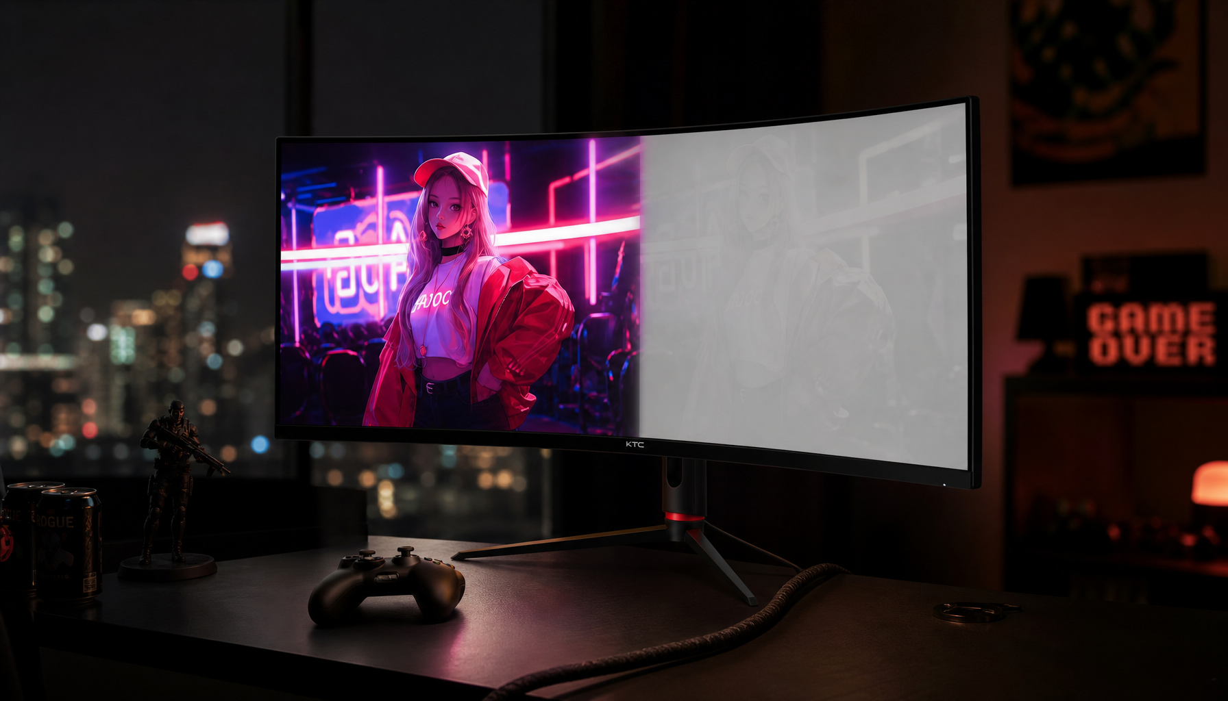
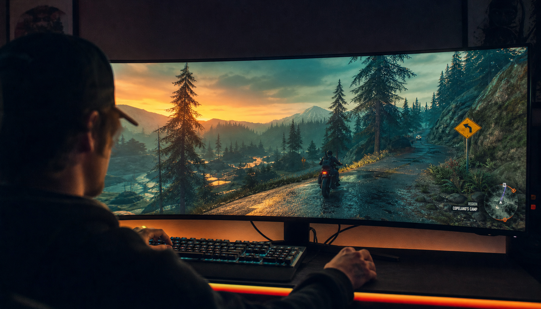
Gaming monitors add another layer. High refresh rates, fast response, and immersive curves are excellent for interactive previews, walkthroughs, and real-time engines. The downside is that many gaming presets push contrast and saturation aggressively. For material approval, switch into a calibrated custom mode or sRGB-like mode when the target output is standard web or client presentation.
A Practical Render-to-Output Workflow
Start by warming up your monitor for about 30 minutes, then work in stable room lighting with glare controlled. Calibrate each display separately, especially in a multi-monitor setup. Use a hardware colorimeter when the work is color-sensitive; software calibration is better than nothing, but visual judgment alone is not precise enough for high-value deliverables.

Next, set the render’s color space and output intent before final material tuning. If the final image is for web, check it in sRGB. If it is for print, soft proof with the printer’s ICC profile. If it is for video, review the export on the kind of screen where it will actually play, whether that is a trade show display, office monitor, or portable smart screen.
Then inspect materials at real output size. Do not approve brushed metal at 300% zoom if the client will view it on a 13-inch laptop. Do not judge leather grain only on a bright OLED phone if the final will be a matte brochure. Make one test export early, not after the render farm has finished the final batch.
Finally, keep a small reference set. Use known neutral grays, skin tones, wood samples, metal finishes, and shadow ramps. When something looks wrong, compare against those references before changing the material itself. Often the problem is the display path, not the shader.
Quick FAQ
Why does my render look darker after export?
Your monitor may be too bright, your export may use a different gamma or color profile, or the viewing app may not be color managed. Check the file in a color-managed application and compare it on a calibrated display before changing the lighting.
Should I render everything in 4K?
No. Use 4K when the final output benefits from visible detail, large-screen presentation, or cropping flexibility. For fast drafts, social previews, and internal approvals, lower resolutions save time without harming the decision process.
Is factory calibration enough?
Factory calibration is useful, but it is not permanent. Displays drift with age, brightness settings change, and room lighting affects perception. Recalibration every few weeks is a practical habit for serious rendering work.
Final Thought
When rendered materials look different on display versus final output, the smartest fix is to control the chain: calibrated monitor, correct profile, appropriate resolution, robust file format, and proofing for the destination. A powerful screen should make you faster and more confident, but the real advantage comes from knowing exactly what that screen is showing you.


