


Ultrawide aspect ratio by itself does not make a monitor less color accurate. What matters more is the panel type, factory tuning, screen uniformity, viewing angle behavior, color gamut, HDR handling, and whether the monitor gives you useful calibration controls.
You drag a photo editor across a 34-inch or 49-inch ultrawide and notice the left side looks a little warmer than the right. That is a real buying and calibration concern, but it usually comes from panel uniformity or viewing geometry rather than the 21:9 or 32:9 shape alone. Here is how to separate normal ultrawide behavior from a monitor worth calibrating, returning, or replacing.
Aspect Ratio Is Not the Same as Color Accuracy
A 21:9 or 32:9 monitor does not have a different color target than a 16:9 monitor. For normal SDR desktop use, the practical baseline is still a neutral white point near 6500K, gamma around 2.2, sensible brightness for the room, and color behavior that matches the content space you use most often. For web, office work, and most SDR games, that usually means sRGB first, not the most saturated preset in the menu.
Color accuracy depends on how closely the screen displays the intended color, not how wide the image is. A monitor can be 16:9 and inaccurate because it ships in a vivid store-demo mode, or it can be a 34-inch ultrawide with excellent factory calibration. Practical checks focus on gamma, white balance, clipping, oversaturation, gradients, uniformity, and color separation; software-only monitor checks can reveal obvious problems, but they cannot prove absolute accuracy without a trusted reference or hardware colorimeter.
For buyers, the most useful specs are not “ultrawide” or “curved” by themselves. Look for near-100% sRGB coverage for general use, a reported average Delta E below 2 for strong factory accuracy, clear SDR and HDR mode behavior, and calibration options that let you adjust brightness, contrast, color temperature, and RGB balance. If a monitor advertises a very wide gamut but has poor sRGB control, web pages, skin tones, and game UI elements may look too saturated.
Factor |
What It Actually Affects |
What to Look For on an Ultrawide |
Aspect ratio |
Workspace width and field of view |
21:9 for wide productivity and immersive gaming; 32:9 for dual-monitor replacement |
Panel type |
Contrast, viewing angles, black level, color stability |
IPS or OLED for stronger off-angle color; VA for contrast with more side-angle caution |
Gamut coverage |
Range of colors the monitor can display |
Near 100% sRGB for everyday SDR; wider gamut with sRGB clamp for mixed use |
Factory calibration |
How accurate the monitor is before user adjustment |
Average Delta E below 2 is excellent; above 3 is often noticeable |
Uniformity |
Whether brightness and tint stay even across the screen |
Check gray fields at 25%, 50%, and 75% brightness across the full panel |
Calibration controls |
How much you can correct |
User mode, RGB sliders, gamma options, sRGB mode, brightness and contrast controls |
HDR behavior |
Tone mapping, brightness, local dimming, color volume |
Separate HDR evaluation; do not judge SDR accuracy with HDR forced on |
Why Ultrawide Monitors Can Look Less Consistent
Ultrawide monitors make panel variation easier to see because the screen covers more of your field of view. On a 49-inch 32:9 display, the far-left and far-right edges sit much farther from your eyes than the center, especially if you sit close. That can make one side look dimmer, warmer, cooler, greener, or pinker even when the center measures well.
Viewing angle is a major reason. Off-axis viewing can change perceived brightness, contrast, gamma, hue, and saturation, and the common 178°/178° viewing-angle rating does not mean the image remains perfectly accurate at every angle. Large displays, stacked monitors, and ultrawide desks increase those angle differences; viewing angle affects color accuracy because LCD light transmission and perceived gamma shift as your eyes move away from the panel’s ideal centerline.

Panel technology changes how visible this is. TN panels are usually weakest for off-axis color. VA panels often deliver strong centered contrast, which is useful for games and movies, but they can wash out or shift from the sides. IPS panels are typically more consistent across angles, making them a safer choice for color-sensitive ultrawide work. OLED panels tend to have excellent off-angle stability, though buyers still need to consider brightness behavior, burn-in risk, subpixel text rendering, and HDR tone mapping.

Curved Screens Help Geometry, Not Calibration Quality
A curved ultrawide can reduce the viewing-angle difference between the center and edges by wrapping the sides toward the viewer. That can make a 34-inch or 49-inch display look more even from a normal seated position. It does not automatically make the panel more accurate, and it does not fix poor factory calibration, weak gamut control, or genuine uniformity defects.
For a practical test, sit where you normally work or play, open a full-screen white image, then full-screen gray fields at 25%, 50%, and 75% brightness. If the center is neutral but the edges change tint as you move your head, viewing angle is likely part of the issue. If one side remains visibly warmer, cooler, brighter, or dimmer from every normal position, that points more toward panel uniformity.
Calibration Targets Stay the Same on 21:9 and 32:9 Displays
The basic calibration target for an ultrawide gaming monitor is not exotic. For SDR, start around 120 nits of brightness in a controlled room, 6500K white point, gamma 2.2, and either sRGB mode or a well-behaved Custom/User mode. Those targets are common because they keep grays neutral, preserve midtone contrast, and prevent the screen from turning normal web and game content into an oversaturated demo reel.
Factory presets are often designed to look impressive in bright retail spaces, not to be accurate in a bedroom, studio, or apartment office. Before judging the monitor, let it warm up for 20 to 30 minutes, reset the picture mode if needed, and disable features that automatically change the image. A gaming calibration workflow should turn off Eco Mode, Dynamic Contrast, and similar processing because calibration adjusts a specific monitor for its room lighting and screen behavior.

Brightness and contrast are not just “make it look good” sliders. Brightness controls black level and shadow visibility; if it is too low, dark game areas crush together, and if it is too high, blacks look gray. Contrast controls highlight detail; if it is pushed too far, bright clouds, UI elements, and white clothing can clip into flat blocks. Built-in operating system calibration tools can help with SDR visual tuning, while basic calibration includes brightness, contrast, gamma, and color balance.
A Practical Ultrawide Calibration Checklist
- Warm up the monitor for 20 to 30 minutes before making decisions.
- Set the monitor to native resolution and the refresh rate you actually use.
- Choose Standard, User, Custom, 6500K, or sRGB mode as the starting point.
- Disable Eco Mode, Dynamic Contrast, automatic brightness, vivid modes, and forced HDR for SDR calibration.
- Adjust brightness so black detail remains visible without making black screens look gray.
- Adjust contrast so bright grays and highlights remain distinct instead of clipping.
- Check 25%, 50%, and 75% full-screen gray fields for side-to-side tint, brightness falloff, and edge shifts.
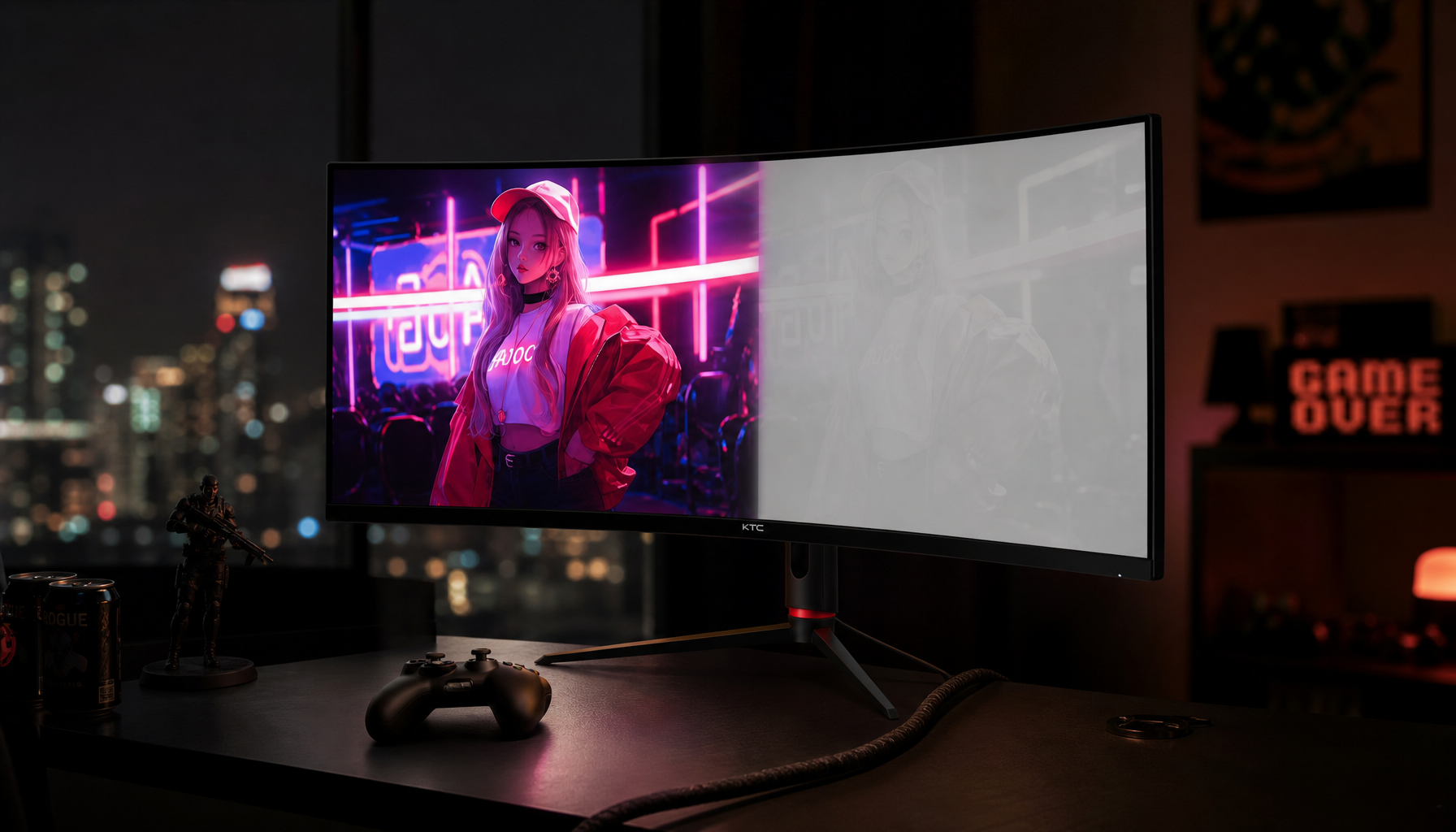
Split-Screen, PBP, and HDR Can Create Color Mismatches
Ultrawide monitors are often used as dual-monitor replacements, which means picture-by-picture (PBP), picture-in-picture (PIP), or split-screen workflows matter. A 49-inch 32:9 display may show a desktop computer on one side and a laptop or game console on the other. If those inputs use different color range, HDR status, refresh rate, resolution, gamma behavior, or metadata, the two halves can look like different monitors.

This is not usually caused by the aspect ratio. It happens because the display is processing two image pipelines at once. One side might receive full-range RGB from a computer while the other receives limited-range video output. One source might be SDR while the other is HDR. One input may use a different color temperature preset, or the monitor may apply one global preset while locking certain controls in split-screen mode. In PIP and PBP modes, color mismatches can come from resolution, refresh rate, dynamic range, color range, gamut, gamma, and HDR metadata differences.
HDR is a special case. Turning on HDR can change tone mapping, peak brightness behavior, local dimming, signal format, and perceived color volume. That is useful for HDR games and movies, but it can make SDR desktop work look inconsistent or too bright. If your ultrawide looks mismatched between the left and right sides, first test in SDR with dynamic features off before assuming the panel is defective.
Matching Two Sources on One Ultrawide
When using PBP, set both devices to the same SDR/HDR state, same color range if possible, and similar refresh rates. Use the same monitor picture mode for both sides if the display allows it. Then compare full-screen white, black level, and gray patterns on each half. If the monitor locks brightness, local dimming, or color temperature in PBP, you may not be able to make both halves match perfectly.
For paid creative work, PBP is usually a convenience mode rather than a precision setup. If you need accurate side-by-side comparison, a hardware colorimeter and a workflow that supports separate display profiles are more dependable. Some ultrawide monitors simply do not provide independent calibration controls for each input region.
Buying Guidance by Use Case
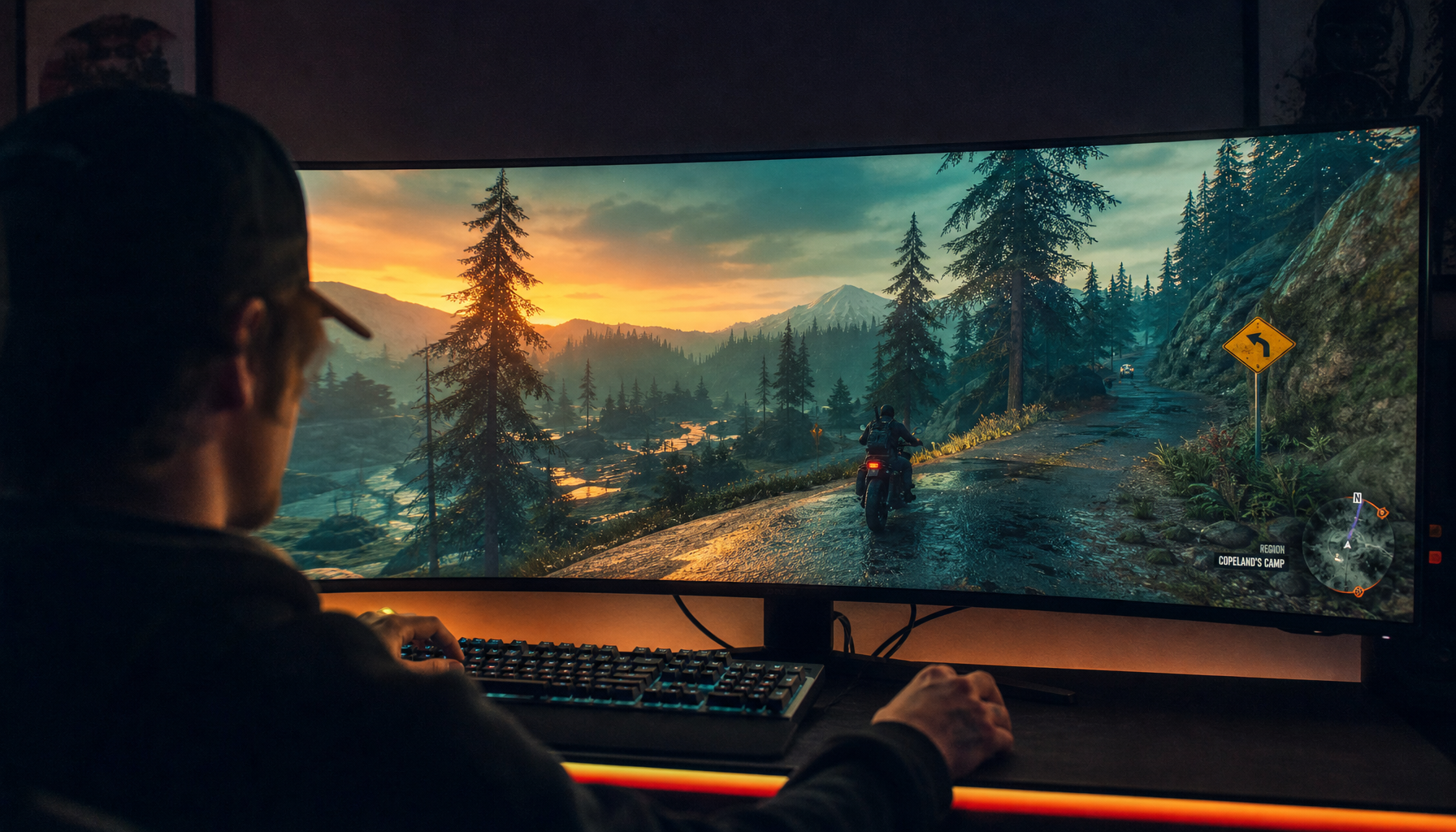
For gaming-first buyers, color accuracy still matters, but motion, refresh rate, response time, adaptive sync, HDR performance, and contrast may sit higher on the list. A good practical target is a fast IPS or OLED ultrawide with a usable sRGB mode, gamma near 2.2, and enough brightness adjustment range for your room. Avoid relying on Vivid, FPS, or Racing modes for color judgment; they often boost saturation and contrast to make games pop.
For content creators, the decision is stricter. A 34-inch ultrawide can be a strong photo, video, or design display if it has good factory calibration, stable uniformity, an sRGB clamp, wide-gamut modes you can control, and enough hardware or software profiling support. A monitor with severe edge tinting is risky for editing because you may correct an image based on where it sits on the screen rather than what the file actually contains.
For productivity and mixed-use setups, comfort and consistency are the priority. A curved 21:9 screen can reduce neck movement and keep more content visible than a standard 16:9 monitor. A 32:9 screen can replace two displays, but it also increases the importance of panel uniformity. If you use spreadsheets, coding windows, browser previews, and occasional games, choose a monitor with reliable SDR behavior over one that only advertises extreme peak HDR brightness.
Use Case |
Best Ultrawide Priority |
Calibration Advice |
Main Risk |
Competitive gaming |
Refresh rate, response time, input behavior |
Use a neutral preset for desktop; game presets only when useful |
Oversaturated modes hiding detail |
Immersive gaming |
Contrast, HDR quality, curvature, field of view |
Calibrate SDR separately from HDR |
HDR tone mapping changing color expectations |
Photo editing |
Uniformity, sRGB accuracy, Delta E, IPS/OLED stability |
Use a colorimeter if work is paid or repeatable |
Edge tint causing bad edits |
Video editing |
Gamut control, HDR/SDR switching, brightness consistency |
Keep separate SDR and HDR workflows |
Mixing HDR desktop behavior with SDR grading |
Office productivity |
Text clarity, brightness control, viewing comfort |
Set brightness for room lighting and neutral grays |
Eye strain from excessive brightness |
Dual-source PBP |
Input matching and independent controls |
Match SDR/HDR, color range, and picture modes |
One global preset affecting both halves |
When Software Checks Are Enough, and When You Need Hardware
Software checks are useful for screening. They can reveal broken gradients, crushed blacks, clipped whites, obvious oversaturation, dead pixels, and uneven brightness. On an ultrawide, they are especially helpful because you can run full-screen patterns and inspect whether the left edge, center, and right edge behave similarly.
They are not the same as measurement. Visual checks depend on your eyes, room lighting, and the reference image. A hardware colorimeter is the better tool when you need repeatable per-unit accuracy, multi-monitor matching, paid photo or video work, or recalibration every 4 to 6 weeks. For most gaming and productivity users, careful SDR setup plus visual tests may be enough; for client-facing creative work, hardware profiling is the more defensible path.
A simple non-hardware uniformity check is still worth doing before a return window closes. Fill the display with plain dark and gray colors, view it full screen, and step slightly farther back than your normal seated position. A practical screen check looks for areas that appear lighter or darker than the rest; plain dark colors can make blotches, edge fading, and uneven backlight behavior easier to notice.
FAQ
Q: Does a 21:9 ultrawide monitor have worse color accuracy than a 16:9 monitor?
A: No. The aspect ratio does not determine color accuracy. A 21:9 ultrawide, 32:9 super-ultrawide, and 16:9 monitor can all be accurate or inaccurate depending on panel quality, factory calibration, gamut control, white balance, gamma, and uniformity. The wider screen simply makes side-to-side differences easier to notice.
Q: Can an ultrawide gaming monitor be calibrated for photo editing?
A: Yes, if the monitor has the right panel behavior and controls. Look for strong sRGB coverage, average Delta E below 2, stable gray uniformity, adjustable RGB balance, and a usable sRGB or Custom mode. For paid photo editing, use a hardware colorimeter and check the full panel, not just the center.

Q: Should I calibrate an ultrawide with HDR turned on?
A: Calibrate SDR with HDR turned off unless you are specifically building an HDR workflow. HDR changes tone mapping, brightness behavior, local dimming, and sometimes color volume, so it can make normal desktop color judgment unreliable. Treat SDR and HDR as separate modes and evaluate each one with appropriate content.
Practical Next Steps
Ultrawide aspect ratio does not ruin color accuracy, but ultrawide size makes weak uniformity, off-angle color shift, and split-screen signal differences more visible. For most buyers, the right move is to judge the monitor by measurable display behavior: sRGB accuracy, Delta E, gamma, white point, panel type, uniformity, HDR handling, and calibration controls.
If you are shopping for an ultrawide, prioritize a monitor that behaves well in SDR before chasing extreme specs. If you already own one, warm it up, use a neutral preset, disable dynamic processing, check gray fields across the full screen, and decide whether the issue is calibration, viewing angle, source mismatch, or a true uniformity defect. When the center looks accurate but the edges stay visibly tinted or dim from normal seating, software calibration will not fully fix it.
References
- KTC, Split-Screen Color Accuracy: Causes & Fixes for Monitors
- KTC, Viewing Angle & Color Accuracy: Why Your Monitor Changes Color
- KTC, Validate Monitor Color Accuracy Without Hardware
- KTC, Validate Monitor Color Accuracy Without Hardware
- KTC, How to Calibrate Your Gaming Monitor
- Coding Horror, Computer Display Calibration 101
- PCMag, How to Calibrate Your Monitor
- DamienSymonds.net, Simple Screen Uniformity Check


