


Color mismatch across monitors costs time because it forces users to re-check visual decisions, move windows back and forth, and trust one screen while doubting the other. The fix is not just “buy a better monitor”; it is choosing compatible displays, setting a reference screen, and calibrating the setup around a consistent target.
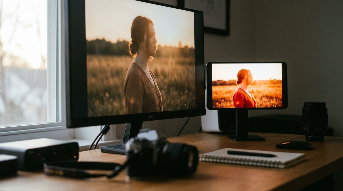
Ever drag the same image from one monitor to another and watch skin tones turn warmer, grays shift green, or a game scene suddenly look washed out? In a two-screen editing or work setup, even a few minutes of second-guessing per task can turn into repeated review cycles, slower handoffs, and buying regret. This guide explains where the time goes and how to build a monitor setup that stays visually consistent.
Why Two Monitors Rarely Match Out of the Box
Panel Type, Backlight, and Factory Tuning All Matter
Two monitors can show the same desktop with different color even when both are set to “standard” mode. Manufacturing tolerances, backlight behavior, optical materials, factory calibration, and panel aging all contribute to visible differences in white point, brightness, contrast, and tint across dual-monitor color mismatch. That is why a newer 27-inch IPS monitor may look cooler than an older 24-inch secondary display, even if both are set to 6500K.
The mismatch becomes more obvious when the displays use different technologies. A Mini-LED gaming monitor may have deeper blacks, higher peak brightness, and stronger perceived contrast than a basic LCD portable monitor. An ultrawide OLED display may make the same gray UI look richer than an office IPS panel beside it. These differences are not always defects; they are often the result of different hardware behavior.
Refresh Rate and Resolution Can Affect the Setup Experience Too
Color mismatch is not the only source of friction in a multi-monitor setup. Common post-setup problems include borrowed resolution settings, incorrect refresh rates, wrong inputs, bad cables, and graphics driver issues in multi-monitor setups. If a computer outputs a refresh rate that a second monitor cannot handle, the user may see a “no signal” state instead of a usable display.
For productivity, that matters because color work depends on a stable baseline. A 165 Hz gaming monitor paired with a 60 Hz portable monitor can be useful, but only if each display runs at its native resolution, supported refresh rate, correct input range, and predictable color mode. Before blaming calibration, confirm that the hardware signal is clean and that the operating system is not forcing the wrong mode.
Where the Hidden Productivity Costs Show Up
The Cost Is Often Re-Checking, Not Rework
The biggest productivity loss is not always a dramatic mistake. It is the repeated micro-decision: “Which screen is right?” A video editor may place the timeline on one monitor, bins on another, and reference playback on a third, but mismatched displays can slow visual choices because editors must keep checking whether the problem is the footage or the monitor. Dual-display workflows can improve productivity by separating timelines, scopes, effects, and playback, while color mismatch can undermine those gains by making visual decisions less reliable in video editing.

A practical example: a creator grades a product shot on a calibrated 27-inch 4K display, then drags it to a cheaper side monitor and sees the white background turn slightly yellow. The file may be fine, but the creator still spends time checking scopes, toggling color modes, asking for a second review, or exporting another test. That is the hidden cost: not just inaccurate color, but lost confidence.
Office, Gaming, and Developer Workflows Feel It Too
Color mismatch is not limited to photographers and video editors. A product manager comparing UI mockups across two screens may reject a button color that only looks wrong on the secondary display. A developer may tune a dark theme on a high-contrast OLED and miss low-contrast text on an IPS monitor. A gamer using a high-refresh-rate main display and a side monitor for streaming controls may see webcam previews, overlays, or thumbnails shift in saturation.
Even general office work can slow down when brightness is inconsistent. If a spreadsheet looks crisp on the primary monitor but dim on the portable monitor beside it, users tend to move windows back to the “trusted” display. That habit quietly reduces the value of the second screen: the extra space exists, but the user stops using it for tasks that require visual comparison.
Which Monitor Specs Matter Most for Color Consistency
Match the Use Case Before Matching the Price
The easiest way to reduce mismatch is to buy monitors with similar panel technology, resolution, size, brightness range, color gamut, and factory calibration claims. For color-critical work, using two identical monitor models or calibrating the weaker monitor is recommended when incorrect color affects designers and artists through poor saturation or weak accuracy in monitor color. Identical models are not guaranteed to match perfectly, but they usually reduce the number of variables.
For buying guidance, the “best” monitor pairing depends on the job. A gamer may reasonably prioritize a 240 Hz or 360 Hz main display and use a less expensive side display for chat, browsing, or streaming tools. A video editor should treat the most accurate monitor as the reference display and use other screens for timeline, bins, scripts, scopes, and communication. A hybrid worker may benefit more from two matched 27-inch IPS monitors than from one premium ultrawide and one low-end portable panel that never looks the same.
Use a Reference Display Instead of Trusting Every Screen Equally
A multi-monitor setup becomes easier to manage when one screen is designated as the “hero” or reference display. Editing guidance recommends using one monitor for final color judgment while assigning the secondary monitor to UI panels, timelines, scripts, chat, or scopes in dual displays. This reduces the need to make final decisions on every screen.
For monitor buyers, that changes the budget decision. Instead of buying two midrange monitors and expecting both to be perfect, it may be smarter to buy one color-accurate main monitor and one secondary monitor chosen for matching size, ergonomics, refresh rate compatibility, and stable brightness. A 27-inch 4K IPS display such as a brand’s 27-inch 4K IPS 60Hz low-blue-light home and office monitor could serve as that main reference screen while secondary monitors are matched to it. The secondary display does not need to be flawless; it needs to avoid misleading the user during routine work.

Setup Type |
Best Main Display Priority |
Secondary Display Role |
Color Consistency Risk |
Practical Buying Advice |
Dual 27-inch office monitors |
Matched IPS panels, similar brightness |
Documents, dashboards, calls |
Low to medium |
Buy the same model if possible; match brightness and color temperature after setup |
Creator workstation |
Factory-calibrated 4K display, wide gamut, hardware calibration support |
Timeline, scopes, bins, scripts |
Medium |
Use one reference display for final color and calibrate on a schedule |
Gaming plus streaming setup |
High refresh rate, low response time, good SDR mode |
Chat, stream preview, controls |
Medium |
Do not judge webcam color or thumbnails from an uncalibrated side screen |
Ultrawide plus portable monitor |
Large workspace, uniformity, ergonomic placement |
Travel screen, notes, email |
High |
Expect visible differences; use portable display for non-color-critical tasks |
Mixed OLED, Mini-LED, and IPS |
Contrast, HDR, refresh rate |
Depends on task |
High |
Avoid using all screens for the same color decision; match SDR modes as closely as possible |
How to Set Up Monitors for More Reliable Color
Start With Signal, Brightness, and Color Mode
Before calibration, make sure both monitors are running at native resolution, supported refresh rate, correct RGB range, and a stable wired display connection. Hardware checks such as reliable cables, native resolution, correct refresh rate, and matching RGB range should come first in dual-display setup. This is especially important when pairing a high-refresh-rate gaming monitor with a second monitor through a dock, adapter, or older display port.
Then turn off features that make the image change from moment to moment. Disable vivid modes, dynamic contrast, blue-light filters, local enhancement modes, and auto-brightness before judging color. A monitor that automatically changes brightness during the day may feel comfortable, but it will also make comparison work less predictable.
Warm Up Displays Before Making Judgments
Displays should warm up before serious color adjustment. Photography calibration guidance notes that monitors should warm up for at least 10 to 15 minutes so brightness and color balance stabilize in monitor calibration. For video editing workflows, a longer 30-minute warm-up is often recommended before calibration or final review.

This is not a theoretical detail. If a user starts color work at 8:00 AM, adjusts a monitor immediately, and checks the same file at 8:30 AM, the display may appear slightly different after it stabilizes. That can lead to unnecessary edits, especially on older LCDs, portable monitors, or displays with inconsistent backlight behavior.
Calibration Targets That Reduce Second-Guessing
Use Standard Targets for Standard Work
For standard web, office, photo, and SDR video work, the common target is a D65 white point, gamma 2.2, and a practical luminance around 100 to 150 nits depending on room brightness. A color-education platform describes white point, gamma, and luminance as common target settings, with gamma 2.2 generally recommended for image editing and viewing in calibration settings. For online video in a normal room, 120 nits is a useful target.

The point is not to chase a perfect number on every monitor. The goal is to make the displays predictable enough that a window does not look obviously warmer, cooler, brighter, or flatter when moved from one screen to another. A full-field gray image, a white browser window, and a few familiar skin-tone photos are simple checks that reveal problems quickly.
Manual Adjustment Helps, but a Colorimeter Is Better
Manual adjustment is useful for getting close. The first pass should be matching brightness, choosing a standard color temperature such as D65 or 6500K, and using each monitor’s on-screen display controls for RGB gain and bias when available. Hardware alignment to D65 and brightness matching with a white or gray test image are recommended first steps for reducing dual-monitor mismatch.
For color-critical work, a colorimeter is the more reliable path. Calibration places the monitor into a defined state, while profiling characterizes that state so the system can map color more accurately through a profile or lookup table. Visual calibration can improve a bad setup, but it is the least accurate method because the user’s eyes adapt quickly to color shifts.
Software Color Management and Maintenance
System-Level Color Management Can Help, With Limits
Modern operating systems can reduce some mismatch when apps and displays support color management. System-level color management can use hardware-accelerated color management to improve consistency and can clamp wide-gamut displays to sRGB for standard content in system-level color management. That matters when a wide-gamut gaming monitor makes ordinary web colors look oversaturated beside a standard-gamut office monitor.
The limit is app behavior. Older apps, some games, and certain media tools may bypass system color management or handle color inconsistently. That means a display can look controlled in a browser but still look different in a game launcher, video player, or legacy design tool. Software helps most when it is combined with stable monitor settings and a clear reference display.
Recalibration Is a Schedule, Not a One-Time Fix
Monitor color drifts over time. Backlights age, brightness changes, firmware updates alter behavior, and users accidentally switch modes. For demanding color work, monthly checks may be appropriate, while lighter editing may only need recalibration every three to six months in editing workflows. A practical minimum for mixed-use setups is to re-check every six months or after major operating system, driver, or monitor firmware updates.
The workflow should be simple enough that it actually happens. Save monitor presets, label the reference display, keep calibration profiles named by date, and use the same test images each time. If the setup includes a portable monitor, recalibrate or at least re-check it after travel because brightness, viewing angle, and dock behavior can change how it appears in daily use.
Action Checklist for a More Consistent Multi-Monitor Setup
- Pick one reference display for final color decisions, especially for photo editing, video editing, design review, streaming visuals, and product images.
- Set every monitor to native resolution and a supported refresh rate, then confirm the correct display input range.
- Disable vivid modes, dynamic contrast, blue-light filters, auto-brightness, and local enhancement before judging color.
- Warm up displays for at least 15 minutes before normal calibration checks; use about 30 minutes before serious editing or review.
- Match brightness with a white or gray full-screen image, then set each monitor as close as possible to D65 or 6500K.
- Use a colorimeter for color-critical work; otherwise, validate with gray ramps, skin tones, and familiar product photos across both displays.
- Re-check calibration every three to six months, or after major driver, operating system, firmware, or hardware changes.
FAQ
Q: Do I need identical monitors for accurate color?
A: Identical monitors are helpful but not mandatory. They reduce differences in panel type, brightness range, coating, gamut, and factory tuning, but even identical models can vary in white point, gamma, brightness, or tint. For serious color work, identical displays plus calibration is stronger than identical displays alone.
Q: Is a gaming monitor bad for color-accurate work?
A: Not necessarily. Many gaming monitors have strong color performance, but high refresh rate, HDR modes, wide gamut, and aggressive factory presets can make colors look exaggerated. For mixed gaming and productivity, use a calibrated SDR mode for work and a separate gaming preset for play.
Q: Can I fix color mismatch without buying a colorimeter?
A: You can improve it, but you may not fully fix it. Manual brightness matching, D65 or 6500K color temperature, native resolution, correct refresh rate, and disabled image enhancements can solve obvious mismatch. A colorimeter is still the better tool when client work, product imagery, print matching, or video grading depends on repeatable color.
Key Takeaways
Inconsistent color accuracy creates productivity costs by making users question which monitor is telling the truth. The time loss shows up as repeated checking, unnecessary exports, slower design reviews, weaker confidence in edits, and underused secondary displays.
The most reliable setup starts with the buying decision: choose compatible panels, avoid unnecessary technology mismatches, and decide which screen will be the reference display. Then stabilize the signal, match brightness and white point, use color management where available, and recalibrate on a schedule. A multi-monitor setup should give you more working space without making every visual choice feel like a second opinion.


