


Lowering monitor brightness does not reduce the screen’s native resolution or remove pixel-level detail. However, it can change how sharp text, game visuals, and fine image details appear, especially if brightness no longer matches the room lighting.
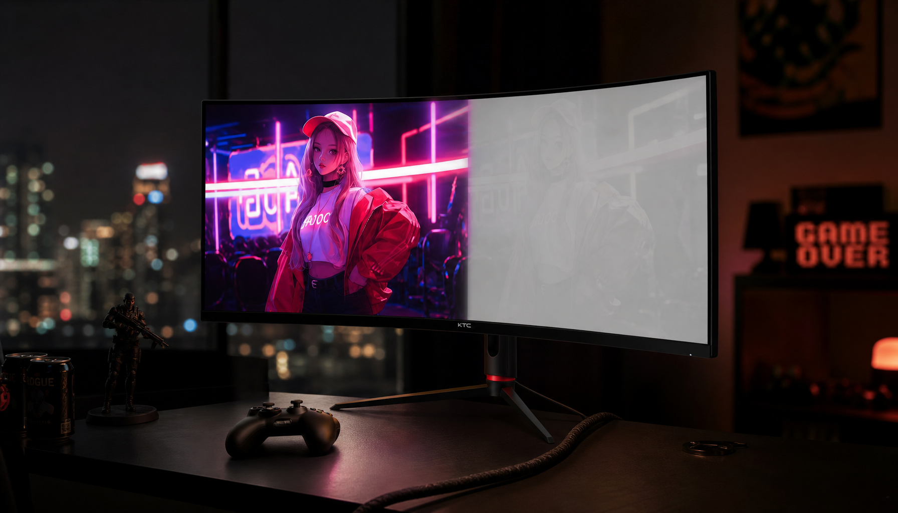
Have you ever reduced the brightness on a gaming monitor at night and noticed that menus suddenly looked softer or shadow details became harder to spot? A practical adjustment from a showroom-style preset above 300 nits to a room-appropriate range of 80-150 nits can reduce glare while preserving clear text and usable detail. The key is knowing when lower brightness is improving visibility and when it has gone too far.
Brightness Changes Perceived Sharpness, Not Actual Resolution
A monitor’s backlight or luminance setting controls how much light the display produces. It does not change the number of physical pixels on the panel. A 27-inch 4K monitor remains a 3,840 × 2,160 display whether it is set to 90 nits or 300 nits, and a 1440p gaming monitor does not lose detail simply because its brightness slider is reduced.
Perceived sharpness is different from native resolution. It describes how clearly your eyes can distinguish text edges, interface elements, character outlines, and small details in a game or image. Brightness affects that experience indirectly by changing contrast, glare, shadow visibility, and visual comfort.

A company’s display controls also treat screen brightness as a separate adjustment from picture sharpness. This distinction matters: raising the brightness slider is not the same as applying sharpening, increasing pixel density, fixing incorrect scaling, or improving focus.
What Brightness Cannot Fix
If text remains blurry after brightness is adjusted, check the settings that directly affect clarity:
- Use the monitor’s native resolution.
- Confirm that operating-system scaling is appropriate for the panel size and resolution.
- Run the operating system’s text-tuning tool if fonts look uneven.
- Check whether the monitor is applying an aggressive sharpness filter.
- Use a digital video connection and verify the correct output format.
- Sit at a practical viewing distance, especially with an ultrawide monitor.
- If motion looks soft only during gameplay, investigate refresh rate, response time, and overdrive settings rather than brightness alone.
Brightness can make these issues more noticeable, but it is rarely the underlying cause.
Why Lower Brightness Can Make a Screen Look Clearer
A bright factory preset can look vivid in a retail showroom while being uncomfortable at a desk. Monitor presets often exceed 300 nits in bright showroom conditions, where strong ambient lighting would otherwise wash out the image. In an apartment office, gaming room, or bedroom, the same preset may create glare and make your eyes work harder.
Lowering brightness can improve perceived sharpness when it reduces that glare. Text edges may look cleaner, white backgrounds become easier to read, and fine interface details become easier to scan during long sessions. This is particularly useful for coding, spreadsheet work, strategy games, and gaming monitors used for both play and productivity.
Match the Monitor to the Room

A useful starting point is to match screen brightness to ambient lighting rather than leaving the monitor at its factory setting. The recommended starting ranges are 120-150 nits for a bright office, 100-120 nits for a typical room, and 80-100 nits for a dark room.
Viewing Environment |
Useful Starting Range |
Likely Result |
Adjustment Priority |
Bright office or sunlit room |
120-150 nits |
Clearer whites without looking washed out |
Control reflections and increase brightness only as needed |
Typical home office |
100-120 nits |
Balanced text clarity and comfort |
Use this range as the baseline for daily work |
Dark gaming room |
80-100 nits |
Less glare and easier viewing during long sessions |
Check shadow detail and reduce excessive contrast |
Retail-style or very bright preset |
Above 300 nits |
Initially vivid, but often tiring indoors |
Reduce brightness before changing sharpness controls |
Content-dependent peak brightness |
Bright highlights with a controlled desktop |
Calibrate HDR and keep SDR desktop whites restrained |
You do not need a light meter to make an effective first adjustment. Open a mostly white document or webpage and hold a sheet of printer paper beside the monitor. In this White Paper Test, the screen should look similar to the paper under the room lighting. Reduce brightness if the display glows aggressively; increase it if white areas look dull or gray.

When Lower Brightness Can Make the Screen Look Softer
Lower brightness is not automatically better. If the display becomes too dim for the room, low-contrast details can blend together. Small gray text may be harder to read, subtle textures can disappear, and dark game scenes may become muddy. This can feel like a loss of sharpness even though the pixels have not changed.
This problem is common when a portable monitor is used near a window, an ultrawide monitor is placed under bright overhead lighting, or a gaming monitor is dimmed for nighttime play and then used the next morning without adjustment. A single brightness level rarely works well for every environment.
Brightness and Contrast Must Work Together

Contrast affects the separation between light and dark areas. A moderate increase can make text edges and interface elements look more distinct, but excessive contrast can create crushed blacks, glare stress, blooming, and halo effects. The risk is more noticeable in dark rooms and on some Mini-LED monitors.
For dark games, reducing hardware contrast by 5-10% can reduce blooming while maintaining a comfortable image. If a Mini-LED monitor offers local-dimming levels, Low or Medium is a sensible starting point for desktop use and darker gaming sessions. Recheck black detail with an actual game scene rather than relying only on the desktop.
Image-editing controls illustrate why these settings should be treated separately. Adjusting brightness primarily changes midtones, while exposure, whites, and blacks alter different parts of an image. A combination of tonal adjustments can reach a more balanced result than pushing one slider to an extreme. The same practical principle applies when tuning a monitor: do not use the brightness control to compensate for poor contrast, glare, or incorrect HDR settings.
Tune Brightness for Your Monitor Type
The right adjustment depends on how the display is used. Gaming monitors, high-refresh-rate displays, ultrawide panels, and portable monitors can all benefit from lower brightness, but each category has a different failure mode to watch for.
Gaming Monitors and High-Refresh-Rate Displays
For competitive gaming, lower brightness can reduce glare during long sessions and make the screen easier to scan. However, lowering brightness will not fix motion blur. If targets look smeared only when moving, confirm that the monitor is running at its intended refresh rate and test the overdrive setting.
For dark single-player games, start near 80-100 nits in a dark room and inspect shadow detail. If caves, nighttime scenes, or dark menus lose too much information, increase brightness slightly before increasing contrast. Strong contrast can make bright highlights look more dramatic while hiding information in shadows.

Mini-LED and HDR Monitors
HDR displays require a more careful approach because peak highlight brightness and everyday desktop brightness serve different purposes. A monitor may need bright HDR highlights for games or video while still benefiting from subdued white backgrounds during regular desktop use.
For operating-system HDR, use the operating system’s HDR calibration tool and keep the SDR Content Brightness slider low, often around 0-20%, to keep desktop whites closer to the ergonomic 80-120 nit range. If bright UI elements create visible halos in dark scenes, reduce hardware contrast slightly and test a less aggressive local-dimming mode.
Ultrawide Monitors
An ultrawide monitor fills more of your field of view than a smaller display, so a high brightness setting can feel more intense even when the measured luminance is unchanged. Start with the same 100-120 nit range used for a typical room, then judge comfort while viewing a full-width white webpage or spreadsheet.
Also check viewing distance and panel curvature. If text looks crisp in the center but less distinct near the edges, brightness may not be the primary issue. Position, viewing angle, and the monitor’s panel characteristics can matter more.
Portable Monitors
Portable monitors are often used in changing environments: a dim hotel room, a bright café, a temporary desk near a window, or a second-screen setup beside a laptop. A lower setting may look clear indoors but washed out in daylight. Treat brightness as a setting to revisit whenever the lighting changes.
Match the portable monitor’s white background to the laptop screen and the surrounding room. If the screens have very different luminance levels, your eyes must keep adapting as you look between them, which can make both displays feel less comfortable and less clear.
A Practical Five-Minute Adjustment Routine
You can tune perceived sharpness without specialized equipment. Use a white document, a page with small text, and a game or video scene with dark details.
- Set the monitor to its native resolution and confirm the intended refresh rate.
- Reset any extreme sharpness, contrast, or gaming enhancement settings to a neutral baseline.
- Adjust brightness for the room: begin at 100-120 nits for a typical home office, 80-100 nits for a dark room, or 120-150 nits for a bright office.
- Perform the White Paper Test. A white screen should not glow far more intensely than printer paper under the same lighting.
- Read small text for several minutes. If letters look washed out, reduce brightness slightly. If gray text becomes hard to distinguish, raise it slightly.
- Load a dark game scene. If shadow detail disappears, increase brightness a small amount. If halos or blooming become distracting, reduce contrast by 5-10% and test a lower local-dimming setting.
- Save separate presets for daytime work, nighttime use, and HDR gaming if the monitor supports them.
Make small changes and evaluate them with real content. A modest brightness adjustment is usually more useful than forcing the monitor into an extreme setting that looks impressive for a few minutes but becomes tiring over a full workday or gaming session.
FAQ
Q: Does lowering monitor brightness reduce resolution?
A: No. Brightness does not change native resolution, pixel density, or the number of pixels rendered by the monitor. It can make details feel less visible if the screen becomes too dim for the room, but the underlying resolution remains the same.
Q: What brightness level is best for sharp text?
A: Start at 100-120 nits in a typical room. Use 120-150 nits in a bright office and 80-100 nits in a dark room. Then refine the setting with a white document and printer paper. The best value is the lowest comfortable level that keeps text distinct without making white areas look dull.
Q: Should I increase sharpness if a dim monitor looks blurry?
A: Check brightness, contrast, native resolution, operating-system scaling, and viewing distance first. Increasing a monitor’s sharpness control can exaggerate edges and introduce visible halos. Use it only after the basic display settings are correct, and keep the adjustment moderate.
Practical Next Steps
Lower monitor brightness does not inherently make a display less sharp. In many indoor setups, reducing an overly bright factory preset improves perceived clarity by lowering glare and visual fatigue. The target is not the dimmest possible image; it is a balanced image that fits the room.
For a general desktop or gaming setup, begin at 100-120 nits. Move toward 80-100 nits for nighttime use or 120-150 nits for a bright office. Test text, dark game scenes, and full-screen white content before changing advanced controls. If clarity problems remain, investigate resolution, scaling, contrast, HDR behavior, motion settings, viewing distance, and reflections rather than assuming that brightness alone is responsible.


