


Gamma changes how your monitor distributes visible brightness between black and white, so it directly affects whether shadows reveal texture, midtones stay natural, and similar colors remain distinct. For most SDR gaming, office, web, and creator workflows, gamma 2.2 is the safest starting point.
Do dark corners in games look like black paint, or do spreadsheets and dark-mode apps blur into muddy gray? A stable gamma setting can make near-black steps visible without making the whole image look faded, and it gives you a practical way to separate display problems from content problems. This article explains what gamma changes, when 2.2, 2.4, or lower gamma makes sense, and how to tune it without damaging color accuracy.
What Gamma Means on a Monitor
Gamma is the tone-response curve that controls how a display turns a digital signal into visible brightness, especially through shadows and midtones. A monitor does not treat a 50% gray signal as half of peak brightness; gamma bends the brightness curve so image data lines up better with how human vision perceives tonal differences.

That matters because your eyes are more sensitive to changes in dark tones than bright tones. Image data can be mapped closer to human perception, which helps preserve subtle differences in darker areas instead of wasting too much tonal precision in highlights. In practical monitor terms, gamma is why a cave wall, charcoal jacket, dark UI panel, and black background can either separate cleanly or collapse into one flat mass.
Historically, gamma was shaped by CRT behavior, where display output was naturally nonlinear. Modern LCD, OLED, mini-LED, and portable screens no longer behave like old CRTs, but the content pipeline still expects controlled tone curves. CRT behavior helps explain the origin, while modern calibration is really about predictable image reproduction across current display technologies.
How Gamma Affects Shadow Detail
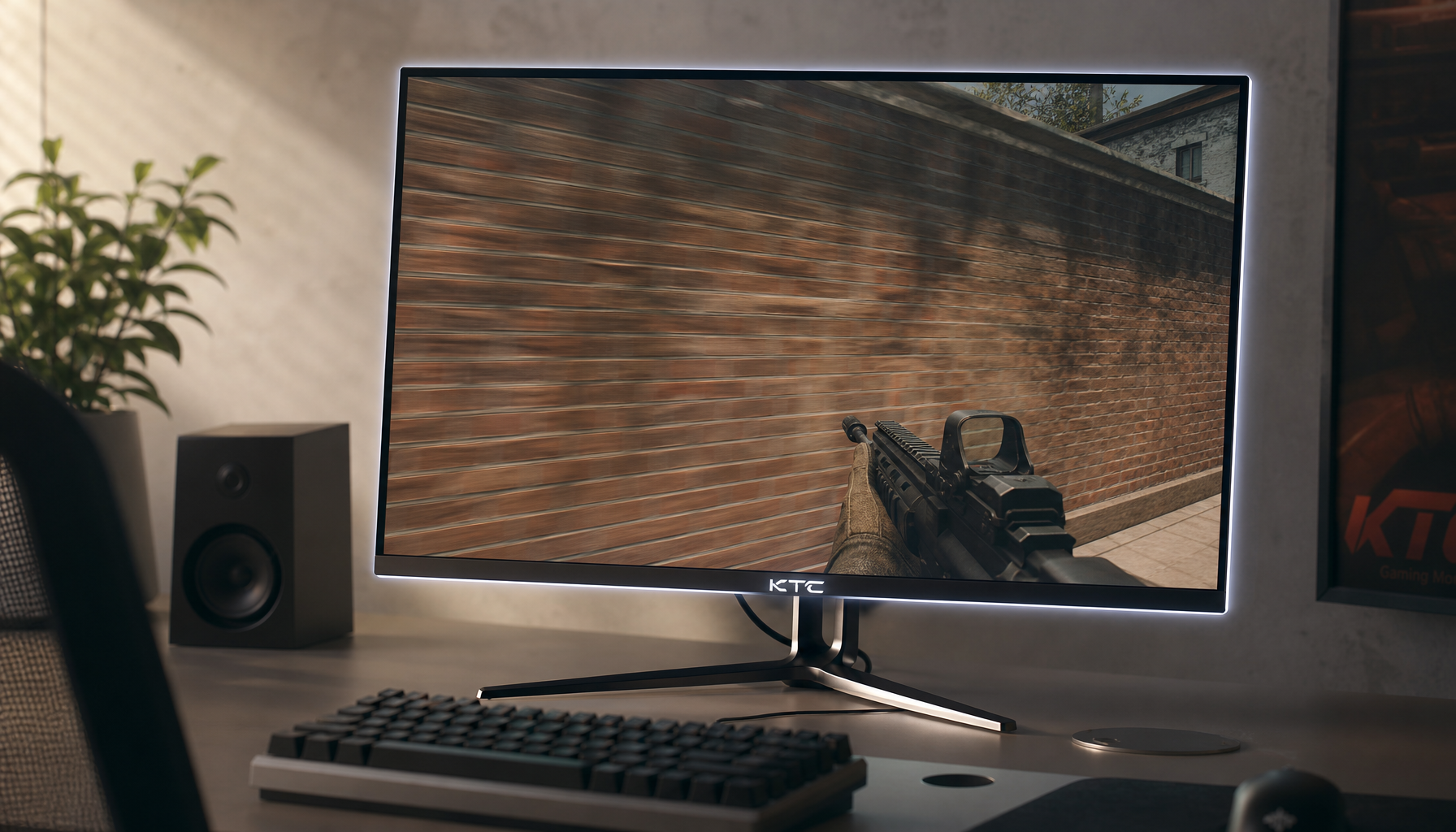
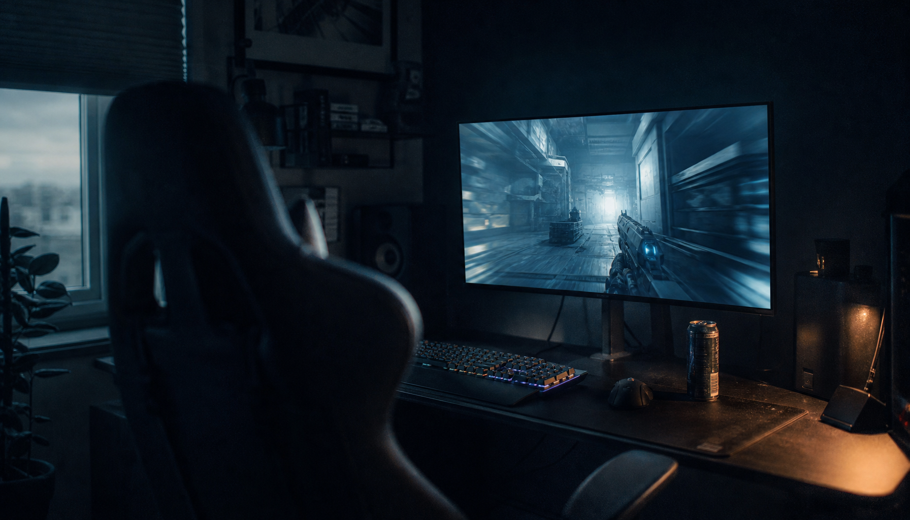
Shadow detail lives just above black. If gamma is too high for your room or content, those near-black values become darker and closer together, so small details disappear. In a tactical shooter, that can hide a player model in a doorway. In a photo, it can erase texture from black hair, a dark suit, or a night skyline. In office work, it can make dark-mode dividers, disabled buttons, and gray chart lines harder to read.

Lower gamma brightens shadows and midtones, which can reveal more in dark scenes. The tradeoff is that the picture can become flat, smoky, and less believable. Shadows can look brighter, but perceived depth may drop and highlights may feel less controlled. That is why competitive players sometimes prefer a slightly brighter effective gamma, while creators and cinematic players usually avoid pushing it too far.
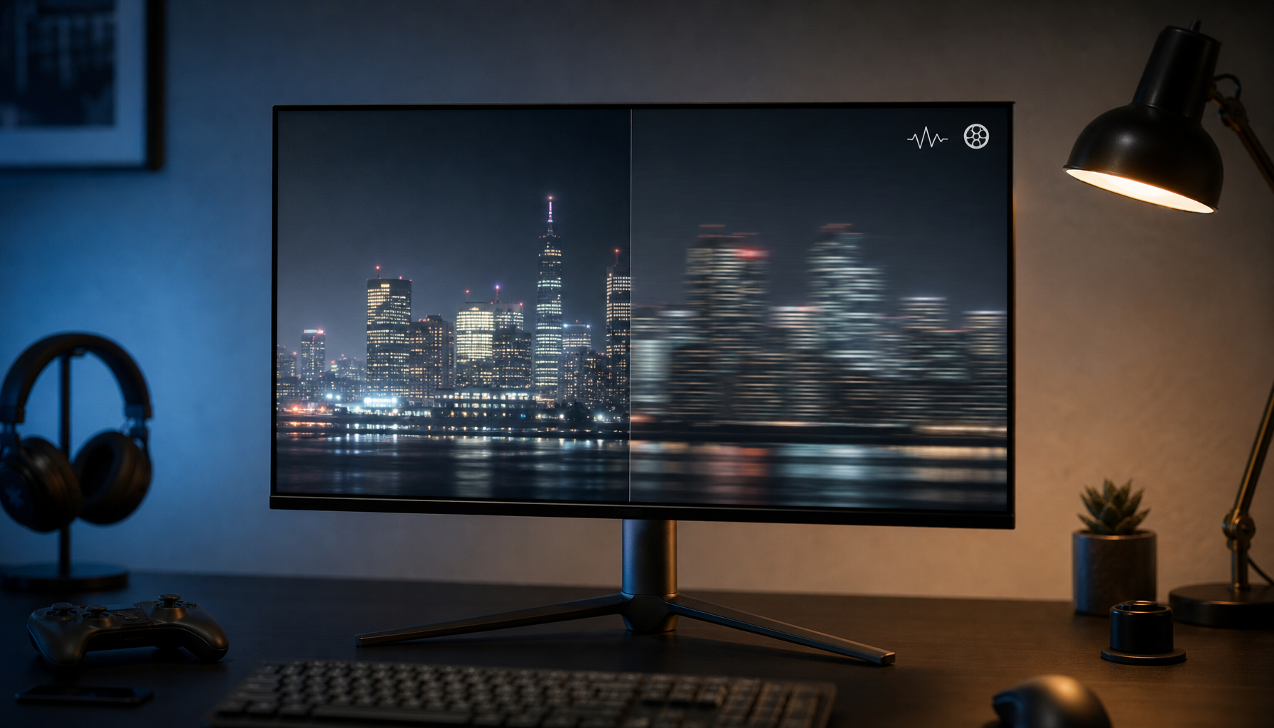
A useful real-world test is a near-black gradient. In a correct setup, pure black should still look black, but the first few dark gray steps should barely appear. If all early steps disappear, your shadows are crushed. If black looks gray and the whole image looks foggy, gamma may be too low, black level may be too high, or a visibility enhancer may be active.
How Gamma Affects Color Separation
Color separation is not only about wide gamut or high bit depth. It also depends on whether nearby tones have enough visible spacing. Gamma changes luminance spacing, and luminance is a major part of how you distinguish similar colors on screen.
For example, two dark blue UI states may have different RGB values, but if your gamma curve pushes both too close to black, they look identical. In a game, dark green foliage, gray armor, and black shadows can merge. In a photo-editing workflow, a slightly warm dark brown and a neutral dark gray can become difficult to judge. This is why gamma mistakes often feel like “bad color,” even when color temperature and gamut are not the root cause.
Higher-quality monitors use internal processing to reduce visible tone jumps. A professional display with a 14-bit or 16-bit LUT can process far more internal tone steps before mapping them to the panel, reducing banding and improving consistency. A 16-bit LUT can process 65,536 steps per channel, but that does not mean the panel outputs true 16-bit color. The practical benefit is smoother gradation and more controlled tone mapping, especially in darker tones where errors are easier to see.
Gamma 2.2 vs. 2.4 vs. 1.8
Gamma 2.2 is the standard baseline for most computer displays because it aligns well with sRGB-style content, desktop workflows, web images, office apps, and many SDR games. The standard gamma value for sRGB is approximately 2.2, which is why monitor reviews and calibration tools often compare measured performance against a 2.2 target.
Gamma 2.4 darkens midtones and gives the image stronger perceived contrast. It can look excellent for movies in a dim room, especially when the display has good black levels. The downside is that it can crush useful shadow detail in a bright room, where ambient light already makes dark tones harder to see.
Gamma 1.8 brightens midtones. It can help with legacy workflows or a display that looks unusually dark, but it often makes blacks look weaker and reduces image depth. For modern SDR desktop use, it is usually a corrective tool rather than a default target.
Gamma setting |
Visual effect |
Best fit |
Main risk |
1.8 |
Brighter midtones and shadows |
Legacy use or unusually dim screens |
Washed-out blacks and weak depth |
2.2 |
Balanced shadow visibility and natural midtones |
Gaming, web, office, SDR desktop, general creative work |
May look slightly bright for dark-room cinema |
2.4 |
Darker midtones and stronger contrast |
Dim-room movies and cinematic viewing |
Crushed shadows in bright rooms |
Gamma Is Not Brightness or Contrast
A common setup mistake is using gamma to fix problems caused by brightness or contrast. Brightness usually affects the dark end of the image or the backlight level, depending on the monitor. Contrast controls the bright end. Gamma shapes the transition between black and white.
That distinction matters when tuning a gaming monitor, productivity display, or portable USB-C screen. If the screen is painfully bright at night, lower brightness first. If clouds, white shirts, or spreadsheet cells merge into flat white, reduce contrast. If the display has visible blacks and whites but midtones feel too dark, too pale, or poorly separated, then gamma is the right control to investigate.
Black level and shadow detail are tied to brightness, while contrast protects highlight detail. Gamma comes after those basics. In hands-on calibration, the most reliable order is to choose a neutral picture mode, set brightness for your room, keep contrast near default unless clipping appears, then test gamma with grayscale and near-black patterns.
Practical Setup for Gaming, Office, and Creative Work
For gaming, start with monitor gamma at 2.2 and leave system-level color controls at default. Then use the game’s own brightness or gamma screen if it provides one. This keeps your desktop, browser, and other games from being distorted by one title’s visibility needs. If a competitive game has very dark maps, a slightly lower in-game gamma can improve visibility, but it may also flatten textures and reduce the intended depth of the scene.

For office productivity, 2.2 is also the best baseline. Dashboards, gray UI panels, charts, antialiased text, and dark-mode layouts rely on midtone consistency. If gamma is too high, subtle interface states become hard to distinguish. If it is too low, the display may look washed out and text contrast may feel weaker even when the panel is bright enough.
For photo, design, and video work, gamma consistency matters more than personal preference. Accurate monitor color usually requires measurement equipment. Without a colorimeter, you can still make the display more reliable by using sRGB or a neutral custom mode, disabling dynamic contrast and vivid presets, setting brightness for your room, and verifying grayscale ramps.
Why Presets Can Mislead You
Many monitors label gamma options as Gamma 1, Gamma 2, and Gamma 3 instead of showing numeric targets. Do not assume the middle option is 2.2. Test each preset with a grayscale ramp and near-black pattern. The right setting is the one that keeps black looking black while preserving the first visible shadow steps and avoiding a foggy midtone lift.
Picture modes can also change gamma behind the scenes. Vivid, FPS, RTS, Cinema, HDR simulation, Eco Mode, black equalizer, and dynamic contrast modes often alter tone response, saturation, brightness, or local contrast at the same time. That can be useful for a specific game or movie, but it is a poor foundation for judging color separation.
Room lighting is another variable. A 2.4 curve that looks rich at night can become too dense in daylight. A brighter effective curve that helps in a sunlit room may look pale after dark. Calibrate under the lighting where you actually use the display most often.
When Hardware Matters More Than Gamma
Gamma cannot create contrast the panel does not have. A low-contrast IPS panel may still show raised blacks in a dark room. A VA panel may show deeper blacks but can have viewing-angle shifts. OLED can deliver excellent black depth, but near-black handling depends on the model and processing. Portable monitors may change behavior across USB-C power modes, presets, or host devices.
Bit depth and LUT quality also affect separation. Most consumer 10-bit displays are often 8-bit plus FRC, which is usually fine for gaming, web, and casual editing. For grading, prepress, product photography, or multi-monitor matching, a display with strong internal LUT processing, uniformity compensation, and measured Delta E performance is a better investment than chasing gamma presets alone.
A Reliable Calibration Workflow
Start from a neutral mode such as Standard, Custom, User, Creator, or sRGB. Disable dynamic contrast, black enhancers, HDR simulation, Eco Mode, automatic brightness, and vivid color modes while tuning. Let the display warm up for about 30 minutes if you are doing careful work, because brightness and color can drift as the panel stabilizes.

Set brightness with a black-level pattern so the darkest near-black steps are barely visible. Set contrast with a white-level pattern so near-white steps remain distinct. Then select gamma 2.2 and check a grayscale ramp. If shadows vanish in your normal room lighting, test the next lower gamma option. If blacks look gray and midtones lack depth, test the next higher option or revisit black level.
For most users, the winning setup is simple: gamma 2.2, brightness matched to the room, contrast below clipping, and dynamic picture tricks turned off. That gives you cleaner shadows, stronger color separation, and a display that behaves consistently across games, documents, videos, and creative apps.


