


Yes. Incorrect contrast, black level, gamma, brightness, or dynamic enhancement settings can hide shadow detail, clip highlights, exaggerate separation, or make smooth tonal transitions look flatter than they are.
Does your edit look rich on your desk, then muddy on a laptop, washed out on a TV, or harsh after export? A practical calibration pass can make faint shadow steps, highlight bars, and neutral grays easier to judge consistently before you commit to color or exposure moves. Here is how to set up your screen so tonal separation decisions come from the image, not from the monitor’s processing.
Why Contrast Settings Change What You Think You See
Tonal separation is the visible difference between adjacent brightness levels: the split between a black jacket and a dark background, the shape in a cloud near white, or the gentle rolloff across skin. Your monitor’s contrast setting influences where bright tones peak and how much distinction remains near white. If it is pushed too high, highlights can clip, so a white shirt, window, or specular reflection becomes a flat patch. If it is too low, the image loses punch and midtone depth, making a good grade feel dull.
Contrast does not work alone. Black level controls how much shadow detail survives near black, gamma changes how quickly tones transition from dark to light, and brightness usually controls the backlight rather than the encoded image. A reliable setup separates these controls instead of treating contrast as a magic quality slider.
A useful real-world example is a talking-head edit with a black blazer against a charcoal chair. If black level is too low, the lapel, chair, and hair collapse into one shape, so you may lift shadows too aggressively. On a normal viewer’s display, that correction can look gray and weak. If black level is too high, you may deepen shadows unnecessarily, causing the final export to lose detail.

Contrast Ratio Is Not the Same as the Contrast Slider
A monitor’s contrast ratio describes the difference between its darkest black and brightest white, while the contrast slider usually adjusts how the signal is mapped near the bright end. Research on visual resolution shows why this matters: contrast ratio explained much of the variation in how well people resolved fine detail, especially when color backgrounds were involved. That study used text-like optotypes rather than photo edits, so the takeaway is not to use one universal number. The stronger lesson is that luminance contrast directly affects whether subtle detail is visible.
For editing, that means a higher-quality panel can help, but a poor setting can still mislead you. A monitor with strong native contrast, such as OLED or Mini-LED for HDR work, may show deeper blacks than a typical IPS display. Yet if you grade SDR footage with dynamic contrast enabled, the screen can keep changing the image under your eyes. That makes a neutral edit nearly impossible because the same shadow may look different from scene to scene.
The Settings That Most Often Distort Tonal Separation
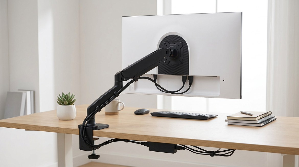
Dynamic contrast is the first feature to disable. In one editor discussion, a user working on a 27-inch 4K display had been advised to turn off Dynamic Contrast after experimenting with brightness and contrast at 50 out of 100. That advice fits a broader color workflow principle: automatic movie, vivid, eco, auto-dimming, black equalizer, and low-blue-light modes can make images look attractive while breaking consistency during grading.

Brightness is the next trap. On most monitors, brightness changes the backlight intensity, not the underlying tone curve. For standard LCD editing, 120 nits is a common brightness target for controlled conditions, while some editors may go a bit brighter in moderate ambient light. If the room is bright and the display is dim, you may crush shadows in the grade because your eyes cannot separate them comfortably. If the monitor is too bright in a dim room, you may underexpose the edit and deliver footage that looks dark elsewhere.
Gamma is just as important. Gamma describes how tones move from black to white; a higher gamma value increases contrast within the tonal range while keeping black and white endpoints conceptually fixed. For typical computer-based SDR work, gamma 2.2 is the standard target; darker viewing environments often use 2.4. If your display is at the wrong gamma, midtones and shadows will not separate the way your timeline scopes suggest they should.
A Practical Calibration Baseline for Editors
Start with the most neutral picture mode available. Modes named Custom, User, Standard, or sRGB are often better starting points than Movie, Vivid, FPS, or HDR simulation modes for SDR editing. If your monitor has an sRGB mode and your work is web, office, gaming capture, online video, or standard social delivery, that mode can prevent oversaturated color. The tradeoff is that some sRGB modes lock brightness or other controls, so use the mode only if it still lets you hit a comfortable luminance target.
Then set brightness for the room, not for drama. Calibration guidance treats luminance as screen brightness and emphasizes keeping it consistent during color correction. A display that drifts because auto-brightness is enabled will cause you to chase the image. For a practical desk setup, keep the room lighting stable, avoid direct glare, and return to the same brightness target before serious tonal work.
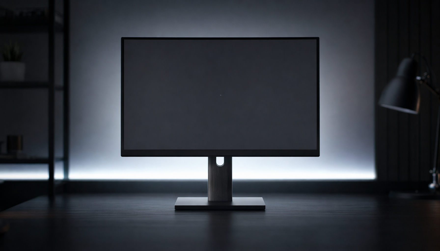
Next, use test patterns. A near-black gradient should show faint separation just above black without turning blacks gray. A white-level pattern should keep the brightest near-white bars visible without making the entire top end merge into solid white. This is the fastest way to catch a bad contrast slider before it costs you an edit.

Finally, calibrate with hardware when accuracy matters. Calibration adjusts display settings so colors and tones better represent the file, rather than your screen’s factory mood. A colorimeter can measure the display, build an ICC profile, and verify errors. The notes cite calibration devices in the rough $80 to $500 range, which is often cheaper than repeated print failures, client revisions, or replacing a monitor you never properly measured.
What to Look for in a Monitor If Tonal Work Matters
For serious editing, prioritize accuracy over marketing brightness. A good creative monitor should cover the color space you actually deliver in, such as sRGB or Rec. 709 for standard web and video, and should offer stable gray balance, predictable gamma, and reliable factory calibration. Video-editing guidance often highlights shadow gradients and subtle color differences as key post-production factors, which is exactly where tonal separation lives.

Delta E is a useful buying clue. Lower Delta E means the displayed color is closer to a reference target, and the research notes recommend avoiding video-editing monitors above Delta E 3 when accuracy matters. For a practical purchasing decision, factory calibration reports, validation status, wide color-gamut coverage, and hardware calibration support all reduce risk.
Panel choice also affects confidence. IPS remains strong for SDR workflows because of consistent viewing angles, which matters when you lean, collaborate, or run a dual-display desk. OLED and Mini-LED can be compelling for HDR because deeper blacks and higher contrast reveal more range, but they still need correct modes, targets, and calibration. A high-contrast panel with the wrong tone mapping is still a bad reference.
Pros and Cons of Adjusting Contrast Manually
Manual contrast tuning has a clear advantage: it is fast, free, and can immediately reveal clipping. If you are editing office training videos, product demos, livestream highlights, or gaming clips, a quick white-level and black-level check can prevent obvious mistakes before export.
The downside is that your eyes adapt. After 10 minutes on a punchy display, an overcontrasted image can start to feel normal. Manual tuning also cannot fully correct gray balance, gamut errors, or nonlinear tone response. That is why physical controls are the first step, not the entire workflow. Calibration software and a colorimeter add measurement, which is what separates a preference from a reference.
Quick FAQ
Should I set monitor contrast to 100 for maximum separation?
No. Maximum contrast can clip bright detail and make subtle highlight separation disappear. Use a white-level test pattern and reduce contrast until faint near-white steps remain visible.
Should I grade with dynamic contrast on because viewers use it?
No. Grade from a neutral, calibrated display. Viewers’ TVs, laptops, and phones will vary, but starting from a moving target makes your export less predictable everywhere.
Is brightness the same as contrast?
No. Brightness usually controls how much light the screen emits, while contrast affects tone mapping near the bright end. Black level and gamma also shape tonal separation, so treating brightness and contrast as one control leads to bad corrections.
Do I need a new monitor to fix tonal separation problems?
Not always. First disable automatic image processing, set the correct range, use native resolution, choose a neutral mode, and calibrate. If the display still cannot hold neutral grays, show smooth gradients, or cover your delivery color space, then the monitor is the bottleneck.
Final Judgment
Your monitor’s contrast setting can absolutely make you misjudge tonal separation, but the bigger risk is the whole chain: contrast, black level, gamma, brightness, dynamic processing, and calibration. Build a stable reference setup, check near-black and near-white detail before every serious session, and let the display serve the edit instead of styling it for you.


