


Your edit usually looks too dark on client monitors because your display, room brightness, gamma target, color space, or playback path does not match the way the client views the final file.
Does your grade look rich and balanced in your studio, then come back from the client with “the shadows are crushed” or “it feels underexposed”? A practical calibration pass can give you a repeatable reference point, so you stop chasing random screens and start grading to a known standard. Here’s how to diagnose the mismatch and build a monitor workflow that travels better.
The Real Problem Is Not One Monitor
Most “too dark” complaints are not caused by a single bad export. They usually come from a chain mismatch: your editing monitor, operating system color profile, editing app viewer, export settings, playback app, browser, platform compression, and the client’s display settings are all interpreting the image slightly differently.
A reliable color workflow starts by matching your monitor to the delivery standard, because color workflow means keeping the image consistent from source footage through software, output, calibration, export, playback, and final display. If one part of that chain is unmanaged, your shadows can shift from cinematic to muddy before the client ever sees your intent.
For example, you may grade in a dim room on a monitor set near gamma 2.4, then send the file to a client watching in a bright office on a laptop using a brighter sRGB-like response. Your edit did not “break,” but your reference environment and their viewing environment are making different assumptions about midtones and shadow detail.
Gamma Is Often the Hidden Brightness Trap

Gamma controls how tones transition from black to white. It does not simply make the whole image brighter or darker; it changes how midtones and darker tones are distributed. That is why an edit can look perfect in the suite but feel heavy on another screen.
For web delivery, a calibrated sRGB-style monitor with gamma 2.2 is often the safer practical target, while broadcast-style Rec. 709 grading commonly uses gamma 2.4 in a dim, controlled room; gamma affects perceived brightness because 2.2 appears brighter than 2.4 in typical computer viewing conditions. The decision is not about which number is “better.” It is about matching the environment and destination.
If you are delivering a social ad, video-platform upload, website video, or internal client review file, gamma 2.2 may be closer to how the piece will actually be consumed. If you are preparing broadcast or a controlled screening master, gamma 2.4 is more defensible. A common mistake is grading web-first content in a dark room on a dim, contrasty setup, then being surprised when the client views it under office lighting and reads the image differently.
Target Use |
Practical Display Target |
Why It Matters |
Web, social, corporate review |
sRGB or Rec. 709-like, gamma 2.2 |
Better fit for brighter computer environments |
Broadcast or controlled room |
Rec. 709, gamma 2.4 or BT.1886 |
Better fit for dim viewing and video reference workflows |
Mixed client approval |
Calibrated reference plus consumer check |
Balances technical accuracy with real-world perception |
Your Monitor May Be Too Bright While You Grade

This sounds backward, but it is one of the most common reasons final edits look too dark elsewhere. If your editing monitor is too bright, you naturally pull exposure and shadows down until the image feels balanced on your screen. On normal client monitors, the same file can then look underexposed.
For standard LCD color correction, many calibration workflows land around 100 to 150 nits depending on room brightness, and recommended luminance is typically chosen to match the editing environment rather than maximize brightness. Several professional video-editing recommendations also point near 120 nits for consistent judgment in standard dynamic range work.
Here is the simple field test: warm up your monitor, set a controlled room light level, and grade a familiar talking-head shot. If skin looks healthy only when your monitor is blazing, your luminance is probably pushing you toward darker corrections. A display set for showroom punch is not a grading reference.
Rec. 709, sRGB, and D65 Need to Be Deliberate Choices
Rec. 709 is the traditional HD video color space, while sRGB is the common computer and web standard. They are close enough to confuse editors, but not identical in viewing behavior, especially around gamma and darker tones. D65, or about 6500K, is the usual white point target for video display work.
For HD video editing, Rec. 709 with D65 is a common calibration target, and editing workflows emphasize that calibration only helps if the profile or LUT is correctly connected to the editing software. Measuring the monitor is only half the job; the software must actually use the correction in the right viewing path.
A practical example: if you calibrate the desktop profile but judge color inside an unmanaged viewer, your operating system may be correcting one app while your editing viewer bypasses that correction. The result can be a monitor that is “calibrated” on paper but still misleading inside the exact program where you make exposure decisions.
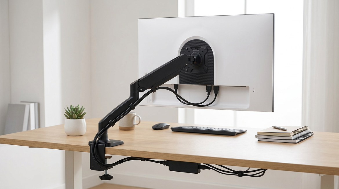
The Editing App Viewer May Not Be Your Truth Monitor
Editing tools can display images differently depending on GPU, color management, ICC behavior, LUT placement, and whether you are using a clean video output. This is where many editors get trapped: the GUI viewer looks pleasing, but the calibrated external path tells a different story.
In a professional color-grading forum discussion, experienced users note that a GUI viewer is not always the same as a calibrated external monitoring path, and a wide-gamut GUI display can appear more saturated than a proper Rec. 709 reference; the practical conclusion is to trust the external hero display when the monitoring LUT and signal chain are correctly configured. That matters for darkness too, because saturation, gamma, and black handling interact visually.
For serious client-facing grading, a clean I/O path through dedicated video output hardware or a LUT box can reduce uncertainty. The downside is cost and setup complexity. The upside is that your reference is less dependent on operating system color quirks and app viewer behavior.
Calibration by Eye Is Useful, but It Is Not Enough

Visual calibration can catch obvious issues: crushed blacks, blown highlights, wildly cool whites, or a monitor set to a gaming preset. It is a good first pass, especially when you need to fix a workstation quickly. But your eyes adapt fast, and neutral gray is harder to judge than most people think.
For serious color work, hardware monitor calibrator tools are recommended because manual adjustment is limited by human perception. A colorimeter measures known color patches, builds a monitor-specific profile or LUT, and gives you a repeatable baseline instead of a personal impression.
The practical routine is straightforward. Let the display warm up for about 30 minutes, reset distracting picture modes, disable dynamic contrast and enhancement features, calibrate to the target color space and luminance, then verify with grayscale and shadow-detail test images. Recheck every few months because even good factory-calibrated monitors drift over time; that drift is a normal display reality, not a sign that the monitor was bad.
Client Monitors Are Not Reference Displays

Your client may be watching on a laptop with auto-brightness, a TV in vivid mode, a cell phone with a warm-tone display filter enabled, or an office monitor under harsh lighting. You cannot control every display, and trying to grade for every possible screen is a losing game.
The professional answer is to grade to a standard, then check common consumer scenarios. After your reference pass, watch the export on a regular laptop, a cell phone, and a living-room TV if the project warrants it. You are not replacing the calibrated monitor; you are checking whether the grade survives normal misuse.
This is especially important for dark commercials, interviews with low-key lighting, gaming trailers, and product videos with black hardware. If shadow detail carries product texture or face shape, leave enough separation above black that a non-reference screen does not erase the information.
A Practical Fix Workflow
Start by deciding the delivery target before touching the grade. Web-first work should usually be judged closer to sRGB or Rec. 709 with gamma 2.2 behavior, while broadcast-style work belongs in a dimmer Rec. 709 environment with gamma 2.4 or BT.1886. Then set monitor brightness to a repeatable value, often around 120 nits for standard LCD SDR work, adjusted sensibly for your room.
Next, calibrate with a colorimeter and confirm that your editing software is using the correct profile, LUT, or color-management path. Verify where the 3D LUT is assigned, and separate GUI viewer expectations from the clean monitoring output. Be intentional about display color management instead of toggling settings until the image “looks right.”
Finally, export a short test file with skin tones, deep shadows, bright highlights, and saturated colors. View it on your reference monitor, then on two ordinary client-like screens. If the reference is correct but every consumer screen feels slightly dark, lift the lower midtones with restraint rather than raising black levels blindly. If only one client screen looks wrong, the problem is probably their display mode, brightness, browser, or room lighting.
FAQ
Should I make my edit brighter so clients stop complaining?
Only after confirming your reference setup. If your monitor is too bright or your gamma target is wrong, brightening the edit may hide the workflow problem. Once the reference is calibrated, a small lower-mid adjustment for web delivery can be sensible, especially for content viewed in bright offices.
Is a gaming monitor good enough for video editing?
It can be, but only if it supports accurate color modes, stable brightness, and good coverage of your target color space. Fast response time and high refresh rate help motion work and gaming, but they do not replace Rec. 709 or sRGB accuracy, D65 white point control, and calibration support.
Why does the export look different from the timeline?
The timeline viewer, operating system, export codec, playback app, browser, and display may not be using the same color assumptions. That is why a calibrated monitor plus a known export-and-review process matters more than trusting one attractive viewer image.
Final Frame
A dark client review is not a reason to abandon your grade; it is a signal to tighten the display chain. Calibrate the monitor, pick the right gamma for the destination, control room brightness, verify the software path, and use consumer screens as sanity checks. When your reference is disciplined, your creative decisions become portable instead of fragile.


