


Choose higher resolution when you need more visible workspace, sharper text, or finer spatial detail; choose higher bit depth when smooth gradients, color correction, HDR work, and tonal precision matter more than extra pixels.
Do gradients in your exports show ugly bands, or does your spreadsheet feel cramped by 2:00 PM? A practical display upgrade can remove a testable bottleneck: either more usable detail on screen or smoother tonal transitions in the files you create. Here is how to decide which spec will improve your daily workflow before you spend money on the wrong monitor.

Resolution vs. Bit Depth: The Clean Difference
Resolution describes the number of pixels used to capture or display visual detail. In monitor terms, it determines how much information can be drawn across the panel: 1920 x 1080, 2560 x 1440, 3840 x 2160, and beyond. More pixels can mean sharper text, denser interface detail, more timeline space, and cleaner previews, provided the screen size and viewing distance make those pixels useful.
Bit depth describes how much tonal information each pixel can carry. An 8-bit-per-channel image can represent 256 values per color channel, while photo files can store 12-bit or 14-bit data for finer tonal gradation. In plain language, resolution answers “How much detail can I see?” while bit depth answers “How smoothly and accurately can tones change?”
The mistake is treating both specs as generic “better image quality.” They improve different weak points. A 4K office monitor will not fix banding in a sky gradient caused by an 8-bit workflow, and a higher-bit-depth color pipeline will not make a 24-inch 1080p screen feel spacious when you are comparing three documents side by side.
When Higher Resolution Pays Off First
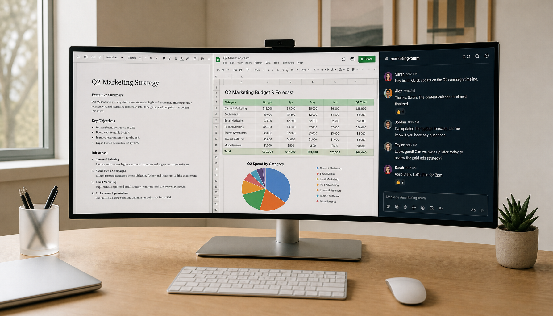
Higher resolutions require stronger GPU performance, but they also increase sharpness and workspace value when your tasks are spatially dense. If you edit large spreadsheets, write code beside a browser, compare documents, run dashboards, work with CAD-style detail, or play immersive single-player games, resolution often creates the most obvious daily improvement.

Moving from 1080p to 1440p gives you far more room for toolbars, timelines, panels, and text columns without jumping straight into the cost and performance demands of 4K. On a 27-inch screen, 1440p is widely treated as a balanced point because it improves text clarity and usable workspace while remaining easier to drive than 4K in games and GPU-heavy apps.
A 27-inch monitor provides about 26% more screen area than a 24-inch model, which matters when the workflow is about seeing more at once. That extra area does not reveal more of a game at the same aspect ratio, but it does make work surfaces, creative tools, and multitasking layouts feel less compressed. For office productivity, a 27-inch 1440p or 4K display is often more valuable than premium color specs you never use.
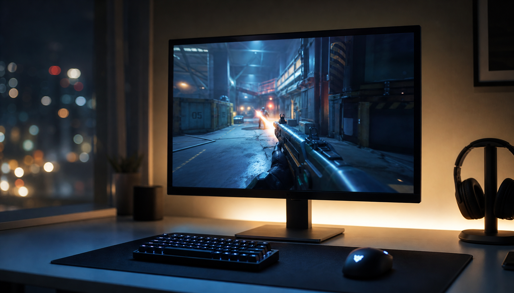
For gaming, the decision depends on genre and hardware. Competitive players often prioritize refresh rate and response time, while immersive players benefit more from 1440p or 4K visuals, strong color, and HDR. If your GPU averages around 90 FPS in your main games, a 4K upgrade may force lower settings; if you play story-driven titles and value scene detail, higher resolution can be worth that trade.
When Higher Bit Depth Pays Off First
Bit depth helps reduce banding because it preserves smoother transitions between tones and colors. That matters most when your workflow bends images hard: photo grading, video color correction, HDR finishing, product render review, game environment art, medical-style visualization, print preparation, and any work where smooth skies, skin tones, shadows, or brand colors must survive adjustment.
The clearest symptom is visible banding after edits. If a sunset background, studio backdrop, product shadow, or UI gradient breaks into steps, more resolution is not the cure. You need a workflow that preserves more tonal values from capture through editing and export. That may mean higher-quality source files instead of compressed formats for photos, higher-bit-depth project settings in creative software, a monitor that can display wide color more reliably, and calibration practices that keep the display honest.

Higher bit depth also increases file size because more information is stored for each pixel. That is the practical cost. If you work mostly in email, docs, browser tabs, spreadsheets, code, and web dashboards, 10-bit output is unlikely to transform your day. If you push exposure, recover shadows, grade log video, or prepare assets where gradients must remain clean, the extra data can protect quality during the edit.
The Decision Matrix
Workflow symptom |
Upgrade priority |
Why it matters |
Text looks soft, UI feels crowded, timelines need more room |
Higher resolution |
More pixels improve clarity and workspace density |
Gradients show banding after editing |
Higher bit depth |
More tonal steps help preserve smooth transitions |
You crop photos heavily or inspect fine product detail |
Higher resolution |
Cropping removes pixels and reduces effective detail |
You color grade footage or edit high-quality photo files |
Higher bit depth |
Tonal precision survives stronger adjustments |
You play esports titles close to the screen |
Resolution only after speed needs are met |
Refresh rate and response time may matter more |
You run spreadsheets, code, and video calls together |
Higher resolution or larger format |
More visible workspace reduces window switching |
Match the Spec to the Full Display Chain
A monitor decision is only as strong as the weakest link in the chain. Lens quality can limit image quality even when a camera has high resolution and high-quality capture, and the same principle applies to displays. A high-resolution panel cannot restore detail that was never captured. A 10-bit-capable display cannot create a clean gradient from a badly compressed 8-bit source.
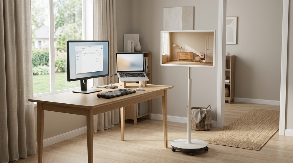
For office and hybrid work, the chain includes the device, cable, apps, layout, and meeting workflow. Workplace display buyers should start with the primary use case because meeting-room screens, collaboration boards, signage, and desk monitors solve different problems. A portable smart screen for travel presentations needs different priorities than a 32-inch 4K desk display for financial modeling.
Desk ergonomics also decide whether resolution becomes usable. A productive office should balance comfort, monitor positioning, lighting, and reduced clutter. A 4K panel placed too far away may force scaling that erases the workspace benefit. A large ultrawide on a shallow desk may create neck movement and glare. The right display is not the most advanced spec sheet; it is the one that fits your working distance, desk depth, apps, and visual tolerance.

Practical Buying Guidance by Use Case
For office productivity, prioritize resolution, screen size, ergonomics, brightness, and connection simplicity. A 27-inch 1440p monitor is the dependable value point for many desks, while 4K becomes more compelling for text clarity, dense spreadsheets, design review, and long reading sessions. Bit depth is secondary unless your work includes color-sensitive assets.
For creators, separate editing from viewing. If you crop, retouch fine details, or inspect layouts, higher resolution matters. If you grade, composite, retouch skin, edit skies, or export HDR-style visuals, higher bit depth becomes decision-critical. The best result often combines a 4K display with a serious color pipeline, but if the budget forces one priority, choose based on the defect you actually see: softness means resolution; banding means bit depth.
For gaming, define the win condition before buying. Fast competitive play benefits from refresh rate, response time, and clear motion before maximum resolution. Immersive games, racing, simulation, and open-world titles gain more from 1440p or 4K, HDR capability, contrast, and screen size. Higher bit depth is most relevant when HDR and color presentation are part of the experience, not when your main goal is maximum frames.
For portable smart screens, be disciplined. A compact 1080p portable display can be excellent for email, chat, dashboards, and travel presentations. Higher resolution helps if you review dense documents or creative work on the go, but tiny screen size limits the payoff. Higher bit depth only matters if the portable display is part of a real color-review workflow rather than a second-screen convenience.
A Simple Test Before You Buy
Open your hardest daily project and identify the pain. If you are constantly zooming, scrolling, hiding panels, or losing context between windows, resolution and screen area are your bottleneck. If the image looks spatially clear but tonal transitions fall apart during editing, bit depth and color handling deserve the budget.
Then check the output path. A 10-bit display is wasted if your software, GPU output, cable, and content all stay locked to 8-bit. A 4K monitor is wasted if your GPU cannot drive your games or your apps scale poorly. Performance-driven buying means matching the display to the whole workflow, not rewarding the loudest number on the box.
FAQ
Is 4K always better than 1440p?
No. 4K gives more pixels and sharper text, but it costs more GPU performance and may require scaling. For many 27-inch productivity and gaming setups, 1440p is the stronger value point.
Does higher bit depth make everything look more colorful?
Not automatically. Bit depth improves tonal precision, especially in gradients and edited footage. Color volume, gamut, contrast, calibration, panel quality, and source content still matter.
Should office users care about 10-bit color?
Usually not as a first priority. Office users get more daily value from resolution, screen size, ergonomics, brightness, glare control, USB-C convenience, and reliable text clarity.
The smart upgrade is the one that removes the bottleneck you can name. Buy resolution for space and detail; buy bit depth for smoother tone and cleaner creative control. When the screen supports the work instead of showing off specs, every hour at the desk feels faster, clearer, and more under your command.


