


Choose true 10-bit color when your work depends on clean gradients in HDR, RAW photo editing, video grading, skin tones, print prep, or client color approval. For office productivity, SDR gaming, coding, spreadsheets, web work, and most portable second-screen setups, 8-bit plus good dithering is usually the smarter value.
Skies, shadows, fog, and product photos can break into visible bands instead of flowing smoothly. A proper 10-bit signal can move from 256 tonal steps per color channel to 1,024, which means smoother transitions when the whole chain supports it. Here’s how to decide whether you need native 10-bit hardware or whether a reliable 8-bit plus dithering monitor will serve your workflow better.

What 8-Bit, 10-Bit, and 8-Bit Plus Dithering Really Mean
Color depth describes how many tonal values a display can represent for each red, green, and blue channel, and 8-bit color commonly means 256 levels per channel, or about 16.7 million RGB combinations. That is already enough for a lot of daily work because most office apps, web pages, SDR videos, and standard image previews are built around 8-bit delivery.
True 10-bit color expands each RGB channel to 1,024 levels, producing about 1.07 billion possible combinations. The practical win is not that every image suddenly looks more colorful. The win is smoother shade spacing in difficult transitions: a gray studio backdrop, a sunset gradient, a blue sky behind tree branches, a dark game scene, a soft skin highlight, or HDR light rolling across metal.
8-bit plus dithering, often described as 8-bit plus FRC, simulates missing intermediate shades by rapidly alternating between nearby values. In a good implementation, it can look surprisingly close to native 10-bit from a normal viewing distance, especially on a fast display. In a weak implementation, it may add shimmer, noise, or unstable-looking gradients. That is why the panel spec alone does not settle the question.
The Fast Decision Test: What Do You Actually Produce?
If your output is mostly documents, dashboards, email, code, video calls, browser tabs, and spreadsheets, native 10-bit color should sit below resolution, ergonomics, brightness, USB-C docking, and screen size on your priority list. Office monitor buying guidance consistently emphasizes matching the display to the work, and home office monitors are mainly productivity tools where comfort and layout matter more than premium color depth.
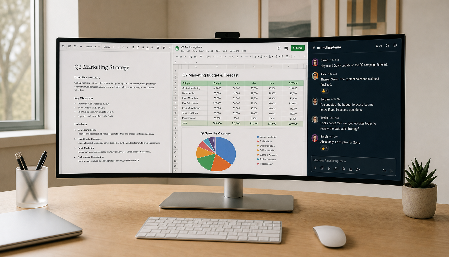
A practical example is a dual-window office workflow on a laptop and portable monitor. If you spend eight hours comparing PDFs, editing slides, and joining calls, a sharper 4K panel, stable stand, low-glare surface, and USB-C power delivery will change your day more than native 10-bit. You may never feed that screen true 10-bit content.

If your workflow includes RAW photo editing, color grading, HDR video, product retouching, digital art, print preparation, or client-facing visual approval, 10-bit becomes much more important. Higher bit depths such as 10, 12, or 16 bits per channel are recommended for HDR and image editing workflows because they reduce quantization and preserve quality during intermediate processing.
The key phrase is “workflow,” not “monitor.” A true 10-bit panel cannot recover missing color data from an 8-bit file, a compressed stream, or a misconfigured graphics output. The file, software, operating system, graphics setting, cable bandwidth, monitor firmware, and panel processing all have to cooperate.
Gaming: Prioritize the Scene, Not the Spec Sheet
For competitive gaming, 8-bit full-range RGB at a higher refresh rate is often the better call. Clear motion, low latency, and stable frame pacing usually matter more than a theoretical increase in gradient precision. If enabling 10-bit forces you to drop from 240 Hz to 144 Hz, lower resolution, or compromised chroma, the trade may hurt the experience you actually play for.
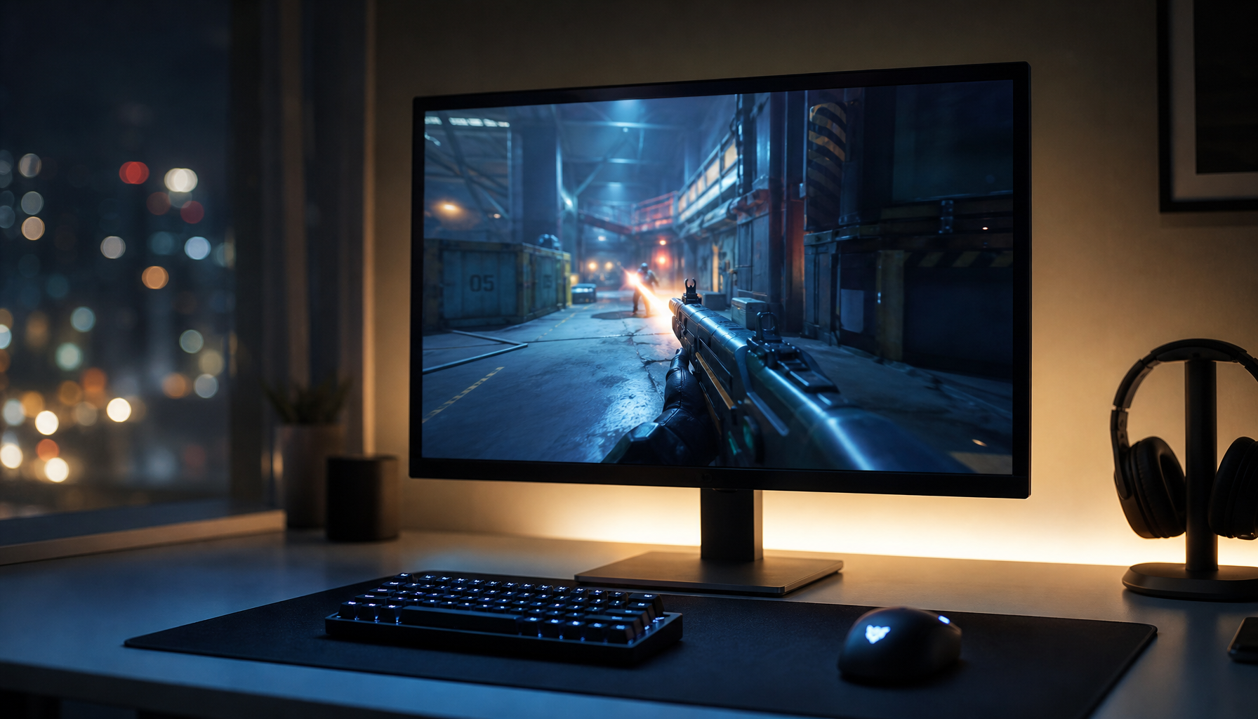
For cinematic gaming, HDR, OLED, QD-OLED, and mini-LED setups change the equation. A 10-bit gaming display matters most in skies, fog, smoke, shadows, near-black scenes, sunsets, and HDR highlights, where 8-bit output is more likely to show banding. In story-driven titles, those transitions are part of the immersion, not a cosmetic extra.
There is also a real-world catch: more bits can look worse if the display handles the signal poorly. Enthusiast discussions around 12-bit at 120 Hz versus 10-bit at 144 Hz often point out that firmware, dynamic range settings, and display processing can cause issues such as black crush or worse-looking gradients. The practical move is to test the monitor in the mode you will actually use, not the highest number in the menu.
Creative Work: True 10-Bit Pays Off When You Push Color
In photo and video work, the need for true 10-bit rises when edits are heavy. A light crop, exposure tweak, and social export may look fine on 8-bit plus FRC. A graded Log video, green-screen composite, beauty retouch, product background cleanup, or large print proof is more demanding because you are stretching tones and asking the display to show subtle differences without stepping.

Color depth is also not the same thing as gamut. Color gamut describes the range of colors a display can reproduce, while bit depth describes how finely it can divide tones inside that range. A wide-gamut 8-bit monitor can show saturated colors but still band in smooth gradients. A 10-bit monitor with mediocre calibration can show many tonal steps inaccurately.
For a designer, that means the buying question should be broader than “true 10-bit or not?” You want color space coverage, color accuracy, calibration controls, uniformity, contrast, and resolution. A 27-inch or 32-inch 4K monitor can reveal detail and typography issues that a lower-resolution 10-bit screen might miss. For image-heavy work, the extra pixels of 4K matter because 4K has more than twice as many pixels as 1440p, improving text sharpness and fine image detail.
Office and Portable Screens: Spend for Usability First
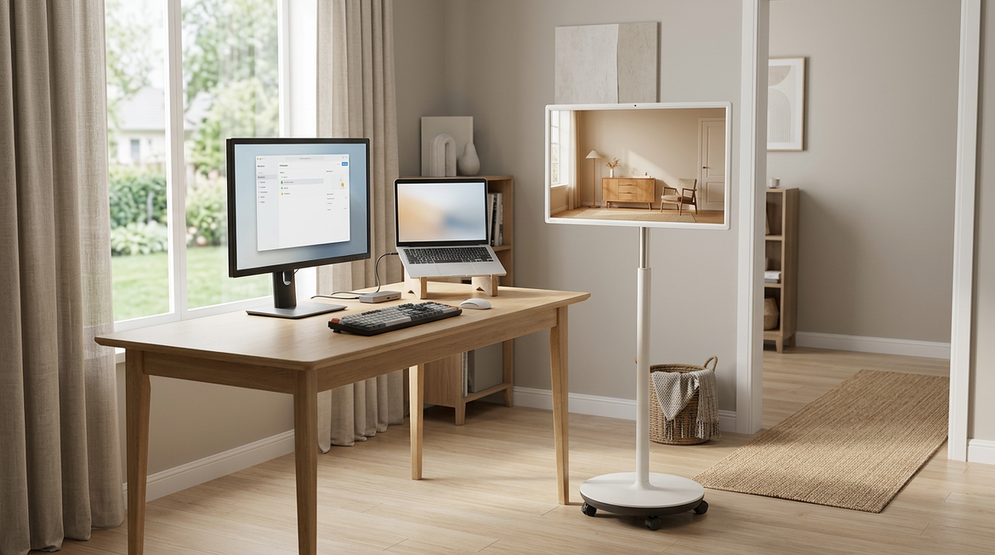
Portable smart screens and office displays live or die by usability. A portable monitor that is bright enough, light enough, color-stable enough, and easy to connect through USB-C can be more valuable than a native 10-bit panel that drains power, costs more, or forces awkward setup.
For productivity, the strongest upgrade is often workspace. A 34-inch ultrawide, a 32-inch 4K display, or a portable second screen gives you more room for timelines, documents, chat, browser research, and dashboards. Business monitor roundups often emphasize features such as webcams, USB-C power delivery, KVM switching, Ethernet, and daisy chaining because modern work is about fewer cables and faster context switching, not only panel color depth.
This does not mean color quality is irrelevant. It means the return on investment is different. If you are choosing a travel display for spreadsheets, email, planning apps, and hotel-room presentations, 8-bit plus FRC with solid sRGB coverage is a rational buy. If the same portable screen is for on-location photo review, client previews, or video editing, then stronger color depth, calibration, and gamut support become worth the weight and cost.
How to Check Whether You’re Getting a Real 10-Bit Workflow
Start with the monitor’s independent reviews, not only the manufacturer page. Forum users and review communities repeatedly warn that many 10-bit gaming monitors are actually 8-bit plus FRC, and spec sheets may not explain that clearly. Independent testing is more useful because it can show gradient performance, HDR behavior, color accuracy, and whether the display handles signals cleanly.
Then inspect your computer settings. Check advanced display settings and your graphics control panel for output color depth, color format, and dynamic range. A 10-bit monitor can still receive an 8-bit signal if HDR is off, bandwidth is limited, the refresh rate is too high for the cable mode, or the app path does not preserve high-bit data.

Finally, test with the right content. Random browser gradient images are weak proof because browsers, compression, color management, and the desktop compositor may interfere. A better practical test is a known high-quality gradient or HDR clip opened in a color-managed app, viewed in the exact resolution, refresh rate, and HDR or SDR mode you plan to use.
Workflow |
Better Choice |
Why It Fits |
Email, spreadsheets, coding, web apps, video calls |
8-bit plus FRC |
Productivity depends more on clarity, size, ergonomics, and connectivity |
Competitive esports |
8-bit full-range RGB or 8-bit plus FRC |
Refresh rate, latency, and motion clarity usually matter more |
HDR cinematic gaming and HDR movies |
10-bit if the full chain supports it |
Smooth skies, shadows, highlights, and fog benefit from finer tonal steps |
RAW photo, video grading, print prep, product color |
True 10-bit preferred |
Heavy edits expose banding and subtle tone errors |
Portable second screen for travel work |
8-bit plus FRC |
Lower cost, lower complexity, and practical usability usually win |
Client color approval or professional post-production |
True 10-bit with calibration |
The display must reveal subtle transitions reliably |
Pros and Cons of True 10-Bit
True 10-bit gives you the cleanest foundation for HDR, grading, retouching, smooth gradients, and professional visual review. It is the performance-driven choice when your display is part of the production chain rather than just a viewing surface.
The tradeoff is cost and complexity. A true 10-bit panel may be more expensive, and the benefit can disappear if your file is 8-bit, your software path is limited, or your graphics output is misconfigured. Some displays also require compromises in refresh rate or bandwidth to enable higher bit depth.
Pros and Cons of 8-Bit Plus Dithering
8-bit plus dithering is the value-oriented choice. It can deliver near-10-bit-looking gradients for normal use, gaming, and general creative work while keeping prices and performance tradeoffs under control.
The downside is that it is implementation-dependent. Good FRC can be nearly invisible; poor FRC can create shimmer or unstable tones. It also does not replace a true 10-bit pipeline for demanding color grading, HDR mastering, or print-critical decisions.
The Reliable Buying Rule
Buy true 10-bit when your work creates or judges high-bit-depth visual content. Buy 8-bit plus dithering when your screen mainly helps you work faster, play smoother, or extend your desk. The most immersive display is not the one with the biggest number on the box; it is the one whose color depth, refresh rate, resolution, brightness, and connectivity match the job in front of you.


