


Your display shows a human-facing interpretation of the image; scopes show measured signal data. When they disagree, the usual cause is calibration, panel behavior, color space mismatch, compression, or viewing conditions rather than one side being wrong.
Does your footage look clean on the waveform but crushed on your monitor, or rich on screen but suspiciously overcooked in the vectorscope? A calibrated, controlled display setup can make grading decisions more repeatable across edits, exports, and client reviews. You’ll learn how to read the gap between what your screen shows and what your scopes prove, then tighten both into a reliable workflow.
The Core Difference: Perception Versus Measurement
A monitor is a presentation device. It converts a video signal into light through a panel, backlight or self-emissive pixels, internal processing, color modes, brightness settings, and the room around it. Scopes are measurement tools. A waveform, vectorscope, histogram, or RGB parade does not care whether your office has sunlight on the wall or whether your display is in Vivid mode.
That distinction matters because video quality control combines objective checks, such as sharpness, color accuracy, and compression artifacts, with subjective viewer experience. Scopes are excellent for objective signal discipline. Displays are where the audience experience becomes visible. Professional confidence comes from using both, not forcing one to replace the other.
A simple example: if a waveform shows shadows sitting safely above black, but your display makes them look plugged up, your file may be fine while your monitor black level, gamma, room lighting, or panel contrast is misleading you. If the waveform shows clipped highlights, though, a beautiful-looking screen cannot restore detail that is no longer in the signal.
Why a Display Can Mislead You
Calibration Changes the Image Before You Judge It
Monitor calibration aligns brightness, white point, contrast, and gamma so the screen behaves predictably. Without it, two displays can show the same file with different skin tones, shadow depth, and highlight rolloff. That is why monitor calibration targets parameters such as white point, luminance, contrast, and gamma, then uses an ICC profile to describe how that specific monitor reproduces color.
For typical online video work, a practical baseline is a D65 white point, gamma 2.2, and consistent brightness in a controlled room. Some calibration workflows also point to D65 and 120 nits for online delivery outside a dedicated grading suite, while stressing deliberate room lighting instead of automatic ambient-light adjustment throughout the day. The exact target depends on the delivery environment, but the discipline is the same: lock the screen down before trusting your eyes.
Here is the real-world calculation. If you grade a talking-head video at night on a monitor set too bright, you may pull the midtones down until the face feels natural. The next morning, that same export may look dull on an office display because your correction compensated for your screen, not the footage.

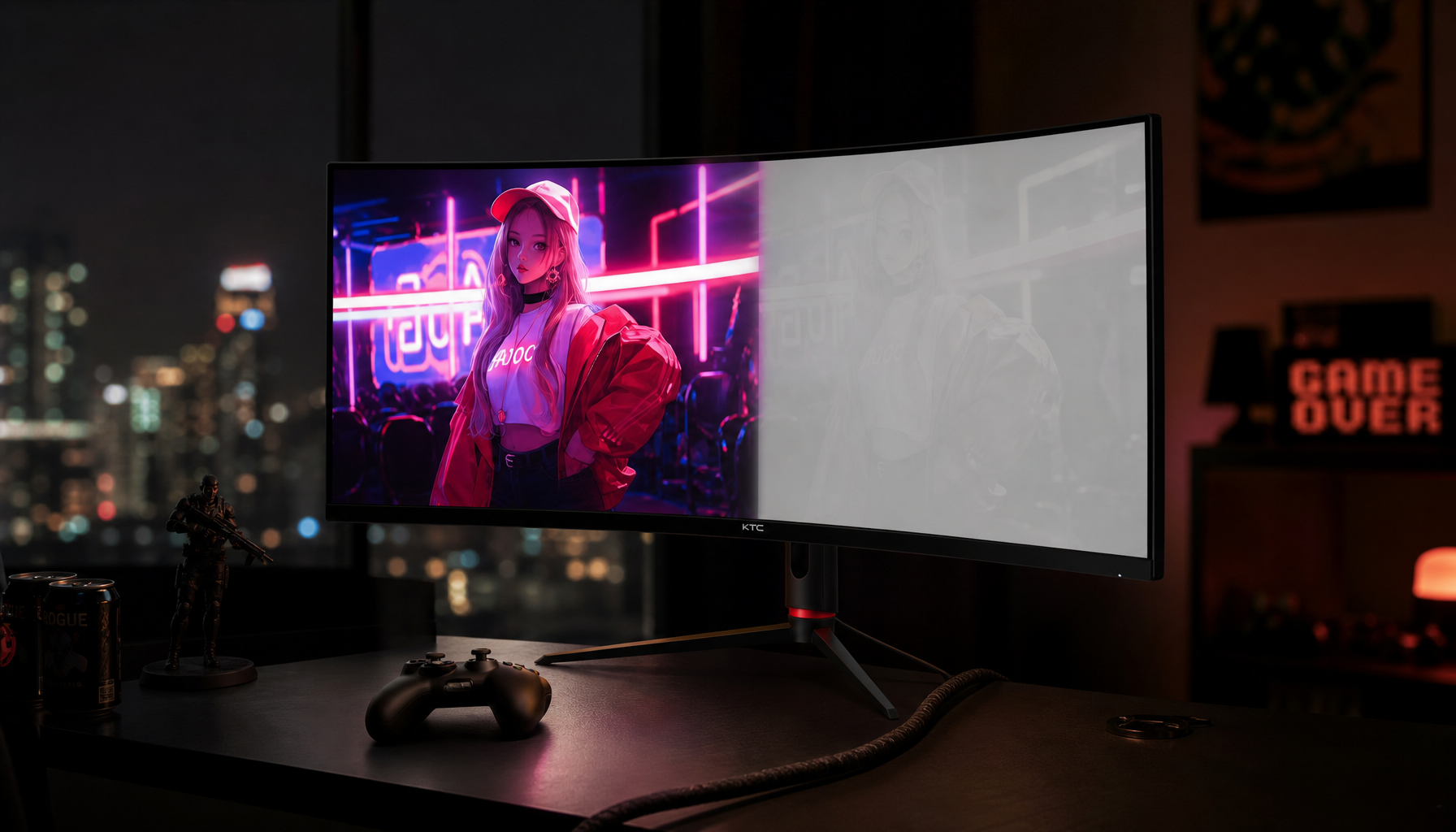
Panel Type Affects What You Think You See
Panel technology changes perceived contrast, motion clarity, and color consistency. IPS panels are widely favored for creative work because they offer strong color consistency and wide viewing angles, while VA panels often deliver deeper blacks and stronger contrast. OLED can produce true blacks and fast pixel response, but long static interfaces may require care because of image retention risk.
The key is that monitor panel type affects color accuracy, contrast, viewing angles, response time, and price. That means a VA display can make a moody grade feel richer than it really is, while an IPS display can make the same shadows look flatter. A scope will not show IPS glow or VA black depth. It shows the encoded values.
For a creator who edits, games, and works from the same desk, this is where a performance display has to be chosen honestly. A high-refresh monitor can feel incredibly responsive, but the most useful grading monitor is the one whose color mode, gamma, brightness, and uniformity you can control and repeat.
Why Scopes Can Look Right While the Export Feels Wrong
Resolution Is Only One Part of Perceived Quality
Many creators blame resolution first, but pixel count is only one piece of the experience. Video resolution defines the pixel dimensions of each frame, so 1920 x 1080 contains 2,073,600 pixels and has 2.25 times the pixel count of 1280 x 720. Yet higher resolution does not automatically mean better perceived quality because bitrate, frame rate, codec, viewing distance, device size, and packet loss all affect the final result.
This explains a common review-session surprise. A 4K master may look excellent in your editor, then look softer after upload because compression reduced detail or introduced blocking. Your scopes may still show legal levels and balanced color, but the audience sees compression stress. For live streams, a stable 720p feed at an appropriate bitrate can look more trustworthy than an unstable 1080p feed that drops packets and smears motion.

Factor |
What the Scope Helps Confirm |
What the Display Reveals |
Luminance |
Clipping, crushed blacks, exposure balance |
Whether shadows feel readable in the room |
Chroma |
Saturation balance and hue direction |
Whether skin, brand colors, and scenes feel natural |
Resolution |
Signal size and scaling assumptions |
Perceived sharpness at screen size and viewing distance |
Compression |
Some artifacts may be visible in analysis |
Blocking, banding, mosquito noise, and motion breakup |
Panel behavior |
Not measured by video scopes |
Glow, black depth, response blur, uniformity, reflections |
Scaling and Aspect Ratio Can Distort Confidence
A display may scale footage to fit its panel. That scaling can sharpen, soften, stretch, crop, or pillarbox the image depending on settings. If you are checking standard-definition, archival, or mixed-format footage, this becomes more than a cosmetic issue. The high-definition video transition changed practical expectations around aspect ratio, resolution, scanning, and frame rate, and the source specifically warns against stretching SD video to fill HD displays.
The scope still reads the video signal. Your monitor may be showing a transformed version of it. A 4:3 source stretched to 16:9 can make faces look wider, while a low-resolution clip enlarged to a 32-inch screen may look worse than the same file on a smaller portable display. Before judging the grade, confirm that the viewer is showing the correct aspect ratio, scaling mode, and output resolution.
Practical Workflow: Make Display and Scopes Work Together
Start With a Controlled Display Baseline
Set the monitor to a neutral or custom picture mode, disable dynamic contrast, eco brightness, blue-light shifts, and game-enhancement modes, then calibrate with hardware if the work is color-critical. If hardware calibration is not available, use built-in calibration tools and test patterns as a temporary step, but do not mistake that for reference-grade certainty.
The practical setup is straightforward: let the display warm up, keep room lighting consistent, avoid direct glare, set a known white point and gamma, then create or apply the correct profile. For web video, D65 and gamma 2.2 are common working targets. For darker viewing environments, gamma may be higher, but do not switch targets casually inside the same project.
Use Scopes to Guard the Signal
Use the waveform to protect black and white levels, RGB parade to catch channel imbalance, and vectorscope to watch saturation and hue relationships. If skin tones look strange on your display but the vectorscope shows a plausible hue direction, question the monitor mode before damaging the grade. If the waveform shows crushed blacks, question the grade even if your high-contrast display makes the scene look cinematic.
This is especially important on wide-gamut monitors. A display running in an oversaturated mode can make Rec.709 footage look punchy even when the file is properly modest. For most office, online video, and standard web delivery, keep the working color space intentional rather than letting the monitor exaggerate it.
Check the Final Delivery Path
Video should be judged in the context where it will live. Professional video guidelines emphasize planning and execution across production, editing, and delivery, which is the same mindset needed for display-versus-scope troubleshooting. A file can pass technical checks and still fail the audience if the export settings, platform compression, or playback device change the experience.
For a product demo, export a short test clip and view it on your calibrated main monitor, a typical office display, and a cell phone. For a gaming channel, check motion at the target frame rate and bitrate, not just a paused frame. For a portable smart screen presentation, test at the screen size and brightness your viewer will actually use.

Pros and Cons of Trusting Each Tool
Scopes are consistent, repeatable, and immune to room lighting. They are best for legal levels, exposure discipline, channel balance, and objective comparison between shots. Their weakness is that they do not tell you how the image feels on a real display, especially when compression, panel contrast, and viewing distance enter the picture.
Displays are essential because viewers do not watch scopes. A good display reveals comfort, immersion, apparent sharpness, skin tone believability, and motion feel. Its weakness is that it can be biased by calibration drift, panel type, brightness, reflections, scaling, and picture modes. The winning workflow is not trust your eyes or trust the scopes. It is calibrate your eyes’ tool, then verify the signal.
FAQ
Why does my video look darker on my monitor than on the waveform?
The waveform may show that shadow detail exists, while your monitor settings or room conditions hide it. Check black level, gamma, brightness, and ambient light before lifting shadows in the grade.
Can a gaming monitor be used for video editing?
Yes, if it offers stable color controls, good uniformity, an accurate mode, and calibration support. High refresh rate is useful for motion, but color-critical work depends more on calibration, panel behavior, and controlled viewing.
Should I always export at the highest resolution?
No. Higher resolution can help with detail and reframing, but bitrate, codec, frame rate, and delivery platform often decide perceived quality. A clean 1080p or stable 720p stream can outperform a poorly compressed higher-resolution file.
Final Word
Scopes protect the integrity of the signal; a disciplined display protects the integrity of the viewing experience. Calibrate the screen, control the room, read the scopes, and test the delivery path before making final color decisions. That is how video stops being a guessing game and becomes a repeatable visual system.


