


Typography changes across displays because each screen turns font outlines into pixels through a different mix of pixel density, scaling, rendering engine, and operating-system rules. The same 16 px text can look crisp on a high-density laptop, chunky on a 1080p monitor, or mismatched across a dual-display desk.
Pixel Density Changes the Real Size of Text
A display’s pixel density controls how much physical space each glyph occupies. In mixed-monitor setups, a high-resolution laptop panel and a lower-resolution external display can make the same interface text feel either too small or oversized, especially when the system cannot scale each monitor independently.
That is why DPI matters: font sizes configured in points are converted into on-screen pixels using the display’s reported density. If that report is wrong, or shared across monitors, typography stops matching the physical screen.
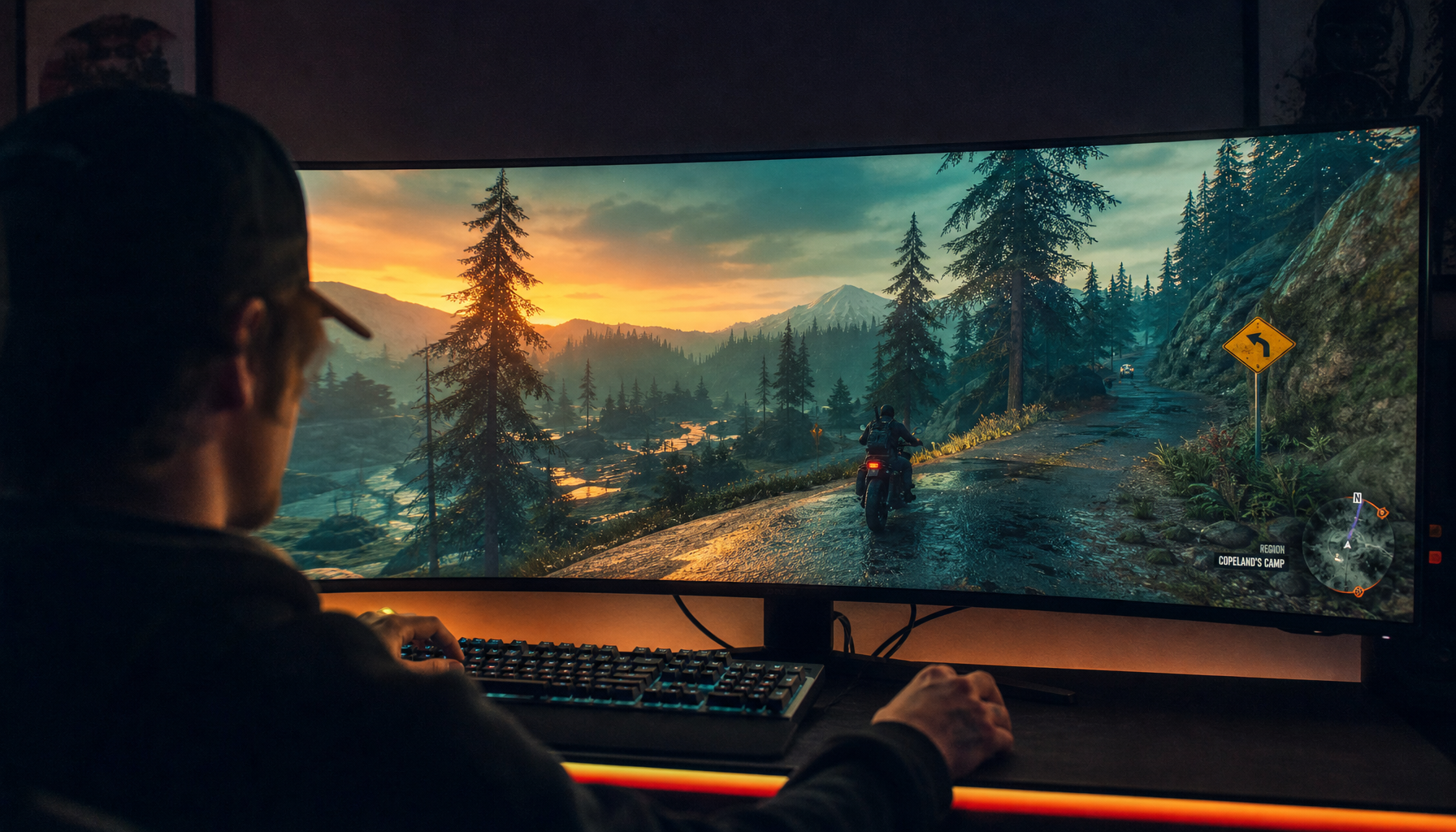
A quick example: a 27-inch 4K display packs far more detail than a 27-inch 1080p display. Small UI text, spreadsheet labels, code, and game HUD elements get more pixel data to describe curves and stems, so the same font can feel calmer and sharper.
Rendering Engines Make Different Tradeoffs
Fonts are not simply shown on screen. The operating system and browser rasterize mathematical outlines into pixels, then decide how much to smooth, snap, or preserve.
On lower-density panels, renderers often align strokes to the pixel grid. This can improve legibility, but it may slightly alter the typeface’s intended shape. As Coding Horror explains, respecting the pixel grid is a practical readability choice when there are not enough pixels to draw the ideal letterform cleanly.
Higher-density screens reduce that compromise. With more pixels per letter, curves, counters, and spacing can stay closer to the original font design, which is why sharper productivity and creative monitors often make text feel less strained over long sessions.
Scaling Can Break Multi-Monitor Consistency
The biggest typography shock happens when displays with different densities share one desktop. A laptop may need 150% or 200% scaling, while an external 1080p monitor may look best at 100%.

The problem is not just resolution; it is independent scaling support. In one Ubuntu dual-monitor case, changing scale for one screen affected the other, causing text to become either too large externally or too small on the laptop. That kind of mixed-DPI monitor setup is a real productivity issue, not a cosmetic preference.
For buyers and workstation builders, this means matching monitors by size and resolution can be just as important as chasing peak specs. A pair of similar-density displays usually feels more consistent than one ultra-sharp panel beside one standard-density panel.
Font Choice Still Matters
A display can expose weak typography choices fast. Thin fonts may fade on matte office panels. Decorative display faces may look striking in a hero banner but tiring in dense dashboard text.

Good design systems treat typography as infrastructure because type can dominate most of the visible interface. Strong systems define body sizes, line height, weights, and responsive behavior early, with on-screen legibility balanced against brand personality and performance.
For monitor users, the practical rule is simple: use expressive type for big, short moments, and use open, sturdy text faces for reading, coding, forms, menus, and competitive overlays. Display type is for impact; UI type is for speed and confidence.
How to Get More Predictable Text
Use these quick checks before blaming the font:
- Match display density when building a multi-monitor setup.
- Set per-monitor scaling instead of one global compromise.
- Prefer native resolution for the sharpest text rendering.
- Test small text in the apps you actually use.
- Choose fonts with clear counters, spacing, and sturdy weights.
Modern high-density screens make typography more print-like, but software scaling and font rendering still decide the final pixels you see.


