


Increasing sharpness can make dark areas look heavier because edge enhancement exaggerates contrast at borders, adds halos, and can mask subtle near-black steps. The fix is usually to reduce sharpness toward neutral, then tune black level, gamma, contrast, and dynamic contrast separately.
Does your game suddenly hide enemies in dark corners after you raise sharpness, or does a dark spreadsheet theme look punchier but less readable? In practical monitor setup, a near-black test pattern can quickly reveal whether you are losing shadow bars instead of gaining real detail. You will leave with a clean way to separate useful clarity from artificial edge boost.
The Short Answer: Sharpness Is Not Real Resolution
Sharpness sounds like a detail control, but on most monitors it is closer to an edge-processing control. Sharpness affects edge and text definition, and excessive sharpness can create artifacts while too little makes the image blurry. When you raise it too far, the monitor may draw stronger light and dark borders around objects, UI text, and texture edges. That makes the picture look more aggressive at first glance, but it can also bury the soft tonal transitions that make shadows readable.
Black crush means dark tones that should be separate become visually merged. A jacket, cave wall, black desktop wallpaper, or dim game hallway may still contain different signal values, but the display shows them as one dark patch. The frustrating part is that the image can look sharper and higher contrast while actually showing less information.
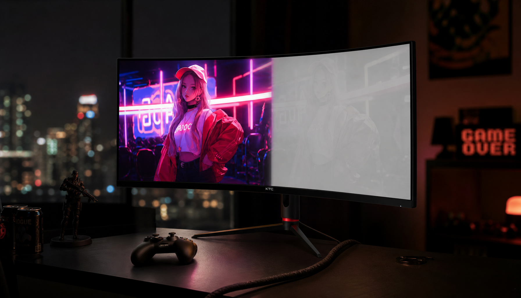
On a 27-inch 4K office or gaming display, this is easy to trigger when someone combines high sharpness with a vivid preset, high contrast, dynamic contrast, and a dark room. The desktop text may pop, but the first five or six near-black steps in a test pattern can disappear. That is not a resolution win. It is a tone-mapping and processing problem.
What Sharpness Actually Changes
Most LCD and OLED monitor sharpness controls do not add missing pixels. They analyze edges and increase local contrast around them. A dark edge next to a medium-gray object can be made darker on one side and brighter on the other. This creates the impression of crispness, especially from a normal desk distance, but it can produce ringing, bright halos, dark halos, and rough text outlines.

For productivity, the tradeoff is immediate. A little edge definition can help low-resolution text feel cleaner on a 24-inch 1080p display. Too much can make antialiased fonts look gritty, thin strokes look uneven, and dark-mode interfaces lose gray separation. For gaming, the tradeoff is more dramatic. Rock textures, weapon outlines, and foliage may appear more etched, but shadow interiors can become harder to read.
This is why the best setting is often the monitor’s default or neutral point, not the highest number. Some monitors label neutral as 50, some as 0, and some hide processing inside clarity, resolution enhancement, shadow boost, or game-enhancement modes. The name changes, but the risk is the same: edge punch is not the same as preserved shadow detail.
Why Blacks Get Crushed After You Increase Sharpness
Black crush usually happens because sharpness is interacting with other controls. Black level controls shadow detail, and setting it too low can crush dark information. If you raise sharpness while black level is already too low, the monitor may emphasize dark borders and make near-black transitions harder to distinguish.
Gamma is another major factor. Gamma changes overall image brightness without changing the backlight, and 2.2 is a common default. Higher gamma makes the image darker and more contrasty, especially in shadows and midtones. If your monitor is in a movie, racing, HDR simulation, or vivid preset, it may already be pushing a darker tonal curve. Add high sharpness, and the image can look dramatic while shadow texture collapses.
Contrast can make the problem worse from the other end. Too much contrast clips bright detail, but some presets raise both contrast and perceived edge strength at once. The result is a punchy image with less usable information at both extremes. On portable smart screens, dynamic contrast can also change the backlight and contrast in real time; dynamic contrast can deepen dark scenes and brighten light scenes, but the same behavior may reduce accuracy, shift tones, or create halos on budget panels.
Panel Type Matters, But Settings Still Matter More
Different panel technologies handle dark detail differently. IPS panels may crush dark tones, while IPS is often strong for color and viewing angles but weaker in black-level handling than VA or TN in some gaming scenarios. That matters if you play dark RPGs, horror games, or tactical shooters where shadow visibility affects performance.
VA panels often deliver deeper native contrast, so dark scenes can look richer. The downside is that some VA monitors show dark smearing during motion, depending on response tuning. IPS often feels faster and more color-stable from angle to angle, but it may show grayish blacks or lose subtle dark steps if the preset is too aggressive. OLED has excellent black depth because pixels can turn off, but it still needs correct near-black handling and careful use around static desktop elements.
Mini-LED monitors can combine high brightness with local dimming, which helps HDR highlights and black-level control. Yet local dimming can create blooming around bright UI elements on dark backgrounds. If sharpness is also high, halos around subtitles, crosshairs, and white text can become more visible.
Display type |
Strength in dark scenes |
Risk when sharpness is too high |
IPS |
Stable color and wide viewing angles |
Gray blacks or crushed-looking shadow steps |
VA |
Strong native contrast |
Dark motion smearing plus over-etched edges |
OLED |
True black and high contrast |
Harsh near-black transitions if processing is aggressive |
Mini-LED |
Bright HDR and local dimming control |
Blooming or halos around bright objects |

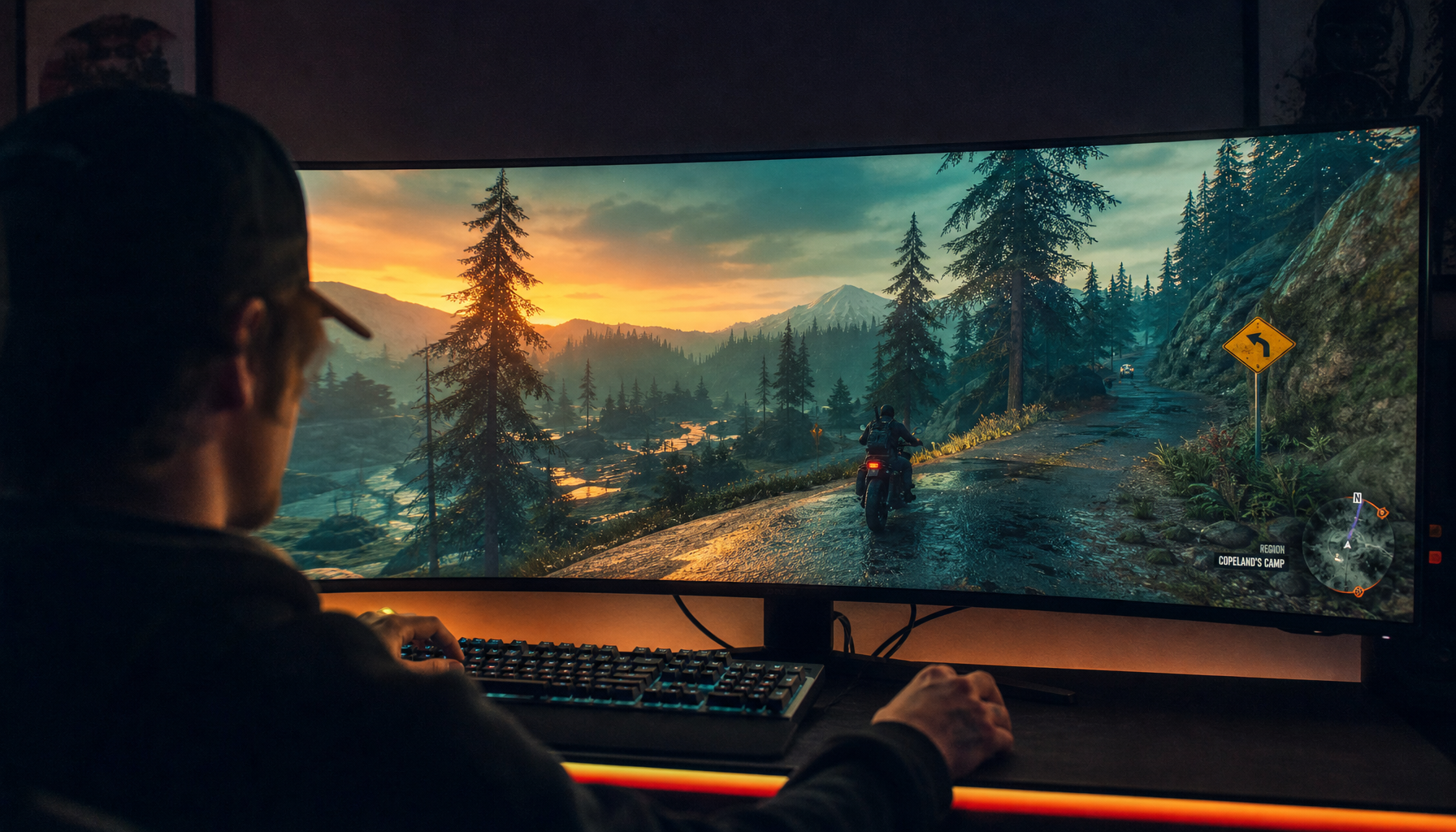
Gaming Monitors, Office Displays, and the Sharpness Trap
Gaming monitors are excellent value for many work setups because high refresh rates, ergonomic stands, and broad connectivity also improve daily use. Gaming monitors can be strong office-work displays, especially when smoother refresh makes moving windows and switching apps feel cleaner. The trap is that gaming presets often ship with punchy image processing designed to impress on a store shelf or make enemies more visible in specific games.
For competitive shooters, you may intentionally raise a shadow-visibility setting or lower effective gamma to reveal opponents in dark areas. That is a visibility choice, not an accuracy choice. For story games, HDR titles, photo review, dashboards, and dark-mode office work, you usually want neutral sharpness and accurate black-level separation. Otherwise, the monitor may turn subtle shadow design into flat black shapes.
Professional and creator displays take a different path. Professional monitors often cost more because they target resolution, color controls, calibration features, and better consistency. That does not automatically make every professional display immune to bad settings, but it does mean the default modes are often less aggressively processed. A budget gaming monitor can still look excellent when tuned, while an expensive monitor can still look wrong in the wrong preset.
A Practical Calibration Flow That Preserves Detail
Start by returning the monitor to a standard, sRGB, custom, or user mode. Avoid vivid, movie, dynamic contrast, HDR simulation, and game-enhancement presets while you diagnose the issue. Set the resolution to the panel’s native resolution because scaling blur can tempt you to overuse sharpness. A 27-inch 4K screen should look crisp without heavy edge enhancement, while a 24-inch 1080p screen may need careful operating-system scaling and font smoothing more than extra monitor sharpness.
Next, set brightness for the room. Brightness usually changes the backlight, so it affects comfort more than tonal accuracy. In a bright office, a higher brightness setting can make near-black detail easier to see. In a dim room, excessive brightness can make blacks look lifted and fatiguing. After brightness feels comfortable, leave contrast near its default unless a white clipping pattern shows lost highlight bars.
Now lower sharpness until halos disappear. Open a page with black text on a white background, then a dark interface with gray text and thin lines. If letters have glowing edges or dark outlines, sharpness is too high. If text looks soft at native resolution, check OS scaling, cable quality, and resolution before raising sharpness again.
Finally, use a near-black test pattern. You should be able to distinguish the first few dark bars from the background without making black look gray. If they vanish, raise black level slightly or choose a lighter gamma preset. If everything looks washed out, black level or gamma may be too lifted. The goal is controlled depth: black should look black, but dark gray should not disappear.

When Higher Sharpness Is Actually Useful
Sharpness has a place. It can help older 1080p portable monitors, low-bitrate video, console output, or soft scaling from non-native resolutions. It can also make office text feel more immediate on lower-density displays. Pixel density above 100 pixels per inch is desirable for sharper professional image detail, so a lower-density panel may need more careful setup than a dense 4K screen.
The reliable rule is to use sharpness as a small correction, not a contrast weapon. If raising it one step improves text without halos and without hiding near-black bars, keep it. If it makes dark scenes punchier but less informative, back it down. For long workdays, readability and tonal separation beat artificial bite.
FAQ
Does sharpness directly change black level?
Usually, no. Sharpness mainly affects edges, while black level controls dark-tone visibility. The problem is that heavy edge enhancement can make dark borders stronger and visually mask subtle shadow steps, especially when black level, contrast, gamma, or dynamic contrast are already aggressive.
Should I use HDR to fix crushed blacks?
Not automatically. HDR can improve contrast when the monitor has enough brightness, local dimming, and good tone mapping, but weak HDR modes can make desktop work look harsh or inconsistent. For routine office work and SDR games, a well-tuned SDR mode is often cleaner.
Is IPS bad for dark games?
IPS is not bad, but it has limits. It is often excellent for color, viewing angles, and fast gaming, while VA, OLED, and Mini-LED models may deliver stronger dark-scene depth. If you already own an IPS display, correct sharpness, gamma, black level, and room lighting before blaming the panel.
Final Word
If increasing sharpness makes blacks look crushed, the monitor is giving you processed contrast instead of usable detail. Set sharpness near neutral, tune black level with a near-black pattern, keep gamma close to a balanced desktop setting, and reserve aggressive enhancement for the few games or videos that truly benefit from it. A strong display should reveal the scene, not merely harden its edges.


