


Gamers are paying more attention to how a monitor looks on the desk, not just how fast it refreshes. Hidden, subtle, or removable branding helps a display fit streaming setups, multi-monitor layouts, work-gaming desks, and minimalist rooms without taking attention away from the screen.
Have you ever finished a clean desk setup, turned on your RGB lighting, lined up two monitors, and then noticed that the biggest visual interruption is the logo under the screen? Modern gaming displays can deliver hard numbers like 240 Hz refresh rates, 1 ms response times, and curved panels, but the visible design still affects how the setup feels every day. This guide breaks down why logo-light monitors appeal to gamers and how to weigh that preference against performance, ergonomics, and long-term usability.
The Shift From Loud Gaming Design to Cleaner Displays
Gaming monitors used to announce themselves
For years, gaming monitors leaned into aggressive styling: large front logos, angular stands, red accents, rear lighting, and branding that made the product look different from a regular office display. That design language made sense when gaming gear was trying to stand out on shelves and signal performance at a glance.
The problem is that the monitor is not a keyboard or mousepad sitting below eye level. It sits directly in the visual field. A large badge on the bottom bezel, a bright mark on the stand, or a glowing rear logo may look exciting in product photos, but it can feel visually noisy when the display is part of a daily setup.
Clean design fits more uses
Many gamers now use one display setup for ranked games, chat platforms, schoolwork, spreadsheets, video editing, streaming, and console play. A clean-looking gaming monitor can move between those roles without making the desk feel like a permanent esports booth.
That shift is also visible in how monitor listings compete. A dual 24.5-inch gaming monitor setup can advertise measurable performance features such as a 240 Hz refresh rate, 1 ms response time, 1500R curve, 1080p resolution, adaptive sync support, and common video input support through its dual gaming monitor setup, while branding visibility may not be treated as a core specification at all. For many buyers, that means logo placement becomes something they have to judge from photos, not a spec line.
Logo-light does not mean non-gaming
A clean monitor can still be a serious gaming display. Refresh rate, response behavior, adaptive sync, input options, stand ergonomics, and panel quality still determine how it performs. Hidden or removable branding simply reduces the amount of visual identity imposed on the desk.
That distinction matters because a monitor should first serve the player. If a display gives you the speed, size, and motion clarity you need, a subtler exterior can be a practical advantage rather than a style compromise.
Why Visible Logos Can Distract in Real Gaming Setups
Multi-monitor layouts multiply visual clutter

One logo may not matter much on a single screen. Two or three logos aligned across a desk can feel very different, especially if the bezels already form vertical lines between displays. In a dual-monitor layout, branding repeats across the bottom edge and can compete with taskbars, chat windows, stream controls, and game HUDs.
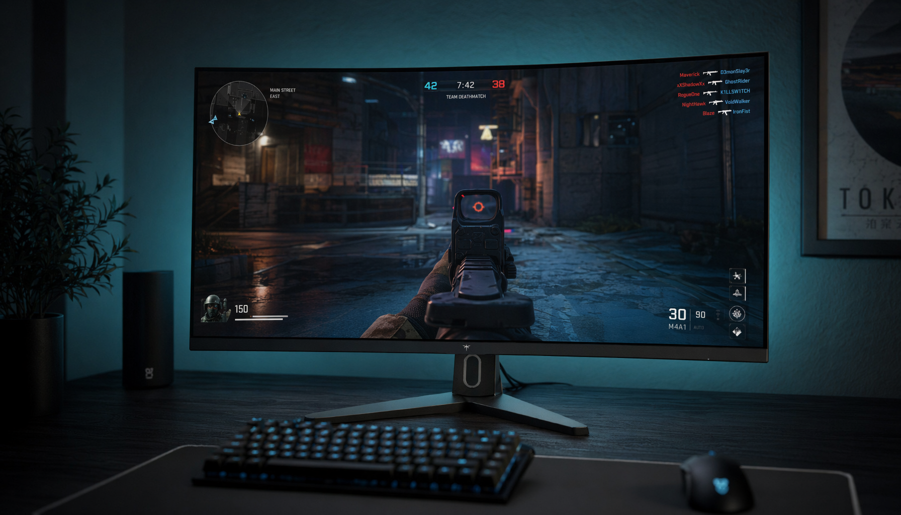
This is why clean branding matters more as setups grow. A pair of 24.5-inch curved displays with 1500R curvature can create a panoramic feel for gaming and multitasking, but repeated front-facing marks can break the visual continuity that curved or slim-bezel designs are trying to create. The more screens you add, the more every badge, light strip, and stand shape matters.
Streaming and video calls expose the desk
![]()
For streamers, content creators, and anyone who appears on camera, the monitor is part of the scene. A prominent logo can show up in desk shots, product reviews, hand-cam angles, and background footage. That can be distracting, and in some cases it may conflict with sponsorships, personal branding, or a deliberately neutral setup.
Logo-heavy monitor imagery is common enough that design asset libraries group visuals around terms like gaming logo, esports tournament, console, electronics, and related tags in monitor with gaming logo collections. That visual language is recognizable, but recognizability is not always what a streamer wants on camera.
Shared work and gaming spaces need restraint
A lot of gaming desks now sit in bedrooms, apartments, home offices, or shared living spaces. A display with loud markings may feel fine during a late-night match but out of place during a 9:00 AM video meeting or when the same monitor is used beside a laptop.
Hidden or removable branding helps the monitor blend into a room instead of defining it. That can be especially useful when the setup includes a high-refresh-rate main display, a secondary work screen, a portable monitor, speakers, docking hardware, and lighting. The cleaner the monitor exterior, the easier it is to make the whole desk feel intentional.
Branding vs. Performance: What Should Matter Most?
Start with the screen, then judge the shell
A gaming monitor should not be chosen only because the logo is subtle. The panel still needs to match the way you play. Competitive players should prioritize refresh rate, response performance, input latency, adaptive sync support, and clear motion handling. Sim, RPG, and productivity-heavy users may care more about screen size, curvature, resolution, color quality, and stand adjustability.
A practical example is a 24.5-inch 1080p gaming display with a 240 Hz refresh rate and 1 ms response time. Those specs point toward fast-paced competitive use, while a 1500R curve and dual-display bundle point toward immersion and multitasking. Branding affects the desk experience, but those performance details affect the game experience.
Compare the tradeoffs directly
Logo-light design becomes most valuable when the display already meets your technical requirements. If two monitors are close on refresh rate, panel quality, ports, warranty, and ergonomics, the cleaner exterior can be a meaningful deciding factor.
Buying Factor |
Logo-Heavy Design |
Hidden or Removable Branding |
What to Check Before Buying |
Front bezel |
More visible under the image area |
Less distraction below the screen |
Product photos from straight-on angles |
Multi-monitor setup |
Repeated logos can look busy |
Easier visual alignment across displays |
Bezel thickness, stand shape, monitor arm mounting support |
Streaming desk |
Brand marks may appear on camera |
Cleaner camera framing |
Webcam angle and desk lighting |
Work-gaming use |
Can feel more aggressive in office tasks |
More neutral for mixed use |
Stand adjustability and input switching |
Resale flexibility |
Style may appeal to fewer buyers |
Broader aesthetic fit |
Condition, ports, warranty, panel health |
Performance relevance |
Branding does not improve speed |
Branding does not reduce speed |
Refresh rate, response time, adaptive sync |
Do not ignore the stand
The stand often carries more visual weight than the logo. Some gaming monitors use large V-shaped bases, sharp legs, or oversized rear housings. Even if the front logo is small, the stand can dominate a desk and make keyboard placement awkward.
If you want a clean setup, check whether the monitor supports standard monitor arm mounting. A monitor arm can reduce desk clutter, align multiple screens, and hide parts of the original stand design. For ultrawide monitors and heavier displays, confirm the arm supports the monitor’s weight and width before buying.
Where Clean Branding Matters Most by Monitor Type
High-refresh-rate gaming monitors
For competitive gaming, clean branding is a secondary but still useful preference. A 240 Hz display should first deliver smooth motion, reliable input handling, and adaptive sync behavior. If the monitor also avoids a large front logo, that is a bonus for focus.
The key is to avoid letting aesthetics hide weak specs. A subtle-looking monitor with poor overdrive tuning, limited ports, or a wobbly stand may be worse than a slightly louder design with stronger performance. Use branding as a tiebreaker after the essentials are met.
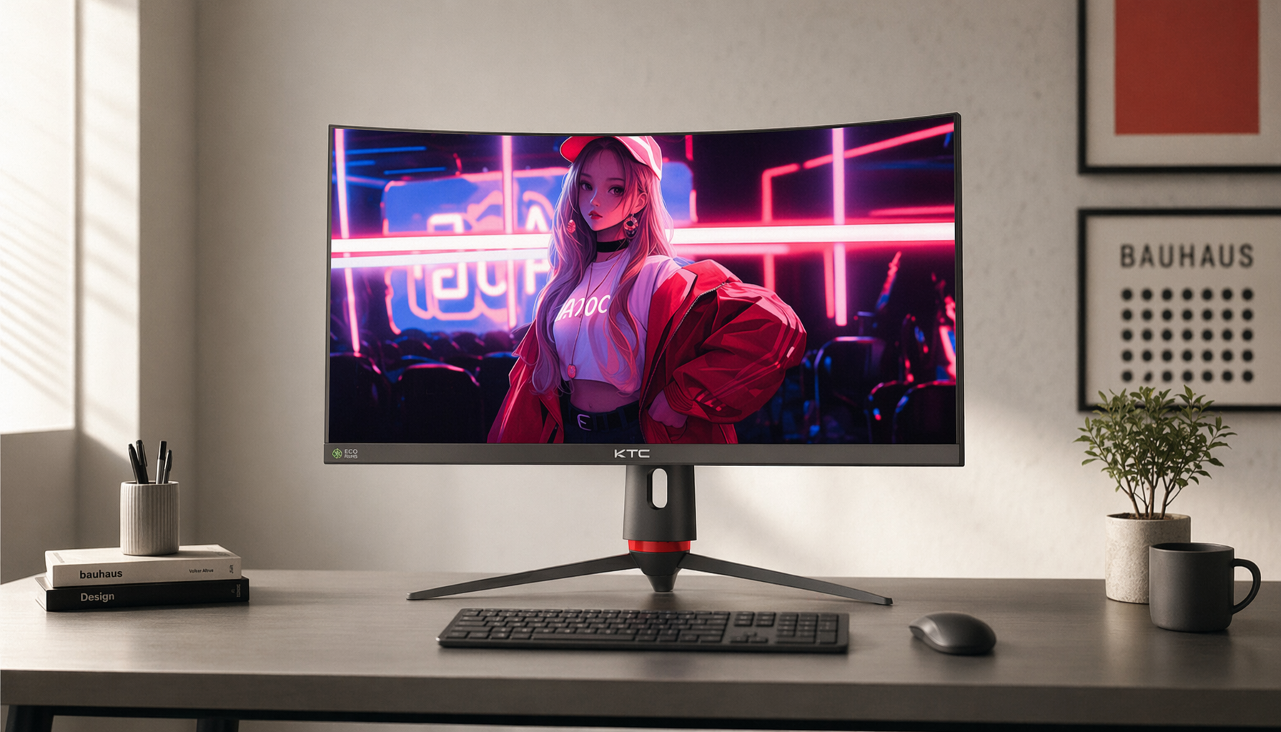
Ultrawide and curved monitors
Logo placement is more noticeable on ultrawide monitors because the display spans more of your desk. A 34-inch, 38-inch, or 49-inch ultrawide already creates a strong visual presence, so a large center badge can become hard to ignore. With curved screens, the lower bezel often sits close to the user’s sightline, which makes subtle branding more valuable.
Maintenance also becomes more important at these sizes. A 12-by-12 inch microfiber cloth is easier to handle on 34-inch, 38-inch, or 49-inch ultrawide displays, while a smaller 6-by-6 inch cloth works better for portable monitors through a microfiber cloth routine. A cleaner screen surface reinforces the same reason people prefer logo-light designs: fewer distractions around the image.
Portable monitors

Portable gaming monitors benefit from minimal branding because they are often used in mixed environments: travel, hotel desks, dorm rooms, shared tables, LAN events, and console setups. A subtle design looks less out of place beside a laptop or handheld gaming device.
Portability also changes the buying checklist. Look closely at weight, case design, cable routing, modern connector support, brightness, and whether the logo is printed on the front bezel or only on the rear cover. If the monitor is frequently packed and unpacked, removable branding matters less than durable construction and a protective sleeve.
Practical Buying Checklist for a Logo-Light Gaming Monitor
Inspect the photos like a setup builder

Product titles rarely describe branding clearly. A listing may highlight refresh rate, response time, curvature, adaptive sync, video inputs, speakers, or a matte surface, but leave logo size and placement to the images. That means you need to review the front, side, rear, and stand photos before deciding.
Use this checklist before buying:
- Check straight-on product photos for front bezel logos and badge size.
- Look at rear photos if the monitor will be visible on camera or from across the room.
- Confirm whether any branding is printed, embossed, backlit, sticker-based, or removable.
- Compare stand depth against your desk size, especially if you use a large mousepad.
- Verify standard monitor arm mounting support if you want a cleaner arm-mounted setup.
- Prioritize refresh rate, response time, resolution, panel type, adaptive sync, and ports before aesthetics.
- Read buyer photos when available, because real desks reveal branding more honestly than studio images.
Keep the display clean without damaging it
A clean-looking monitor loses some of its advantage if the screen is covered in smudges or wipe marks. Use a dedicated, clean, lint-free microfiber cloth and store it in a drawer or pouch so it does not collect grit. Avoid paper towels, tissues, napkins, rough towels, shirt hems, cotton rags, and abrasive pads.
The safest process is simple: power the monitor down, let it cool, wipe dry with microfiber, use distilled water or alcohol-free screen cleaner only for stubborn marks, then dry it again. Apply liquid to the cloth instead of spraying the panel directly, because moisture can reach bezels, seams, ports, vents, speakers, and controls.
Common Misconceptions About Logo-Light Gaming Monitors
“A cleaner monitor is less serious for gaming”
A monitor’s appearance does not determine gaming performance. A clean display can still offer a high refresh rate, fast response time, adaptive sync, digital video inputs, and a matte surface. The design language is separate from the panel’s actual behavior.
A good way to think about it: the logo tells you who made the monitor, but the spec sheet and real-world performance tell you whether it fits your games. If you play shooters, racing games, or competitive titles, motion clarity and input feel matter more than the badge.
“Removable branding always improves the product”
Removable branding is useful only if it is implemented cleanly. A sticker that leaves residue, a badge that exposes a recess, or a removable part that damages the finish can create a worse look than a small fixed logo. Buyers should check real photos and reviews when possible.
Hidden branding is often better than removable branding because there is nothing to modify. A small rear logo, a subtle stand mark, or a low-contrast badge can preserve brand identity without demanding attention.
“Logo-heavy designs are always bad”
Logo-heavy monitors are not automatically poor choices. Some gamers like bold hardware, matched peripherals, and visible brand identity. If the monitor performs well and the design fits the rest of the setup, there is nothing wrong with choosing it.
The issue is fit. A large logo may work on a dedicated gaming desk but feel distracting in a streaming frame, work setup, or multi-monitor layout. The best choice depends on the room, the camera angle, the number of displays, and how often the monitor is used outside gaming.
FAQ
Q: Does hidden or removable branding affect monitor performance?
A: No. Branding does not change refresh rate, response time, resolution, adaptive sync, input latency, brightness, or panel quality. It affects the visual experience around the display, especially on camera, in multi-monitor setups, or in shared work-gaming spaces.
Q: Should I choose a logo-light monitor over a faster gaming monitor?
A: Usually, no. Choose the monitor that meets your performance needs first. If you are comparing two similar displays, then cleaner branding can be a strong tiebreaker, especially if both have the refresh rate, response time, ports, and ergonomics you need.
Q: What is the easiest way to make a logo-heavy monitor look cleaner?
A: Start with setup changes before modifying the monitor. Use a monitor arm if the stand is visually heavy, reduce extra lighting, keep cables hidden, clean the screen properly, and adjust camera angles if you stream. Avoid peeling badges or covering logos unless you are sure the finish will not be damaged.
Key Takeaways
Gamers are choosing hidden, subtle, or removable branding because monitors now live in more flexible spaces. The same display may handle ranked matches, remote work, school assignments, streaming, editing, and console gaming, so a cleaner exterior makes the setup easier to live with.
The best buying approach is balanced: choose performance first, then use branding as a practical design filter. A strong gaming monitor should meet your needs for refresh rate, response behavior, resolution, size, curvature, ports, adaptive sync, and ergonomics. Once those basics are covered, logo-light design can make the difference between a monitor that only performs well and one that also fits the desk naturally.


