


Colors shift because browsers, image viewers, operating systems, image profiles, and monitor profiles do not always interpret the same RGB numbers the same way. The practical fix is to use sRGB for web images, preserve embedded ICC profiles, and check your monitor profile and app color-management settings.
Does a product render look perfect in an image editor, then turn too red in a browser or dull in a photo viewer? In a repeatable workflow, converting exports to sRGB, keeping the ICC profile, and testing in a color-managed viewer gives you a fast way to separate a real color issue from an app-display mismatch. Here is how to diagnose the problem and make browser tabs, standalone viewers, gaming monitors, office displays, and portable screens agree more often.
The Core Reason: Color Management Is Not Universal
Every digital color starts as numbers, such as RGB 220, 40, 60. Those numbers are not a final color by themselves; they need a color space and a display profile to become a visible result. A color-managed app reads the image’s embedded profile, checks the monitor profile, and converts the color so the screen shows the intended appearance.
That two-profile relationship is the heart of the issue. A useful color-management explanation notes that color depends on both the image’s document profile and the monitor profile, and that a color-managed app converts between them before display through the monitor profile. If a standalone viewer skips that conversion, or a browser only partly handles it, the same image can look warmer, flatter, more saturated, or slightly off in contrast.
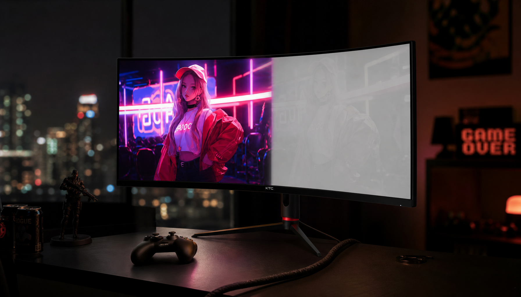
A real-world example is a red gaming keyboard product photo. If it was edited in a wide-gamut RGB space but exported without clear profile handling, a wide-gamut display may make the reds look hot and overpowered in one browser, while a basic office monitor may hide the problem because it cannot reproduce the extra color range anyway.
ICC Profiles: The Small File Tag That Changes Everything
An ICC profile is metadata that tells software how to interpret color. For web images, that often means an embedded sRGB profile. For editing and print workflows, it may mean a wider color space. The display itself also has a profile, which describes how that monitor reproduces color.
The trouble starts when an image optimizer strips the ICC profile. One documented case found that compressed web images lost profile data and then appeared oversaturated on a calibrated wide-gamut monitor, while the same shift was much less obvious on ordinary phones and consumer monitors through lost profile data. That is exactly the kind of mismatch that frustrates creators using performance displays: the better the panel, the easier it is to see a broken workflow.
For a display buyer, this is why “wide gamut” is powerful but not magic. A portable screen advertising full coverage of a wide-gamut RGB space can be a strong fit for pro-grade photo and design work, and one top-tier portable model explicitly highlights wide-gamut RGB coverage. But if the browser, viewer, or export pipeline mishandles profiles, the extra gamut can amplify mistakes instead of improving trust.

Browser Tabs Versus Image Viewers: Why They Disagree
Browsers and viewers have different color-management behavior. Some read embedded profiles and sync well with the system monitor profile. Others may assume sRGB, ignore the monitor profile, or behave differently depending on settings and operating system. The result is that a browser tab can become a different viewing instrument than a standalone viewer.
Forum troubleshooting around browser color differences points to both display profiles and browser color-management settings as likely causes, especially when one browser looks more saturated than another on the same machine through browser color-management settings. That matches what appears in mixed setups: a laptop panel, an external gaming monitor, and a USB-C portable display can each be correct according to their own profile, yet still disagree visually if software translation is inconsistent.
Standalone viewers vary too. Some are properly color managed, some are not, and some require a preference toggle. A viewer that looks simpler is not necessarily more truthful, especially if its color-management setting is disabled.
Viewing path |
What can go right |
What can go wrong |
Color-managed editor |
Reads document profile and monitor profile |
Can look different from unmanaged apps |
Modern browser |
Often handles common web images well |
May vary by browser, settings, OS, and missing profiles |
Basic image viewer |
Fast and convenient |
May ignore profiles or assume the wrong color space |
Wide-gamut monitor |
Reveals richer color and workflow errors |
Can exaggerate oversaturation when profiles are stripped |
Portable monitor |
Adds reliable workspace for review |
Needs proper OS profile and consistent connection behavior |
Why Wide-Gamut and Multi-Screen Setups Make It More Visible
If you use a regular sRGB office monitor, profile mistakes may be subtle. If you use a wide-gamut creative display, a high-refresh gaming monitor with vivid factory settings, or a portable smart screen for field review, the same mistake becomes obvious. A red jacket, orange UI accent, or green health bar can look punchy in one app and restrained in another.
This is especially relevant for users shopping across gaming, office, and portable display categories. KTC positions its lineup around pro gaming, office, and portable monitor needs with an emphasis on strong price-to-performance value, but value only becomes reliable when the display mode and software workflow match the task. For competitive gaming, vivid color may feel exciting. For product photography, e-commerce banners, UI work, or document review, accuracy matters more than punch.
Panel type also affects perceived consistency. IPS displays are widely favored for color-sensitive work because they maintain strong viewing angles and color behavior; one panel-technology overview describes IPS as offering viewing angles up to 178 degrees and strong color accuracy. In practice, that means a browser-viewer mismatch is less likely to be confused with simple off-axis color shift, especially on a desk where you glance between a main monitor and a side screen.
The Most Reliable Web Export Workflow
For images headed to websites, marketplaces, browser-based dashboards, or online portfolios, sRGB remains the safest delivery color space. Edit in the space your project requires, but before publishing, convert the final file to sRGB and embed the profile. Do not merely assign sRGB to a file that was edited in a wider RGB space; converting changes the color numbers to preserve appearance, while assigning changes the interpretation and can visibly alter the image.

For example, if a monitor product render is built in a wide-gamut RGB space and then uploaded without conversion, a browser or web service may show it with muted or shifted colors. If the same image is converted to sRGB, embedded with the sRGB profile, and previewed in two common browsers plus a color-managed viewer, you get a much stronger prediction of what most shoppers will see.
Image compression is still worth using, but not at the expense of color metadata when accuracy matters. A 10% to 50% smaller file is attractive for page speed, yet the compressed-image case above shows that stripping profiles can create a color penalty on wide-gamut monitors through web images. For product pages, creator portfolios, and monitor reviews, preserving the profile is usually the better trade.
Monitor Profiles, OS Settings, and the Hidden System Layer
Sometimes the image is fine and the app is fine, but the operating system is feeding software a bad monitor profile. In one desktop troubleshooting case, a color mismatch was traced to a problematic ICC profile applied at the root display level, with a workaround that removes the relevant profile property through a problematic ICC profile. The detail is technical, but the lesson is universal: system-level color settings can override your expectations.
On desktop systems, the practical step is to check the active display profile in system color settings, especially after installing monitor drivers, calibration software, GPU utilities, or docking-station display tools. If your laptop, external monitor, and portable display each have different profiles, compare one screen at a time before blaming the browser.
For portable workstations, wired reliability also matters. A dedicated portable monitor typically prioritizes low-lag external display use, while a tablet used as a second screen may rely on adapters or wireless mirroring that can introduce delay through wireless mirroring. Lag does not directly change color, but unstable preview conditions make visual judgment harder, especially during live design review or client presentation.
Practical Fixes That Usually Work
Start with the file. Convert web-bound images to sRGB, embed the ICC profile, and avoid stripping color metadata during optimization. If you receive an untagged file, do not guess casually; open it in a color-managed editor and test whether assigning sRGB or another expected profile restores the intended appearance before making a final conversion.
Then check the software. Use at least one known color-managed editor or viewer as your reference, and verify whether your standalone viewer has a color-management setting. If a professional editor and a properly configured viewer match, but a basic photo app does not, the basic app is probably the weak link rather than the image.
Finally, tune the display path. Use an sRGB mode when preparing web graphics, unless that mode locks brightness or other controls in a way that breaks your working environment. For gaming monitors, turn off extreme vivid, dynamic contrast, and genre modes when evaluating color. For office productivity displays, prioritize a neutral mode that makes documents and browser content consistent. For portable screens, create a stable profile for the exact connection you use most often, such as USB-C direct instead of a dock when color review matters.
When the Difference Is Acceptable
Not every mismatch deserves a full calibration session. If a browser tab and viewer differ only slightly in saturation on a secondary screen, and the image is for internal documentation or casual sharing, the practical answer may be to standardize on sRGB export and move on. If the image sells a product, represents brand color, supports medical or technical visual review, or feeds a creative approval workflow, the tolerance should be much tighter.
Display choice should follow the job. One monitor lineup separates color-focused, 4K, ergonomic, gaming, curved, and conferencing displays for different workflows through different workflows. Another frames monitor selection around work, gaming, entertainment, creative tasks, and everyday use through creative tasks. The right panel will not fix a broken profile chain, but it will give you a better foundation once the chain is correct.
FAQ
Why does a browser look different from my image viewer?
A browser may be handling the image profile, monitor profile, or untagged file differently than your viewer. If the file is not sRGB or has no embedded ICC profile, the difference can become more visible on wide-gamut displays.
Should I use a wide-gamut RGB space for web images?
Use a wide-gamut RGB space for editing only when your workflow needs it, then convert the final web export to sRGB and embed the profile. Wider spaces can preserve more color for creative work, but sRGB is the safer delivery format for browsers and online platforms.
Is my monitor defective if colors change between apps?
Usually, no. App color management, missing ICC profiles, OS monitor profiles, and display modes are more common causes. A defective monitor is more likely if color shifts happen everywhere, across all apps, inputs, and known-good test images.
Reliable color is not about trusting one browser tab or one viewer. It comes from a disciplined chain: correct export color space, preserved ICC profile, color-managed software, and a display mode matched to the job. Once that chain is clean, your gaming monitor, office display, or portable smart screen becomes a dependable tool instead of a guessing game.


