


Color can shift between HDMI, DisplayPort, USB-C, a dock, a console, or a second PC because each source may send a different signal, color range, refresh mode, HDR state, driver profile, or picture preset to the same screen.
Does your monitor look neutral from your work laptop, oversaturated from your gaming PC, and slightly washed out from a console on the same desk? A few controlled checks can usually separate a bad cable from a color-space mismatch, a GPU setting, or a per-input monitor preset. Here is how to diagnose the cause and lock the display into a more consistent, reliable image.
Why the Same Monitor Can Look Different by Input
A display is not just showing “the image.” It is interpreting a signal. That signal includes resolution, refresh rate, bit depth, RGB or YCbCr format, limited or full range, HDR metadata, color profile behavior, and sometimes source-specific tone mapping. When any of those change, the same panel can produce a noticeably different result.
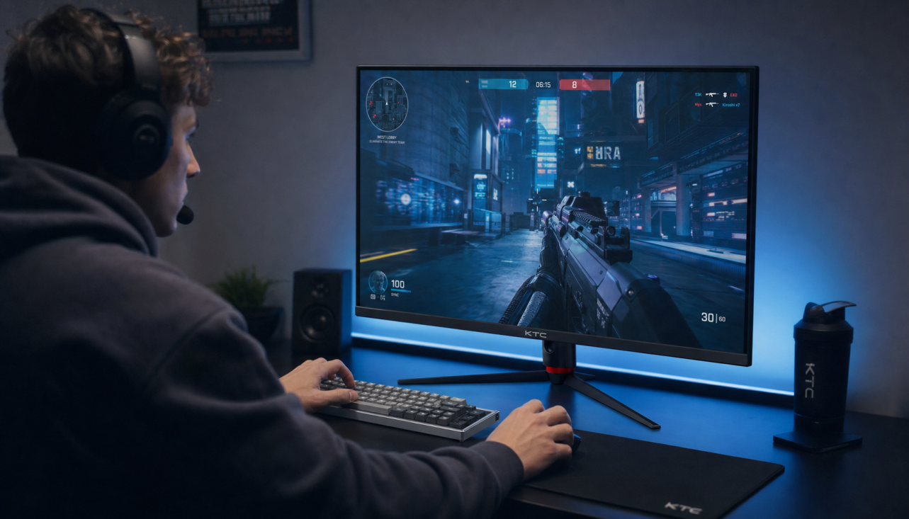
In hands-on desk setups, the most common pattern is simple: HDMI from a console looks punchier, DisplayPort from a PC looks flatter but more accurate, and USB-C from a laptop looks dimmer because the laptop is using a different profile or power behavior. The monitor did not suddenly become inaccurate. It is receiving a different instruction set.
This is why swapping ports is such a useful test. If the color shift follows the source or cable, the issue is upstream. If the color shift stays with the same monitor input, the display’s input-specific settings are likely responsible. Community troubleshooting around identical monitor models points to the same practical suspects: hardware settings, connection type, cables, software configuration, and age.
Signal Format: RGB, YCbCr, Full Range, and Limited Range
The biggest hidden color swing often comes from signal format. A PC monitor usually expects full-range RGB, where black and white use the full digital range. Some consoles, streaming boxes, TVs, docks, and GPUs may output limited range or YCbCr instead, especially over HDMI. The result can be raised blacks, crushed shadow detail, or colors that look oddly “video-like” rather than desktop-clean.

For example, if your gaming PC sends full RGB but your console sends limited range while the monitor expects full range, blacks may look gray. If the monitor expects limited range but the source sends full range, shadow detail can disappear. This is not subjective tuning; it is a mismatch in how tonal values are mapped.
The fix is to check both ends. In your GPU control panel or console video settings, confirm RGB versus YCbCr and full versus limited range. Then check the monitor’s HDMI black level, input range, or color format setting. For a desk-first monitor used with PCs, full-range RGB is usually the cleanest baseline. For video devices, automatic settings can work, but only if both devices agree.
Per-Input Picture Modes Change More Than Brightness
Many modern monitors remember settings separately for each input. HDMI 1 may be in Game mode, DisplayPort may be in Custom mode, and USB-C may be using an eye-care or low-blue-light preset. Those modes can alter gamma, color temperature, saturation, local dimming, sharpness, HDR behavior, and black equalizer controls.

That is useful for hybrid desks, but it can also make calibration feel unstable. A work input might use a neutral preset, while an entertainment input uses higher contrast and more saturation. Source-specific presets reduce repeated manual changes, but the tradeoff is that “same monitor” no longer means “same image settings.”
For accuracy, make every input start from the same baseline. Use Standard, Custom, User, sRGB, or Creator mode if available. Avoid Vivid, Cinema, Dynamic, FPS, and Racing modes when judging color. Then match brightness, contrast, color temperature, gamma, and HDR state across the inputs before making finer judgments.
Setting Area |
What Can Go Wrong |
Practical Baseline |
Picture mode |
Game or Vivid boosts saturation |
Use Custom, User, Standard, or sRGB |
Color temperature |
One input looks blue, another warm |
Aim for neutral or 6500 K-style white |
Gamma |
Midtones look too dark or washed out |
Start near 2.2 for SDR desktop use |
HDR |
One source tone maps differently |
Turn HDR off for SDR color checks |
Input range |
Blacks look gray or crushed |
Match full or limited range on both ends |
Gamma and Color Temperature Shape the Feel of Accuracy
Gamma is not the same as brightness. Brightness controls the backlight level; gamma controls how the image moves through shadows, midtones, and highlights. A display set near gamma 2.2 usually gives a reliable SDR baseline for office work, web content, and most gaming. A darker gamma can make movies feel richer in a dim room, but it can also hide enemy detail in a dark game or make spreadsheet grays feel heavy.
This matters because different sources can trigger different gamma-like behavior. A game console with HDR enabled may tone map differently than a PC in SDR. A laptop may load an ICC profile that changes how applications send color. A dock may negotiate a different output mode at a high refresh rate. Calibration guidance for monitor settings is especially useful here: start with picture mode, then brightness, black level, contrast, gamma, sharpness, and color temperature instead of randomly adjusting saturation first.
A real-world check is simple. Open the same grayscale ramp, skin-tone image, and near-black test pattern on each source. If white looks different, adjust color temperature. If mid-gray looks different, check gamma or picture mode. If dark boxes disappear, check black level, RGB range, or console HDR.

Cables, Ports, Docks, and Bandwidth Can Change the Output
Digital cables do not usually “tint” color in the old analog sense, but cable quality and port capability still matter. A marginal HDMI cable, passive USB-C cable, adapter, or dock can force the source into a lower bandwidth mode. That may reduce refresh rate, color depth, chroma quality, or HDR capability.
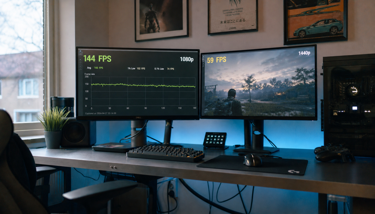
This shows up often on high-performance monitors. A 27-inch 1440p display at 165 Hz is not demanding in the same way as a 4K display at high refresh with HDR and 10-bit color. Push enough bandwidth through the wrong cable and the source may compromise. The image may still appear sharp, but color gradients, text edges, or HDR behavior can change.
For consistency, use the same class of connection where possible. Dual-PC setups are easier to balance when both machines use DisplayPort, or when both use comparable HDMI ports and certified cables. Dual-monitor setup guidance also notes that cables, ports, adapters, and docks can create performance imbalance, especially when resolution, refresh rate, and scaling differ.

Drivers, ICC Profiles, and Operating System Settings
The monitor is only one part of the color chain. Operating systems, GPU drivers, creative apps, games, browsers, and ICC profiles can all influence the final image. A work laptop may have a manufacturer ICC profile installed. A gaming PC may use driver-level settings that override application color. A console may ignore monitor ICC profiles entirely and rely on its own output calibration.
This is where many users lose time. They adjust the monitor, then the GPU driver changes output range after a restart, or the operating system loads a different profile after switching displays. Practical calibration advice for a monitor-to-printer workflow highlights why ICC profiles matter: they describe device-specific color behavior so software can translate color more consistently.
For color-critical work, use a hardware colorimeter and calibrate the input path you actually use. If your editing PC connects over DisplayPort, calibrate that path. If your laptop connects through USB-C, confirm the same profile is active when docked. For general productivity and gaming, you can still gain a lot by using the same picture mode, matching output range, and disabling unnecessary enhancements.
Panel Limits Still Matter
Input settings can explain a lot, but they cannot turn a weak panel into a reference display. An office monitor, a fast esports panel, a portable smart screen, and a creator-grade 4K display may all prioritize different strengths. Gaming monitors often emphasize refresh rate, response time, and motion clarity, while professional creative monitors prioritize uniformity, gamut control, and calibration options.
Resolution, panel type, brightness, and viewing angle also shape perceived accuracy. IPS panels are typically strong for color consistency across viewing angles, VA panels can deliver deeper contrast, and OLED can produce exceptional black levels but needs careful management for static desktop use. For image-heavy work, monitor recommendations often emphasize 4K monitors because higher resolution improves detail and workspace for visual tasks.
The value decision is workload-based. If you are tuning a display for ranked play, prioritize the fastest input path, stable refresh rate, and readable shadow detail. If you are editing product photos, prioritize sRGB or Adobe RGB behavior, calibration, stable lighting, and repeatable presets. If you switch between both, build two named modes and know which one is accurate versus intentionally enhanced.
A Practical Troubleshooting Workflow
Start with one known-good source and one known-good cable. Use the monitor’s factory reset if the settings have drifted, then choose a neutral picture mode. Turn off HDR, dynamic contrast, blue-light filters, black equalizers, super resolution, and game-specific enhancements while testing.
Next, set the source to the display’s native resolution and a refresh rate the cable can reliably support. Confirm full-range RGB for PC use unless you have a specific video reason not to. Open the same test images on every source, then compare white, gray, skin tone, saturated red, and near-black detail.
After that, swap cables and ports. If HDMI 1 looks wrong only with one device, investigate that device’s output settings. If HDMI 1 looks wrong with every source, inspect that input’s monitor preset. If the issue appears only through a dock, test a direct cable before blaming the display.
Finally, calibrate in the environment where you actually work. Match display brightness to room lighting, and use a white-paper comparison as a low-tech check for office setups. Stable lighting matters because the same screen can look cooler, warmer, brighter, or duller as the room changes.
Pros and Cons of Matching Every Input
The advantage of matching every input is confidence. Your desktop, laptop, and console stop fighting each other, and your eyes do less adapting during long sessions. This is especially valuable for streamers, designers, analysts, and anyone using one premium monitor as a command center.
The downside is that perfect uniformity can reduce flexibility. A neutral SDR preset is excellent for spreadsheets, design review, and web work, but it may look less dramatic than an HDR entertainment preset. Competitive players may intentionally raise shadow visibility, even though that is less accurate. The right move is not one universal mode; it is one accurate baseline plus clearly separated performance or entertainment modes.
Color accuracy varies between input sources because the display is part of a chain, not the whole chain. Match the signal format, picture mode, gamma, HDR state, cable capability, and software profile, then calibrate the path that matters most. Do that, and the same screen becomes predictable instead of mysterious, whether it is driving a workday, a ranked match, or a portable second-screen setup.


