


Panel subpixel arrangement affects how sharp, colored, or fuzzy text looks because font renderers often assume a specific red-green-blue stripe layout. Subpixel text smoothing can help on many PC displays, while modern high-density desktop rendering usually depends more on pixel density than subpixel tricks.
Why Subpixels Matter
A pixel is usually built from smaller red, green, and blue elements, and subpixel rendering uses those elements to increase perceived horizontal text detail. On a conventional RGB stripe LCD, this can make letter stems look cleaner than grayscale antialiasing alone.

The catch is that the renderer has to know the physical order. If a monitor uses BGR instead of RGB, or a less common layout such as triangular, PenTile-like, or unusual OLED structures, the same text algorithm can create color fringing or soft edges.
For productivity displays, this matters most at normal desk viewing distances. A 27-inch 1440p office monitor can reveal subpixel mismatches quickly; a 27-inch 4K display usually hides more of the issue because the pixels are denser.
PC Text Smoothing Is Powerful, but Layout-Sensitive
Subpixel text smoothing was built around LCD subpixels, and it can improve text contrast when the display uses a predictable stripe layout. The original concept relies on exploiting LCD color components to position text edges more precisely than full pixels alone.
That makes RGB panels the easiest match. BGR panels can still work well, but you should run the text-tuning utility and confirm the operating system is applying the correct subpixel order. If the order is wrong, black text may show red or blue halos along vertical strokes.

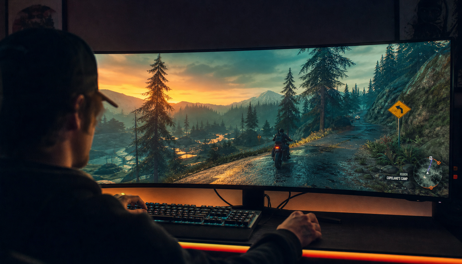
For gaming monitors, this becomes a value question. A high-refresh BGR VA panel might be excellent for motion and contrast, but if you also write, code, or manage spreadsheets all day, text clarity deserves equal weight in the buying decision.
Quick check before you keep a monitor:
- Open black text on a white background at 100% scaling.
- Look for red or blue edges on vertical strokes.
- Run text tuning after setting native resolution.
- Test browser text, documents, and your main work app.
- Compare 100%, 125%, and 150% scaling.

High Density Beats Subpixel Optimization
Modern desktop font rendering no longer leans on classic LCD subpixel antialiasing the way older systems did, so panel layout matters differently. Instead of deeply tuning for RGB or BGR, it generally looks best when the display has enough pixel density for grayscale smoothing to look clean.
That is why many users prefer 4K, 5K, or Retina-class screens for text-heavy work. The scaling model favors high-density panels where letterforms are built from more physical pixels, not from aggressive subpixel color placement.
This is also why a 32-inch 4K screen can look less crisp than expected beside a 27-inch 5K display. The first gives more physical size and workspace; the second delivers tighter text geometry, which helps fonts feel calmer and more printed.
Some users still find text acceptable on standard-density monitors, but tolerance varies by eyesight, viewing distance, app, and scaling mode.
Panel Types That Can Surprise You
OLED, QD-OLED, mini-LED LCD, IPS, VA, and portable smart screens can all render text differently, even at the same resolution. The issue is not just panel technology; it is the exact subpixel geometry and how the operating system interprets it.
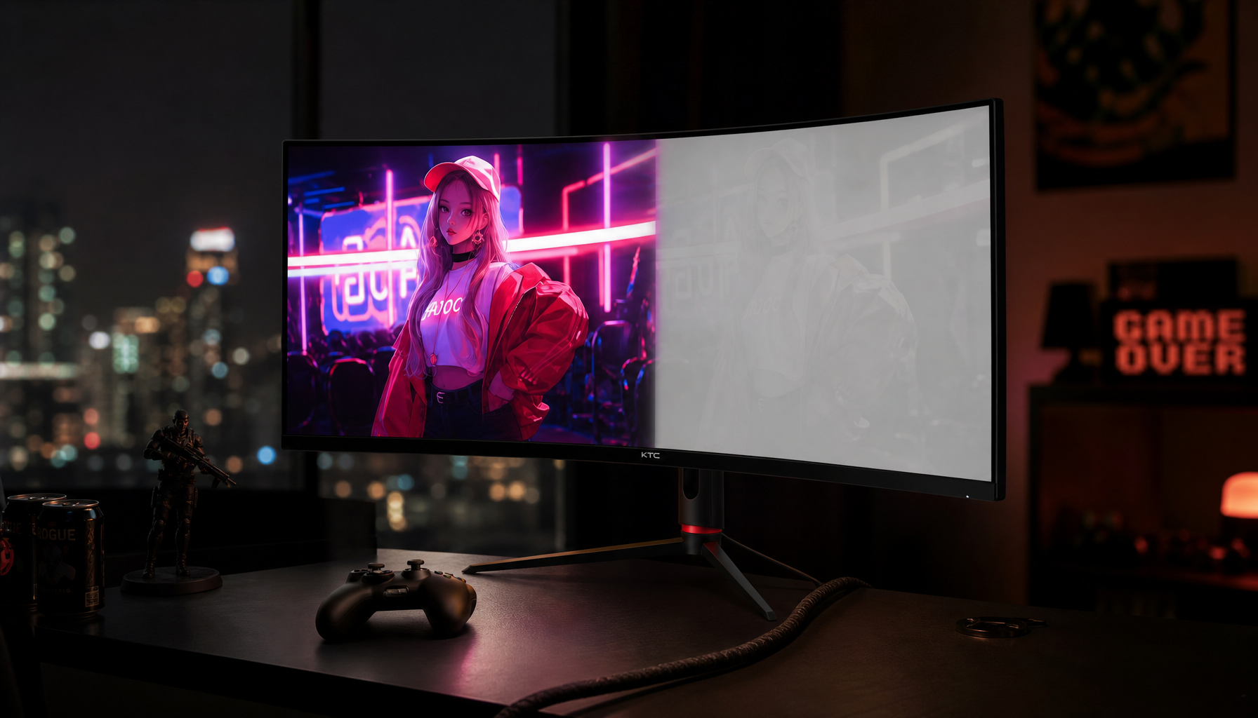
Some OLED monitors use nonstandard layouts that are optimized for brightness, lifespan, or color performance rather than desktop text. That can produce fantastic game immersion but less satisfying small-font clarity in email, dashboards, or code editors.

Portable displays add another twist. Many 14-inch to 16-inch 1080p portable screens are dense enough to look decent, but cheaper panels may use odd layouts, weak coatings, or scaling defaults that make text feel thinner than expected.
Buying Advice for Clear Text
For PC productivity, an RGB-stripe IPS or high-quality VA panel remains the safest value pick. If you choose BGR, confirm the operating system handles it well and avoid judging sharpness before text tuning.
For high-density desktop rendering, prioritize pixel density first. A 27-inch 4K monitor is usually a practical floor; 5K is the premium sweet spot for office-grade sharpness. Monitor recommendations often emphasize high-resolution panels because high-resolution laptop displays set a demanding clarity baseline.
For hybrid gaming and work, do not buy on refresh rate alone. A 240 Hz panel that makes spreadsheets shimmer is the wrong performance tradeoff for an all-day setup.
The best screen is not just fast or bright. It is the one whose pixel structure, operating system, and scaling mode work together so your eyes stay locked into the content, not the artifacts around the letters.


