


OLED text clarity is good enough for some office desks, but it is not the safest default if your day is mostly spreadsheets, docs, and dense web reading. The real question is whether you value OLED contrast and mixed-use flexibility enough to accept some text-rendering tradeoffs, or whether you want the most predictable text-first experience.

Why OLED Text Can Look Different
OLED text clarity is not just about resolution. It is also about how the display's subpixels are arranged and how the operating system draws text on top of that layout. On some OLED panels, the mismatch between panel structure and text rendering can make thin strokes or small UI labels look less crisp at desk distance, especially when you compare them with a standard RGB-stripe IPS monitor. PC Monitors' subpixel breakdown is a useful reminder that the issue is usually about rendering behavior, not a universal flaw in OLED itself.
For most office buyers, that means OLED text clarity is model-dependent and setup-dependent. If you sit a little farther back, use larger type, and run a panel with a layout your software handles well, the difference may feel minor. If you sit close and read tiny interface text all day, the tradeoff becomes easier to notice.
Subpixel Layout and Font Rendering
Subpixel layout influences how text edges are drawn. When the panel's red, green, and blue elements do not line up with the pattern the software expects, fine letters can show fringe patterns or a softer edge. That does not mean text is unreadable. It means some readers notice the edge treatment more quickly than they would on an IPS office monitor.
If you are sensitive to crisp type, what subpixel layout does is worth understanding before you buy. It helps explain why two monitors with the same size and resolution can still feel different for text.
Resolution, Scaling, and Viewing Distance
Higher resolution can help, but it does not automatically eliminate OLED text clarity complaints. A 4K or 5K panel usually gives more room for fine text than a lower-resolution screen, yet scaling still matters because the panel and the software have to work together. If the scaling is too small for your eyes or you sit too close, the text tradeoff becomes more visible.
A practical rule is simple: the closer and denser the reading task, the more you should judge the monitor by how it feels at your actual desk, not by spec sheet alone. That is why office buyers often care more about real viewing distance than abstract pixel counts.
Why Office Apps Expose the Issue Most
The office tasks most likely to expose OLED text issues are the ones that combine small fonts and long reading sessions. Dense spreadsheets, document editing, and text-heavy web pages are the usual stress test, because they put a lot of dark text on light backgrounds and keep your eyes on fine detail for long stretches. Office productivity workloads are where that difference shows up fastest.
That is also why the same OLED can feel fine in mixed use but less satisfying in a full day of tab-heavy work. Small menus, side-by-side windows, and default browser zoom levels often matter more than one dramatic benchmark number.
Where Office Readability Problems Show Up
If you want the short version, these are the situations most likely to make OLED text clarity feel less forgiving on a productivity desk:
- Dense spreadsheets: small cells and thin grid text make fringe patterns easier to notice.
- Browser-heavy research days: lots of white-background reading can make softer edges feel more obvious.
- Docs and email at small zoom: tiny fonts reveal panel behavior faster than large headings do.
- Side-by-side windows: split-screen layouts compress text and reduce the margin for clarity loss.
- Bright rooms or window glare: reflections can make the whole desk feel harsher, even if the panel is otherwise fine.
A useful self-check is to ask what you spend most of your day looking at. If the answer is mostly documents, spreadsheets, and web text, you are closer to the IPS side of the line. If your desk also handles video, creative work, or entertainment, OLED becomes easier to justify.
Settings That Can Help Text Look Cleaner
Settings can improve OLED text clarity, but they are mitigation, not a cure. The goal is to make text easier to read and artifacts less noticeable, not to recreate IPS-like rendering.
Scaling, Font Size, and Text Rendering
Start with operating-system scaling and app font size before judging the panel. Practical OLED text tuning often begins with a higher scale setting, such as a larger desktop layout and bigger spreadsheet fonts, because that reduces how much tiny edge behavior your eyes have to process.
If you use Windows, the built-in text rendering tools may help more than a random app tweak. If you use macOS, high-resolution scaling can matter just as much. The exact path differs by platform, but the decision is the same: make the text easier to read before you decide the monitor is a bad fit.
Brightness, Contrast, and Room Light
Brightness should match the room, not your instinct to run the display at maximum. KTC's own home-office guidance on monitor brightness for desk lighting lines up with the broader ergonomics idea that overly bright screens can feel harsher in typical office lighting.
For OLED office use, that matters because glare and aggressive brightness can make the text look less comfortable than it really is. A bright room does not automatically disqualify OLED, but it should make you more careful about reflections, desk orientation, and whether you can control light from nearby windows.
Workflow Habits for Spreadsheets and Docs
Small workflow changes can reduce regret. Increase zoom in dense spreadsheets. Use a larger browser zoom for research days. Raise font size in document editors when you can. Sit at the distance where the screen feels readable without leaning in.
These habits matter because OLED monitor productivity text sharpness is not decided by the panel alone. It is the combination of panel, app scaling, and desk setup that determines whether the difference bothers you day after day.

Where a KTC OLED Fits in the Office
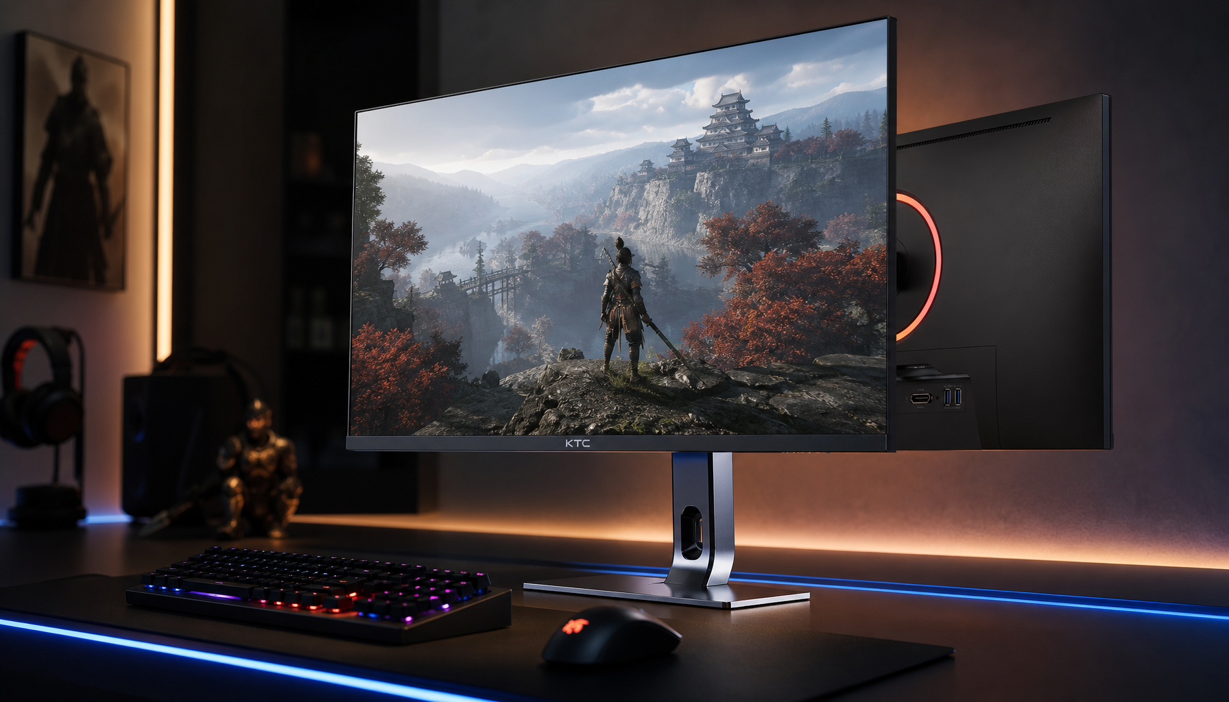
The KTC OLED 27" 2K 240Hz/0.03ms USB-C Gaming Monitor can make sense for a mixed-use desk, but it should be treated as a conditional option rather than the default office pick. Its product facts support a 27-inch OLED panel, 2560×1440 resolution, 240Hz refresh rate, USB-C connectivity, and 65W USB-C charging, which fits buyers who want one screen for work plus leisure and who value dock-like convenience.
| Buyer condition | Why it may fit | What to check first |
|---|---|---|
| Mixed work and entertainment | OLED contrast and USB-C convenience can make a shared desk feel more versatile | Make sure you are okay with some text-rendering tradeoff during long office sessions |
| Laptop docking at a hybrid desk | USB-C charging can reduce cable clutter | Verify that 65W charging is enough for your laptop under load |
| Text-first spreadsheet work | The panel may still be fine, but this is the least forgiving use case | Check the display in person, or favor IPS if text sharpness is your top priority |
If you want to browse the broader category, the All-OLED Monitor collection is a reasonable starting point, but it should be used as a navigation aid, not as proof that every OLED is equally good for office text. For buyers who already know they want OLED, the key is to compare your desk habits against the panel's text behavior before checkout.
OLED or IPS for a Productivity Desk
For text-heavy office work, IPS is still the safer default. If your day is mostly spreadsheets, email, docs, and long reading sessions, predictable text behavior matters more than OLED contrast. If your desk is mixed use and you care about deeper blacks, media enjoyment, or USB-C convenience, OLED can be the better lifestyle fit, as long as you accept that text may not feel identical to IPS.
A simple decision rule is this: choose OLED when mixed-use enjoyment is part of the value, and choose IPS when text clarity is the main requirement. KTC's office IPS lineup, including the 27-inch 4K office monitor, the 27-inch 2K office monitor, and the 27-inch 5K professional monitor, gives you the clearer path if you want the most predictable reading experience.
Before you buy, check three things: how close you sit, how small your fonts usually are, and how much time you spend in text-first apps. If all three point toward heavy reading, stay with IPS. If two of them are flexible and you want OLED's contrast more, OLED text clarity is probably good enough for your desk.
FAQs
Why Can OLED Text Look Less Crisp in Office Apps?
OLED panels can use subpixel layouts that do not line up perfectly with the text rendering many operating systems expect. That can make fine text edges look a little different, especially at small sizes. The effect is often most noticeable in dense office apps, not in video or casual browsing.
What Settings Help OLED Look Better for Spreadsheets?
Start with larger OS scaling, bigger spreadsheet fonts, and slightly higher app zoom. Those changes reduce how much tiny text rendering quirks stand out. Brightness tuning also helps, but it is mainly about comfort and glare control, not a permanent fix.
Can OLED Work Well for a Home Office Desk?
Yes, if the desk is mixed use and you are comfortable with some text tradeoff. OLED can be a strong fit for people who want contrast, darker interfaces, and occasional media use. If your day is mostly documents and spreadsheets, IPS is still the safer choice.
How Do I Decide Between OLED and IPS for Reading All Day?
Use the simplest rule possible. Choose OLED if you want mixed-use versatility and can accept a little less text predictability. Choose IPS if you want the most dependable reading experience for long office sessions, especially in spreadsheets and browser-heavy work.
What Should I Check Before Buying an OLED for Productivity?
Check your normal viewing distance, the default scaling you plan to use, and how bright your room gets during the workday. Also think about how often you read tiny text versus mixed media. Those real-world habits matter more than the monitor category name alone.
Final Takeaway
OLED text clarity can be good enough for office work, but it is best treated as a fit question, not a universal answer. Choose OLED if your desk is mixed use and you value contrast enough to accept some text tradeoff. Choose IPS if your day is mostly reading and writing, because it still gives the safer text-first experience.
If you are close to the fence, test the scaling and viewing distance first, then decide whether the tradeoff feels worth it. If not, stay with IPS and move on with a monitor that matches the work you actually do.


