


A monitor can look less sharp from the side even when its resolution has not changed, because viewing angle changes contrast, brightness, color, black level, and text edge definition. OLED and IPS usually preserve perceived sharpness best off-center, VA is more position-sensitive, and TN is the least forgiving.
Ever sit slightly to the side of a gaming monitor and notice that text looks thinner, shadows look muddy, or the far edge of an ultrawide screen seems softer than the center? Practical monitor testing shows that the useful viewing zone is often much narrower than the advertised 178° number, especially for VA and TN panels. This guide explains why that happens, how each panel type behaves, and how to choose or set up a monitor so it stays clear in real use.
Why Viewing Angle Changes Perceived Sharpness
Sharpness Is Not Just Resolution
Resolution tells you how many pixels the monitor has, but perceived sharpness is what your eyes actually experience. A 1440p monitor viewed straight-on can look crisp, while the same screen viewed from a steep side angle can look softer because contrast drops, dark tones shift, and fine edges lose separation. That is why two monitors with the same resolution and refresh rate can feel very different on a desk.
A monitor’s listed viewing angle is often based on a minimum contrast threshold, not perfect image consistency. Many LCD specifications use points where contrast falls to 10:1 or 5:1, so a 178°/178° rating usually means the picture remains visible, not that color, brightness, or contrast remain accurate across the whole range. For monitor buyers, the more useful question is not “Can I still see the image?” but “Do text, HUD elements, dark scenes, and UI edges still look clean from my actual seat?”
Contrast and Gamma Make Edges Look Clear or Soft
Edges look sharp when neighboring tones are clearly separated. When viewing angle reduces contrast or shifts gamma, dark gray text can look lighter, black borders can look washed out, and shadow details can merge together. On a gaming monitor, that can make distant enemies, map icons, and dark corridor edges look less defined even though the panel is still drawing the same pixels.

This is especially noticeable in dark games and high-contrast desktop themes. Off-axis viewing can cause brightness loss, color washout, black-level rise, hue drift, or gamma shift, all of which change how cleanly edges appear. In practical terms, a monitor that looks “sharp” from the center may look hazier from 25° to 35° off-center, particularly on large flat screens where the far left and right edges are naturally viewed at steeper angles.
Panel Types Compared for Off-Axis Sharpness
IPS, VA, TN, and OLED Behave Differently
Panel type matters because each technology handles light, color, and contrast differently as your eyes move away from center. IPS panels are usually the safest LCD choice for consistent text, color, and UI clarity from side angles. VA panels often look excellent straight-on because of their deeper blacks, but their perceived sharpness can fall off faster when viewed from the side due to gamma and contrast shifts. TN panels are fast and inexpensive in some gaming displays, but they usually have the weakest viewing-angle performance.
OLED is different because it does not rely on an LCD backlight and liquid crystal alignment in the same way. Independent monitor testing summarized by a company reports color washout around 70° on OLED, the low 40° range on IPS, and the high 20° range on VA, which matches the common real-world pattern: OLED stays stable longest, IPS is broadly consistent, VA is moderate, and TN is narrowest.
Panel type |
Off-center perceived sharpness |
Main strength |
Main viewing-angle risk |
Best fit |
OLED |
Excellent |
Very stable contrast and color off-axis |
Text clarity can vary with nonstandard subpixels |
Premium gaming, media, shared viewing, dark-room use |
IPS / IPS Black |
Very good |
Consistent color, grayscale, and UI clarity |
Blacks may look gray compared with VA or OLED |
Productivity, esports, creative work, shared desks |
VA |
Good from center, moderate off-center |
High native contrast and deep blacks |
Gamma shift, raised blacks, uneven shadow detail |
Solo gaming, movies, centered curved ultrawides |
TN |
Weakest |
Fast response in some older or budget gaming models |
Vertical washout and possible inversion-like effects |
Competitive setups where angle consistency is less important |

VA Looks Sharpest When You Stay in the Sweet Spot
VA panels can look very sharp from the right position because their high contrast makes edges and dark scenes appear punchy. Lab-style testing cited by a company found VA monitors averaging 3,305:1 native contrast versus 1,113:1 for IPS models, which helps explain why a centered VA display can make movies, single-player games, and dark UI themes look more dimensional.
The tradeoff is that VA is more sensitive to viewing position. Some VA monitors show visible contrast and color loss at roughly 30° off-center, with shifts becoming noticeable beyond about 20° to 25° on certain models. That does not make VA a bad choice; it means VA works best when one person sits squarely in front of the screen, with the monitor height, tilt, and curve adjusted for that user.
Screen Size, Curvature, and Desk Position Matter
Large Flat Screens Make Edge Angles Worse
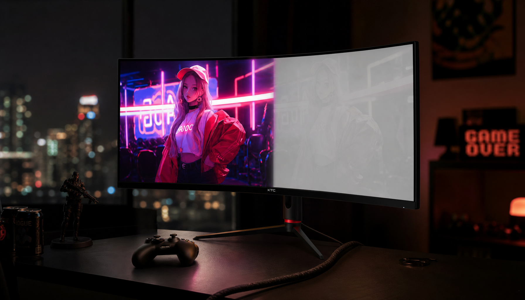
A large monitor can create its own viewing-angle problem even when you sit directly in front of it. On a 32-inch flat display, and especially on a 34-inch or 49-inch ultrawide, your eyes view the center almost straight-on but see the left and right edges from a steeper angle. If the panel is VA or TN, those edges may appear lower in contrast, slightly washed out, or less sharply separated than the center.
This is one reason a monitor can look good in a straight-on product photo but feel uneven on a real desk. Large VA screens, ultrawides, and flat panels show edge inconsistency more clearly because the viewer naturally sees screen edges from sharper angles. For productivity, that can make spreadsheet columns, code panes, or browser tabs near the edge look less crisp than the active window in the center.
Curved Ultrawides Help, But Only for the Centered User
A curved ultrawide reduces the angle between your eyes and the screen edges. That can make a VA ultrawide look more uniform for gaming and movies because the far edges are angled back toward you. For a single-user setup, especially at a normal desk distance, curvature can make the far corners feel less faded and keep HUD elements easier to scan.

The limitation is that curvature mainly benefits the person sitting in the sweet spot. If two people are watching from a couch, or if you often lean far to one side while using a racing wheel, flight stick, or second keyboard, a curved VA panel will not eliminate panel-level viewing-angle shift. IPS or OLED is usually more forgiving when multiple people need a clear view or when the monitor is used from changing positions.
Text Clarity Depends on Angle, Pixel Density, and Subpixels
Why Text Can Look Soft Off-Center
Text is one of the fastest ways to notice viewing-angle sharpness loss. Fine black letters on a white background rely on clean edge contrast, consistent brightness, and predictable subpixel rendering. When the screen is viewed off-axis, strokes can look thinner, thicker, gray, or slightly smeared because the tone balance around each letter changes.
An independent review platform evaluates monitor text clarity using normal viewing conditions, close-up photos, native resolution, default sharpness, and default operating-system scaling, which reflects how most people actually use a monitor. Its methodology also highlights why subpixel layout matters: most IPS, VA, and TN monitors use RGB subpixels, while WOLED, QD-OLED, and some BGR monitors use layouts that can affect font edges.
Pixel Density Can Hide Some Weaknesses
Higher pixel density makes many sharpness problems less visible. A 27-inch 4K monitor generally hides text fringing better than a 27-inch 1440p monitor, and both usually hide it better than a 24-inch 1080p screen at the same desk distance. As a straightforward example, a 27” 4K 160Hz/320Hz 90W gaming monitor pairs a 27-inch 4K panel with IPS, a combination that can help preserve perceived sharpness when you are not perfectly centered. This matters for OLED monitors with nonstandard subpixel layouts, where higher density can reduce the visibility of colored edges around small text.

An operating system’s font-smoothing feature can improve the apparent sharpness of diagonals and curves, especially on lower-resolution displays, but it is not a cure for viewing-angle instability. If a VA or TN screen loses contrast at the top, bottom, or sides, the font-smoothing feature cannot restore the original tone accuracy. For work-heavy setups, evaluate text at your normal chair position, then lean left, right, up, and down to check whether letters stay equally readable across the screen.
Settings That Improve or Hurt Perceived Sharpness
Avoid Using Sharpness as a Fix for Viewing Angle
The sharpness control on most LCD and OLED monitors is usually edge processing, not a real resolution upgrade. Raising it can increase local contrast around edges, which may create bright halos, dark halos, ringing, and rough text outlines. From an off-center angle, those artifacts can become more obvious because the panel is already shifting contrast and gamma.
This is also where black crush can appear. Black crush happens when separate dark tones visually merge into one dark area, hiding shadow detail. High sharpness can make near-black transitions harder to distinguish, especially when contrast, gamma, black level, or dynamic contrast is already aggressive, so the “sharper” image may actually contain less useful detail.
Use a Practical Calibration Flow
Start with a standard, sRGB, or custom picture mode instead of a vivid or dynamic mode. Set the monitor to native resolution, adjust brightness for the room, keep contrast close to default, and lower sharpness until halos around text and high-contrast edges disappear. Then check a near-black test pattern or a dark game scene where you can distinguish shadow steps without the image looking washed out.
Gamma also matters. A 2.2 gamma target is commonly used as a default for monitor use, while higher gamma darkens shadows and midtones. On VA and OLED displays, overly dark gamma settings can make shadow edges look more dramatic from the center but harder to read off-axis; on IPS, aggressive contrast or dynamic modes can exaggerate gray blacks and make edge clarity feel less natural.
Buying Guidance by Use Case
Choose Based on How You Actually Sit
For solo gaming from a fixed centered position, VA can be a strong value if you like deep blacks and high contrast. It is especially compelling for story games, horror games, movies, and dark-room use, where the extra contrast helps perceived depth. A curved VA ultrawide is often more practical than a flat VA ultrawide because it reduces edge-angle problems for the person in the center seat.
For productivity, color-sensitive work, shared viewing, and mixed-use desks, IPS is usually the safer LCD choice. IPS panels generally hold brightness and color more consistently than VA when viewed off-axis, so toolbars, text columns, timelines, and browser windows stay more even across the screen. IPS Black can improve contrast compared with traditional IPS while keeping much of the IPS viewing-angle advantage.
Match Panel Type to Monitor Format
Portable monitors deserve special attention because their height, tilt, and stand stability vary a lot. A 1080p portable monitor may benefit from a small sharpness adjustment if scaling looks soft, but it should still preserve near-black detail and avoid halos around text. If you frequently use a portable display beside a laptop, prioritize IPS or OLED because side-by-side viewing often places one screen at an angle.
For high-refresh-rate gaming, viewing angle is still relevant even if response time and refresh rate dominate the spec sheet. A 240 Hz or 360 Hz screen that looks washed out when you lean back or move vertically can feel less clear in motion because the image loses contrast. For competitive play, align your eyes with the screen center, keep the panel perpendicular to your face, and avoid placing critical HUD elements on the far edge of a large VA or TN display.
FAQ
Q: Why does my monitor look less sharp from the side if the resolution is unchanged?
A: The pixel count is unchanged, but your eyes are seeing a different version of the image. Off-axis viewing can reduce contrast, lift blacks, shift gamma, wash out colors, or dim brightness. Since edge clarity depends on tone separation, those changes make text, UI lines, and game details look softer even at native resolution.
Q: Is a 178° viewing-angle rating reliable for buying a gaming monitor?
A: It is useful only as a basic visibility number. A 178° rating usually means the image remains viewable under a low contrast threshold, not that the monitor stays accurate or sharp from that angle. For real buying decisions, compare panel type, independent viewing-angle tests, screen size, curvature, and your expected seating position.
Q: Do curved monitors fix viewing-angle sharpness problems?
A: Curvature can reduce edge-angle problems on wide monitors, especially VA ultrawides used by one centered person. It does not change the panel’s underlying viewing-angle behavior, and it does not help much for people sitting off to the side. For shared viewing or frequent posture changes, IPS or OLED remains more consistent.
Practical Next Steps
Start by deciding whether your monitor will be used mostly by one centered person or from multiple positions. If you sit centered and want deep blacks for games and movies, consider VA, preferably curved for ultrawide sizes. If you need consistent text, color, and UI clarity across the screen, choose IPS or IPS Black. If budget allows and text rendering is acceptable for your software, OLED offers the strongest off-axis image stability.
Before keeping a new monitor, test it the way you actually use it. Open black text on a white page, a neutral gray background, saturated colors, and a dark game or movie scene. Sit at your normal desk distance, then lean left, right, above, and below center. Watch for gray blacks, color washout, dim edges, hue drift, shadow crush, and halos. A monitor that stays readable in those tests will feel sharper every day than one that only looks impressive straight-on.
References
- KTC, Why Sharpness Causes Black Crush on Your Monitor
- KTC, VA Panels: High Contrast vs. Viewing Angle Limits
- KTC, Monitor Viewing Angle Explained: What 178° Really Means
- KTC, Monitor Viewing Angle Explained: What 178° Really Means
- RTINGS, Our Monitor Picture Quality Tests: Text Clarity
- RTINGS, Our Monitor Picture Quality Tests: Vertical Viewing Angle
- KTC, VA Panel Contrast: Why It Fades Off-Center


