


Usually not. Higher sharpness can make edges look more defined at first, but it does not create real detail and often adds halos, ringing, and eye strain.
Does your screen look a little fuzzy even though the monitor is expensive and your game or spreadsheet should look cleaner? In most cases, the biggest improvement comes from fixing resolution, scaling, and picture mode first. Sharpness is usually a final adjustment, not the main solution.
The Short Answer
Monitor sharpness does not add pixels or increase resolution; it changes edge contrast so borders look more pronounced. That can make text, HUD elements, or distant targets appear crisper at a glance, but it is still post-processing. On a properly configured monitor running at its native resolution, the best sharpness setting is often the neutral one rather than the highest one.
In everyday use, the downside shows up quickly. Push sharpness too far on a desktop monitor and black text starts to glow, diagonal lines look jagged, and skin, grass, or UI outlines become brittle instead of clean. That is why monitor settings guidance generally treats sharpness as a control best left at default unless visible blur or halos justify a small adjustment.
What the Sharpness Control Actually Does

Image sharpening works by emphasizing transitions between dark and light areas. In plain terms, the monitor boosts local contrast around edges so your eye reads them as more defined. This is the same basic idea behind unsharp masking and edge peaking: contours become punchier even though the underlying image information has not increased.
That distinction matters because “looks sharper” and “contains more detail” are not the same thing. A 27-inch 1080p panel still has the same pixel structure whether sharpness is set to 20, 50, or 80. If the panel looks coarse from your seating distance, or if the source image is soft, no OSD slider can turn it into a 27-inch 1440p or 4K display. KTC’s explanation of fine-detail clarity makes the point clearly: native resolution and pixel density create real detail, while sharpness is only a finishing filter.
Why More Sharpness Often Looks Worse

Over-sharpening commonly creates halos, ringing, and false outlines. That result is not limited to consumer monitor advice. Image-quality research also shows that sharpening can measurably change image characteristics and increase overshoot artifacts. Different field, same visual risk: the image may look more dramatic while becoming less reliable.
The easiest way to spot this on your own display is with black text on a white background. Open a document, browser page, or code editor and raise sharpness until the letters gain a bright fringe or dark echo. Once that happens, readability usually gets worse, especially over long sessions. Practical calibration notes describe this as aiming for optical transparency, where the setting neither softens the image nor adds artificial edges.
There is also a comfort cost. A screen that looks extra crisp for 30 seconds can become tiring after three hours because your eyes are constantly resolving boosted borders instead of natural ones. That is why office displays, coding monitors, and portable productivity screens usually work best near neutral sharpness rather than at the high end.
When Increasing Sharpness Can Help

Sharpness can be useful when the monitor is scaling an image. That is the main exception. If you feed a panel a non-native signal, or use a display mode that softens fine edges, a modest increase may recover some perceived crispness. It still does not restore lost detail, but it can make the result easier to read.
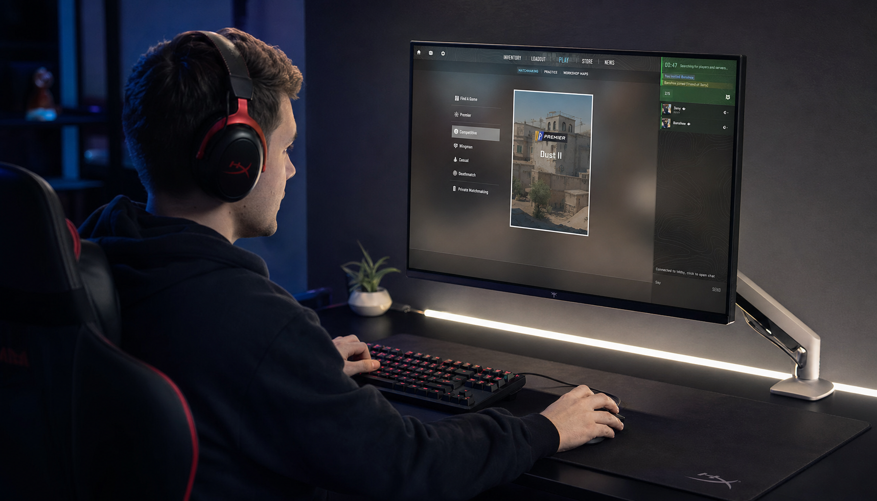
This comes up more often in gaming than in content creation. A competitive player on a softer-looking 1080p screen may prefer a moderate bump because enemy silhouettes, map lines, or nearby crosshair detail stand out faster. Gaming monitor setup guidance frames competitive tuning as a balance of visibility tools rather than pure image accuracy, which is exactly where a mild sharpness increase can make sense.
The key word is mild. If you move from neutral to slightly above neutral and distant enemies separate a bit better without shimmering fences, sparkling foliage, or crunchy UI edges, the setting is helping. If the image starts advertising the processing, you have already gone too far.
When You Should Leave Sharpness at Neutral
For photo editing, video work, and color-critical viewing, neutral sharpness is usually the right choice. Those tasks depend on fidelity, not edge exaggeration. A sharpened preview can trick you into thinking focus, micro-contrast, or texture is better than it really is.
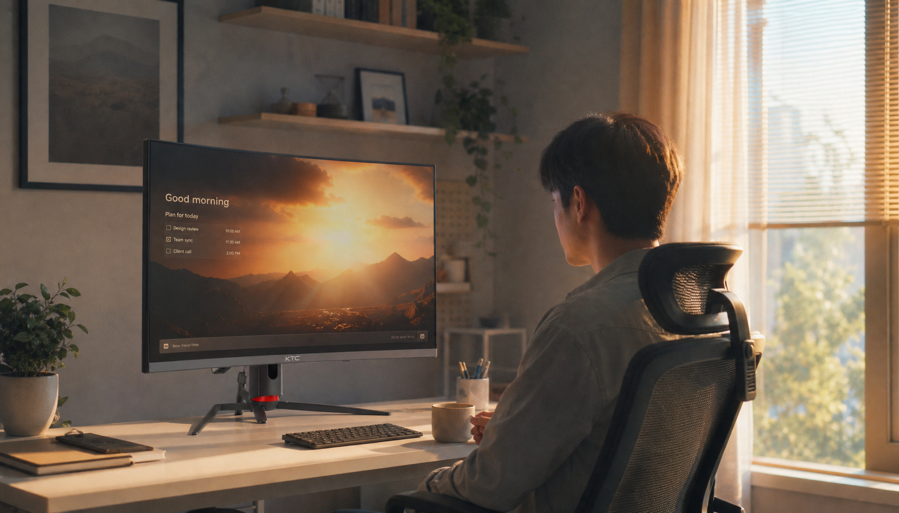
Text-heavy work belongs in the same category more often than people expect. Word processing, spreadsheets, coding, and web research benefit from stable letterforms, not etched-looking outlines. If you spend an eight-hour day on an office monitor or portable second screen, a neutral or slightly soft setting is often more comfortable than an aggressive one.
There is also no performance gain here. Monitor guidance on image controls notes that monitor-side sharpness does not improve frame rate because the processing happens inside the display. If your goal is smoother gameplay, refresh rate, response behavior, and sync settings matter far more.
A Practical Way to Set Sharpness Correctly

Start by fixing the signal path before touching the slider. Use the monitor’s native resolution and a proper digital connection, and disable heavy enhancement modes such as “Super Resolution,” “VividPixel,” or similar extras. If the screen is too bright, too contrasty, or badly scaled, sharpness becomes a bandage for the wrong problem.
Then use a simple halo test. Set sharpness very high, look at black text, thin spreadsheet lines, and diagonal edges, and slowly lower the control until the glow or edge shimmer disappears. On many monitors, the neutral point lands around the middle of the scale, but not always. Some 4K displays need less, some softer 1080p screens tolerate a little more, and some monitors label neutral as 0 rather than 50.
The decision becomes easier if you think in terms of use case rather than fixed numbers:
Use case |
Best target |
Office work, coding, writing |
Neutral to slightly soft |
Photo and video editing |
Neutral |
Competitive FPS gaming |
Neutral to slightly elevated |
Movies and single-player games |
Neutral or slightly below competitive gaming settings |
That pattern is consistent across multiple practical guides. KTC’s tuning advice and practical calibration notes both point toward modest, task-specific adjustment rather than maxing out the control.
The Real Fix for a “Blurry” Monitor
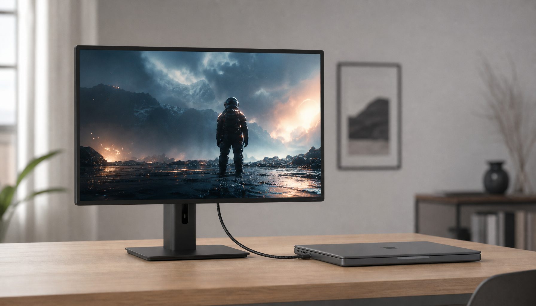
Better image quality comes from the right panel, resolution, and setup, not from forcing the sharpness slider upward. If a 15-inch portable display at 1920×1200 looks cleaner than a larger 1080p desktop monitor, that is not magic OSD tuning. It is pixel density doing real work.
This is where buying decisions matter more than menu adjustments. For gaming, motion clarity, response tuning, and refresh behavior often change what you actually perceive more than sharpness does. For office productivity, the right pairing of screen size and resolution will beat any sharpening trick every time. For portable smart screens, a denser panel lets you run lower sharpness while keeping text crisp and reducing fatigue.
A strong monitor should not need to be rescued by its sharpness control. Use the slider as a finishing tool, keep it conservative, and judge success by clean edges that stay comfortable after hours, not by the first five seconds of extra punch.


