


Contrast ratio only feels impressive when the room lets the display preserve black depth, shadow detail, and glare control. Bright rooms raise the apparent black floor, while very dark rooms can make the same screen feel too intense unless brightness is matched to the space.
Does your premium monitor look punchy at night but flat beside a sunny window? A practical setup can protect dark-scene detail, reduce glare, and make text easier to read without chasing inflated contrast specs. Here is how to match display type, brightness, and room lighting so the image looks clean where you actually use it.
Why Contrast Ratio Changes Once the Lights Are On
Contrast ratio describes the gap between the brightest white and darkest black a display can produce. A 2,000:1 display means white is 2,000 times brighter than black under the measurement conditions used. That sounds simple, but perceived contrast is not only a monitor property. It is the result of panel performance, screen brightness, surface reflectance, room light, viewing angle, and your eyes adapting to the environment.
A monitor’s advertised contrast is usually measured in controlled conditions, but real rooms are messier. Ambient light can reduce usability and perceived image quality by lowering visible contrast, increasing reflections, and making content harder to detect, especially under bright indoor or outdoor lighting. Research on ambient illumination describes lighting as a situational impairment because it can temporarily degrade readability, comfort, immersion, and satisfaction across device types.
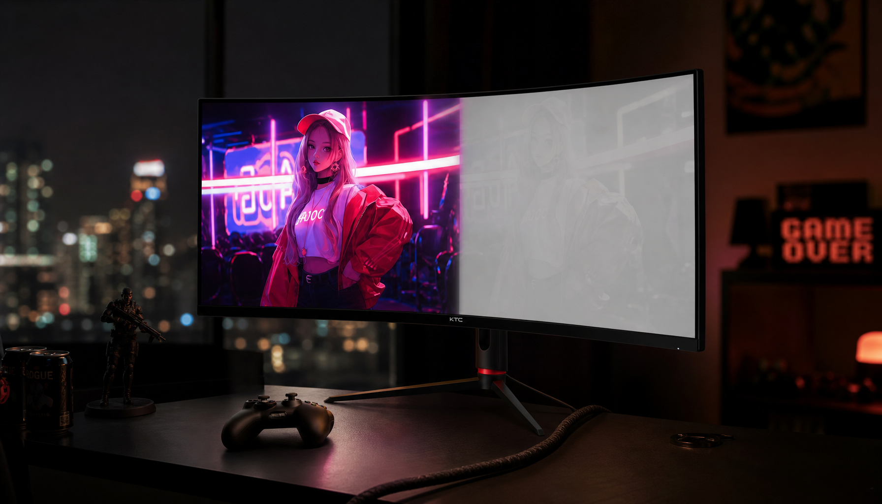
For a gaming example, picture a dark stealth level on a VA or OLED screen. In a dim room, a black hallway can look deep, and a faint enemy outline can remain visible. Put the same screen across from an uncovered window, and reflected light brightens the “black” parts of the image. The panel did not lose its native contrast, but your eye sees less separation between dark gray and black.
Static, Dynamic, and Ambient Contrast Are Not the Same
Static contrast is the useful baseline because it describes what the panel can do under fixed conditions. Dynamic contrast changes brightness over time, often by dimming the backlight in dark scenes and boosting it in bright scenes. Ambient contrast is the real-world result after room light and reflections hit the screen.
Contrast Type |
What It Tells You |
Practical Value |
Static contrast |
Hardware-level white-to-black separation under fixed settings |
Best starting point for monitor comparison |
Dynamic contrast |
Scene-by-scene processing or backlight adjustment |
Can add punch, but may distort accuracy |
Ambient contrast |
Visible contrast in the actual room |
Most relevant to daily image quality |
The catch is that dynamic contrast numbers can be huge and still less useful than a modest native contrast ratio. A display contrast explainer notes that dynamic contrast claims can depend heavily on processing and may be misleading when compared across brands. In practice, a stable 2,000:1 static contrast monitor in a controlled office can look better than a flashy “millions to one” spec fighting glare.
For portable smart screens, dynamic contrast ratio can be helpful because the environment changes often. A portable monitor used in a hotel room, airport lounge, or bright kitchen may benefit from automatic backlight adjustment, but DCR can also shift color, over-brighten scenes, or make text-heavy work less natural. The impact of DCR is strongest when convenience and punch matter more than color-critical accuracy.
Room Lighting Raises the Black Floor
The most important interaction is black level. In a dark room, black is limited mostly by the display. In a bright room, black is limited by reflected light from the panel surface. That is why a monitor with excellent contrast can still look washed out under direct light.
A simple way to think about it: if your monitor’s black level is already low, any extra reflected light becomes a large percentage of the visible black. Whites can usually fight back with brightness, but blacks cannot emit “less than black.” This is why matte coatings, anti-glare treatment, window placement, and controlled lighting matter as much as raw contrast for office productivity.
Bright room performance is not just about being brighter. If a screen gets brighter but also reflects a lamp or window, the image may still look low contrast. Ambient contrast ratio matters because normal rooms are much brighter than dark testing environments, so a specification measured in very dim conditions may not predict office or living-room performance.
For an office example, a 27-inch productivity monitor near a side window will usually look better with blinds partially closed and the screen angled away from reflections than with brightness simply pushed to maximum. Maximum brightness can keep whites visible, but it can also make spreadsheets harsh and increase fatigue during long sessions.
Dim Rooms Can Make High Contrast Feel Harsh
A dark room improves black depth, but it can also make a bright monitor feel like a light source aimed straight at your face. This is where perceived image quality and comfort split. The image may look dramatic for games and movies, yet exhausting for writing, coding, or late-night browsing.
Display brightness should be matched to room brightness rather than left at factory defaults. A calibration workflow should use the same lighting where the monitor is normally used, because settings made beside a bright window can feel too dim at night, while dark-room settings can wash out in daylight. KTC’s brightness and contrast calibration advice recommends using black-level and white-level patterns so shadows stay visible and near-white detail does not merge into a flat block.
Bias lighting helps in dim rooms when used correctly. A neutral light behind the display reduces the jump between the bright screen and dark surroundings, which can make perceived contrast feel more controlled. It does not turn a low-contrast panel into an OLED, but it can make long gaming or editing sessions more comfortable.

Panel Type Decides How Much Room Light Hurts
OLED, VA, IPS, and TN panels react differently to lighting. OLED has exceptional black depth because pixels can shut off, but glossy or semi-gloss surfaces can still reflect bright objects. VA panels often deliver stronger native contrast than IPS, making them attractive for dark games and movies, but glare can hide shadow detail. IPS panels usually have lower native contrast but more consistent color and viewing angles, which helps in shared workstations and wide desks. TN panels are less common for premium image quality because viewing-angle shifts can change perceived contrast quickly.
For productivity, IPS remains a strong default when color stability and text clarity matter. For dark-room media and immersive gaming, VA and OLED have clear contrast advantages. For portable screens, matte surface quality and brightness flexibility often matter more than a headline contrast number because the screen may move from a desk to a coffee shop to a hotel nightstand.

A work monitor buying guide notes that panel types differ by use case: IPS is broadly useful for productivity, VA offers deeper contrast, and OLED delivers premium contrast with higher cost and burn-in considerations. That is the right buying frame: choose the panel for the room and workload, not the spec sheet alone.
How to Tune Contrast for Your Room
Start with the room before touching the monitor. Move bright lamps so they do not hit the screen directly, place windows to the side when possible, and avoid mixed warm and cool bulbs if color judgment matters. Neutral, diffuse light is easier on the eyes than a bright point source reflected in the panel.
Next, set brightness so a white document on screen does not overpower the room. In a typical office, that often means stepping down from factory brightness. Then use a black-level test pattern and adjust brightness until the darkest near-black detail is barely visible without turning black into gray. After that, use a white-level ramp and raise contrast only until near-white steps remain distinct. If the last few steps disappear, the monitor is clipping highlight detail, even if the image looks punchy at first glance.
Disable dynamic contrast, eco modes, black enhancers, HDR simulation, and aggressive game presets while calibrating. Once the baseline is clean, you can re-enable a gaming mode or DCR feature if it improves the specific content you play. For competitive gaming, visibility and response matter more than cinematic black depth. For single-player HDR-style immersion, deeper blacks and controlled lighting matter more.
Practical Settings by Use Case
Scenario |
Room Strategy |
Display Priority |
Competitive gaming |
Moderate ambient light, no direct glare |
High refresh, clear shadow visibility, stable gamma |
Story games and movies |
Dim room with neutral bias light |
High native contrast, OLED or VA if practical |
Office productivity |
Even room light, matte screen, side-positioned windows |
Text clarity, ergonomic brightness, anti-glare coating |
Portable smart screen |
Flexible brightness, avoid direct sunlight |
Matte finish, strong peak brightness, usable presets |
Color work |
Controlled neutral lighting |
Fixed brightness, accurate preset, DCR disabled |
One calculation helps make the tradeoff concrete. If a monitor looks excellent in a dim room but a bright window reflection lifts perceived black by even a small amount, dark scenes lose separation first. You may still read email, but smoky game environments, dark UI themes, and photo shadows will look flatter. That is why a $300.00 monitor placed well can sometimes look more convincing than a more expensive panel aimed at a window.
Blue Light, Evening Use, and Perceived Comfort
Room lighting also affects how intense the screen feels at night. Blue-rich LED lighting and screens can influence circadian timing, especially during evening use. The discussion of blue light exposure highlights that white LEDs often include a blue peak, and warmer-looking light does not always reveal the full spectral profile.
For image quality, do not judge color with night modes enabled. Low-blue or warm modes are useful for late reading and comfort, but they change whites, skin tones, and saturation. Use them after work is done, not while editing product photos, grading video, or comparing monitor color.
The Buying Rule That Saves Money
Do not buy contrast in isolation. Buy contrast for the lighting you can control. A high-native-contrast display is powerful in a dim, well-managed room. In a bright office, anti-glare handling, adequate brightness, stable viewing angles, and sensible calibration may deliver a bigger visible upgrade than a larger advertised ratio.
For most users, the best value path is a monitor with honest static contrast, enough brightness for the room, a matte or low-reflection surface, and presets you can actually tune. For immersion-first gaming, prioritize OLED or a strong VA panel if your room can be kept dim. For office productivity, prioritize text clarity, ergonomics, and glare control before chasing theatrical black levels.
Great contrast is not just a number; it is a system. Control the light, match brightness to the room, verify black and white detail with patterns, and the screen will look sharper, deeper, and easier to live with every day.


