


Display brightness does not replace contrast ratio; it changes how much contrast your eyes actually perceive. A brighter screen can make images look punchier in bright rooms, but true depth still depends on black level, static contrast, gamma, ambient light, and panel technology.
Does your new gaming monitor look vivid at the store but flat on your desk at night, or does your office display seem sharp in the morning and washed out by afternoon glare? In practical setup work, matching brightness to the room first makes text separation, shadow detail, and highlight clarity easier to judge without chasing random contrast settings. You’ll learn how brightness and contrast interact, what specs matter, and how to tune a monitor for gaming, productivity, and portable use.
Brightness and Contrast Are Related, But Not the Same Thing
Brightness is the amount of light a display emits. In monitor specs, you will usually see it described in nits, where a higher number means the screen can produce more light. Contrast ratio describes the gap between the brightest white and darkest black a screen can produce, so a 1,000:1 contrast ratio means white is 1,000 times brighter than black under that measurement method.
The relationship is simple at first: if a monitor raises white brightness while black stays equally dark, measured contrast improves. If brightness rises but the black floor rises too, the image may look brighter without gaining real depth. That is why an over-bright IPS office monitor can still look gray in dark scenes, while an OLED can look dimensional at lower brightness because its black level is far lower.
For example, imagine two monitors showing peak white at 300 nits. If one has a black level of 0.3 nits, its contrast is 1,000:1. If another has a black level of 0.1 nits, its contrast is 3,000:1. Both are equally bright at the top end, but the second monitor will usually show deeper shadows, cleaner edges, and stronger depth.
Perceived Contrast Depends on Your Eyes and the Room
Perceived contrast is not just the number printed on a spec sheet. It is the contrast your visual system can separate under real conditions. Brightness affects eye adaptation, and the room affects black level through glare and reflections. A display that measures well in a lab can look weaker in a sunlit room because ambient light lifts dark tones and reduces the visible gap between black and white.

A display-perception discussion highlights the practical point: human contrast perception changes with scene brightness and stimulus size, so brighter scenes allow the eye to perceive contrast differently than very dark scenes. That helps explain why a monitor with strong peak brightness can feel more vivid in games or HDR scenes, even when its native contrast ratio is not class-leading.
In a bright office, raising brightness can improve perceived contrast because text and UI elements overcome reflections. In a dark room, pushing brightness too high can make blacks look elevated, fatigue your eyes, and make subtle gray differences feel harsher rather than clearer. The best setting is not maximum brightness; it is the brightness where white looks like illuminated paper, not a lamp.
Static Contrast Matters More Than Huge Dynamic Numbers
Static contrast, sometimes called native contrast, measures how bright and dark areas perform at the same time. Dynamic contrast measures changes across time, often by dimming or brightening the backlight scene by scene. That can create dramatic marketing numbers, but it does not always represent what happens when a game HUD, bright sky, and dark hallway appear in the same frame.
Display buying resources consistently warn that dynamic contrast figures can look extremely high while static contrast remains the more useful baseline for real image quality. For monitor buyers, this matters because a claimed 1,000,000:1 dynamic contrast ratio may tell you less than a verified 2,000:1 or 3,000:1 static contrast ratio.
For productivity, a 1,000:1 class display can be perfectly usable for documents, spreadsheets, email, coding, and browser work. For cinematic gaming, darker RPGs, horror titles, HDR-style visuals, and media viewing, stronger native contrast gives shadows more shape and highlights more authority. The practical upgrade is not just brighter; it is brighter without turning black into gray.
Why Higher Brightness Can Improve Perceived Contrast
Brightness helps when the environment is fighting the screen. A portable smart screen used near a window, a gaming monitor in a bright dorm room, or an office display under overhead lighting needs enough luminance to keep whites clean and midtones visible. If the screen is too dim, dark grays collapse together and light gray UI panels lose separation.
Monitor buying guidance for work displays emphasizes matching the display to comfort, productivity, and environment, with matte anti-glare finishes helping typical office users manage reflections. In practice, brightness and anti-glare treatment work together: brightness pushes the image above room light, while surface treatment reduces the light bouncing back at your eyes.
For example, a 300-nit portable display may look strong in a shaded apartment but struggle beside a bright window. A 400-nit monitor with a matte surface can hold text and chart contrast better in the same space. That does not mean it has better native contrast; it means its perceived contrast survives the room better.
Why Higher Brightness Can Also Hurt Contrast
Too much brightness can make the image feel less refined. On many LCD monitors, raising brightness increases the backlight output, but the panel still blocks light imperfectly. In a dark room, that can make black scenes look lifted and gray, especially on lower-contrast IPS panels. The result is a bright image with weak depth.
Brightness can also make design hierarchy harder to read. Secondary text, disabled buttons, subtle dividers, gridlines, and gray UI panels depend on small tonal differences. If the screen is too bright for the room, those differences can feel harsh or blown out. If it is too dim, they can disappear into the background.
A simple office example is a spreadsheet with white cells, pale gridlines, blue headers, and gray comments. At the right brightness, the sheet is readable for hours. Too dim, and the grid structure becomes mushy. Too bright, and the white background dominates everything, making your eyes work harder than the content deserves.
Panel Type Changes the Brightness-Contrast Tradeoff
Different panel technologies respond differently to brightness. Typical IPS monitors offer strong color and viewing angles, but native contrast often sits around the basic office range. VA panels usually deliver deeper blacks and stronger contrast, which can help games and movies feel richer. OLED and QD-OLED can produce near-black pixels with exceptional depth, though they carry cost and static-image considerations for office-heavy use.
Monitor guidance notes that panel type strongly affects image behavior, with OLED and mini-LED panels often performing especially well for HDR while higher-contrast IPS variants can improve on standard IPS. That is why a monitor with moderate brightness but excellent black level can outperform a brighter monitor with weak blacks in a dim room.
For a competitive gamer, brightness supports visibility, but response time, refresh rate, and black handling still matter. For a financial analyst or developer, contrast should support text clarity and interface separation without causing fatigue. For a portable screen user, brightness headroom is valuable because the environment changes more often.

Use Case |
Brightness Priority |
Contrast Priority |
Practical Target |
Office productivity |
Medium |
Medium |
Comfortable white background, readable gray UI, low glare |
Competitive gaming |
Medium to high |
Medium |
Clear enemies in shadows without washed-out textures |
Cinematic gaming |
High |
High |
Strong highlights, deep blacks, stable shadow detail |
Portable screen |
High |
Medium |
Enough brightness to overcome changing room light |
Creative review |
Controlled |
High |
Stable tone, neutral gamma, consistent blacks |
The Medical Display Lesson: Ratio Alone Can Mislead
A useful nuance comes from medical display research, where visibility is not about attractive images but about whether trained observers can detect fine detail. A study in the National Library of Medicine tested display luminance settings with different luminance ratios, including 1-250, 6-500, and 12-750 nits, while keeping the same perceptual JND range. The key finding was that lower luminance ratios could still preserve perceived contrast when the perceptual range was maintained.
That does not mean contrast ratio is useless. It means the eye does not respond to display specs in a perfectly linear way. Fine detail, dark pixel values, luminance range, and viewing conditions all influence whether contrast is actually visible. The same study found that high-frequency patterns required much higher contrast than low-frequency patterns, which matches real monitor use: tiny text, fine map lines, and subtle texture need more careful setup than large blocks of color.
For daily users, the lesson is practical. Do not buy by one spec alone. A monitor with strong native contrast, stable gamma, adequate brightness, and a suitable coating will usually outperform a spec-sheet champion that gets one number right and the rest wrong.
How to Set Brightness and Contrast for Real Use
Start with the room, not the monitor menu. Put the display where direct sunlight and strong reflections are minimized. Then set brightness so a white document looks similar to a piece of white paper under the same lighting. In a bright room, that may mean using much of the monitor’s brightness range. At night, it often means lowering brightness substantially.

After brightness feels natural, leave contrast near the factory default unless you see clipping. Clipping means near-white steps blend into pure white or near-black steps disappear into black. A grayscale test image is useful here: you should see separation in the brightest and darkest patches without turning blacks into fog.
For SDR desktop use and most games, use a standard or sRGB-like mode when available. Avoid vivid, racing, and dynamic contrast presets for serious setup because they often exaggerate brightness, color, and shadow behavior. If you play esports titles, a slightly lifted shadow setting can help visibility, but treat that as a competitive preference, not accurate image quality.
Buying Advice: What to Prioritize
If you work mostly in documents, dashboards, coding tools, and browser tabs, prioritize brightness comfort, matte finish, text sharpness, ergonomic adjustment, and a reliable static contrast ratio. KTC work-monitor buying guidance recommends matching resolution and panel type to the job, with QHD at 27 inches described as a productivity sweet spot.
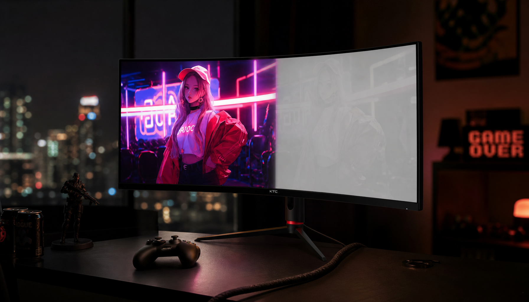
If you game in mixed lighting, look for enough brightness to resist glare, but do not ignore native contrast. A contrast guide frames 3,000:1 contrast as stronger than 1,000:1 for richer visuals, which aligns with the real-world difference many users see when moving from standard IPS to VA or higher-contrast technologies.
If you want HDR impact, brightness headroom becomes more important, but only when paired with local dimming, OLED-level blacks, or another technology that can keep dark areas dark. Peak brightness without black control gives you glare, not immersion.
FAQ
Does turning up brightness increase contrast ratio?
It can increase measured contrast only if black level does not rise along with white level. On most LCD monitors, raising backlight brightness makes the whole panel brighter, so perceived visibility may improve in a bright room, but native contrast does not necessarily improve.
Is contrast more important than brightness?
For image depth, black levels, and dark-scene detail, contrast is usually more important. For bright rooms, portable displays, and glare-heavy setups, brightness may matter more because the screen first has to stay visible.
What contrast ratio is good for a monitor?
For general office work, around 1,000:1 can be adequate. For gaming, movies, and more immersive visuals, 2,000:1 to 3,000:1 or higher is more satisfying when the measurement is static contrast rather than dynamic contrast.
Final Word
Brightness controls how hard the screen pushes through your environment; contrast controls how much depth the image can hold. The best display is not the brightest one on the shelf, but the one that keeps blacks disciplined, whites clean, and details readable in the room where you actually play, work, and create.


