


Ambient lighting can make a calibrated display look wrong even when calibration is technically correct. Control glare, white point, brightness, and surrounding colors before blaming the monitor.
Does your edited photo look neutral at midnight but oddly warm the next morning, or does a game scene lose shadow depth when sunlight hits the desk? A calibrated workflow can give you repeatable color, but only if the room stops changing the visual reference around the panel. Here is how ambient lighting shifts perceived accuracy and how to set up a display that stays trustworthy for work, play, and portable use.
Why a Calibrated Display Can Still Look Off
Calibration adjusts the display toward known targets such as white point, gamma, luminance, and color response. Profiling describes the calibrated display so color-managed software can translate colors more accurately. That distinction matters because calibration and profiling are not the same job, and neither one can fully control the light hitting your eyes from the room.
Ambient light changes perceived color through adaptation. If the room is filled with warm desk lamps, neutral whites on the display may look cooler by comparison. If the room uses cool overhead LEDs, the same screen may appear warmer or flatter. This is not the display losing calibration; it is your visual system adapting to the environment while the monitor emits its own light.
For example, a 27-inch 4K IPS monitor calibrated for photo work may look balanced in the evening with soft, neutral bias lighting. Put the same monitor beside a bright window at noon, and black areas rise visually, highlight separation feels weaker, and skin tones can look less controlled. The signal did not change. The viewing condition did.
The Three Ambient-Light Problems That Matter Most
Glare Reduces Contrast Before It Changes Color
Glare is the fastest way to undermine confidence in a calibrated screen. A reflection from a window, white wall, glossy desk, or overhead fixture adds stray light on top of the image. That lifts perceived blacks and makes midtones look less rich, which can trick you into adding contrast or saturation that the file does not need.

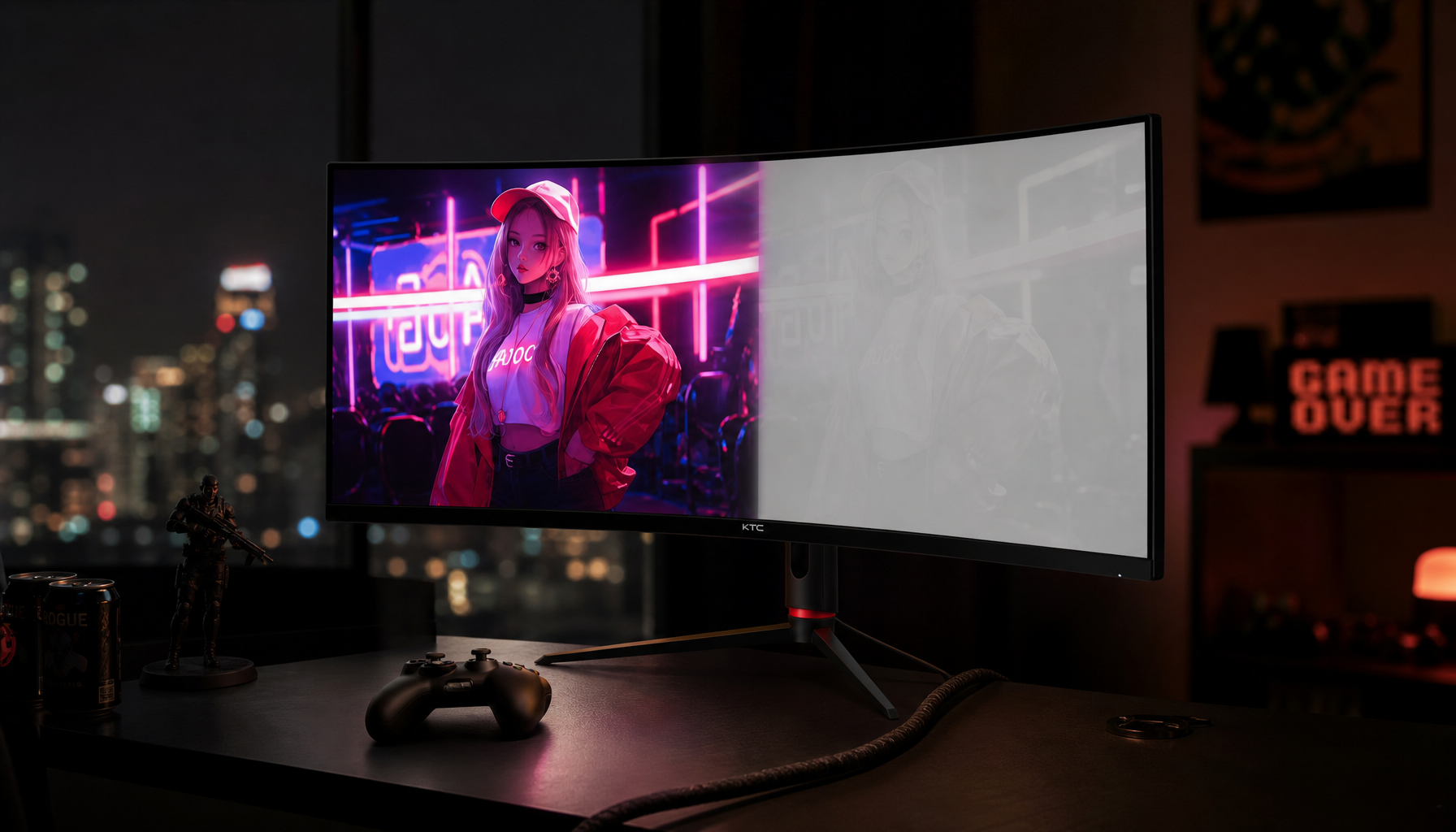
This is especially noticeable in games, HDR media, and dark creative work. A display with impressive black performance can lose its advantage in a bright office if reflections mask shadow detail. In one real-world OLED discussion, a 27-inch 4K OLED measured as accurate yet felt poorly suited to desktop graphics work in a lit office, partly because ambient glare masked its black-point advantage.
The practical fix is physical. Move the screen so windows are beside you rather than in front of or behind the panel. Use blinds, matte desk surfaces, and a monitor hood for serious editing. If you can see a lamp, window shape, or bright shirt reflected in the display, you are not evaluating color under clean conditions.
Room Color Shifts Your White Reference
A calibrated white point is usually chosen around D65 for general creative, web, and productivity use. In plain terms, that aims for a neutral daylight-style white. But your brain judges white against nearby surfaces, so a red wall, wood desk, green plant cluster, or warm lamp can bias your perception.
This is why neutral surroundings are standard practice in color work. The room does not need to look like a lab, but the area behind and around the display should be visually quiet. Viewing conditions matter enough that serious photo workflows recommend dim, consistent room light, neutral backgrounds, and print evaluation under lighting close to the monitor white point.
For a home office, this can be simple. Put a neutral gray or off-white surface behind the monitor, avoid saturated LED strips while editing, and turn off color-warming modes when judging files. A warm lamp is comfortable for email, but it is a poor reference for approving a product photo.
Brightness Mismatch Makes Accuracy Feel Wrong
A display calibrated too bright for a dim room looks punchy but fatiguing. A display calibrated too dim for a bright room looks muddy and weak. In both cases, the user often misreads the problem as poor color accuracy when the immediate issue is luminance matching.
Hardware calibration is valuable here because it lets you set repeatable targets and return to them instead of chasing slider positions by feel. For paid photography, design, print prep, product-color review, or brand asset creation, hardware calibration becomes important because color errors can create reprints, failed approvals, or inconsistent multi-screen decisions.
A practical check is to open a neutral gray image and a white document at the brightness you actually use during the day. If the white document feels like a light source in a dim room, lower luminance or add soft bias lighting. If it looks dull under bright office lighting, reduce glare first, then raise brightness only as much as needed.
How Panel Type Changes the Ambient-Light Story
Panel technology does not replace room control, but it changes the weak points. IPS is usually the reliable productivity choice because it maintains color more consistently across viewing angles. VA can deliver deeper native contrast, but off-angle viewing can reduce shadow confidence. OLED has exceptional pixel-level contrast, but desktop use in bright rooms can expose limits such as reflections, automatic brightness behavior, static UI dimming, and burn-in concerns.
Display Type |
Ambient-Light Strength |
Ambient-Light Risk |
Best Fit |
IPS |
Stable viewing angles and predictable color |
Backlight bleed and lower contrast can show in dark rooms |
Office productivity, design, multi-monitor work |
VA |
Stronger contrast than typical IPS |
Shadow detail can shift off-center |
Media, general work, darker rooms |
OLED |
Deep blacks and strong perceived contrast in controlled light |
Bright offices can mask black advantage; static desktop UI can be a concern |
Media, gaming, dark-room viewing, selective creative review |
Portable IPS/OLED |
Flexible for travel and second-screen work |
Changing rooms make color less repeatable |
Portable work with quick brightness and preset discipline |
Portable smart screens deserve special discipline because the environment changes constantly. A hotel room, coworking table, kitchen counter, and client office can all make the same display appear different. A portable display color strategy should begin with a defined target for gamut, white point, gamma, color depth, and use case, because changing lighting conditions are one of the major barriers to consistent color across devices.
Calibrated Accuracy vs Perceived Accuracy
Measured accuracy answers, “How close is the display to a target?” Perceived accuracy answers, “Does the image look correct to a human in this room?” Both matter. For a product retoucher, measured accuracy protects deliverables. For a competitive gamer, perceived shadow separation affects reaction confidence. For an office power user, stable whites and readable text reduce fatigue across long sessions.
Tight ambient control improves repeatability, print-to-screen judgment, eye comfort, and editing discipline. The tradeoff is practical: controlled lighting takes space, costs some money, and may feel less dramatic than a vivid showroom mode. That tradeoff is worthwhile when the screen is part of a production chain.
Print workflows show the limit clearly. A perfect screen-to-print match is impossible because displays use emitted RGB light while paper reflects light through ink and substrate. Monitor-to-printer color mismatch also depends on profiles, paper choice, printer behavior, and application settings, so ambient lighting is one part of a larger chain rather than a single fix.
A Practical Room Setup for Reliable Color
Start by choosing the most accurate preset, often sRGB or a factory-calibrated mode, then disable dynamic contrast, eco brightness, night modes, and automatic color temperature while judging color. Let the monitor warm up before calibration or critical work, keep the panel clean, and use native resolution. These steps remove common variables that make a calibrated display look inconsistent.

Next, control the room. Use diffuse lighting rather than direct light on the screen. Keep bright windows out of the reflection path. Place a neutral light behind the monitor for evening work if the screen feels harsh in a dark room. Keep surrounding colors subdued, especially behind the panel and in your peripheral vision.
For multi-monitor setups, do not assume matching model numbers mean matching color. Backlight age, coating, panel variation, and brightness uniformity can all differ. IPS panels can also show edge bleed or uniformity variation, and professional color work generally benefits from tighter Delta E and brightness uniformity control; color uniformity issues are easiest to notice on neutral white, gray, and black test screens.

When to Recalibrate
Recalibrate when the room changes, not only when the monitor ages. Moving from a dim studio to a bright office, adding a second display, changing wall color, installing new bulbs, enabling HDR, or switching to a different graphics card can all invalidate the practical viewing condition.
A value-oriented cadence is monthly for paid color work, every few months for serious enthusiast editing, and after major hardware or lighting changes. For general office productivity and gaming, a stable preset plus sensible brightness control is usually enough. For client approvals, brand color, product photos, and print prep, use a colorimeter or spectrophotometer and keep the room visually neutral.
FAQ
Does ambient lighting change the actual calibration?
Ambient lighting usually does not change the stored calibration or ICC profile. It changes how your eyes perceive the calibrated image. Auto-brightness, night modes, HDR tone mapping, eco modes, and dynamic contrast are exceptions because they can alter the display output after calibration.
Is OLED always better for perceived color accuracy?
No. OLED can look spectacular in controlled lighting, but bright offices can reduce its perceived black advantage. For desktop productivity and color work under normal room light, a high-quality IPS display with hardware calibration, matte coating, and stable brightness can be the more reliable tool.
Should I edit in total darkness?
No. Total darkness often makes the monitor feel too bright and contrasty, which can lead to underexposed or undersaturated edits. A dim, consistent, neutral environment with controlled reflections is usually better than a blacked-out room.
A calibrated display is only half the viewing system; the other half is the room. Control the light, reflections, and surroundings, then let calibration do its job. That is how a monitor becomes a trustworthy instrument instead of just a bright rectangle on a desk.


