


Your monitor’s color temperature changes the white point your eyes adapt to, so the same photo or video can look too blue, too yellow, or neutral before you ever touch the white balance slider.
Does your edit look clean on your screen, then strangely warm on a client’s laptop or too cold on your phone? A stable 6500K-style setup, consistent brightness, and disabled automatic color features give you a repeatable baseline before you judge skin, paper, snow, product whites, or game capture footage. This article explains why the monitor setting changes your editing decisions and how to set it up so white balance edits travel better across screens.
Color Temperature Is Your Monitor’s White Point
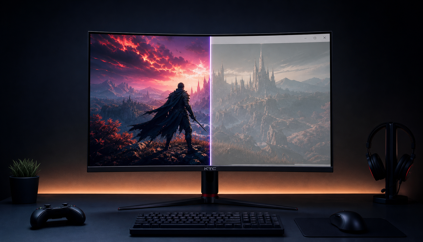
Color temperature describes whether your display’s white appears warm, neutral, or cool. Lower values look warmer, with more yellow or red in the image. Higher values look cooler, with more blue in the image. For most web, office, gaming, and SDR creative work, 6500K is the practical neutral target because it aligns with common display standards and everyday content expectations.
That matters because white balance editing is also about deciding what should look neutral. If your monitor is set too cool, a correctly balanced image may look blue to you, so you push the edit warmer. If your monitor is set too warm, you may remove warmth that should have stayed in the image. The file’s RGB values did not change; your viewing reference did.
In real editing sessions, this shows up quickly. A white gaming keyboard in a product shot may look crisp on a Cool preset, but the same image can become sterile after export because you unknowingly warmed the file to compensate. A portrait edited on a Warm preset can leave skin looking pale elsewhere because you cooled the image too aggressively.

Why White Balance Becomes Harder on the Wrong Preset
White balance tools assume you are judging color from a trustworthy display. The eyedropper, temperature slider, tint slider, scopes, and preview window can all be technically available, but your eyes are still making the final call. If the monitor’s white point is drifting, your judgment drifts with it.
A monitor preset can alter the entire visual field. Warm modes can make whites look creamier, gray backgrounds slightly beige, and skin more saturated. Cool modes can make whites look brighter, text appear sharper, and blue highlights feel more intense. That may help comfort or visibility, but it is not neutral color evaluation.
The practical trap is adaptation. After 10 minutes on a blue-heavy screen, your eyes start accepting that blue-white as normal. Then a neutral D65 image can look slightly yellow, even when it is closer to standard output. This is why serious photo and video workflows treat the display as part of the editing pipeline, not as a passive window.

The 6500K Baseline and When to Move Away From It
For most creators, 6500K is the right starting point. Basic display calibration guidance commonly recommends neutral gray balance around 6500K, often labeled Warm or Low on consumer monitors rather than Neutral or Normal neutral gray balance around 6500K. That naming is confusing, but it reflects how many monitors ship with overly cool showroom-style defaults.

Photo editing guidance reaches the same practical conclusion from a workflow angle. Color-sensitive work benefits from disabling automatic display changes, keeping brightness consistent, and avoiding automatic white-point behavior because those features change the screen’s white point while you are editing disabling automatic display changes.
There are legitimate exceptions. Print-oriented prepress work may use a warmer D50-style reference when comparing to paper under controlled lighting. Competitive gaming may favor cooler settings for visibility, especially in dark scenes, while night use may favor warmer settings for comfort. The key is not that one color temperature is universally best. The key is that you should not edit white balance in a performance or comfort preset unless that preset is also your delivery target.
Use Case |
Practical White Point Choice |
Why It Helps |
Photo editing for web |
Around 6500K |
Matches common screen viewing expectations |
SDR video editing |
Around 6500K |
Supports Rec. 709-style monitor judgment |
Warmer controlled target may be used |
Better matches paper viewing conditions |
|
Competitive gaming |
Cooler mode may be useful |
Can increase perceived visibility |
Night office work |
Warmer mode may be comfortable |
Reduces harsh blue-white appearance |
Brightness, Gamma, and Room Light Also Change Your White Balance Decisions
Color temperature is not acting alone. Brightness affects how you perceive contrast and color saturation. Gamma changes midtone visibility. Room lighting changes what your eyes consider neutral. If your monitor is too bright in a dim room, you may underexpose edits or make whites dull. If your room light is warm and your monitor is cool, every neutral decision becomes a negotiation between the display and the environment.
For standard color correction, a moderate luminance target is often better than chasing maximum brightness. Video editing guidance notes that very high brightness is not automatically better and points to 120 nits as a sensible standard LCD correction target 120 nits. Photography workflows also treat 120 cd/m² as a common reference point, with slightly higher levels sometimes used in brighter rooms.
A simple real-world check is to open a neutral gray image, a white browser page, and a known-good portrait. If the gray looks blue, green, red, or yellow before you begin editing, do not fix the photo first. Fix the monitor mode, brightness, room light, and calibration state first.
Calibration Turns “Looks Right” Into a Repeatable Setup
Manual adjustment can get you closer, but hardware calibration is the more reliable route when color affects money, approvals, or print costs. A colorimeter measures the light coming from the screen and builds a profile that color-managed apps can use. Calibration targets white point, luminance, contrast, and gamma, while profiling describes how the monitor actually displays color so software can compensate white point, luminance, contrast, and gamma.

This is where white balance editing becomes more dependable. Instead of asking whether this white looks okay today, you work from a measured display state. You can still make creative choices, but you are no longer compensating for an unknown screen bias.
Before calibration, let the monitor warm up for about 20 to 30 minutes, use the same room lighting you normally edit under, disable Eco Mode and dynamic contrast, and choose a Custom, User, sRGB, or calibration mode. Gaming calibration guidance gives the same baseline logic: warm up the panel, avoid automatic image processing, start from a stable picture mode, and use 6500K as the standard color temperature target 6500K as the standard color temperature target.
Pros and Cons of Changing Color Temperature While Editing
Changing color temperature is not bad by itself. It becomes risky when the purpose is unclear. A warmer monitor can be easier on your eyes at night and may feel more natural for reading. A cooler monitor can make interfaces look sharper and improve perceived contrast in games. A neutral calibrated monitor is less dramatic, but it is the right tool for judging files.
The tradeoff is simple. Comfort presets optimize your viewing experience. Competitive presets optimize visibility. Calibration presets optimize trust. If you edit white balance in a comfort or gaming preset, your exported image may inherit the correction you made against that biased display.
For a creator who games, edits video, and works all day on one screen, the best setup is usually separate monitor modes. Keep one calibrated or sRGB-style mode for editing and productivity. Keep a game mode for responsiveness and visibility. Keep a warmer low-light mode for evening reading. Switch intentionally, and do not make final color calls outside the calibrated mode.
Practical Setup for Better White Balance Edits
Start with the monitor’s native resolution and a digital connection such as HDMI, DisplayPort, or USB-C. Use a neutral picture mode, set color temperature near 6500K, and turn off dynamic contrast, auto brightness, Eco dimming, black enhancement, blue-light reduction, adaptive white point, and similar automatic features. Then set brightness for the room rather than using color temperature as a brightness fix.
Next, use a gray ramp, black-level pattern, and white-level pattern. Black should remain deep without crushing shadow detail. White should stay bright without clipping subtle highlight detail. Gamma around 2.2 is the practical default for most computer and SDR editing workflows, and it gives midtones a predictable shape.
Finally, validate with real content. Use a portrait, a white product photo, a daylight exterior, and a dark scene. If all four look plausible without fighting the white balance slider, your display is giving you a better reference. If one monitor in a dual-screen setup looks blue and the other looks yellow, do not average your edits between them. Pick the calibrated display as the decision screen.

FAQ
Is Warm always more accurate than Normal?
Not always, but many consumer monitors label the closer-to-6500K mode as Warm. Normal can be cooler than expected, especially on displays tuned to look bright in stores. Trust measured Kelvin values or calibration results over preset names.
Should I edit with blue-light reduction on?
No, not for final color decisions. Blue-light reduction changes the screen’s white point, so it changes how you judge white balance. Use it for reading or late-night comfort, then switch back to your neutral mode before editing.
Does a factory-calibrated monitor still need adjustment?
Factory calibration helps, especially on professional displays, but monitors drift over time and your room lighting still matters. If color accuracy affects client work, print matching, or product color, periodic hardware calibration is worth it.
A monitor’s color temperature setting changes white balance editing because it changes your reference for white. Keep a neutral, calibrated mode for creative decisions, save comfort and gaming presets for their own jobs, and your edits will stop chasing the personality of the screen.


