


Your grading monitor should be a stable reference, not a moving target; control brightness, room light, gamma, white point, and display automation before judging color.
Does your grade look rich at night, then muddy, pale, or too dark the next morning? A repeatable monitor setup can keep the same scene from being pushed brighter, darker, warmer, or cooler just because your screen or room changed. Here is a practical workflow for locking brightness down so your color decisions travel better across web, office displays, TVs, and portable screens.
Why Brightness Tricks Your Eye During Color Grading
Brightness is not just how intense the screen feels. It changes how you perceive contrast, saturation, skin tone, and shadow detail. A monitor that is too bright often makes footage look more open and energetic than it really is, so you may grade the image too dark. A monitor that is too dim can push you toward overexposed-looking corrections, raised blacks, or oversaturated color.

For grading, luminance means the light output of the display, measured in nits. Many color-accuracy workflows target roughly 80 to 140 nits, with 120 nits often used as a practical SDR reference for LCD work. The key is not chasing one magic number; it is holding the same measured brightness while your room lighting stays consistent.
The display calibration process separates two jobs: calibration adjusts the display toward a desired behavior, while profiling describes that behavior to the operating system and color-managed apps. That distinction matters because lowering your monitor’s brightness after profiling changes the display behavior you just measured.
Start With a Stable SDR Baseline
Warm Up, Reset, Then Disable Automation
Before judging a grade, let the monitor warm up for about 15 to 30 minutes. LCD, OLED, and mini-LED displays can shift slightly after power-on, and grading on a cold panel is an easy way to make decisions against a moving reference.
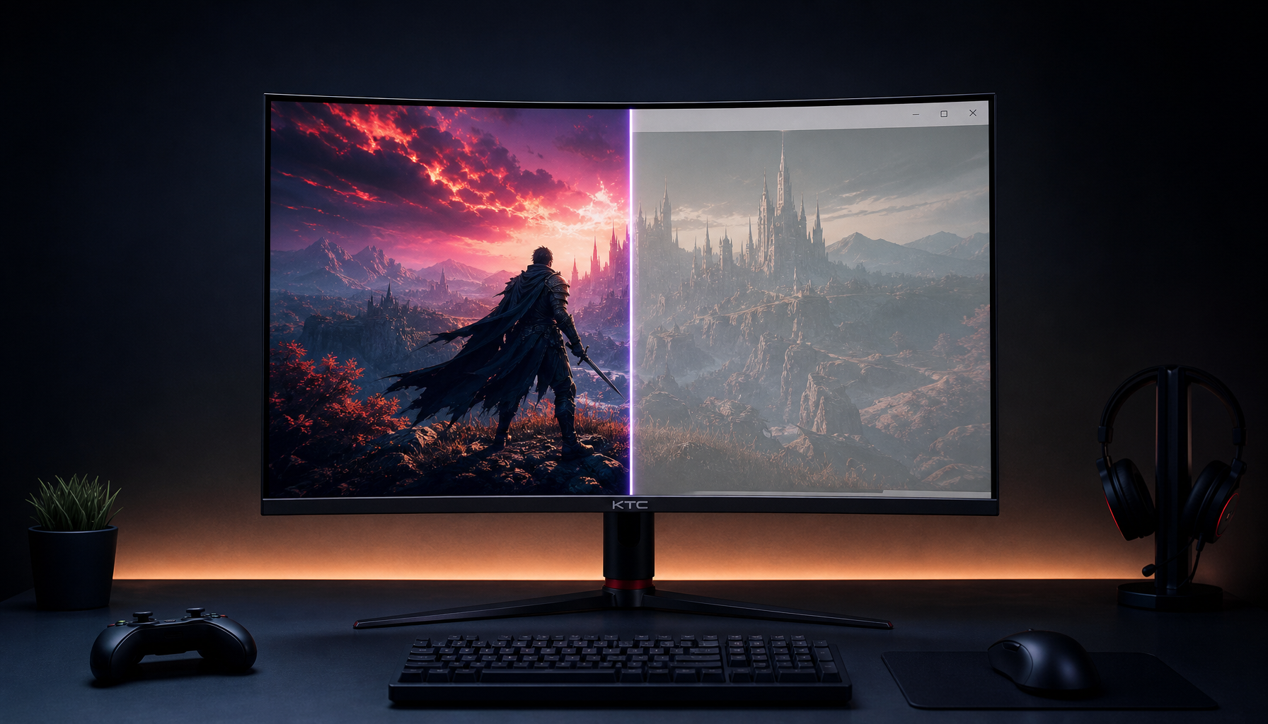
Reset the display to a neutral starting point, then choose Standard, Custom, User, sRGB, or Rec. 709 mode if available. Avoid Vivid, Movie, Eco, eye-care, HDR simulation, black enhancer, dynamic contrast, and auto brightness modes when making color decisions. Those modes can be useful for gaming immersion or casual viewing, but they are not reliable reference modes.
The brightness calibration with patterns workflow is a strong low-cost sanity check because it tells you whether near-black and near-white detail remain visible after you change brightness and contrast. For example, if a dark gray shirt loses all folds after you lower brightness, you have not made the image more cinematic; you have crushed useful grading information.
Lock the Core Targets
For SDR grading aimed at web and general display playback, use Rec. 709 or sRGB behavior, a D65 white point around 6500K, and gamma 2.2 unless your delivery environment specifically calls for another target. In a darker reference-style viewing room, gamma 2.4 may be more appropriate, but many mixed-use creator setups are closer to office lighting than cinema lighting.
A reliable starting point is D65, gamma 2.2, and a measured luminance near 100 to 120 nits. If your room is very dim, 80 to 100 nits may feel more balanced. If the room is bright and controlled glare is impossible, you may need higher luminance, but that is a compromise rather than a reference ideal.
Setting |
Why It Matters |
|
Luminance |
About 100 to 120 nits |
Keeps brightness decisions consistent |
White point |
D65, about 6500K |
Prevents warm or cool bias in neutrals |
Gamma |
2.2 for common desktop/web use |
Keeps midtones predictable |
Gamut |
sRGB or Rec. 709 |
Prevents wide-gamut oversaturation |
Automation |
Off |
Prevents scene-by-scene display changes |
Use Hardware Measurement When Color Decisions Cost Money
A colorimeter or spectrophotometer is the reliable way to measure what your specific monitor is doing. Visual setup tools can help, but your eyes adapt quickly to white balance and brightness, especially when the room changes. That adaptation is useful for daily life and risky for grading.
The best monitor settings for color accuracy guidance is blunt on this point: hardware measurement is the dependable route because displays vary by unit, age, panel technology, and settings. Factory calibration is valuable, especially on professional IPS, OLED, or mini-LED monitors, but it does not prove your unit is still hitting the target in your room today.
For paid video work, product color, client review, print-adjacent stills, or multi-monitor matching, a colorimeter is not an accessory; it is part of the display system. For casual YouTube edits or internal office videos, a good factory-calibrated sRGB or Rec. 709 mode plus test patterns may be acceptable, but you should understand the risk.
The tradeoff is simple. Hardware calibration adds cost, setup time, and periodic maintenance. The benefit is measured repeatability: you can profile the exact display, catch drift, and stop guessing whether your monitor is the reason every export feels too dark.
Match the Room Before You Touch the Grade
Your monitor does not exist in isolation. A 120-nit screen in a dim room can feel bright and punchy; the same screen beside a sunny window can feel weak and flat. If you grade under changing daylight, your eyes will keep recalibrating themselves, and your corrections will follow the room instead of the footage.
Use stable, neutral room lighting and avoid direct light on the panel. Neutral walls help because strong wall color can tint your perception of white and skin tone. If you work in an apartment, bedroom studio, or office corner, the practical move is to create repeatable day and night monitor presets only after you have checked both with patterns or measurement.

A simple real-world test is a white document beside a neutral page or matte white reference under your normal room light. If the monitor white looks like a flashlight, it is probably too bright for critical grading. If it looks gray and lifeless, the room may be too bright or the screen too dim.
Control Contrast Separately From Brightness
Brightness and contrast are often adjusted together, but they solve different problems. Brightness usually changes the display’s light output or black level behavior, while contrast affects white-level separation and highlight clipping. If you raise contrast until the image pops, clouds, windows, forehead highlights, and UI whites can merge into featureless blocks.
A screen contrast ratio describes the gap between the brightest white and darkest black a display can produce. Higher native contrast can help a monitor show richer depth, but dynamic contrast claims are not the same as stable reference behavior. For grading, predictable tone separation beats dramatic marketing numbers.
Use a black-level pattern first and adjust until the darkest visible steps are barely separated without lifting black into gray. Then use a white-level pattern and lower contrast if the brightest steps merge. Recheck black after changing contrast because the two controls can interact.

Turn Off Dynamic Contrast, Auto HDR, and Brightness Tricks
Dynamic contrast changes brightness or contrast based on the image content. That can make a movie look more dramatic on a couch or give a game more impact, but it corrupts grading judgment because the same correction behaves differently from shot to shot.
The community discussion around accurate color grading brightness captures the practical conflict: consumer TVs may use enhancements by default, yet editors still need to grade from a neutral reference. You cannot reliably compensate for every viewer’s TV mode, laptop brightness, or cell phone display, so your best move is to create a technically stable master.
Your operating system and monitor firmware can also introduce adaptive brightness, HDR behavior, power-saving dimming, and color temperature shifts. Disable Night Light, auto brightness, Eco modes, HDR simulation, and GPU-level color enhancements for SDR grading. If you need HDR, treat it as a separate workflow with a separate monitor mode, separate calibration targets, and content-specific checks.
Do Not Let Software Fix a Bad Viewing Setup
Automated correction tools can help smooth exposure changes inside footage, but they do not solve monitor brightness errors. If your display is too bright, every manual adjustment and every tool-assisted correction is still being judged through a biased reference.
The forum discussion on brightness changes in a clip points to a useful production reality: manual keyframes can be more reliable than automated stabilizers when brightness shifts are context-sensitive. In practice, fix the monitoring environment first, then use scopes, manual keyframes, and targeted nodes to correct the footage itself.
For example, if an interview subject walks past a window and the camera exposure shifts, a stabilizer may flatten the entire shot in an unnatural way. A better workflow is to keyframe one node for the exposure transition, check skin tone and waveform levels, then apply a gentle stabilizing pass only if needed.
Use Scopes as a Second Opinion
Waveform, parade, vectorscope, and histogram tools are essential because they do not care how bright your room feels. A waveform can show that two shots have similar luma levels even when one appears darker because your monitor mode, ambient light, or surrounding UI is misleading you.
Still, scopes do not replace a calibrated display. They tell you where values sit, but they do not show whether the monitor is rendering hue, saturation, gamma, and highlight rolloff accurately. The strongest workflow combines measured display setup, stable room lighting, visual test patterns, and scopes.
A practical check is to compare skin exposure on the waveform before making a global brightness change. If the waveform is already where you expect but the image feels dull, the issue may be monitor luminance, room glare, gamma, or viewing mode rather than the grade.
Build Separate Profiles for Work and Play
A pro gaming monitor, office display, or portable smart screen often serves multiple roles. That is normal. The mistake is using one punchy entertainment mode for everything.
Keep a reference-style SDR profile for grading with automation off, D65, gamma 2.2, and controlled luminance. Keep a separate gaming or media profile with higher brightness, HDR, adaptive sync features, and more aggressive contrast if you enjoy that look. Keep an office profile tuned for text comfort and lower eye strain during long spreadsheet or writing sessions.

This separation gives you performance without sabotaging accuracy. Your gaming mode can be immersive, your office mode can be comfortable, and your grading mode can stay disciplined.
FAQ
Is 50 brightness and 50 contrast accurate?
Not necessarily. Monitor scales are not standardized, so 50 on one display may be much brighter than 50 on another. Use measurement if possible, or at least validate with black-level and white-level patterns.
Should I grade brighter because viewers watch on bright screens?
No. Grade from a stable reference and let playback devices be playback devices. If you chase every consumer screen, you will build inconsistency into the master.
Can a factory-calibrated monitor replace calibration hardware?
Factory calibration is a strong starting point, especially on a quality display, but it does not measure your exact current setup, room, brightness level, or panel drift. For paid color work, hardware profiling remains the stronger choice.
Does HDR mode help SDR color grading?
Usually no. HDR mode changes tone mapping, brightness behavior, and sometimes color handling. Use SDR mode for SDR grading and reserve HDR mode for true HDR work.
Final Check Before You Grade
Warm up the display, choose the correct SDR mode, disable automation, set D65 and gamma 2.2, target a controlled luminance, verify black and white levels, then keep the room consistent. When brightness stops moving, your creative decisions get sharper, your exports travel better, and your monitor becomes a tool instead of a variable.


