


The spec is pixel density, usually listed as PPI. Resolution tells you how many pixels exist; PPI tells you how tightly those pixels are packed, which directly affects how sharp code, PDFs, logs, and dense reference docs look at your desk.
Why PPI Beats Resolution for Text Clarity
A 4K badge sounds like a guaranteed readability win, but screen size changes the result. A 27-inch 4K monitor lands around 163 PPI, while a 32-inch 4K monitor is closer to 137 PPI. Both are 4K, but the smaller panel renders text edges more finely.

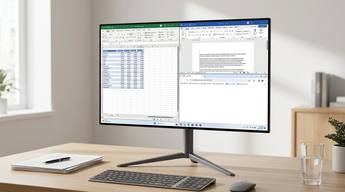
That matters when you live in API references, CLI output, legal-style PDFs, specs, and multi-column documentation. Higher pixel density makes letterforms, punctuation, and symbols easier to distinguish, especially in compact text blocks where ., ,, :, and ; can blur together.
For document-heavy work, monitor quality affects more than comfort. Fuzzy text, weak contrast, and poor adjustment can create eye strain and bad posture during long reading sessions, especially when your day is spent inside documents and browser tabs.
The Quick PPI Math That Helps You Buy Smarter
Think of PPI as sharpness per inch. More PPI usually means smoother text edges, assuming the operating system scales cleanly and the panel has a sensible subpixel layout.
A 24-inch 1080p display is workable but not ideal for dense documents. A 27-inch 1440p display is balanced and popular at roughly 108 PPI. A 27-inch 4K display gives sharper text and strong value for technical reading, while a 32-inch 4K display provides more physical workspace with slightly softer text. A 27-inch 5K display is the premium clarity option for text-first workflows.
This is why a 27-inch display is often the default sweet spot for developers and technical writers: it balances sharpness, cost, desk fit, and reduced head movement, while 32-inch screens favor bigger multi-window layouts over maximum crispness.
Sharper pixels do not fix every vision issue, so users who enlarge text heavily should test scaling and comfort in person before paying a big premium.
Workspace Still Matters for Dense Documentation
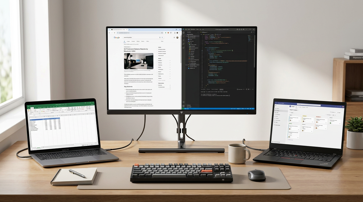
Pixel density is the hidden readability spec, but it does not work alone. Dense technical work also needs enough screen space to keep the source material, editor, terminal, and preview visible without constant window swapping.
A large 4K display can show far more document context than a laptop screen, and vertical pixels are especially useful because documentation, webpages, and PDFs usually scroll downward, not sideways. That extra context helps you compare sections, spot repeated language, and keep reference material visible while writing or debugging.

For most office and technical setups, 24 to 27 inches is the practical productivity zone, while 28 to 32 inches works better for spreadsheets, side-by-side review, editing, and data-heavy layouts.
The Best Setup for Readable Technical Work
Start with a 27-inch 4K IPS monitor if you want the safest text-first upgrade. It gives dense documentation enough sharpness to feel clean without forcing an oversized screen onto a normal desk.

If you review several windows at once, a 32-inch 4K monitor or a 34-inch ultrawide can be better, but sit farther back and use a proper arm or stand. Keep the main reading pane centered, with the top third of the screen at or slightly below eye level.
Also check the basics: matte coating, flicker-free backlight, usable brightness, height adjustment, USB-C if you dock a laptop, and a text or coding mode that lets you tune contrast and sharpness. A good display should make dense information feel easier to command, not merely bigger.


%20is%20the%20most%20overlooked%20spec%20for%20text%20readability.%20High%20PPI,%20not%20just%204K%20resolution,%20is%20crucial%20for%20sharp%20code,%20PDFs,%20and%20dense%20technical%20documentation.
)