


Text looks blurry in certain professional apps when the app, operating system, GPU, cable, or panel subpixel layout disagrees about how pixels should be drawn. The fix is usually matching resolution, scaling, signal format, and app rendering behavior to your actual workflow before replacing the monitor.
The App May Be Scaling Text Differently
Professional software often uses custom UI engines. CAD tools, PDF readers, trading platforms, DAWs, design suites, and legacy business apps may ignore or partially override operating system scaling, so one window looks crisp while another looks slightly smeared.

Start with the basics: your monitor should run at its native resolution because lower-than-native resolutions can make text less sharp. A 4K panel driven at 1080p may look acceptable in video, but fine menus and small labels often lose edge precision.
Scaling is the second lever. A 27-inch 4K display is very sharp, but 100% scaling can make UI text tiny; 150% is often more usable. A 32-inch 4K screen can work well at 125% or 150%, depending on eyesight and desk distance.
Quick checks:
- Use the resolution marked Recommended.
- Use the operating system scaling value marked Recommended.
- Avoid custom scaling unless one app truly requires it.
- Reopen the affected app after changing scaling.
- Test the app on one display before judging a multi-monitor setup.
Your Signal Path Can Soften Fine Fonts
Gaming monitor owners often optimize for refresh rate first, then discover that spreadsheets, code editors, or timeline labels look worse at high refresh rates. The hidden culprit can be bandwidth.
For text-heavy desktop use, the signal should preserve full color detail. Chroma subsampling reduces color information, while RGB or 4:4:4 keeps full color data for each pixel; that matters for thin fonts and colored UI edges. A monitor may look crisp at 60 Hz but softer at 120 Hz or 144 Hz if the connection drops to 4:2:2 or 4:2:0.

This is common with 4K high-refresh setups, HDR, 10-bit color, USB-C docks, adapters, or older HDMI paths. For productivity, reliability matters more than theoretical specs: use the best direct cable and port your monitor supports, usually DisplayPort, HDMI 2.1, or full-bandwidth USB-C.
Also check monitor sharpness. Artificial sharpness modes can add halos around letters, making text look harsh instead of clean. A neutral sharpness setting near the middle is usually the better professional baseline.
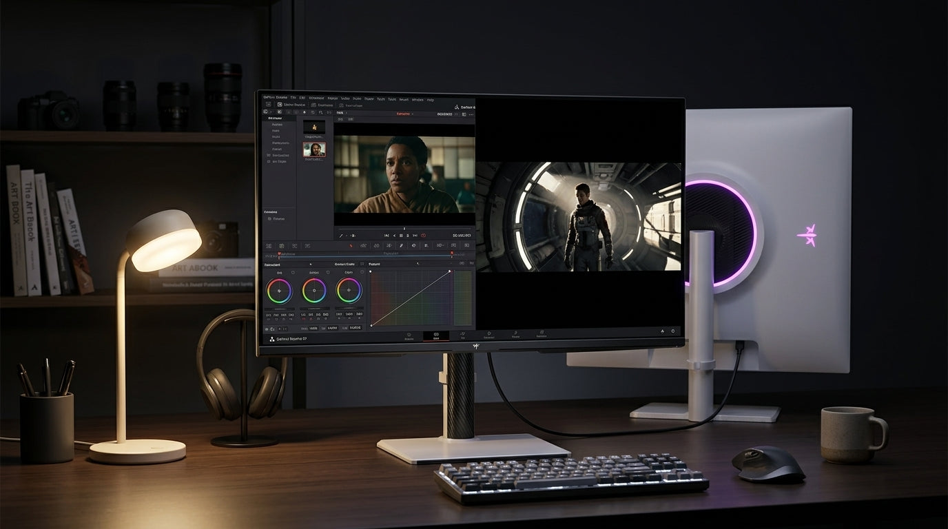
OLED and Panel Layouts Can Change Text Edges
Not all blur is traditional blur. OLED monitors, especially QD-OLED and WOLED, can show color fringing because many panels do not use the standard RGB stripe layout that common text rendering expects.
On these displays, black text on white backgrounds may show faint magenta, green, yellow, or shadow-like edges. The issue is often most visible in static productivity work, colored icons, PDF text, and dense UI panels; it is usually less noticeable in games and video. According to analysis of OLED fringing, panel generation, pixel density, and subpixel structure all affect how obvious it looks.

Font-smoothing adjustments can help LCDs and some OLED setups, but they are not universal. On WOLED, disabling font smoothing may reduce colored edges while making letters look thinner. On QD-OLED, some users prefer third-party text tuning, but results vary by app.
If only one professional application looks bad, the panel may not be defective; that app may be using its own RGB-optimized text renderer.
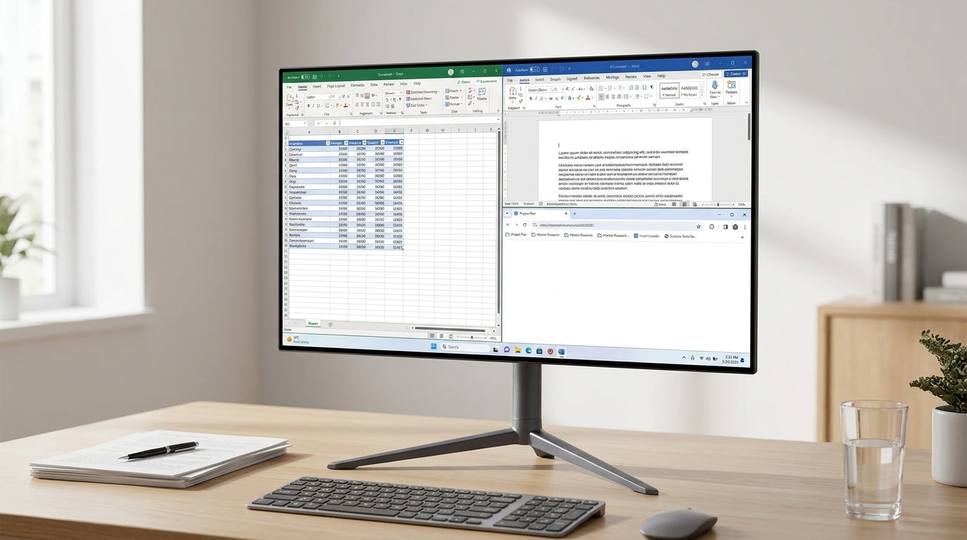
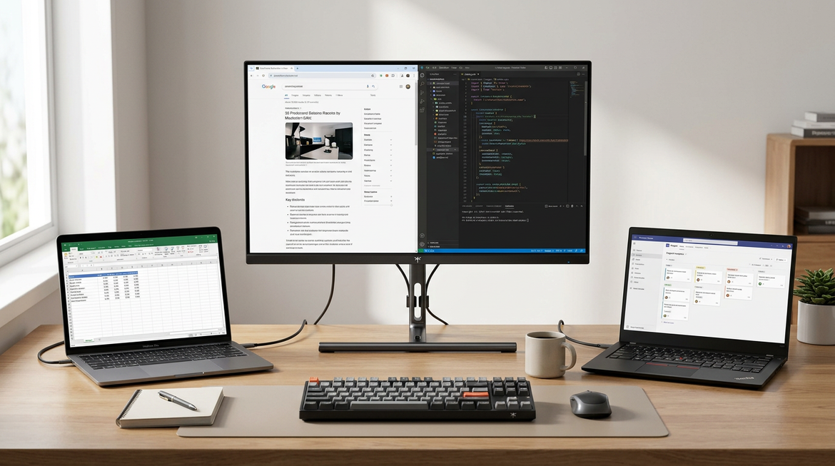
Multi-Monitor Setups Add Another Failure Point
Blurry text often appears after adding a second display. Each screen may have a different resolution, pixel density, scaling percentage, refresh rate, or subpixel layout.

A 24-inch 1080p side monitor, a 27-inch 1440p work screen, and a 4K primary display all need separate settings. Duplicating displays can force a compromise resolution, while extended mode lets each screen run closer to its best configuration.
Pixel density also shapes expectations. A 24-inch 1080p monitor is about 92 PPI, a 27-inch 1440p display is about 109 PPI, and a 32-inch 4K panel is about 137 PPI; higher pixel density usually makes text look cleaner at normal desk distances.
For a professional setup, tune each display independently, then test your actual workload: one PDF, one spreadsheet, one browser tab, and one creative or engineering app. The sharpest monitor is the one that keeps your real tools readable for hours, not just the one with the biggest number on the box.


