


Display uniformity has a direct impact on comfort: when a monitor has bright corners, dim patches, or visible color shifts, light-sensitive users have to keep adapting to the screen instead of simply reading or playing.
If your eyes start to ache when a white document looks brighter on one side, or a dark game scene seems to glow at the edges, the problem may not be “too much screen time” alone. Research on digital eye strain shows symptoms can start after as little as 2 continuous hours, and monitor-side issues such as glare, low contrast, and unstable brightness make that load worse. The sections below show how to judge uniformity, which monitor features matter most, and how to set up a gaming, ultrawide, or portable display for better day-to-day comfort.
Why Uniformity Matters More for Light-Sensitive Users
Uneven brightness creates constant adaptation
Digital eye strain includes glare sensitivity, headache, blurred vision, dry eyes, and trouble keeping the eyes open, especially during long screen sessions. For light-sensitive users, uneven monitor brightness adds another stressor: the eyes are not just focusing on text or motion, but also adapting to brighter and darker areas of the same screen.
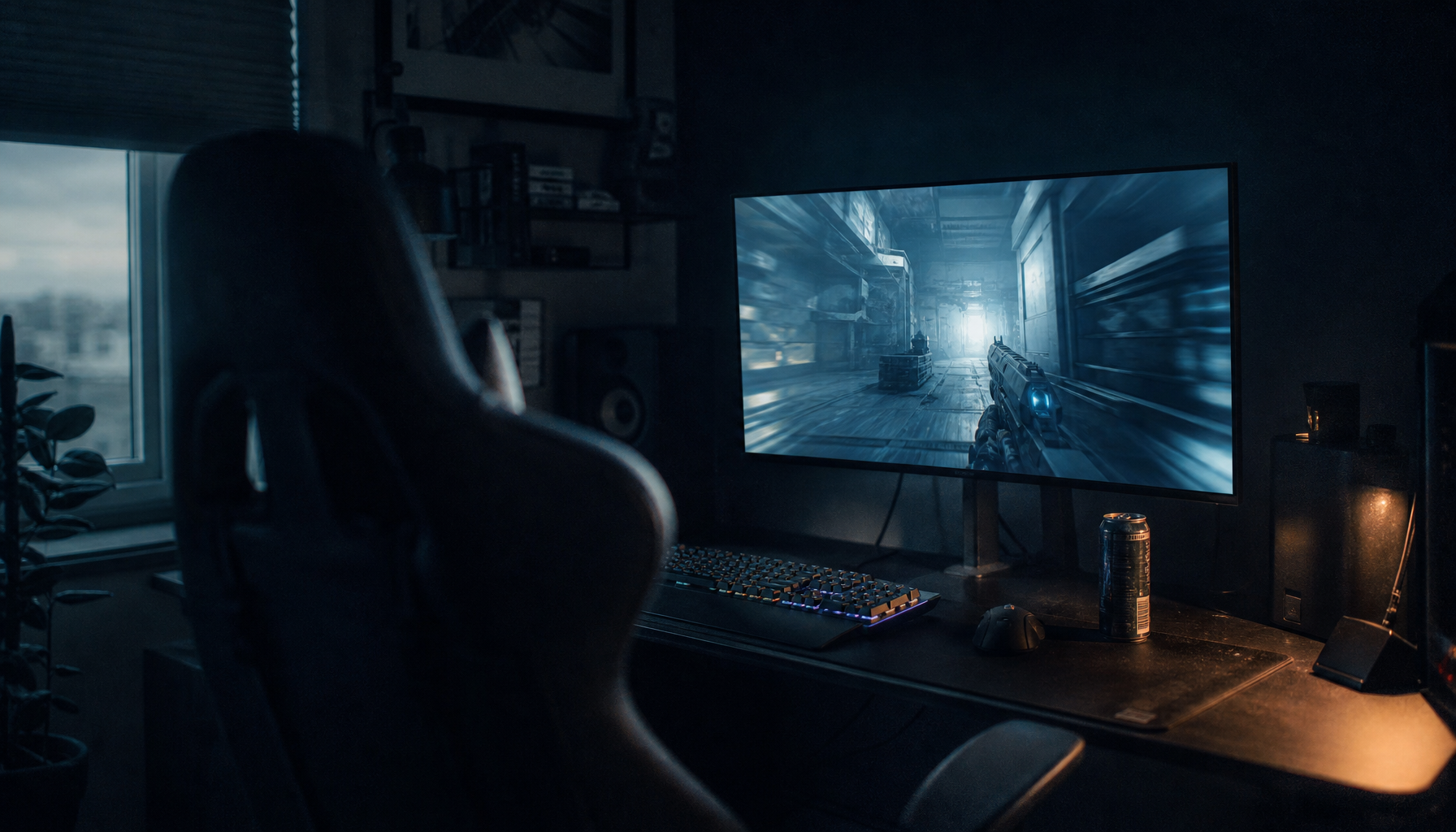
Luminance uniformity matters because abrupt brightness differences force repeated visual adaptation. In practical monitor use, that shows up when the center of a spreadsheet looks normal but the upper corners appear washed out, or when a dark game HUD sits next to a brighter edge glow that keeps pulling attention.

Static desktop work often exposes the problem first
Display uniformity usually looks worst on full-screen white, gray, black, or other low-detail backgrounds because there is nothing else to hide the panel’s own behavior. That is why coding windows, web pages, spreadsheets, and document editors often feel harsher than expected on a monitor that seemed fine in a colorful game trailer.
The same source notes that even a 10% brightness difference in one area can feel much larger during static work. For a light-sensitive user, that can translate into a familiar pattern: the monitor looks acceptable for 20 minutes, but after an hour the dim left side or bright lower corner becomes impossible to ignore.
What “Poor Uniformity” Looks Like on Real Monitors
Bright corners, dirty gray, and tint shifts are not the same issue
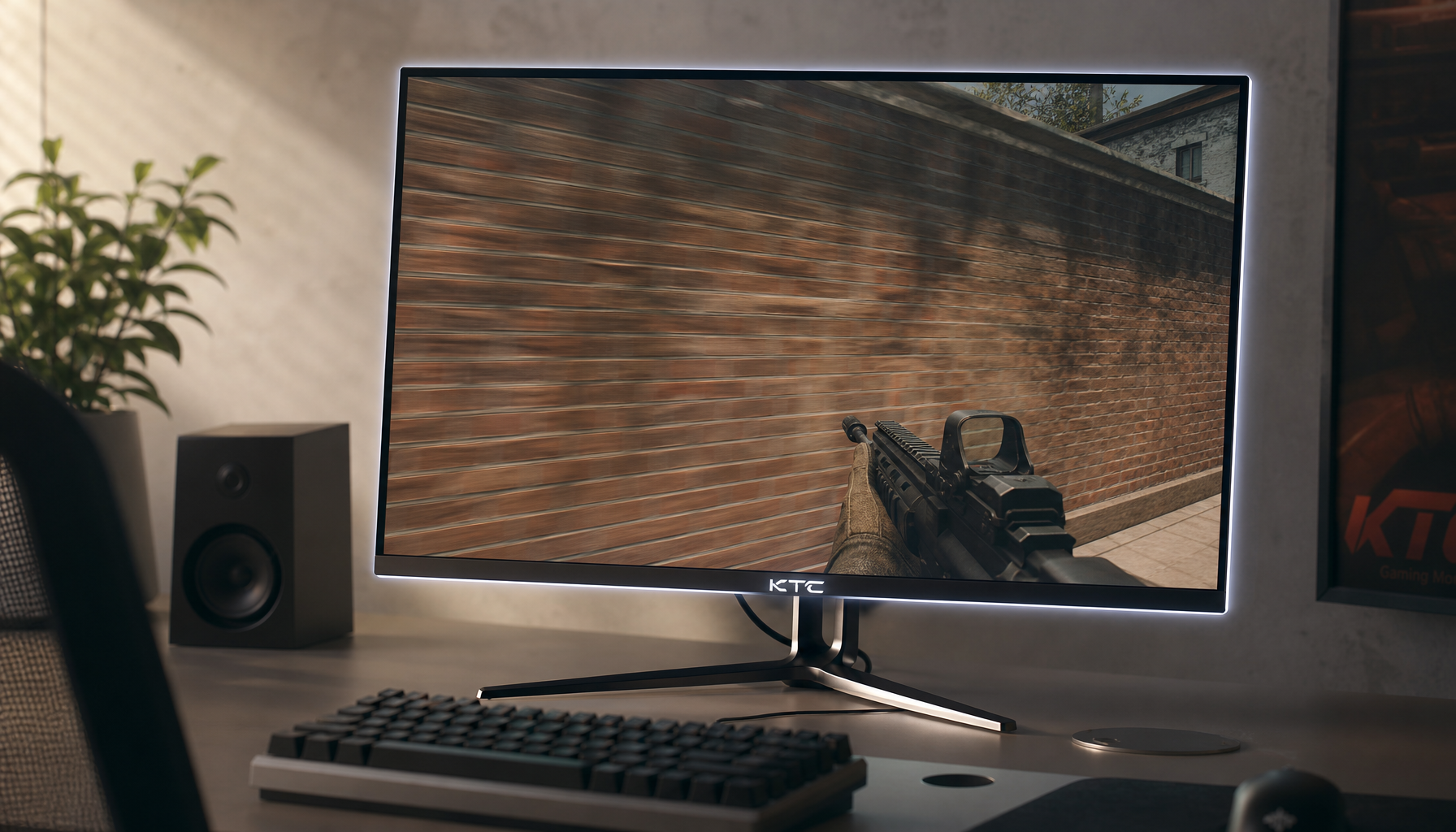
Uneven brightness can come from normal panel variation, setup errors, software behavior such as HDR, or a true hardware defect. On a gaming monitor, this may look like one corner glowing during a loading screen. On an office or portable monitor, it may look like one side of a white page turning slightly gray or yellow.

Monitor uniformity issues usually fall into a few patterns: darker corners, bright hotspots, cloudy gray patches, edge glow, and warm or cool tint in one area. Each one affects comfort differently. Bright hotspots tend to bother light-sensitive users most in dark rooms, while dirty gray patches are more noticeable during web browsing and productivity work.
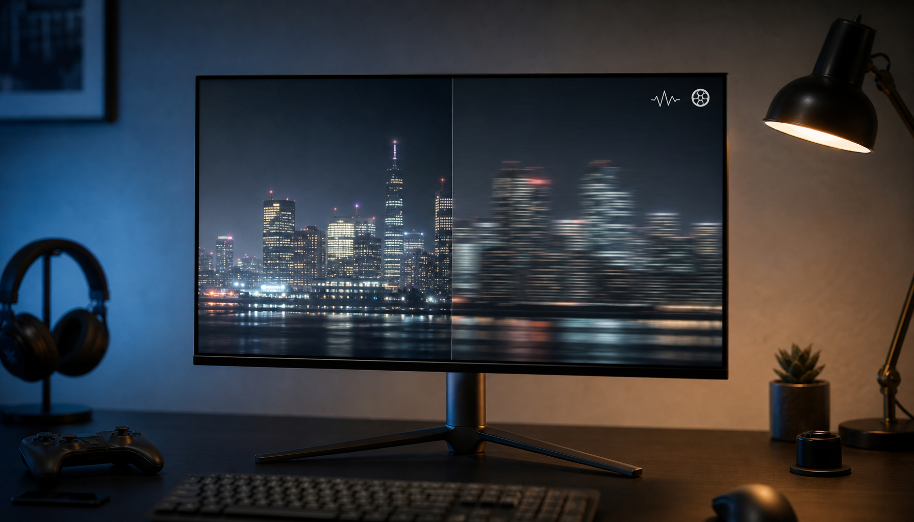
Viewing angle can mimic a bad panel
IPS panels and wide viewing angles often look more stable across the screen, which helps comfort on larger monitors. That matters because some “uniformity” complaints are really angle-related: the panel is behaving normally, but the image shifts because the user is sitting too close to a large screen or looking at the far edge of a wide display from too sharp an angle.
A useful desk test is simple. Let the monitor warm up for 20 to 30 minutes, open full-screen white, 50% gray, and black test images, and view them from your normal seated position. If the dim or bright area moves when you change your head position, the issue is more likely viewing angle than a fixed panel defect.

Which Monitor Features Matter Most for Comfort
Brightness control usually matters more than maximum brightness
Monitor brightness that matches room light reduces repeated pupil adjustment, which is especially important for light-sensitive users. A very bright gaming monitor may look impressive in a spec sheet, but if it is run too hot in a normal room, uniformity flaws become easier to see and visual fatigue rises.
Reasonable desktop brightness is often around 120 to 180 nits for typical indoor use, while a brand notes that even 300 nits can feel excessive for normal desktop work and that many calibration setups target roughly 80 to 120 nits in controlled rooms. In plain terms, if a monitor only looks “good” when cranked high, it may be a poor choice for someone with light sensitivity.
Panel type, coating, and refresh rate all shape perceived stability
IPS monitors are commonly easier on the eyes because they keep colors and image appearance more stable across the screen. Matte anti-glare coatings also help because reflections create their own bright patches, which can feel just as distracting as true panel non-uniformity.
Higher refresh rates can reduce visible flicker and make motion feel calmer over long sessions, which is useful on gaming monitors and high-refresh productivity displays. Refresh rate does not fix bad uniformity, but a 120 Hz or higher panel with stable brightness, flicker-free backlighting, and a matte finish is usually a more comfortable package than a faster screen with obvious glow or hotspotting.
How Screen Size and Shape Change the Experience
Ultrawide monitors can help or hurt
A 49-inch ultrawide places the far left and right edges much farther from the center of your view than a standard monitor, which makes viewing angle behavior more important. Curvature helps by keeping the side areas closer to a right angle relative to your eyes, so the edges are less likely to look washed out or uneven.
That said, larger screens also give uniformity problems more room to show up. A small bright corner on a 27-inch display may be tolerable; the same behavior across a 49-inch ultrawide can become a persistent distraction during coding, trading, simulation gaming, or timeline work.
Portable monitors need tighter setup discipline
Portable monitors are convenient, but they are also easy to use too close, too bright, or at a poor angle. That combination can exaggerate apparent uniformity problems, especially on glossy or thinner panels where brightness falls off faster at the edges.
Computer vision syndrome guidance recommends placing the screen about 20 to 28 inches away and 15 to 20 degrees below eye level. On a portable monitor, simply moving the screen back a few inches, lowering brightness, and avoiding overhead reflections often improves comfort more than changing color settings.

How to Test Uniformity Before You Buy or Keep a Monitor
Use a repeatable home test
A practical uniformity check starts with warming the monitor for 20 to 30 minutes, resetting picture settings, using the native resolution, and connecting over a digital input. Then view full-screen white, gray, and black images at your normal seat. This method is useful for gaming monitors, ultrawides, and portable displays because it separates panel behavior from game art direction or app design.
Uniformity thresholds used in visual comfort work also give buyers a way to think about severity. Ratios above 3:1 in task areas can increase fatigue, and ratios above 10:1 can signal a serious comfort problem. Most monitor reviews will not publish those exact ratios for every use case, but they often do show heat maps and photos that reveal whether the panel has a mild edge drop-off or a clearly distracting hotspot.
Distinguish fixable settings from return-worthy defects
Calibration and setup changes can improve white point, gamma, and overall balance, but they cannot physically repair a dim corner or a permanently warmer patch. If the same patch stays visible across inputs, devices, and test patterns, you are no longer dealing with “preferences.” You are evaluating panel quality.
That matters for buying decisions. A comfort-focused user should be willing to return a monitor with fixed non-uniformity that keeps drawing the eye, even if the refresh rate, resolution, and price look attractive on paper.
Comparison Table: What to Prioritize by Monitor Type
Monitor type |
Uniformity risk |
Best comfort traits |
Common tradeoff |
Best fit for light-sensitive users |
24-27 inch productivity monitor |
Lower to moderate |
IPS panel, matte coating, 1440p-class sharpness, stable brightness around 120-180 nits |
Less immersive for gaming |
Strong baseline choice for daily work |
27 inch high-refresh gaming monitor |
Moderate |
120 Hz or higher, flicker-free backlight, moderate brightness, good factory tuning |
Some fast panels still show glow or edge variance |
Good if motion comfort and desktop comfort both matter |
34-49 inch ultrawide |
Moderate to high |
Gentle curve, wide viewing-angle stability, careful seat distance |
Larger panel makes flaws easier to spot |
Best when immersion or multitasking is needed and panel quality is proven |
Portable monitor |
Moderate |
Matte finish, adjustable stand, conservative brightness, digital connection |
Easy to use too close or at a poor angle |
Good for travel if setup can be controlled |
HDR-focused display |
Moderate to high |
Optional uniform brightness mode, restrained desktop brightness |
Local dimming and highlight behavior may feel harsh |
Better for mixed media than all-day static office work |
Practical Next Steps
Action checklist
- Warm the monitor up for 20 to 30 minutes before judging brightness or color.
- Test full-screen white, 50% gray, and black images from your normal seated position.
- Lower brightness until white screens stop feeling self-luminous in your room.
- Use native resolution, a digital connection, and a neutral picture mode before making judgments.
- Favor IPS, matte coatings, and flicker-free backlighting for all-day use.
- Return any monitor with a fixed dim patch, bright hotspot, or tint zone that keeps pulling your eye.
Digital screen comfort is not only about taking breaks, though the 20-20-20 rule still matters. For light-sensitive users, the most effective upgrade is often choosing a monitor that looks boring in the best possible way: even white screens, calm dark scenes, no glittering reflections, and no corner that keeps demanding attention.
There is no single perfect screen setting, so the final target is not maximum brightness, deepest blacks, or the highest refresh rate in isolation. It is a stable image that matches your room, your viewing distance, and the kind of work or gaming you actually do.
FAQ
Q: Can poor display uniformity really make light sensitivity feel worse?
A: Yes. Uneven brightness, bright corners, and color shifts make the eyes keep adapting across the screen, which can add to glare sensitivity, headaches, and fatigue during long sessions.
Q: Is refresh rate or uniformity more important for comfort?
A: For light-sensitive users, uniformity usually comes first. A 144 Hz monitor with obvious edge glow can feel worse than a calmer 120 Hz screen with even brightness, though higher refresh still helps reduce flicker-related discomfort.
Q: Are ultrawide monitors bad for sensitive eyes?
A: Not automatically. A well-tuned curved ultrawide with stable viewing angles can be comfortable, but larger panels make uniformity flaws easier to notice, so model-specific panel quality matters more than the format alone.
References
- An organization: Computer Vision Syndrome
- A company: Top Metrics for Evaluating Visual Comfort in Lighting
- A brand: Fix Uneven Brightness on a Gaming Monitor
- A brand: Best Monitors for Eye Strain
- A brand: Monitor Uniformity Issues in Applications
- A brand: Best Monitor for Eye Strain in 2026
- A brand: Perfect Monitor Brightness for Long Work Days
- A platform: Digital Eye Strain, A Comprehensive Review
- A platform: Digital Display Preference of Electronic Gadgets for Visual Comfort
- An organization: Guidelines for Optimum Visual Comfort


