


These games reward fast board reading more than extreme motion clarity. Once animation is already smooth, stronger color, contrast, and gradient handling usually improve decisions more than a higher refresh rate.
Because these games are won by reading a board, not by tracking a target at 300 mph. Once motion is already reasonably smooth, richer color, better contrast, and cleaner gradients usually improve decision-making more than another jump in refresh rate.
Do your cards blur together after a long session, or do shop units and rarity cues start looking flat and indistinct when the match gets tense? In real monitor setups, the difference between a washed-out panel and a vivid, well-tuned one is easy to test: card frames separate faster, status colors read more clearly, and long sessions feel less fatiguing. The goal is to choose display settings and monitor specs that fit this genre without overpaying for esports features you may barely use.
The Core Reason: These Games Are Information-Dense, Not Motion-Dense
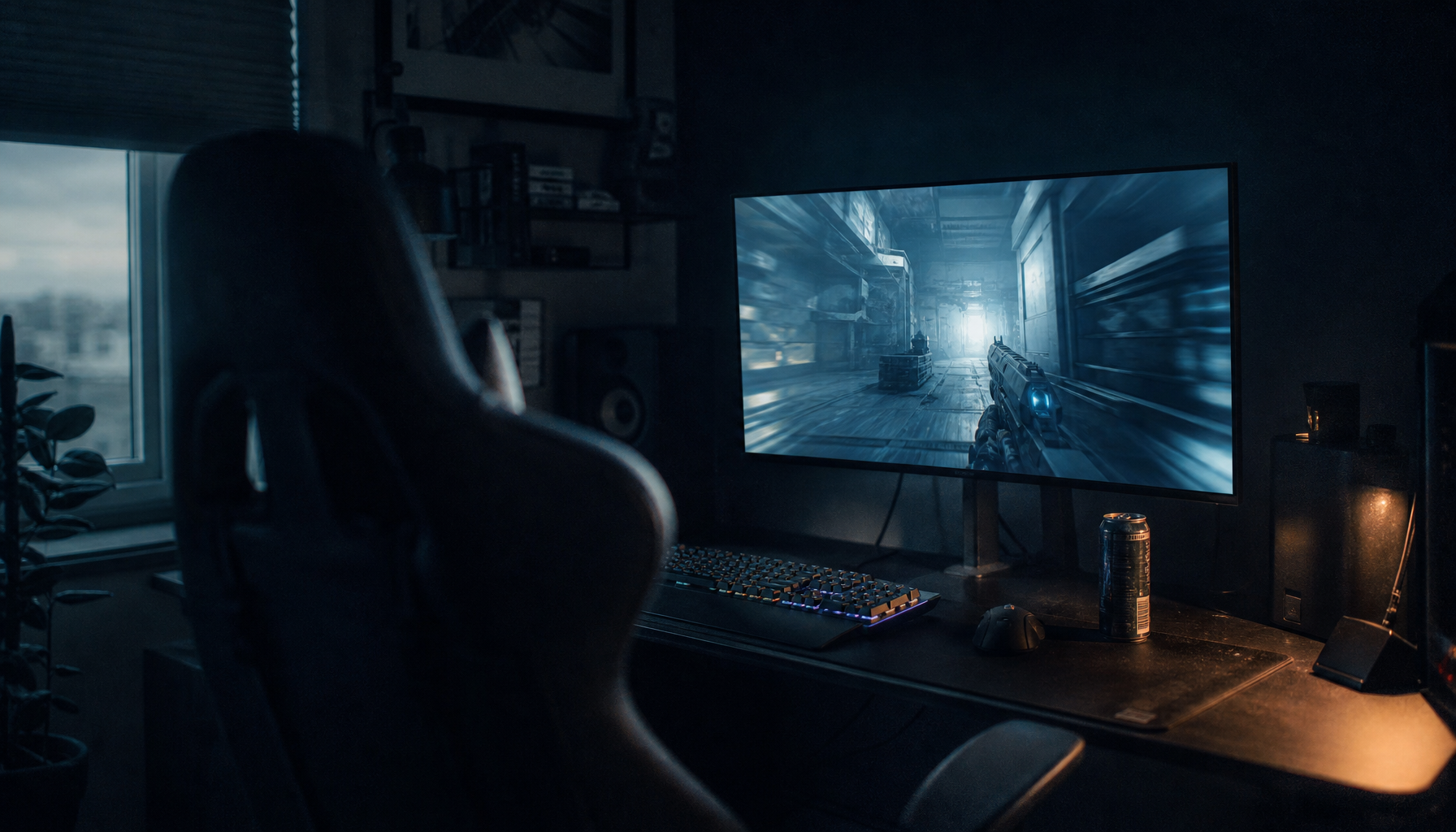
In a shooter, motion performance can decide whether you track a target in a split second. In card games and auto-battlers, the more common challenge is visual parsing: spotting a golden border, distinguishing tribe or class colors, reading item glows, checking health bars, and recognizing board state at a glance. That is why fast-paced competitive play benefits more from higher refresh rates, while slower, strategy-heavy genres often gain more from picture quality.
That tradeoff becomes obvious when you compare genres side by side. A jump from 60Hz to 144Hz is easy to notice in almost any game, and the move from 144Hz to 240Hz mainly matters for highly competitive players chasing lower latency and cleaner motion. In a card battler, however, your eyes are usually resting on static art, interface layers, and color-coded information. The board is animated, but the game is not asking you to track targets the way a tactical FPS does.
In practice, that means color vibrancy often creates more useful clarity than ultra-high refresh. If a shop reroll presents seven units with similar silhouettes, stronger separation in reds, greens, golds, and blues helps you recognize them faster. If a digital card game uses rarity gems, class borders, poison effects, shield tints, or mana colors, better gamut and contrast reduce the chance that those cues blend together.

What “Color Vibrancy” Actually Helps With
Faster Board Reading
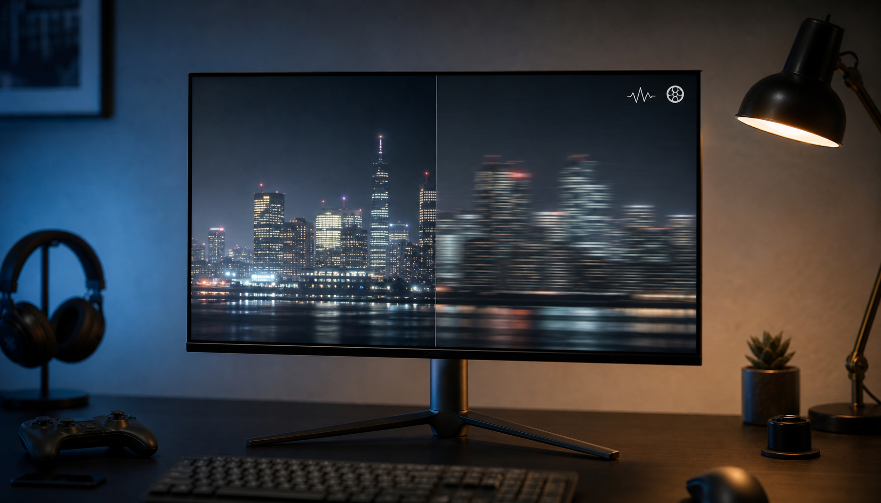
A vibrant display is not just about pretty art. It improves separation between neighboring hues, especially when the UI leans heavily on color coding. A broader range of colors makes images look more vivid and lifelike. For card and auto-battler players, the practical benefit is simpler: important visual cues stand out sooner.
A common example is a late-game board with layered effects. If burn, shield, buff, debuff, and rarity indicators all share similar brightness on a weak panel, you spend extra time confirming what you are seeing. On a better IPS or OLED display with stronger color volume and cleaner gradients, those signals separate faster. That is not just an aesthetic gain; it lowers cognitive load.

Better Art, Better Immersion, Better Endurance
These genres are unusually art-driven. You spend much more time looking at card illustrations, faction palettes, battlefield skins, and UI transitions than physically steering a camera. Deep blacks and saturated highlights make fantasy art, neon spell effects, and board themes feel materially richer.

Long-session comfort matters too. Washed-out panels often make you work harder to distinguish subtle states, especially in dim scenes or low-contrast UI. Auto color management exists for a reason: color consistency and fewer artifacts can improve detail in gradients, shadows, and darker scenes. In a genre full of layered UI, that consistency is more useful than most people expect.
Cleaner Gradients and Less Cheap-Panel Fatigue
Card games frequently use soft glow effects, fog, smoke, magical gradients, and tinted shadows. Poor color handling turns these into visible banding or muddy transitions. 10-bit output and better calibration help reduce banding and improve gradients. You do not need a studio display for card gaming, but the principle carries over directly: smoother gradients make boards look cleaner and less harsh over time.
Why Motion Performance Still Matters, Just Less
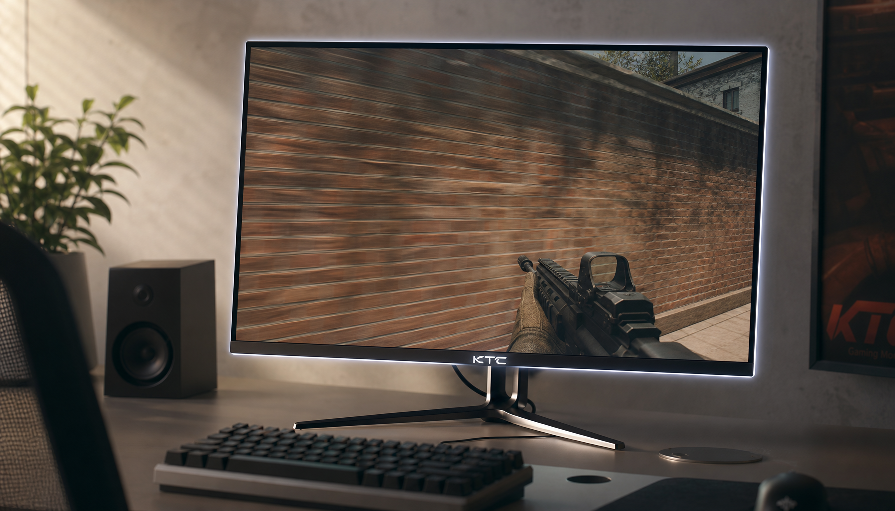
Motion performance is not irrelevant. Smooth animation makes card draws, board pans, combat phases, and mouse movement feel better. A 144Hz monitor refreshes every 6.94 ms, while 240Hz refreshes every 4.17 ms, so there is a measurable latency difference. The real question is whether that difference changes outcomes in your actual games.
For most card and auto-battler players, the answer is not much after a certain point. Once you reach a stable 120Hz to 165Hz range with decent pixel response and variable refresh support, the display is already smooth enough for menus, transitions, and combat animations. 144Hz-class displays as the practical sweet spot matches the needs of many players, while extreme refresh tiers serve more specialized competitive use.
That matches real play. In Hearthstone-style turns, TFT-style planning rounds, or any shop-and-position cycle, your limiting factor is usually judgment and recognition, not a 2.77 ms frame-time gap. Spending more for better panel quality often returns more value in this genre than spending more for 240Hz or 360Hz.
The Best Display Priorities for This Genre
Panel Type Usually Beats Extreme Refresh
For these games, IPS is a strong baseline because it tends to deliver better color accuracy and viewing angles than older speed-first TN designs. General monitor guidance places IPS in the balanced middle, while OLED moves further ahead in black level and color richness if your budget allows.
VA can also work well if you care about contrast and darker scene depth, but some VA panels still carry motion-smear tradeoffs in fast transitions. That matters less here than in shooters, though it is still worth checking if your game includes a lot of scrolling text, camera panning, or fast combat playback.
Resolution and Size Affect Readability
A vibrant image helps most when the board is also sharp enough to read comfortably. how readable and immersive the same information feels can change with screen size, even when the game does not show more information. For many players, a 27-inch 1440p display is a sweet spot because it keeps text and card art crisp without demanding extreme GPU power.
If you sit close, 27 inches tends to be easier to scan as a whole. If you multitask with deck trackers, streams, or spreadsheets, a larger 32-inch screen may feel more luxurious, but only if your desk distance is adequate. A cramped setup can make edge scanning worse, which is the opposite of what a strategy player wants.
Color Standards That Matter More Than Marketing
The most useful specs are not the ones labeled for gaming. sRGB accuracy, white balance, gamma, and oversaturation all affect how clearly a display presents information. For this genre, near-full sRGB coverage is a solid floor, and wider DCI-P3 coverage can make fantasy-heavy visuals look richer if the monitor handles color well. 99%+ sRGB for accuracy and 90%+ DCI-P3 for richer color is a sensible target, as long as you do not mistake oversaturation for true quality.
A short comparison makes the buying logic clearer:
Priority |
Why it matters for card and auto-battler play |
Good target |
Color gamut and accuracy |
Helps rarity, faction, status, and UI cues stand apart |
Near-100% sRGB, strong factory tuning |
Contrast and black depth |
Improves readability in dark boards and rich fantasy art |
At least 1,000:1 on LCD, better on OLED |
Refresh rate |
Keeps scrolling, dragging, and combat smooth |
120Hz to 165Hz is usually enough |
Response time and VRR |
Prevents distracting blur and tearing |
Decent overdrive, FreeSync or G-Sync compatible |
Resolution and size |
Improves card text, icons, and board clarity |
27-inch 1440p for many desks |
Practical Setup Advice That Pays Off Immediately
The easiest win is to stop chasing saturation through guesswork and start with the most accurate mode your monitor offers. Digital Vibrance controls can make colors look richer, brighter, and cleaner, but they work best in moderation. Push them too far and golds, reds, and skin tones clip into cartoonish blobs, which can actually reduce legibility.
If your display supports an sRGB mode, test it for a few matches, then compare it with your usual preset. If your system supports it, enable auto color management to improve consistency in apps that are not fully color-managed. Keep brightness comfortable for the room rather than maxed out, because excessive brightness makes long sessions harsher and can flatten perceived contrast.
When buying new, prioritize panel quality and picture quality before chasing headline hertz. A 1440p IPS display at 144Hz with good factory tuning will usually serve this genre better than a cheap 240Hz panel with washed-out color and weak contrast. That same value logic appears across current gaming monitor recommendations and broader monitor roundups: the best display is not the one with the single biggest spec, but the one whose tradeoffs match the games you actually play.
A strong card-game display does not need to be the fastest screen on the market. It needs to make every card, unit, border, and battlefield cue easier to read, more satisfying to look at, and less tiring to stare at for hours. For this genre, vivid, controlled color is often the real performance upgrade.


