


Blurry text usually comes down to a mismatch between how a smart display is tuned for video and what desktop work needs: exact native resolution, correct scaling, and text-friendly pixel structure.
If you have ever plugged a 40-inch smart display into a PC, opened a spreadsheet, and felt like every letter had a soft halo, the problem is real and usually fixable only up to a point. Real-world reports show the same pattern: video can look acceptable while fine desktop text stays fuzzy, especially on large 1080p screens or mixed-scaling operating system setups. This guide will help you identify the cause, apply the settings that matter, and decide when a true monitor is the better buy.
Why Video Looks Fine but Text Looks Soft
Native resolution matters most on LCD and LED screens, because these panels have a fixed pixel grid. When a smart display receives anything other than that exact grid, it has to scale the image, and text suffers first. High-contrast letter edges are less forgiving than movies, streaming apps, or game footage, so a picture that looks fine from the couch can still look rough at desk distance.
A second issue is pixel density. A large screen with a modest resolution spreads pixels over more surface area, which makes letters look bigger but not cleaner. The practical example from a hardware publication is still familiar today: a 40-inch 1080p TV used for construction plans looked blurry even at 1920 x 1080 over a digital video connection. That is the core tradeoff with many living-room-first displays: screen size rises faster than desktop sharpness.
Subpixel layout and text rendering also affect perceived sharpness. An operating system’s text rendering is often optimized around standard RGB assumptions, so displays with unusual subpixel structures can show fringing or softness on black text over white backgrounds. That is one reason a dedicated IPS office monitor often looks cleaner for documents than a gaming-first OLED or a general-purpose smart display, even when the headline resolution seems competitive.
The Most Common Causes of Blurry Desktop Text
Operating system scaling is a major cause of fuzzy text in mixed-display setups. If one screen runs at 100% and another uses higher scaling, some apps render sharply while others get bitmap-scaled and look soft. In practice, this is why a laptop plus smart display setup can look inconsistent: the browser may be crisp, but an older app or utility window looks smeared.
Pixel density and size-to-resolution pairing matter more than panel marketing terms. Panel type alone does not decide text quality. Surface finish, luminance range, subpixel layout, and pixels per inch all matter, which is why a 27-inch 1440p desktop monitor can be more comfortable for text than a much larger 1080p smart display, even if both look “sharp enough” for streaming video.
Nonstandard OLED subpixel layouts can add visible color fringing when the display is used for office-heavy work. The issue tends to be more noticeable below about 120 PPI, less distracting around 120 to 150 PPI, and much harder to spot above 150 PPI. For buyers comparing a 27-inch 1440p OLED against a 27-inch or 32-inch 4K model, that difference is often more important for spreadsheets and writing than the panel’s gaming appeal.
Settings That Usually Help First
Set the display to its native resolution and simplify operating system scaling. On many setups, that means using 1920 x 1080 only on a true 1080p panel, avoiding lower interpolated modes, and testing 100% scaling first if text size is still usable. When multiple displays are attached, making the lower-DPI, 100%-scaled screen the primary display and signing out and back in can also improve app sharpness.

High resolution is the baseline for better text clarity. Full HD is workable, but QHD and 4K give noticeably sharper text when screen size stays reasonable. That is why a 27-inch QHD monitor or a 32-inch 4K monitor usually feels more “desktop correct” than a large smart display with the same or lower pixel count.
Per-app DPI fixes can clean up stubborn blurry programs. In some operating systems, older non-DPI-aware apps may still look fuzzy even after you correct the display settings. For those, the app’s executable compatibility settings can override high-DPI behavior, and that often helps more than changing the screen itself.
Quick Checklist to Troubleshoot Blurry Text
- Use the display’s native resolution.
- Test the operating system’s Scale and layout at 100% first.
- Make the lower-DPI screen the primary display if you use multiple monitors.
- Sign out and sign back in after changing scaling or primary-display settings.
- Check individual app compatibility settings for high-DPI overrides.
- If the display offers a PC-oriented picture mode, use that instead of a video-enhanced mode.
- If text is still soft on a large 1080p screen, treat it as a hardware limitation rather than a settings bug.
What to Look for if You Are Buying a Better Display for Text
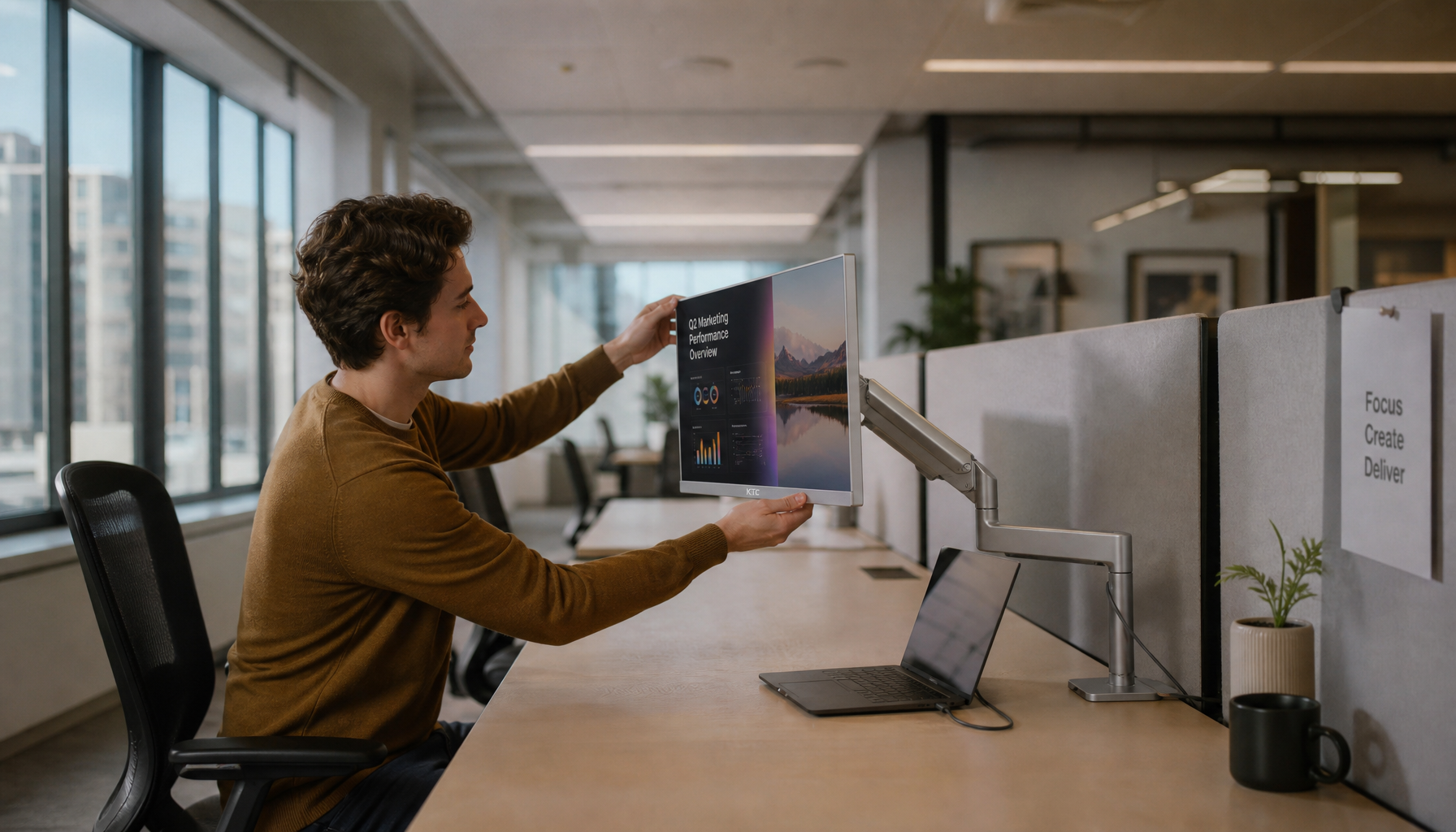
Resolution should rise with screen size, especially if your main tasks are writing, coding, browsing, office work, or editing. A practical buying baseline is simple: 24-inch to 27-inch Full HD is entry-level, 27-inch QHD is a strong value point, and 27-inch to 32-inch 4K is where text clarity starts to feel premium for all-day desktop use. A current example of that desk-distance category is a 27-inch 4K IPS 60Hz home and office monitor, which fits the same 27-inch 4K IPS profile that usually makes more sense for text work than a larger smart display.
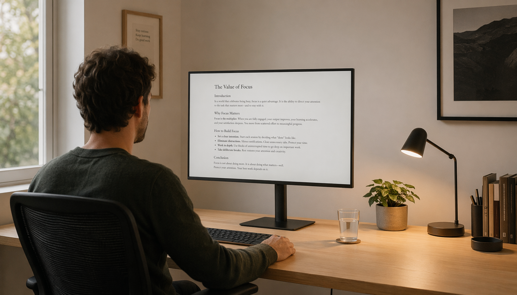
Text-friendly displays usually benefit from standard RGB behavior and adequate pixel density. If office readability comes before gaming contrast or HDR impact, IPS remains the safer default. VA can still be comfortable and sometimes gives text a darker, inkier look, but the implementation matters more than the label on the box.
Refresh rate is a separate decision from text sharpness. A 144Hz or 240Hz gaming monitor feels smoother in motion, but it does not automatically fix fuzzy letters. For mixed use, a high-refresh IPS or 4K smart monitor can give both clean text and smooth desktop movement; for text-first work, 60Hz is often enough if the panel is sharp and properly scaled.
Comparison Table: Smart Display vs Monitor for Desktop Text
Option |
Typical Strength |
Main Text Risk |
Best Use Case |
Better Buying Choice When |
Large 1080p smart display |
Big image, streaming features |
Low pixel density softens text |
Casual browsing from farther away |
You mainly watch video and only occasionally use a PC |
27-inch QHD monitor |
Strong clarity for the price |
Less cinematic than a TV-style screen |
Office work, school, daily desktop use |
You want a reliable all-around monitor |
Very sharp text, lots of workspace |
May need scaling for comfort |
Productivity, photo work, long reading sessions |
You want premium text clarity |
|
27-inch 1440p OLED |
Great contrast and gaming feel |
Fringing can be noticeable for text |
Gaming-first hybrid setup |
Motion and contrast matter more than office perfection |
32-inch 4K OLED |
Better text behavior than 1440p OLED |
Still not as safe as IPS for pure office use |
High-end hybrid gaming and work |
You want OLED but still need decent desktop readability |
Ultrawide productivity monitor |
Wide workspace without dual screens |
Sharpness depends heavily on resolution |
Multitasking, timelines, spreadsheets |
You want side-by-side apps on one screen |
When a Dedicated Monitor Is the Better Choice
Smart displays and smart monitors are not built around the same assumptions. Smart TVs and large smart displays prioritize streaming, built-in apps, and distance viewing, while smart monitors and PC monitors are designed more around close-up desktop use. That difference matters more than marketing names when text is your daily workload.
For pure productivity, IPS with standard RGB subpixels is still the safer choice. If you spend hours in documents, code editors, trading platforms, or browser tabs, a real monitor usually wins on comfort and consistency. If you split time between work and fast games, a high-refresh gaming monitor or a higher-PPI OLED can make sense, but the decision should be based on text tolerance, not just contrast or response time.
Ergonomics also push many buyers toward proper monitors. Height, tilt, and swivel adjustments matter when the screen sits 2 ft to 3 ft from your face all day. A smart display can work in a pinch, but if you are building a serious desk setup, the better long-term move is usually a monitor designed for close-range text, not couch-distance entertainment.

FAQ
Q: Why does text look blurry even when movies and a video platform look good?
A: Video hides scaling flaws better than text. Desktop letters have thin, high-contrast edges, so any interpolation, poor scaling, or low pixel density becomes obvious much faster than it does in movies.
Q: Will a higher refresh rate fix blurry text?
A: Usually no. Higher refresh rates improve motion smoothness, not static letter sharpness. For text, native resolution, pixel density, scaling behavior, and subpixel layout matter more.
Q: Is OLED always bad for office work?
A: No, but it is less predictable for text than a good IPS monitor. Higher-PPI 4K OLEDs are much better than 1440p OLEDs for desktop work, while IPS remains the safer pick for people who care most about crisp documents and spreadsheets.
Practical Next Steps
If your smart display is already on the desk, start with native resolution, 100% scaling, sign-out/sign-in, and per-app DPI fixes. If text still looks soft on a large 1080p panel, you are probably seeing the limit of the hardware rather than a missing setting.
For a new purchase, match the display to the job. A 27-inch QHD or 32-inch 4K monitor is the safer choice for text-heavy work, a high-refresh gaming monitor is the better fit for motion-focused use, and a higher-PPI ultrawide makes more sense than a big smart display when productivity is the goal.


