


Edited photos often look too dark on phones because they were judged on a brighter, larger, or differently tuned screen. A simple phone-check workflow helps you protect shadow detail, midtones, and contrast before sharing.
Does your photo look clean on your monitor, then suddenly heavy, muddy, or underexposed when you text it or post it from your phone? A quick phone check can show whether the issue is the edit, the display, or the original capture before you overcorrect the whole image.
The Core Problem: You Edited for One Screen, but Viewers See Another
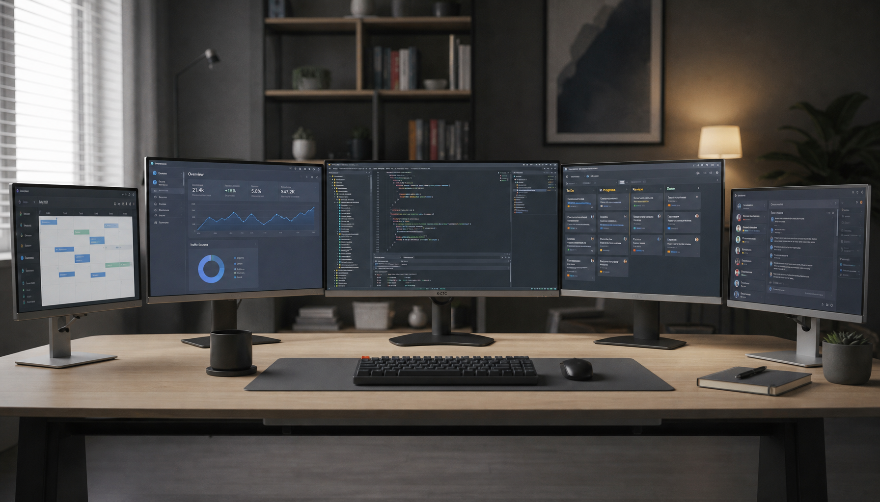
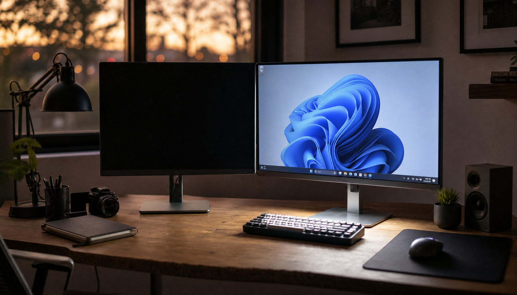
A desktop monitor, laptop display, tablet, and cell phone rarely show brightness the same way. Even when the image file is unchanged, the viewing experience changes with screen brightness, contrast, ambient light, and display size. A shadow that feels cinematic on a 27-inch productivity display can collapse into a dark patch on a 6-inch phone outdoors.

This is especially common when editing at night on a bright monitor. Your eyes adapt to the room, the display feels vivid, and you stop brightening earlier than you should. The next morning, the same image on a phone at medium brightness looks dull because the midtones and shadows were never strong enough for small-screen viewing.
The fix is not simply to make everything brighter. That often ruins highlights, skin, skies, and product detail. A better approach is to separate exposure, midtone brightness, whites, blacks, and contrast so the image gains screen-ready clarity without looking washed out.
Brightness, Exposure, and Contrast Are Not the Same Thing
Many dark mobile edits come from treating every light-related slider as interchangeable. They are connected, but they do different jobs.
The brightness of an image is often felt most in the midtones, while exposure shifts the image more broadly across highlights, midtones, and shadows. That distinction matters because a photo can have bright highlights but still look too dark overall if the midtones are low.
Contrast is different again. It controls how strongly light and dark areas separate. Raising contrast can make an image feel more powerful on a monitor, but on a phone it can bury shadow detail. Lowering contrast can rescue detail, but too much flattening makes the photo look gray and weak.
Adjustment |
What It Mainly Changes |
Mobile Risk |
Better Use |
Exposure |
Overall light level |
Blown highlights if pushed too far |
Use in small steps when the whole photo is dark |
Brightness or midtones |
Middle tonal range |
Can look flat if overused |
Lift faces, interiors, food, and products naturally |
Whites or highlights |
Bright areas |
Lost sky, skin, or screen detail |
Recover or shape bright detail carefully |
Blacks or shadows |
Dark areas |
Muddy corners and blocked hair or clothing |
Open shadows without killing depth |
Contrast |
Separation between tones |
Harsh darks on small screens |
Add clarity after exposure is balanced |
In practical terms, if a desk setup photo looks too dark on a phone, do not jump straight to a big exposure boost. Try a small exposure lift, raise shadows slightly, and then tune blacks so the keyboard, monitor bezels, and chair still have shape.
Your Phone Reveals the Weakest Part of the Edit
Phones are unforgiving because they compress the viewing experience. The image is smaller, the viewer may be in bright ambient light, and dark details compete with reflections on the glass. A full-size editing display gives you room to see subtle separation in dark tones; a phone often turns those same tones into one block.
This is why shadow handling matters. In smartphone photography education, lighting and exposure are treated as core controls because they determine whether an image reads as bright, sharp, moody, or grainy. If the original capture is underexposed, a phone edit has less clean information to work with, and brightening later can reveal noise.
A real-world example is a portrait taken in front of a bright window. The phone or camera may protect the window highlight and leave the face too dark. If you edit on a bright monitor, the face may seem acceptable. On a phone, it can look flat and shadowed. The better capture choice is to tap the face for focus and exposure, use HDR when appropriate, or move the subject into softer side light before editing.

HDR Helps, but It Is Not a Magic Brightness Button
High Dynamic Range is useful when a scene has bright skies and dark ground, or a backlit subject with a bright background. HDR balances bright and dark areas by preserving more detail across the scene, which gives you a stronger file for editing.
The benefit is clear: more highlight and shadow detail means less desperate slider work later. The tradeoff is that HDR can look unnatural if the phone over-processes the scene or if you stack heavy editing on top of an already processed image. For fast motion, HDR can also be less dependable because it may combine multiple exposures.
Use HDR for static high-contrast scenes like sunsets, interiors with windows, and landscapes. For moving kids, pets, sports, or handheld night shots, prioritize a sharp, well-exposed image over maximum dynamic range.
The Original Capture May Be Too Dark Before Editing Starts
A dark mobile result often begins before the edit. If the phone captured too little light, you are trying to build brightness from thin data. Raising exposure later can work, but it can also reveal grain, weak color, and soft detail.
The exposure triangle explains the tradeoff among shutter speed, aperture, and ISO. On phones, you may not control all three directly, but the principle still applies. More light can come from a slower shutter, a larger aperture, or higher ISO, and each has a cost. Slower shutter speeds can blur motion, while higher ISO can add noise.
A simple field test is to photograph the same coffee cup near a window, then again under dim ceiling light. Edit both to the same apparent brightness. The window-lit image will usually look cleaner on a phone because the original file contains better tonal information.

How to Edit So Photos Stay Bright on Phones
Start by setting your editing display to a realistic brightness. If your monitor is blazing while your room is dim, you will under-edit. A productivity display does not need to be painfully bright for photo work; it needs to be consistent. Keep the room lighting stable, avoid editing in total darkness, and check the image on the phone before export.
Next, correct exposure before chasing style. The basic workflow of adjusting exposure, contrast, and color balance works because it solves readability first. After that, you can shape warmth, saturation, crop, and mood.
For a photo that looks dark only on phones, raise exposure modestly, then open shadows. If the image becomes washed out, deepen blacks slightly instead of lowering exposure again. If faces still look dull, lift midtones or use a selective edit rather than brightening the entire frame. If skies or white shirts lose detail, reduce highlights or whites.
Selective editing tools are valuable because they let you brighten a face, product, or desk area without forcing the whole image upward. For quick fixes, online tools can also help; a simple image brightness adjustment is useful when the whole photo is underexposed, though it gives less control than a full editor.
Check the Histogram, Then Check the Phone
A histogram is a performance dashboard for your photo. If most of the data is crowded on the left side, the image contains many dark tones. That is not automatically wrong, but it explains why the photo may feel dense on a phone.
A strong mobile-ready edit usually leaves enough information in the shadows for the subject to read at a glance. For example, a black monitor on a dark desk can stay dramatic, but the edges of the screen, keyboard, mouse, and hands should still separate. If they merge together, the image may be too dark for practical viewing.

After the histogram check, send the image to your phone and view it at normal brightness. Then lower the phone brightness slightly and check again. If the subject still reads clearly, your edit is more likely to survive social feeds, messages, and casual viewing.
Cropping Can Make a Dark Photo Feel Even Darker
Cropping is not just composition; it changes the visual weight of tones. If you crop tightly into a dark jacket, black desk, or shadowed background, the phone screen fills with dark pixels and the whole image feels heavier.
Smartphone photography guidance often emphasizes gridlines because composition controls where the eye lands. A brighter face, product, sky, or reflective surface can balance darker regions when placed intentionally. If your crop removes the brighter anchor, the mobile version may look underexposed even when the histogram is technically acceptable.
For product photos, keep enough bright negative space or surface reflection to give the object separation. For portraits, avoid letting hair, clothing, and background all fall into the same dark range. For gaming desk shots, make sure monitor glow, key lighting, or color accents support the subject instead of becoming the only visible detail.
Pros and Cons of Brightening for Mobile
Brightening for mobile improves readability, shareability, and first-glance impact. It helps faces look alive, products show texture, and landscapes keep detail when viewed in bright rooms or outdoors. For social media, that extra clarity often matters more than subtle desktop mood.
The downside is that aggressive brightening can flatten contrast, expose noise, and make an intentional low-key image look ordinary. A moody gaming setup, concert shot, or night street photo should not be edited like a sunlit product listing. The goal is controlled visibility, not maximum luminance.
The best compromise is to preserve the image’s intent while protecting the subject. Let backgrounds stay dark if they support the mood, but keep the main subject readable. A photo can be dramatic and still mobile-friendly.
A Reliable Screen-Check Workflow
Use one consistent editing screen, one consistent phone check, and one consistent export habit. Edit the image until it looks balanced on your main display, then check it on your phone at everyday brightness. If it looks too dark, return to the edit and adjust exposure, shadows, and midtones in small moves rather than applying a global brightness boost.
For social posts, export a test version and view it in the app or message thread where it will actually appear. App backgrounds, compression, and thumbnails can change perception. A photo that looks fine full-screen may feel darker in a feed surrounded by white interface elements.
For recurring work, create a personal phone-safe preset. Build it from edits that already looked good on both your monitor and phone. Keep the preset moderate, then fine-tune each image instead of forcing every shot into the same brightness recipe.
FAQ
Why does my photo look bright in the editor but dark after I post it?
Your editing environment may be brighter than the viewing environment, and the app may show the image smaller or against a different background. Check the exported file on your phone before posting, not only inside the editor.
Should I increase exposure or shadows first?
If the whole image is dark, start with a small exposure lift. If the highlights are fine but faces, clothing, or foreground detail are too dark, lift shadows or midtones instead.
Is my phone screen the problem?
It can be part of the problem, especially if brightness is low or adaptive brightness is active. Still, if the image looks dark on several phones, the edit likely needs more midtone or shadow support.
A strong edit should survive the jump from a large display to a pocket screen without losing the subject. Treat the phone preview as a final performance test, and your photos will keep their depth without going dark where viewers actually see them.


