


D65 is a useful reference white for monitors, but it is not a guarantee that white will look natural in every room. If your lighting, brightness, or workflow do not match that reference, a technically correct display can still look off.
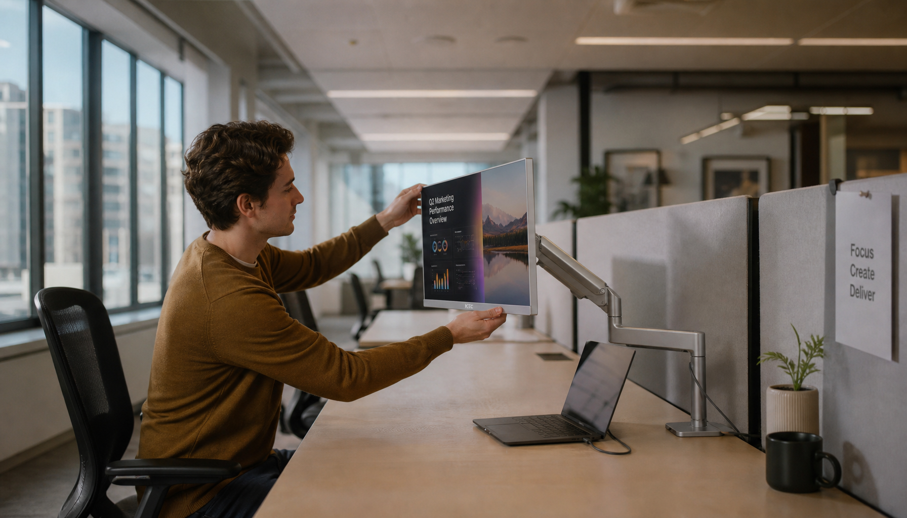
If your new gaming monitor looks yellow at night but oddly blue the next morning, the panel may not be the real problem. In real calibration workflows, displays that measure near 6,500 K can still feel wrong when the room is much warmer, the screen is far brighter than the desk, or your previous monitor was closer to 7,200 K or 8,000 K. You’ll leave with a practical way to choose a white point for gaming monitors, ultrawides, portable monitors, and creator displays without chasing the wrong target.
D65 Is a Reference, Not a Room Simulator
Why D65 became the default
D65 is the default white for sRGB, which is why so many desktop monitors, gaming monitors, and laptop panels are built around it. That makes sense for web content, video, and general display work, because most color-managed screen workflows assume a daylight-style white rather than the warmer white used for print booths.
Why that does not make it universal
D50 is the print standard, so a monitor set to D50 will usually match paper under a D50 viewing light better than the same monitor set to D65. That is why print shops, proofing stations, and soft-proof setups often use a controlled D50 light beside the screen instead of assuming the monitor alone should solve the match.

Why Kelvin numbers can still mislead
Color temperature alone is not enough, because a display can sit near the right Kelvin value and still lean green, pink, or otherwise non-neutral. For monitor buyers, that matters because a spec sheet that says “6500 K” does not prove a gaming monitor or ultrawide will actually look neutral once it is on your desk.
Room Lighting Changes What “Correct White” Looks Like
Your eyes adapt to the room first
Ambient light changes perceived white, so a D65 ultrawide in a warm room can look too blue, while a warmer display in a cool daylight room can look too yellow. This is why side-by-side judgments are so unreliable: the wall color, desk lamp, and even the second monitor on your setup all push your visual adaptation around.

Brightness mismatch makes the problem worse
Screen brightness should sit roughly near ambient illumination, because a monitor that is far brighter than the desk and walls increases eye strain and makes white balance harder to judge. In a dark room, about 40 cd/m² is a practical lower floor if you still need to see small luminance differences, while many common calibration targets for normal desks still land around 80 to 120 cd/m².
Sometimes the room is the real problem
Very warm rooms can break the theory: one measured workspace came in around 2,300 K under tungsten lighting, the software would not target below 3,000 K, and the display showed red artifacts when pushed that warm. In plain terms, if your evening setup is lit by a very orange lamp, changing the bulb is often smarter than forcing a high-refresh-rate display into an extreme white point it was never designed to hold cleanly.
Why D65 Often Looks “Yellow” on a New Gaming Monitor
Your old display may have trained your eyes badly
Many users are coming from cooler native whites, which is why a correct D65 target can look unexpectedly warm on a new OLED gaming monitor or creator panel. In one case, a laptop measured around 8,000 K and an external display around 7,200 K, so dropping to 6,500 K felt wrong at first even though the new target was closer to standard screen white.
Not every yellow cast is calibration
A yellow cast is not always a calibration error, and one a brand display case was fixed by turning off a platform “Automatically manage colour for apps” rather than changing the monitor’s 6,500 K setting. If your screen shifts during gaming, after alt-tabbing, or only in certain apps, check the OS, HDR status, blue-light modes, and vendor software before you assume the panel or calibrator is wrong.
Measurement quality matters on modern panels
Instrument correction has to match the backlight, which matters on OLED, wide-gamut IPS, and mini-LED screens that do not behave like older office monitors. A mismatched correction can make a premium display read wrong on paper, which leads buyers to “fix” a white point that was neutral to begin with.

Choosing the Right White Point for the Monitor You Actually Use
Pick the target by workflow, not internet consensus
The right white point depends on the job, not on a universal rule for every 240 Hz esports display, ultrawide productivity monitor, or print-proofing screen. If the monitor’s main job is web, gaming, streaming, or general desktop use, D65 remains the most practical starting point; if the job is evaluating prints under controlled print lighting, D50 is still the more defensible target.
Setup |
Typical room condition |
Practical white point target |
Practical brightness target |
Why it usually works |
Gaming monitor for web, streaming, and everyday use |
Neutral room light, blinds open or balanced LEDs |
D65 |
80 to 120 cd/m² |
Matches common screen standards and most sRGB content |
Ultrawide or dual-monitor office setup used day and night |
Mixed room light, changing lamp color, bright second screen nearby |
Start with D65, then fix room lighting and brightness before changing white point |
Near ambient; avoid huge screen-to-room mismatch |
Reduces eye strain and avoids chasing a color problem caused by the room |
Creator monitor used for print proofing |
Controlled booth or print-viewing light |
D50 |
Match proofing environment |
Tracks paper white more closely under print-standard lighting |
Portable monitor used in variable spaces |
Hotel room, coffee shop, travel desk, uneven ambient light |
Native or D65, whichever looks neutral and repeatable |
Moderate, adjusted for the room |
Portability makes room control weak, so consistency matters more than theory |
Personal photo editing in mixed home lighting |
Daylight plus warm evening lamps |
Slightly warmer than D65 can be reasonable |
Lower than showroom brightness |
Comfort and print plausibility may improve if the room is not standardized |
A warmer target can be reasonable in mixed-light homes
Some editors intentionally use a slightly warmer white point, especially when their prints are viewed under mixed daylight and incandescent light instead of a controlled booth. That is a workflow choice, not a standard, and it makes the most sense when you care more about believable real-world viewing than strict cross-lab matching.
Do not compare mismatched whites side by side
Direct screen-to-print comparison across different whites is misleading, so if you keep D65 for screen-first work, judge prints under proper print lighting instead of holding them next to a bright monitor. The same logic applies to dual-monitor desks: if one display is much cooler or brighter, it can make the other one look wrong even when both are technically fine.
How to Calibrate Without Chasing the Wrong Problem
Set white point before final brightness
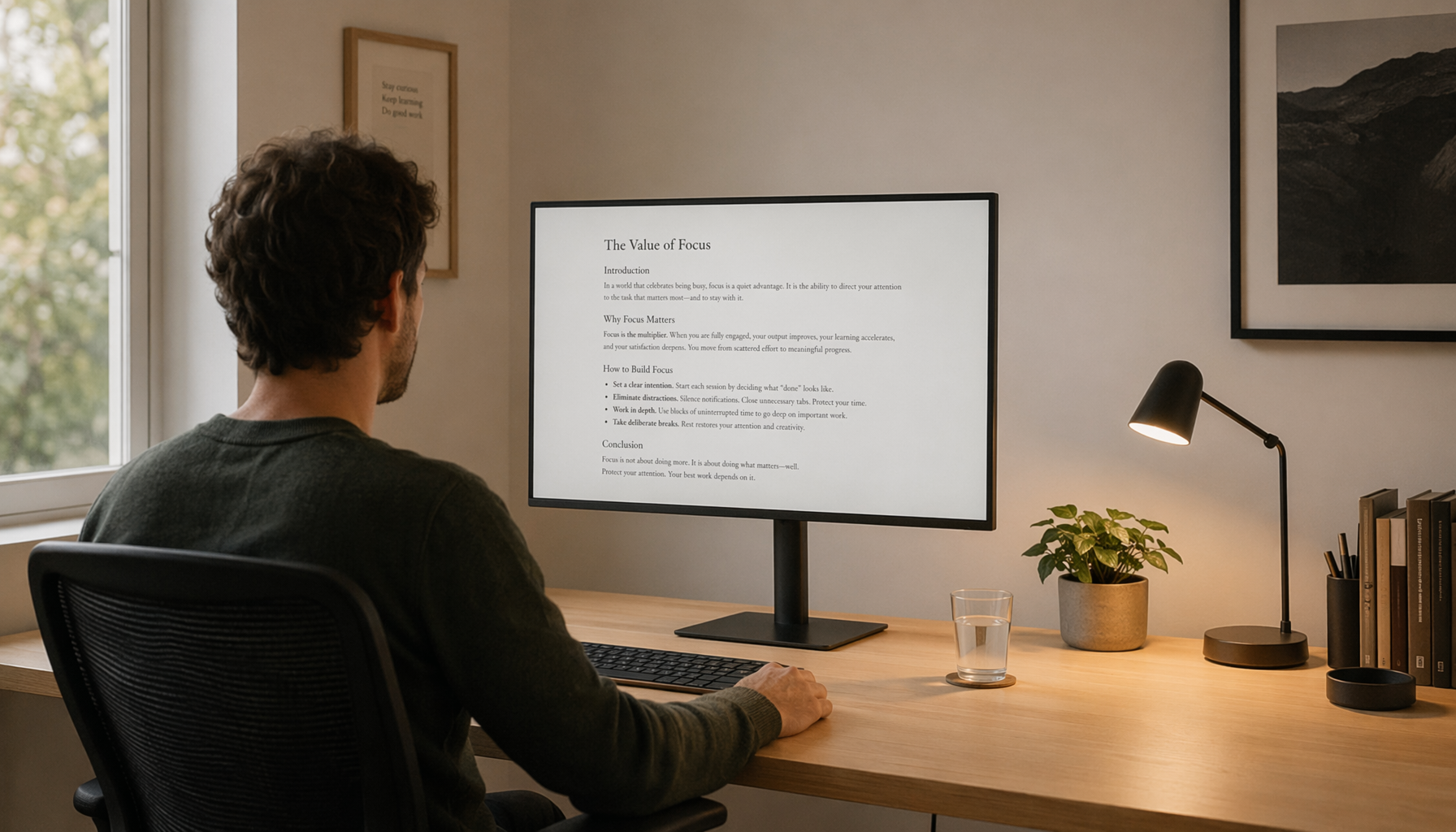
White-point adjustment should come before final brightness tuning, using the monitor’s RGB or white-point controls in the OSD rather than guessing from a software slider alone. On a gaming monitor, that usually means disabling blue-light presets, setting the desired color temperature mode, then using the custom RGB controls only if the calibration software asks for it.
Measure the room the right way
Ambient readings only help if the meter is placed correctly, which means next to the display with the diffuser facing up, not pointed at the screen. If your wall paint, LED strip lights, or desk mat are strongly colored, the measured result can be misleading, and at that point visual comfort becomes a better tie-breaker than blindly following a target number.

Verify with a simple white-detail check
A near-white visibility test can catch bad contrast settings, and on a well-adjusted monitor the brightest steps should still separate instead of clipping into one flat patch. This matters on gaming monitors especially, because aggressive contrast presets can make a display look punchy in the store while crushing the subtle near-white detail you need for calibration and image work.
FAQ
Q: Why does D65 look yellow on my new gaming monitor?
A: A true D65 white can look yellow if you were used to a cooler panel, if the room light is cooler than the screen, or if the OS is adding a tint. Check your previous monitor habits, room lighting, a night mode or blue-light features, and app-level color management before changing the calibration target.
Q: Should my gaming monitor and portable monitor use the same white point?
A: Matching white point makes the most sense when displays are used in the same viewing condition. If a portable monitor moves between hotel rooms, offices, and home, repeatability may matter more than forcing it to match the desktop screen perfectly.
Q: Do I need D50 if I sometimes print?
A: D50 is most useful when print evaluation happens under D50 viewing light. If your real work is mostly web, gaming, store listings, or screen-first content, D65 is usually the better default and proper print lighting matters more than forcing every screen to D50.
Practical Next Steps
A stable monitor setup usually comes from controlling the room first, then choosing the white point that matches the job, then dialing in brightness and verification. Use this checklist before you blame a new panel.
- Warm the monitor up for at least 30 minutes before calibrating.
- Turn off a night mode, blue-light filters, HDR experiments, and app-level color tweaks before testing white point.
- Start at D65 for gaming, web, and general display work; use D50 only when you also control print-viewing light.
- Set brightness close to the room instead of leaving the screen at showroom intensity.
- If the room is very warm or very dim, fix the lighting before forcing the monitor into an extreme target.
- Verify near-white detail after calibration so bright highlights do not clip away.
- Recheck the setup at the time of day you actually use the monitor most.


