


Exports usually look washed out because the file, app, browser, operating system, or display is interpreting color space, gamma, brightness, or ICC profiles differently than your editing monitor did.
Did your screenshot, product render, game capture, or edited photo look rich on your monitor, then turn flat the moment you opened the exported file somewhere else? A practical export check using sRGB conversion, a neutral monitor mode, and one second-screen review can catch the most common mismatch before you publish. Here is how to diagnose the weak link and export images that hold their color with more confidence.
The Core Problem: Your Monitor Is Not the Final Truth
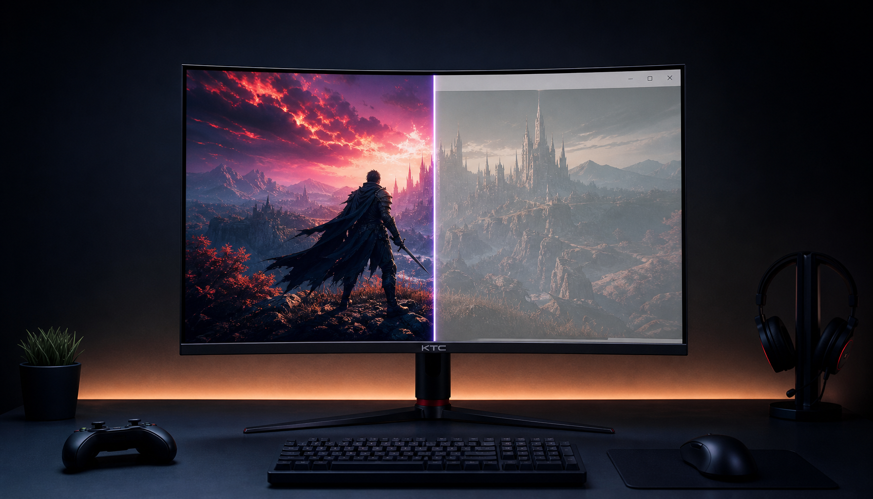
A vibrant monitor can lie in a convincing way. Many gaming monitors ship in vivid, FPS, movie, HDR, or wide-gamut modes because those settings look punchy on a showroom wall and immersive in games. That does not mean the screen is showing your file accurately.
When you export an image, the exported file carries color data, and sometimes a color profile, into a new viewing chain. That chain may include your editing app, the export settings, the operating system color engine, the browser, the photo viewer, a phone screen, a web platform, and the viewer’s display mode. If any one of those parts assumes the wrong color space or tone curve, saturated reds, electric blues, and deep shadows can lose their punch.
This is why a design can look bold in an image editor, 3D tool, photo editor, or game capture utility, then look pale in a browser tab or messaging app. The display made one promise; the export pipeline delivered another.
Color Space: The Most Common Washed-Out Export Trap
A color space defines the range of colors a file or display is designed to represent. For everyday web images, office visuals, screenshots, product graphics, and most screen sharing, sRGB is the safest target because sRGB color profile support is broad across browsers, screens, cameras, and image software.

Wide-gamut RGB spaces can hold a broader range of colors, which is useful in certain print and advanced photography workflows. The downside is compatibility. If a wide-gamut image is uploaded or opened in a viewer that assumes sRGB, the colors can appear dull, shifted, or undersaturated. In plain terms, the file is speaking one color language while the app is listening in another.
For a real-world example, imagine editing a banner in a wide-gamut RGB space on a wide-gamut monitor. The greens look deep and the orange call-to-action button feels alive. You export a JPEG, upload it to a web page, and the same button looks weak on a coworker’s laptop. The likely fix is not to increase saturation blindly. The smarter move is to convert the finished export to sRGB and embed the sRGB ICC profile.
Convert, Do Not Just Assign
“Assign profile” and “convert to profile” are not the same. Assigning a profile changes how existing numbers are interpreted. Converting to a profile changes the color numbers so the appearance is preserved as closely as possible in the destination space.
For web delivery, convert the final image to sRGB, then export. In professional image editors, use a convert-to-profile command with sRGB as the destination, then save with the ICC profile embedded. In photo-management workflows, choose sRGB in the export color space setting. In similar tools, look for export settings that preserve or convert the profile rather than stripping it.
Export Target |
Best Practical Color Space |
Why It Helps |
Web article image |
sRGB |
Most predictable in browsers and common displays |
Office deck or PDF screenshot |
sRGB |
Reduces surprises across laptops and projectors |
Social media image |
sRGB |
Safer for phone viewing and platform processing |
Fine-art print workflow |
Wide-gamut RGB with soft proofing |
Preserves a wider editing range when the full workflow supports it |
SDR video stills |
sRGB or Rec. 709 depending on workflow |
Keeps still-image and video standards from being mixed casually |
Gamma: Why Brightness Can Shift Even When Color Space Is Correct
Gamma controls how midtones are mapped between black and white. If color space is the map, gamma is the road grade through the midtones. A mismatch here often makes exports look lifted, gray, or low-contrast rather than simply less saturated.
Video workflows are especially vulnerable. Rec. 709 is common for HD video, while sRGB is common for still images and computer displays. A production discussion comparing multiple compositing tools, 3D tools, media players, image formats, video codecs, and container types found that outputs did not visually match consistently across applications. That is not user error alone; different apps can apply different assumptions about video levels, gamma, and color management.
A practical example: you render a still from a 3D scene and it looks rich in the viewport. Then you export a frame or video, open it in a media player, and the blacks lift. If the file is Rec. 709 but the viewer treats it differently, the result can look washed out even if the export technically contains the expected data.
For still web images, gamma 2.2 is the practical default. For broadcast-style grading, gamma 2.4 may be more appropriate. The trouble starts when you grade under one expectation and judge under another.
Monitor Modes Can Make You Overcorrect
A monitor’s “vivid” mode is a performance feature for visual impact, not a reference mode for exporting. It may boost saturation, raise contrast, sharpen edges, alter gamma, cool the white point, or expand sRGB content into a wider gamut. That makes games and dashboards pop, but it can push you into under-editing the file.

If your monitor makes every red look intense, you may reduce saturation during editing. Then the exported image looks weak on a normal office display. If your monitor brightness is maxed out in a dim room, you may darken the image too much. If your screen is in a cool mode under warm lamps, you may push white balance in the wrong direction.
Room light matters too. Ambient reflections raise perceived black levels and compress color. A display-quality analysis explains that ambient reflections reduce apparent black levels and mix with emitted light, which makes colors look less distinct. In a bright office with overhead lights, a glossy portable monitor can make deep navy look like dusty blue before the file even leaves your machine.
For a practical baseline, use sRGB, Standard, Custom, User, or Creator mode instead of Vivid or Movie. Set white point near D65 for screen work, keep brightness matched to the room rather than maxed out, and avoid direct lamp or window reflections on the panel.
Calibration: When “Looks Good” Needs Measurement
Calibration gives your display a reliable baseline. Profiling creates an ICC or ICM profile that tells the operating system how that specific screen reproduces color. Together, they reduce the gap between what you see while editing and what the file actually contains.
A hardware colorimeter is the serious tool here. Software-only calibration can help with rough brightness and gamma, but it depends on your eyes, and your eyes adapt quickly to room lighting. A monitor calibration workflow built around a colorimeter can measure screen output against known reference values and create a monitor-specific profile; one calibration guide recommends a colorimeter plus software and driver support for consistent profiling.

For creators doing paid photography, product visuals, design review, print preparation, or brand assets, calibration is not a luxury add-on. It protects decisions. If your monitor is too saturated, you will under-saturate exports. If your brightness is too high, you will make images too dark. If your white point is too cool, skin tones and neutral grays can drift warm in the final file.
A reliable working setup is simple: let the monitor warm up, use a neutral room, set a sensible brightness, calibrate to a screen-focused target such as D65 and gamma 2.2, then verify with test images. Recheck periodically because panels drift with age, firmware changes, GPU settings, and room setup.
Wide-Gamut and HDR Displays: Powerful, but Easy to Misread
Modern gaming and creator monitors often cover much more than sRGB. That is a strength when the workflow is color managed. It is a liability when unmanaged apps stretch sRGB content into the full panel gamut or when HDR mode changes brightness behavior.
DCI-P3 and Rec. 2020 are larger gamuts than sRGB, and display measurement work notes that DCI-P3 is about 26% larger than sRGB, while Rec. 2020 is much larger still. That extra range can make a wallpaper or game look spectacular, but a web image exported for ordinary viewers still needs to survive in sRGB.
HDR introduces another layer. If you edit an SDR image while the operating system or monitor is in HDR mode, desktop brightness mapping may not match what most viewers will see. For export checks, switch to the target viewing mode. If the final image is SDR web content, judge it in a controlled SDR setup.
A Practical Fix Workflow Before You Re-Export
Start by checking the file’s color profile. If the image is intended for web, office sharing, ecommerce, or social viewing, convert it to sRGB and embed the profile. Then open the exported file in at least two viewers, such as your editing app and a major browser. If those differ dramatically on the same monitor, the issue is likely color management in the app or export settings.

Next, change the monitor from Vivid, HDR, Movie, or game-enhancement presets to an sRGB or neutral mode. Match brightness to the room. A quick paper test helps: open a white document on screen and compare it with a white sheet of paper under your desk lighting. The screen should not look like a flashlight or a gray tile.
Then test on another display. A laptop, phone, or second monitor will not be perfectly accurate, but it shows whether the export is generally robust. Checking work across multiple screens and even a phone reflects a real limitation of digital delivery: monitors vary in calibration, panel quality, and viewing conditions.
Finally, avoid chasing every screen. Your goal is not to make the image identical everywhere; that is impossible. Your goal is to make the file correctly prepared for its destination so it looks credible across normal devices.
Pros and Cons of Common Fixes
Fix |
Pros |
Cons |
Export as sRGB |
Best compatibility for web and office use |
Smaller gamut than wider RGB spaces |
Embed ICC profile |
Helps color-managed apps interpret the file correctly |
Some platforms may strip or ignore profiles |
Calibrate with colorimeter |
Most reliable monitor baseline |
Costs money and takes setup time |
Use sRGB monitor mode |
Reduces oversaturation while editing |
May look less exciting for gaming |
Check on multiple devices |
Catches obvious delivery issues |
Cannot prove true color accuracy |
Increase saturation manually |
Fast visual patch |
Can damage already-correct files and create clipping |
FAQ
Why does my exported JPEG look dull on my phone?
The file may be in a wide-gamut RGB space or another profile that the phone app or transfer path does not handle as expected. Convert the export to sRGB before sharing, then test the actual uploaded or transferred file rather than the version still inside your editor.
Why does PNG look different from JPEG?
The format itself is not usually the main problem. The color profile, app color management, compression settings, transparency handling, and viewer behavior matter more. A PNG without the expected profile can still look wrong, while a properly converted JPEG can look consistent.
Should I edit in sRGB all the time?
For web graphics, screenshots, UI images, and office productivity visuals, sRGB is the most reliable working and export target. For advanced photography or print, a wider working space can make sense, but only if you understand soft proofing, profile conversion, and the final output condition.
Is my monitor defective if exports look washed out?
Not necessarily. A washed-out export is more often a workflow mismatch than a broken panel. Still, if every app looks faded, blacks look gray, or an external monitor looks normal while the built-in display does not, check display profiles, GPU settings, night-light features, HDR mode, and monitor presets.
The Reliable Export Mindset
Treat your monitor as a controlled instrument, not just a beautiful screen. Use neutral display settings, convert web-bound images to sRGB, embed the profile, keep room lighting stable, and verify the exported file outside your editor. The result is not just better color; it is a workflow that lets your visuals land with the impact you intended.


