


You cannot prove lab-grade color accuracy without a meter, but you can verify whether your monitor is practically trustworthy by checking black detail, white detail, neutral grays, preset behavior, room lighting, and real-world output consistency.
Does your game look sharp at night, but your edited product photos come back too dark, too warm, or strangely flat? A focused 15-minute verification pass can expose the most common calibration failures before they cost you ranked visibility, print money, or daily eye comfort. This practical, no-hardware workflow will help you decide whether your display is accurate enough for gaming, office work, content review, or casual photo editing.
What “Accurate” Means Without a Colorimeter
Monitor calibration is the process of adjusting brightness, contrast, color balance, gamma, and white point so the screen behaves closer to a known target. Verification is different: it asks whether the result still holds up after calibration. Without professional equipment, you are not measuring exact Delta E values or building a scientifically validated ICC profile; you are checking whether obvious errors remain.
That distinction matters. A hardware calibrator measures the monitor’s actual output and creates a profile for that specific panel, while visual checks depend on your eyes, room lighting, test patterns, and reference material. One calibration resource describes a calibration device as hardware plus software that measures monitor color values and builds a monitor-specific profile, which is why copied profiles from another unit are never reliable.
For most high-refresh gaming monitors, office displays, and portable smart screens, the goal is practical accuracy. Blacks should retain shadow detail, whites should not blow out, grays should look neutral, skin tones should not drift green or magenta, and the screen should not be so bright that every image you edit turns out dark elsewhere.
Start With the Conditions That Make Verification Fair
A monitor can look wrong simply because the setup is unstable. Let the display warm up before judging it, especially if it has just been turned on or moved from a cold room. Broadcast monitor workflows commonly require a warm-up period before calibration because display behavior stabilizes after the panel reaches operating temperature.
Use the same lighting you normally work in. If your desk faces a window in the morning and becomes dim by evening, your visual judgment will shift even if the monitor has not changed. Block harsh direct sunlight, avoid colored LED room lighting, and turn off automatic brightness, eco modes, night-light modes, and dynamic contrast before testing. Those features may be comfortable for casual viewing, but they change the target while you are trying to verify it.
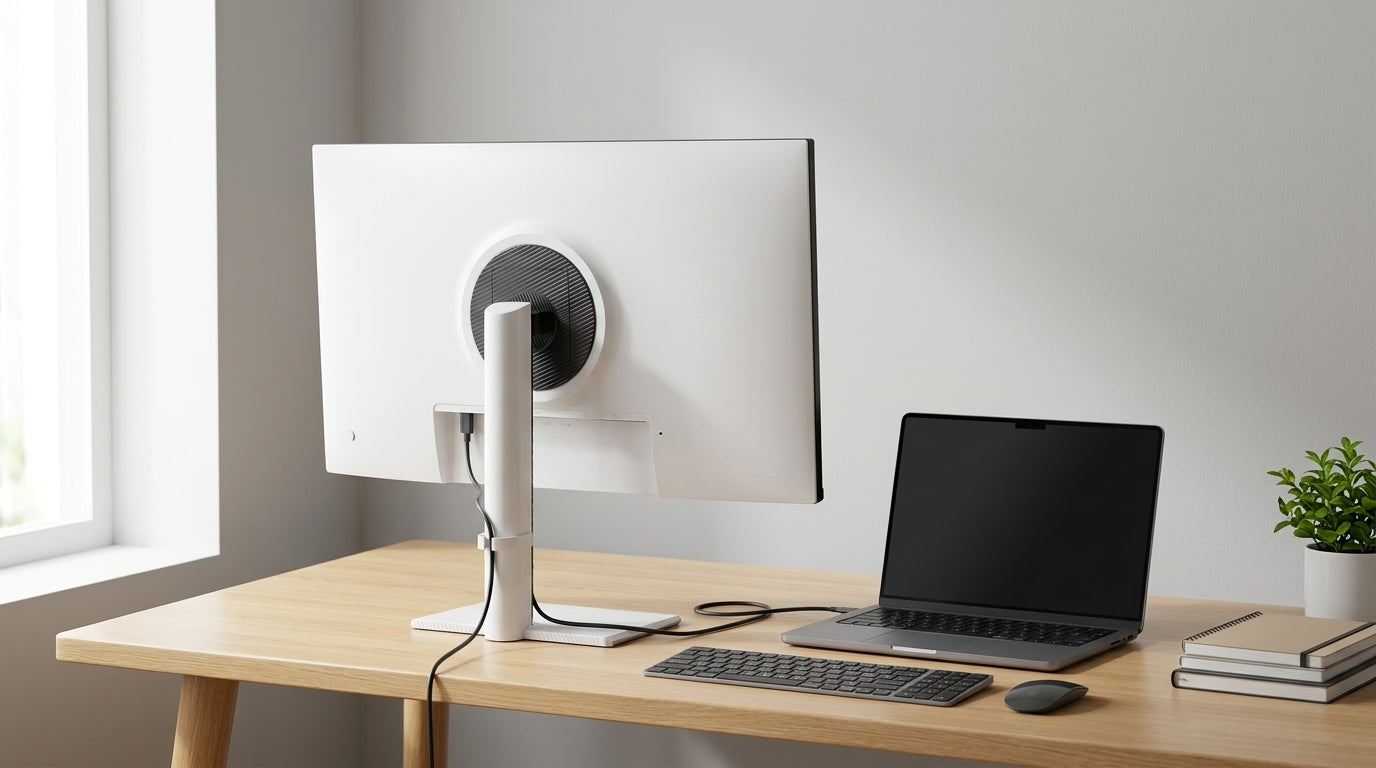
Set the display to native resolution and use a clean digital connection such as HDMI, DisplayPort, USB-C DisplayPort Alt Mode, or DVI on older panels. A digitally connected LCD at its native resolution needs far less correction for sizing and geometry, which lets you focus on brightness, contrast, and RGB balance.
Verify Black Detail First
Black level is where many monitors fail quietly. If brightness is too low, dark scenes in games lose enemy silhouettes, photo shadows turn into mud, and dark UI themes hide separators. If brightness is too high, blacks become gray and the screen loses punch.
Use a black-level test pattern with several near-black bars or squares. Sit in your normal position, not inches from the panel. The darkest patch should blend into black, but the next few steps above black should be barely visible. A practical rule still holds: preserve deep blacks while retaining shadow detail. The point is not to make every dark box obvious; it is to avoid crushing real image detail.
A simple real-world check is a dark game corridor, a black jacket with folds, or a night photo with visible texture. If the image only looks correct after you lean forward or raise in-game brightness dramatically, your monitor’s black level or gamma is probably off. For office productivity, open a document in dark mode and check whether gray dividers and disabled buttons remain visible without glowing.

Check White Detail and Contrast Clipping
Contrast errors show up at the bright end. Too much contrast clips highlights, which means a white shirt, cloud, spreadsheet grid, or bright HUD element becomes a flat white block. Too little contrast makes the whole image look dull and reduces text clarity.
Use a near-white test pattern and look for separation between the brightest steps. Then open a real image with white fabric, chrome, clouds, or snow. You should be able to see texture in the bright areas instead of one blank patch. Fine highlight details such as wrinkles or buttons in a white shirt are exactly the kind of practical reference that works without a meter.

For a gaming monitor, also test bright UI overlays and muzzle flashes in HDR-off SDR mode. If white areas bloom or smear into neighboring tones, reduce contrast slightly. If the image becomes lifeless before highlight detail returns, the selected picture mode may be the problem rather than the contrast slider itself.
Use Neutral Gray to Catch Color Casts
A calibrated monitor should show grays as gray, not reddish, greenish, bluish, or brown. This is one of the easiest no-equipment checks because the human eye is sensitive to unwanted tint in neutral areas.
Open a neutral gray ramp, a black-to-white gradient, and several black-and-white photos. If the shadows are cool blue but the highlights are pink, or the whole image looks tea-stained, the display preset may be interfering. One calibration forum case found that a brownish cast came from the monitor’s standard preset, and switching out of that preset while using warm color temperature or custom RGB controls produced a more neutral result.
The practical move is to test User, Custom, Warm, sRGB, and any creator-oriented modes your monitor offers. Be careful with sRGB mode: it can improve web-content restraint on wide-gamut panels, but some monitors lock brightness or RGB controls in that mode. If a mode prevents basic correction, it may be accurate in theory but unusable for your room.
Confirm White Point Without Chasing Perfection
White point describes whether white appears warm, neutral, or cool. For common LCD use, a 6500K target is a practical baseline, often labeled D65, Warm, or Low depending on the monitor. Many displays’ Warm setting is closer to that target than the colder default showroom mode.
Do not verify white point by comparing your monitor to a phone. Phones frequently change brightness and color automatically, and their vivid modes can make an accurate monitor look dull. Instead, compare multiple neutral images, white web pages, black-and-white photos, and known interface elements across your normal apps. If every neutral surface looks slightly blue, try Warm. If it looks yellow or brown, try Custom RGB and reduce red or green carefully.
For portable smart screens, white point can shift more visibly with viewing angle and battery-saving modes. Verify while the screen is plugged in, set to the brightness you actually use, and positioned at your normal angle. A portable display that looks neutral only when tilted is not calibrated for the way you use it.
Compare Against Real Output, But Know the Limits
A print comparison can be useful, but only if you understand what it proves. If you order an uncorrected print from a reputable lab or use a well-managed printer, the print can reveal whether your monitor is too bright, too dark, or obviously tinted. One screen-calibration resource presents print comparison as a fallback when a calibrator is not available, especially for spotting brightness and color mismatches before serious editing work.
The limitation is that print has its own variables: paper type, printer profile, viewing light, and lab correction settings. If a print looks warmer than the screen under a yellow desk lamp, that does not automatically mean the monitor is wrong. View the print under consistent neutral light, set the monitor to your normal editing brightness, and compare overall brightness, skin tone, shadow openness, and white balance rather than expecting a glowing screen to match paper perfectly.

For office and product-shopping use, use physical references you already trust. A brand color swatch, packaging label, gray notebook cover, or printed photo can help identify obvious shifts. The result is not professional proof, but it is a strong sanity check.
Use Video Patterns for Luma Discipline
If you review video, stream, or game capture, SMPTE-style bars and PLUGE patterns are valuable because they separate luma setup from color preference. PLUGE bars help establish black level by showing near-black values around the black point, and broadcast monitor workflows use them to adjust brightness and contrast before color controls.
On a consumer monitor, you usually will not have a blue-only mode, so do not pretend you can fully verify chroma and phase like a broadcast display. What you can do is use the luma portions of test patterns to confirm that black is not crushed and white is not clipping. This is especially helpful if your monitor has separate modes for FPS, RTS, cinema, reader, and HDR, because those modes often change gamma and saturation aggressively.
A practical example: if a streamer’s black hoodie merges into a black chair on your calibrated setting but separates clearly on a reference laptop and a TV, your black level may be too low. If the hoodie looks gray in every dark scene, it may be too high. Cross-checking several displays will not create a lab standard, but it will expose a bad preset quickly.
Accuracy Checks by Use Case
Use case |
Most important check |
Acceptable result |
Warning sign |
Competitive gaming |
Shadow detail and input mode consistency |
Dark detail is visible without washing out the image |
FPS mode makes everything gray or neon |
Office productivity |
Brightness and neutral whites |
Screen feels like a well-lit page, not a lamp |
Eye strain, blue whites, harsh contrast |
Photo editing |
Gray neutrality and print comparison |
Skin, shadows, and whites look plausible across outputs |
Prints repeatedly come back too dark |
Video review |
PLUGE-style luma and highlight detail |
Near-black and near-white steps remain separable |
Broadcast footage looks correct only in vivid mode |
Portable screen use |
Angle, power mode, and brightness stability |
Same image holds up at normal viewing angle |
Color shifts when tilted or unplugged |
Pros and Cons of No-Equipment Verification
Visual verification is fast, free, and surprisingly effective for catching the failures that bother real users: crushed blacks, clipped whites, blue whites, oversaturation, and excessive brightness. It is also valuable after firmware updates, GPU driver changes, docking station swaps, or moving a portable display between rooms.
The downside is precision. Your eyes adapt, room lighting changes perception, and two monitors can look different while both are technically reasonable. Without a colorimeter, you cannot confirm exact gamut coverage, white point coordinates, luminance, gamma curve, or Delta E. That is why professional photo, print, and color-grading workflows still justify hardware measurement.
The middle ground is simple: use visual verification for routine confidence, and buy or borrow a calibrator when color decisions have financial consequences. Current device categories include enthusiast and professional colorimeter options, making hardware calibration a realistic upgrade path rather than a mystery category.
How Often Should You Recheck?
Recheck after any major change: new cable, new GPU, driver update, operating system color setting change, monitor reset, desk move, or seasonal lighting shift. For a daily work display, a monthly visual check is enough to catch drift and accidental preset changes. For photo, video, or product-color work, check before important projects and consider hardware profiling on a regular schedule.
The most common failure in real setups is not subtle scientific drift. It is a monitor left in vivid, game, eco, reader, or standard mode with locked controls and extreme brightness. The well-lit page comparison remains one of the best desk-level tests: for reading and normal productivity, the screen should not look brighter than a page under good room light.

FAQ
Can I trust factory calibration?
Factory calibration can be a strong starting point, especially on creator-class monitors, but it does not account for your room, brightness preference, GPU output path, aging panel, or selected preset. Verify it with black, white, gray, and real-output checks before relying on it.
Should I copy someone else’s ICC profile?
No. Even the same monitor model can vary by unit, panel batch, age, and brightness setting. A borrowed profile may make your screen worse because it describes another display, not yours.
Is sRGB mode always best?
sRGB mode is useful for web content and standard office work, especially on wide-gamut displays that otherwise oversaturate colors. It is not automatically best if it locks brightness too high, blocks RGB controls, or creates a visible cast in your room.
Why do my prints look too dark?
The monitor is often too bright during editing. Lower the screen to match your room, compare against a reliable print under neutral light, and make sure automatic brightness is disabled before judging exposure.
Final Calibration Reality Check
A monitor is practically accurate when it holds shadow detail, protects highlight detail, keeps grays neutral, stays consistent in your actual room, and matches trusted output closely enough for the decisions you make on it. Professional equipment gives measurement; disciplined verification gives control. For gaming, productivity, and everyday creative work, that control is the difference between a screen that merely looks impressive and one you can actually trust.


