


Yes, too much perceived contrast can contribute to headaches during long monitor sessions, especially when bright text, deep blacks, glare, and room lighting create harsh visual jumps. The fix is not “lower contrast as much as possible,” but to tune brightness, contrast, text size, refresh rate, and lighting together.
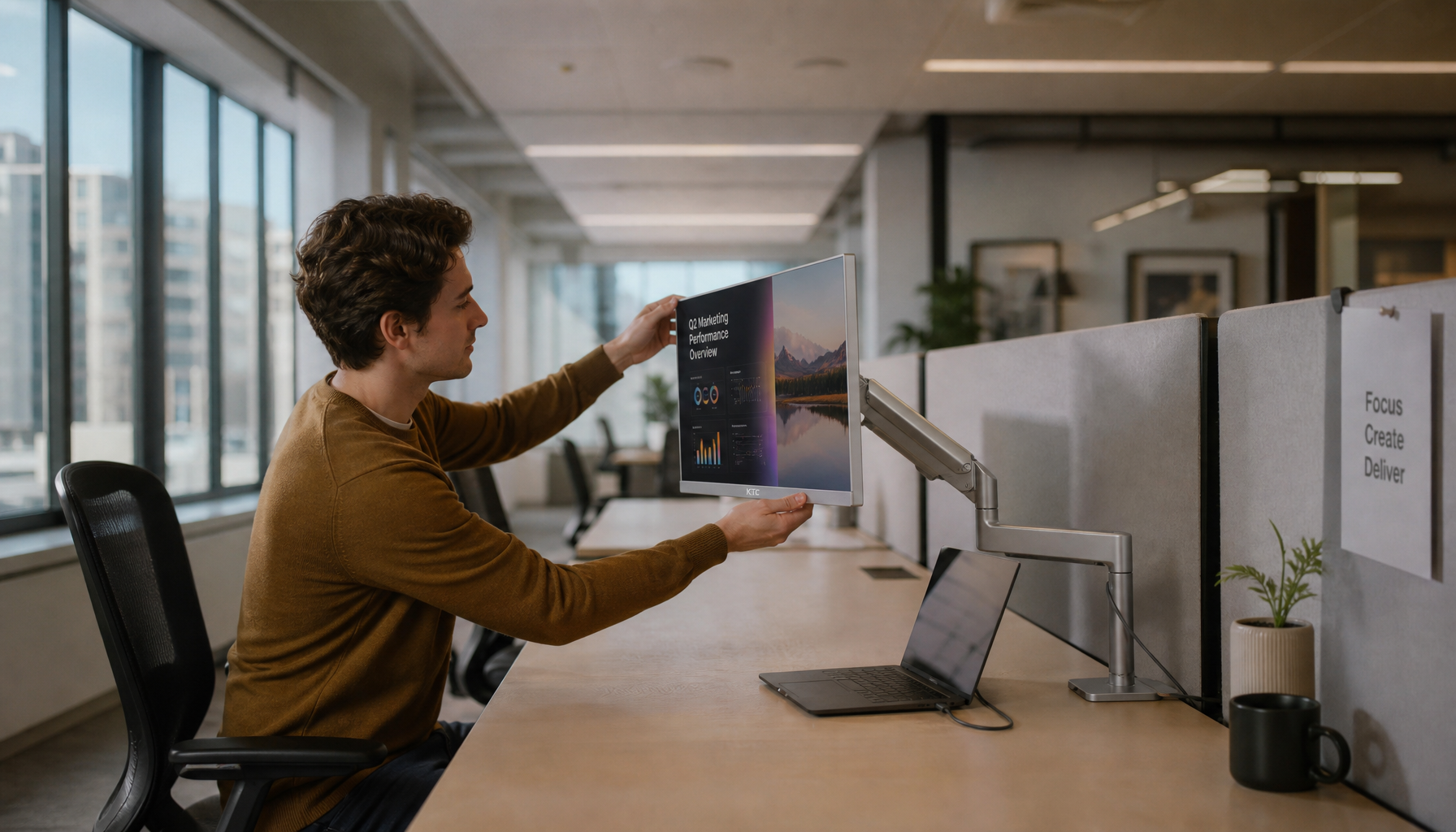
Ever finish a long spreadsheet, coding session, or late-night gaming session with pressure behind your eyes and a headache starting at your temples? Practical monitor tuning often starts with two concrete targets: keep text contrast readable, then set screen contrast around a comfortable middle range rather than maxing it out. This guide shows how to set up office monitors, gaming displays, ultrawides, and portable screens so they stay sharp without feeling harsh.
Why High Contrast Can Help and Still Feel Uncomfortable
Readability Needs Contrast
Monitor contrast is the difference between light and dark areas on screen. In everyday use, it shows up as black text on a white page, white text in dark mode, UI borders, menu labels, cursor visibility, and the separation between game HUD elements and the scene behind them.
For text, contrast is essential. The Web Content Accessibility Guidelines require at least a 4.5:1 contrast ratio for normal text and 3:1 for large text. That is why pale gray text on a white background can feel like work: your eyes have to keep resolving weak edges for hours.
Comfort Is Not the Same as Maximum Contrast
The problem starts when “clear” becomes “harsh.” A high-contrast monitor, bright white document, dark room, glossy panel, and small text can combine into a screen that is technically readable but physically tiring. A university’s accessibility guidance notes that very high contrast can make reading harder for some people, and an off-white background may be more comfortable than pure white for on-screen reading.
For monitors, the practical distinction is important: WCAG contrast ratios are readability floors for content, not perfect comfort settings for a 6-hour editing session. A spreadsheet at 10:30 PM, white text on pure black, and a 32-inch display set too bright can all pass a contrast check while still causing visual fatigue.
How Contrast Can Contribute to Headaches
The Headache Trigger Is Often Perceived Contrast
A monitor’s advertised contrast ratio is only part of the story. What your eyes experience depends on screen brightness, black level, ambient light, reflections, font rendering, panel coating, viewing angle, and how long you stare at the same surface.
Digital eye strain can include headaches, dry eyes, blurry vision, light sensitivity, and aches behind the eyes. A medical center notes that risk rises with continuous screen use, especially after two or more hours per day, and that people blink only three to seven times per minute during screen use, roughly one-third less often than normal. Dryness plus harsh contrast makes text edges feel sharper in the wrong way.

Bright Screen, Dim Room, Bigger Problem
A common long-session setup is a bright monitor in a dim bedroom, home office, or gaming room. That creates a strong luminance gap between the display and everything around it. Your eyes keep adapting between the bright rectangle and the darker room, which can make the display feel more intense than its settings suggest.

A university’s ergonomics guidance ties computer discomfort to uneven lighting, reflections, glare, and prolonged eye use. It recommends adjusting screen contrast for comfortable viewing and clear character definition, but also matching monitor brightness to room brightness and reducing glare before relying on display controls. In other words, a contrast slider alone will not fix a bright monitor facing a window or a dark-mode setup in a blacked-out room.
Dark Mode Can Be Calmer, but Not Always
Dark mode lowers total emitted light, which can feel better at night or in a low-light workspace. But pure white text on pure black can create halos, blooming, and strong edge contrast, especially on OLED, mini-LED, or high-brightness gaming monitors.
A more comfortable dark-mode setup uses charcoal or near-black backgrounds with light gray or off-white text. Real-world dark-mode readability is affected by reflections because ambient light raises the apparent black level of the screen, reducing practical text contrast. That is why a glossy dark screen near a window can behave more like a mirror than a comfort feature.

Better Monitor Settings for Long Work Sessions
Start With Brightness, Then Tune Contrast
The fastest fix is usually brightness, not contrast. Set the monitor so a white document looks like paper under your room lighting, not like a light source. If the screen seems to glow from across the room, it is probably too bright for sustained work.
For general work, a medical center recommends setting screen contrast around 60% to 70%. Treat that as a starting point, not a law. On many monitors, the factory “contrast” control affects white level and color clipping, so pushing it to 100% can crush detail, exaggerate edges, and make text look brittle.

Use Readable Text Without Harsh Color Pairings
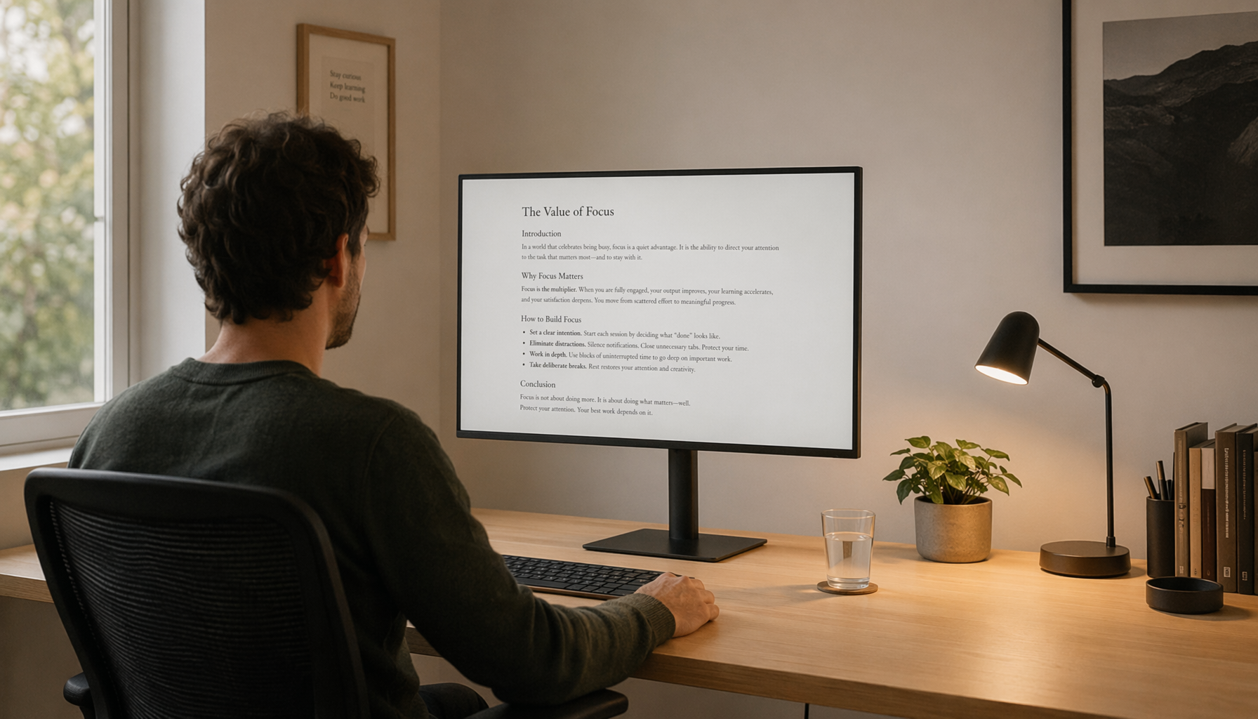
For documents, dashboards, and browsers, avoid both extremes: pale gray text on white and pure black text on maximum-brightness white. A practical light-mode setup is dark charcoal text on a warm off-white or light gray background. A practical dark-mode setup is light gray text on charcoal, not pure white on pure black.
If you design or choose themes for your own tools, use contrast testing. Normal body text should meet 4.5:1 contrast, while large text can meet 3:1. For monitor comfort, then verify the same colors in the actual room, because two displays can render the same theme differently.
Suggested Settings by Use Case
Scenario |
Brightness |
Contrast |
Color temperature |
Refresh rate |
Best practical move |
Daytime office work |
Match room brightness |
Neutral or slightly warm |
75 Hz or higher if available |
Reduce window glare before changing the monitor |
|
Night work |
Lower than daytime |
55% to 70% |
Warm or low-blue-light mode if comfortable |
75 Hz or higher |
Use a desk lamp or bias light behind the display |
Competitive gaming |
Moderate to high only as needed |
Avoid max contrast if HUD blooms |
Neutral |
120 Hz, 144 Hz, or higher |
Prioritize motion clarity without over-brightening the panel |
Ultrawide productivity |
Moderate |
60% to 70% starting point |
Neutral |
100 Hz or higher if supported |
Keep the center of the screen directly ahead |
Portable monitor |
Usually lower indoors |
Avoid punchy vivid modes |
Neutral or warm |
60 Hz to 75 Hz typical |
Use matte finish and avoid reflections from overhead lights |
These are practical starting points. The right setting is the one where text edges remain crisp after 30 to 60 minutes without squinting, watering eyes, or pressure behind the eyes.
Buying Guidance for Headache-Sensitive Monitor Users
Look Beyond Advertised Contrast Ratio
A very high static contrast ratio can be useful, especially for movies, games, and dark scenes. VA panels often have deeper blacks than IPS panels, OLED has pixel-level black, and mini-LED can deliver strong HDR contrast. But for long work sessions, the buying decision should be broader than “highest contrast wins.”
Prioritize a monitor with a wide brightness adjustment range, a good anti-glare coating, clear text rendering, stable viewing angles, and comfortable ergonomics. A university recommends a viewing distance of at least 20 to 26 inches, with 30 to 40 inches often preferred, and the screen center positioned 10 to 20 degrees below straight-ahead gaze. A monitor that cannot be raised, lowered, or tilted easily may cause neck strain that blends into headache discomfort.
Panel Type Tradeoffs
IPS monitors are common for office and creative work because they offer stable viewing angles and consistent color. VA monitors often provide stronger native contrast, which can help dark scenes and movie viewing, but some models show darker smearing in motion. OLED displays offer exceptional contrast, but bright white-on-black text, automatic brightness behavior, and subpixel layouts can bother some users during document-heavy work.
For gaming monitors, do not buy only for peak brightness or HDR marketing. If you are headache-sensitive, a 144 Hz or 165 Hz SDR monitor with good anti-glare treatment and clean text may feel better than an extremely bright HDR display run in vivid mode all day. Older university ergonomics guidance lists refresh rates of at least 70 Hz, and modern high-refresh-rate monitors exceed that comfortably.
Ultrawide and Portable Monitor Considerations
Ultrawides can reduce window switching, but they also create a larger luminous surface. A 34-inch or 49-inch ultrawide in a dark room can feel intense even at moderate settings. Use zones: keep the brightest document or browser window centered, and avoid placing pure-white panels across the full width for hours.
Portable monitors need extra attention because they are often used in hotels, coffee shops, airplanes, and shared workspaces with unpredictable lighting. Choose a matte portable display when possible, keep it at the same height as your laptop screen, and lower brightness in dim rooms. If a portable monitor has only coarse brightness controls, use app-level themes and font size adjustments to reduce harsh contrast.
A Practical Setup Checklist
- Set monitor brightness so a white page looks like paper in your room, not a lamp.
- Start with contrast around 60% to 70%, then adjust only until text edges are clear without glare.
- Use off-white or light gray backgrounds in light mode, and charcoal backgrounds with light gray text in dark mode.
- Move the monitor away from windows, glossy walls, and direct overhead reflections.
- Keep the screen about 20 to 40 inches from your face, with the center slightly below eye level.
- Use a refresh rate above 70 Hz when available, especially on external monitors and gaming displays.
- Take visual breaks: look about 20 feet away for 20 seconds every 20 minutes, and take longer breaks during multi-hour sessions.
When Contrast Is Not the Main Problem
Glare Can Masquerade as Contrast Trouble
If lowering contrast does not help, check glare. A simple test is to shield your eyes or the screen from a bright light source with your hand or a folder. If the discomfort immediately improves, the problem is probably reflection or lighting, not the contrast ratio itself.
Glare controls include indirect lighting, shades, monitor hoods, matte screen surfaces, and repositioning the display. A university recommends reducing room glare first and then adjusting monitor brightness near the middle of its range when possible. This is especially relevant for glossy OLED monitors, glass-covered portable displays, and desks facing windows.
Font Size, Scaling, and Distance Matter
Small text forces constant focusing effort. On a 27-inch 1440p monitor, 100% scaling may be comfortable for some users and too small for others. On a 32-inch 4K monitor, many people need 125% or 150% scaling for long document work. On ultrawides, small side-panel text can be harder to read because it sits farther from the center of your gaze.
A good test is simple: open the app you use most, sit at your normal distance, and read for 10 minutes without leaning forward. If you lean in, increase scaling or font size before changing contrast. Clearer text at a larger size often reduces strain more effectively than making the monitor more intense.
Medical Factors Still Matter
Screen-related headaches can overlap with migraine, dry eye, uncorrected vision issues, neck strain, and light sensitivity. Migraine-related visual triggers can include light contrast, striped shadows, fluorescent shimmer, and flashing light. If headaches are frequent, severe, one-sided, accompanied by vision changes, or interfering with work, monitor tuning should not replace professional care.
FAQ
Q: Should I lower my monitor contrast if I get headaches?
A: Maybe, but start with brightness and glare first. Keep text clearly readable, set contrast around 60% to 70% as a starting point, and avoid max-contrast presets such as “Vivid,” “Dynamic,” or aggressive gaming modes during long work sessions. If text becomes gray or fuzzy, contrast is too low.
Q: Is dark mode better for preventing monitor headaches?
A: Dark mode can help in low-light rooms because it reduces total emitted light, but it is not automatically easier on the eyes. For comfort, use charcoal backgrounds with light gray or off-white text instead of pure black behind pure white. Also add soft room lighting so the screen is not the only bright object in view.
Q: What kind of monitor should I buy if I am sensitive to eye strain?
A: Choose a monitor with matte anti-glare coating, flexible brightness controls, good text clarity, an ergonomic stand, and a refresh rate above 70 Hz. For work, a quality IPS or VA monitor with restrained SDR brightness may be more comfortable than a very bright HDR display. For gaming, prioritize smooth refresh, flicker-free operation, and readable HUD contrast over maximum brightness.
Final Takeaway
Too much monitor contrast can contribute to headaches when it creates harsh visual jumps between bright text, dark backgrounds, glare, and the surrounding room. But the best fix is balanced contrast, not low contrast. Aim for readable text, moderate contrast, matched room brightness, reduced glare, comfortable scaling, and enough refresh rate for stable viewing.
For a long-session setup, the most reliable first move is simple: turn off vivid modes, lower brightness until the screen stops feeling like a light source, set contrast near the middle, and test your normal apps for 30 minutes. If your eyes stop squinting and text still looks clean, you are closer to the right monitor setup.
References
- Improving Readability
- Use Sufficient Color Contrast
- Eye Discomfort
- Understanding Success Criterion 1.4.3: Contrast (Minimum)
- Computer Vision Syndrome (Digital Eye Strain)
- Effects of Paradigm Color and Screen Brightness on Visual Fatigue
- How to Avoid Computer Headaches and What to Do If They Still Happen
- Contrast Ratio & Text Readability on Dark Backgrounds


