


Oversaturated colors on a value gaming monitor usually mean the panel is showing office and web content too vividly, not that the screen is broken. The safest fix is to start with the monitor color settings first, then check Windows or GPU color handling only if the image still looks too intense. The goal is a natural, comfortable desktop image for work, not perfect calibration.

Why Value Gaming Monitors Look Too Vivid
A lot of value gaming monitors leave the factory in picture modes that make games look punchier than a normal office desktop needs. That can be fine for fast-paced play, but it often makes documents, browser tabs, and app icons feel louder than they should.
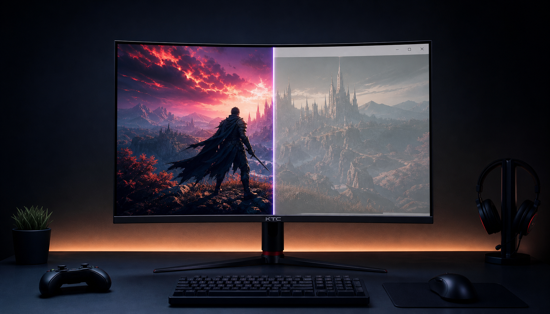
The other common cause is a wide-gamut panel showing ordinary sRGB content at its native range without enough clamping. In plain terms, the monitor can cover more color than the page or app intended, so reds, greens, and blues can look stretched. PC Monitors explains the wide-gamut oversaturation problem clearly.
This is why the first decision is not "Is the monitor bad?" It is "Is the monitor in a vivid preset, or is the color range simply too wide for everyday desktop work?" If the screen looks extreme only in normal office apps, that points toward a settings issue before it points toward a replacement.
For readers who also notice tired eyes while reading, the linked guide on screen-reading discomfort is a useful follow-up, because the complaint is often a mix of contrast, brightness, and focus fatigue rather than color alone.
Check the Cause Before Changing Settings
Before you touch sliders, make sure you are judging the monitor in its normal SDR desktop state. HDR, game modes, and app-specific filters can all make the screen look more intense than it does during everyday work. If you are testing office use, test office use first.
Then check the room. OSHA's workstation guidance emphasizes monitor placement and glare control because lighting and viewing position can affect comfort a lot more than people expect. A bright window behind you, a low monitor angle, or a screen that sits too close can make saturation feel harsher than it really is.
A quick self-check helps:
- Open a browser, a spreadsheet, and a document side by side.
- Compare the image in normal lighting, not in a dark room or with a lamp shining at the panel.
- Check whether the look changes when you switch inputs or devices.
- If the screen seems different across apps, suspect software handling; if it seems different across inputs, suspect the source chain.
If room lighting is doing most of the damage, the most useful next read is why a D65 white point can look wrong, because a "too warm" or "too vivid" complaint can be the room, not the monitor.

Dial in the Monitor OSD Settings
For most people, the easiest path is still the monitor menu. Start there because it is the narrowest change. If the monitor has a neutral preset or an sRGB-style mode, try that before you touch Windows settings or GPU controls. That keeps the fix reversible and avoids piling changes on top of each other.
Choose a Neutral Picture Mode
Look for the most neutral preset available, usually labeled Standard, Custom, User, or something similar. Treat vivid presets, game presets, and cinema modes as tests, not defaults. They can be useful for spotting whether the panel has a more restrained mode hidden in the menu, but they are not usually the best starting point for office work.
If your monitor has separate SDR and HDR behavior, judge the mode you actually use for email, documents, and web browsing. HDR can change how the desktop feels even when you are not watching HDR video.
Set Brightness and Contrast First
Brightness is the first control that usually matters in real office use. If the screen feels harsh, lowering brightness often helps more than reducing saturation. A home-office article on comfortable monitor brightness is a good reference point if you want a practical target for calmer SDR work.
Keep contrast changes small. Contrast affects how clearly light and dark details separate, so if you push it too far down, the screen can start looking flat instead of comfortable. The point is not to dim the panel into a cave. It is to make white backgrounds, menus, and spreadsheets easier to live with in your room.
A useful rule: if a change makes the screen darker but not more natural, undo it and try a smaller step. For office use, you want the page to look calmer without making text look gray or lifeless.
Tame Saturation or Color Intensity
If your monitor has a saturation, color intensity, or vividness control, lower it gradually. Large drops can make the image look dull in a way that is just as annoying as oversaturation. The goal is a gentler desktop, not a washed-out one.
Check real content after every step. Browser chrome, spreadsheet grids, and document whites are better tests than a game wallpaper. On a wide-gamut panel, this step often does the most to bring the desktop back into a normal range, because the monitor is no longer stretching sRGB content so aggressively.
Adjust RGB and Color Temperature Carefully
Use RGB gain, custom color, or temperature controls only after the simpler steps are close. These settings can be helpful when the screen still has a tint, but they are easy to overdo. If one color channel is pushed too hard, the screen can go from vivid to oddly cold, green, or pink.
A more practical test is simple: does white paper, gray UI, and a familiar skin tone look comfortable in your room lighting? If yes, stop there. You do not need a technical-looking result to get a good work image.
For readers who want a broader productivity setup, the linked guide on comfortable monitor brightness pairs well with this section, because brightness and saturation are often mistaken for the same problem.
Match Windows Color Settings to the Display
Windows color management can help, but it does not replace monitor-side tuning. Think of it as the second layer, not the first. If the OSD is wildly vivid, fix that first. If the monitor already has a decent neutral preset but desktop apps still look off, then Windows settings are worth checking.
For general background, operating system color management explains how profiles help apps send the right color to the display, while wide-gamut workflows show why browsers, office apps, and games can behave differently on the same panel.
How Windows Scaling and HDR Can Mislead You
Scaling changes how large text and UI elements appear, which can make people blame color when the real issue is presentation. HDR can also change the desktop look enough to feel oversaturated or too bright during normal work.
When troubleshooting, turn off extra display effects first. That gives you a clean baseline. Once the screen looks reasonable in SDR, you can decide whether any software-side color setting is actually helping or just adding another layer of uncertainty.
Test Apps Separately Before You Save a Profile
Open a browser, a spreadsheet, and a photo viewer before you commit to a color profile. If one app looks much better than the others, that suggests the issue is partly app-specific rather than purely monitor-specific.
Windows 11 Auto Color Management may help some wide-gamut setups, but it is not a universal fix. If your display chain supports it, it can be a useful helper. If not, do not force it to carry the whole job.
When the monitor has no convincing sRGB mode or still looks too vivid after a neutral preset, GPU-level clamping becomes the fallback. Community discussions around driver-level gamut clamping make that order of operations pretty clear: use it when the monitor cannot rein itself in, not as the first move.
Choose the Right Monitor for Office Comfort
Sometimes the right answer is not more tweaking. If the screen still feels too vivid after a neutral preset, sane brightness, and a clean Windows setup, the panel may simply be a poor fit for long office sessions. That is not the same as being defective. It just means the monitor is better suited to a more vivid gaming look than to calm daily work.
The practical choice is to compare three paths: keep it, tune it, or switch to an office-first monitor. If you mainly want easier text reading, steadier whites, and fewer color surprises, the office-first path can be the cleaner long-term choice.
| Situation | Best first move | When to escalate | When to switch |
|---|---|---|---|
| New value gaming monitor looks too vivid in office apps | Try a neutral OSD preset | Adjust brightness, saturation, and color temperature if the look is still harsh | Switch if the panel never feels calm in daily work |
| Monitor has a weak or missing sRGB mode | Use monitor controls first, then software | Try Windows color management or GPU clamping if oversaturation remains | Switch if the clamp still feels awkward or inconsistent |
| Desktop feels tiring even after basic tuning | Recheck room lighting and viewing angle | Save a workable setup only if the image now feels natural | Switch if office comfort still needs constant compromise |
| Reader wants a calmer office-first display | Compare office-oriented models | Check specs, stand needs, and desk fit | Choose a display that starts closer to the target look |
If you want a neutral office-first reference point, the Office Monitor collection is a cleaner place to browse than a gaming lineup. One relevant example is a 27-inch 4K office monitor, a 27-inch IPS display built for professional work and everyday entertainment. That does not make it the answer for everyone, but it is a sensible fit check for readers whose main goal is calmer everyday work rather than gaming-style color pop.
Verify the Result and Decide Your Next Step
Check the screen in the apps you actually use most: a browser, a document, and a spreadsheet are enough for most people. If whites feel less harsh, grays look more neutral, and skin tones no longer seem extreme, stop adjusting and save the settings. If one problem improved but another got worse, go back one layer instead of changing everything again.
The best outcome is simple: keep the current monitor if the image now feels natural, save the settings if it is close, or move on if office work still feels like a compromise. If you need more context on why lighting can still change the result, real-world white point behavior is worth a look.
FAQs
How Do I Tell If My Monitor Is Oversaturated or Just Too Bright?
Oversaturation makes colors look unrealistically intense, while high brightness makes the whole screen feel uncomfortable, especially on white backgrounds. A neutral page, spreadsheet, or document is a better test than a colorful game scene because it shows whether the problem is color range or simple luminance.
What Monitor Picture Mode Should I Try First for Office Work?
Start with the most neutral preset your monitor offers, such as Standard, Custom, or User. If those still look too vivid, test a different preset only as a comparison step. Vivid and game modes often make office content harder to judge, even if they look exciting in games.
Can Windows Color Settings Fix Oversaturated Colors on Their Own?
They can help, but they are not a stand-alone fix. Windows color management works best after the monitor is already close. If the OSD is still in a vivid mode, fix that first, then use Windows settings to refine how apps and the display talk to each other.
Why Do Web Pages and Office Apps Look Different on the Same Monitor?
Browsers, office apps, and photo tools do not always handle color the same way. That is why one app may look fine while another seems too vivid or dull. Test more than one common app before deciding the monitor itself is the problem.
When Should I Consider a Different Monitor Instead of More Tweaking?
If the screen still feels harsh after a neutral preset, lower brightness, and a clean Windows setup, the monitor may just be the wrong fit for office-first use. At that point, an office-oriented model with calmer defaults is usually a better long-term answer than endless adjustments.
Wrap-Up
If your monitor color settings are close and the desktop now feels calmer, save the profile and stop there. If office use still feels strained, compare an office-first display rather than chasing more tweaks.


