


Mini-LED value monitors often look punchier than they should out of the box, so KTC monitor calibration settings are worth a quick pass before you trust the image for editing. The safest approach is to tune SDR creator work first, treat HDR as a separate mode, and use visual checks only as a baseline when you do not have a colorimeter.

What Calibration Can and Cannot Fix
For creator work, the main goal is not perfection. It is to get the panel close enough that color, white balance, and shadow detail are readable in a consistent way. Reviews of the M27P6 note that value Mini-LED monitors can need adjustment before they look right for color-sensitive work, especially when the factory picture mode leans vivid or gaming-first rather than neutral. TFTCentral's M27P6 review is a good reminder that out-of-box picture modes are only a starting point.
That matters because calibration can improve the baseline, but it cannot make every unit identical. Panel variation, room lighting, source device output, and firmware behavior still affect the result. In other words, KTC monitor calibration settings are useful for getting to a stable, usable image, but they are not a substitute for measurement-based profiling when accuracy matters most.
A practical rule is simple: if the image looks too vivid, too cool, or unstable for editing, start over from a neutral preset before trying to "fix" it with bigger changes. That is especially true on Mini-LED models, where local dimming can make desktop brightness feel different from one window layout to another. If you want a background piece on that part of the setup, ambient lighting and color is one of the easiest things to control before you blame the panel.
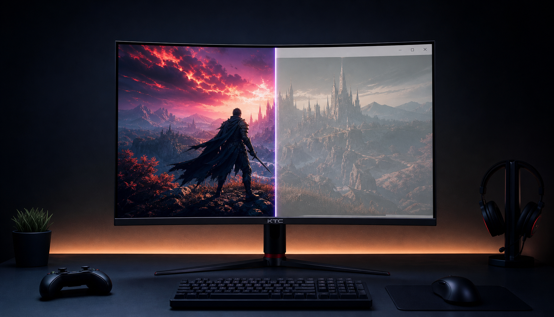
The featured 27-inch 4K Mini-LED model is a reasonable fit when the reader wants sharper desktop detail and broad-gamut creator review work, but it still needs the same careful first-pass tuning as any other value monitor. If you are comparing the branch, the model page for the M27P6 4K Mini-LED is the relevant starting point, not a promise that the factory mode is already perfect.
Starter Picture Settings for SDR Work
For photo, video, and graphics work, SDR creator tuning should come before any HDR testing. The safest starting point is a neutral picture mode, then small changes to brightness, white point, and gamma. Saturated game modes may look exciting, but they can make skin tones and neutral grays harder to judge.
Choose a Neutral Picture Mode
Start from the most neutral preset the monitor offers. If there is an sRGB-style mode, that is usually the first preset worth trying for everyday creator work. If not, use the calmest default mode and avoid any preset that obviously pushes color or contrast for games.
The point is to make the monitor less opinionated before you tune it. A neutral baseline gives you a better chance of spotting whether the panel is too cool, too warm, or simply too bright. If you need a separate reference for this step, white balance check is a practical follow-up.
Set Brightness and Contrast for the Room
Set brightness for your desk lighting, not for an imagined studio. If the screen is glaring, you will overcorrect color and shadow judgment. If it is too dim, dark content can look crushed and you may miss detail. Keep contrast conservative until the image stops losing information in highlights or shadows.
This is one of the easiest places to over-tweak. For most creators, a comfortable room-matched brightness setting is more useful than a dramatic-looking one. Recheck the image with a familiar timeline, document, or photo before you decide the setting is final.
Tune White Point and Gamma
White point controls whether neutrals drift blue, yellow, or pink. Gamma shapes how quickly the image moves from dark to light, which affects shadow visibility and the overall "feel" of the image. In plain terms, white point helps you judge neutrality, while gamma helps you see whether the midtones and shadows are behaving.
Use the most neutral white point that still looks believable in your room. If the room is bright, a slightly different feel may look normal than it does in a dim room, so do not chase one universal look too aggressively. The goal is a stable editing baseline, not the most dramatic picture.
Check Color and Sharpness Last
Leave saturation close to default unless a neutral photo or gray reference clearly looks off. Then check sharpness. Too much sharpness can add halos around text and edges, which makes the screen feel crisp without actually helping image judgment.
For this stage, the best color settings for KTC Mini-LED are usually the least flashy ones. If skin tones look believable, gray UI panels look neutral, and text still looks clean, you are probably close enough for SDR creator work. For room-dependent color perception, perceived color accuracy is still part of the equation.

When Mini-LED HDR Needs a Different Approach
HDR is where many people mix up two separate workflows. For SDR editing, the stable desktop look matters most. For HDR gaming or HDR playback, contrast impact and tone mapping matter more, and the image may look different from app to app. That is normal enough that KTC monitor HDR calibration guide advice should treat HDR as its own mode, not the default creator baseline.
A simple decision rule helps: if you are editing SDR photos, video, or graphics, HDR usually belongs off. If you are reviewing HDR games or HDR playback, HDR can stay on, but only while you are actively working in that format. Do not assume the HDR look is a better creator reference just because it looks more striking.
Local dimming is the main reason this split matters. On Mini-LED displays, the backlight can change how bright desktop areas feel as window content changes, which can distract from neutral editing. In practical terms, if the image seems to pulse, lift, or darken as you move around the desktop, that setting is a weak fit for SDR judgment. For background reading on why HDR behavior is content-sensitive, HDR mastering differences is the right conceptual follow-up.
Here is the short version:
| Workflow | Start With | What You Want To Notice | When To Turn It Off |
|---|---|---|---|
| SDR photo, video, graphics | Neutral preset, stable brightness, conservative sharpness | Gray neutrality, skin tones, shadow detail | If local dimming changes desktop brightness or makes the image feel unstable |
| HDR gaming | HDR on, but only for HDR content | Impact, tone mapping, bright highlights | If the source game or app does not support HDR cleanly |
| HDR review/playback | HDR on, then verify by app and source | Whether the content looks consistent across titles | If the desktop look is distracting or hard to judge |
| No colorimeter available | Visual baseline with gray and skin-tone references | Whether the image looks believable, not perfect | If repeated tweaks stop producing clearer results |
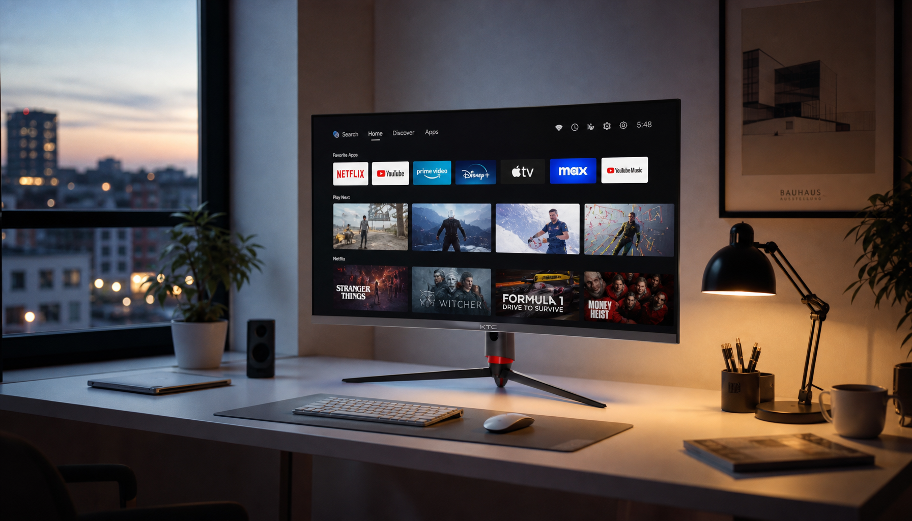
For readers comparing model paths, the M27T6S 1440p Mini-LED makes more sense when gaming speed matters as much as creator use. It is not a better calibration target for every creator, but it is the more natural branch for users who want higher refresh in the same mixed-use desk setup. The 4K M27P6 is the sharper desktop option, while the 1440p model is the faster mixed-use compromise.
Which KTC Mini-LED Setup Fits Your Workflow
If your priority is creator review work, sharper text, and the cleanest 4K desktop canvas in the lineup, the M27P6 is the more logical branch. Its 27-inch 4K panel, Mini-LED backlight, and broad-gamut specs make it the model to check first when you care about detail and HDR visibility on a single desk display. IGN's M27P6 review also frames it as a strong fit for higher-end mixed creative and gaming use.
If your priority is a lower-cost Mini-LED desk setup with more gaming headroom, the M27T6S is the better balance point. It gives you 1440p resolution, 200Hz-class speed, and wide color coverage, which helps if the same monitor has to handle creator tasks and games without pushing you into a 4K budget. That does not make it the default creator answer, but it does make it a sensible compromise when motion matters more.
If you mostly do light editing, office work, or browser-based content review, a Mini-LED monitor may be more than you need. In that case, calibration effort should be modest, and a simpler display class may be enough. The real question is whether you need HDR impact and Mini-LED contrast often enough to justify the extra setup attention.
The featured product fit is therefore conditional: choose the 4K Mini-LED path when desktop detail and creator review matter most, choose the 1440p Mini-LED path when speed is part of the brief, and skip the upgrade if you only need a neutral work screen. If you want the category view, browse Mini-LED monitor options.
Final Calibration Checks Before You Save Settings
Before you save anything, run one short check on real content. Look at a neutral gray patch, a few skin tones, a text-heavy window, and one darker image. Then change the room light slightly and see whether the image still feels stable.
Save the profile when SDR looks calm, grays look believable, and text still reads cleanly in your normal desk lighting. If HDR or brightness still feels unpredictable, the source app or room lighting may be part of the problem, not the monitor itself.


