


There is no single monitor brightness level that prevents both eye strain and glare in every room. The best setting is the one that makes the screen look about as bright as the surrounding workspace while keeping reflections, harsh whites, and dark-game details under control.
Ever turn down a gaming monitor at night, only to lose enemies in shadowed corners, or crank up a portable monitor near a window and still fight reflections? A practical setup can start with repeatable targets: about 30% to 55% brightness for many 24- to 27-inch gaming monitors, about 120 to 180 nits in dim rooms, and a 20- to 28-inch viewing distance for sustained screen work. You will learn how to set brightness by room, monitor type, and use case instead of relying on one magic number.
Why One Brightness Number Does Not Work
Monitor brightness feels comfortable only in relation to the room around it. A screen that is pleasant at noon in a bright home office can feel like a flashlight at 11:00 PM, while the same screen may look dull beside a sunny window. Digital eye strain is tied to prolonged screen use, and contributing factors include poor lighting, screen glare, viewing distance, posture, and uncorrected vision issues, not brightness alone digital eye strain.
For monitor users, the main mistake is treating brightness as a universal percentage. A 35% setting on a 250-nit office display is not the same as 35% on a 600-nit HDR gaming monitor. Brightness percentage is only a control position; actual luminance depends on the panel, firmware, preset mode, contrast setting, and whether HDR or dynamic brightness features are active.
Eye Strain Is Usually a Mismatch Problem
Eye strain often shows up when the display is much brighter or much dimmer than the environment. If a white document looks like a lit panel in a dark room, your eyes keep adapting between the screen and the darker surroundings. If the screen is too dim in a bright room, you may squint, lean forward, or raise contrast until whites bloom and text edges look harsh.

A simple first-hand test works better than guessing: open a blank white document, place a sheet of white paper beside the monitor, and adjust brightness until the screen resembles softly lit paper. It should not look like a lamp, and it should not look like a gray sheet. This is especially useful for home-office monitors and ultrawide displays where a large white spreadsheet can fill most of your field of view.
Glare Is Not the Same as Brightness
Glare can come from reflected light, such as a window, ceiling fixture, or desk lamp bouncing off the screen. It can also come from excessive contrast between a bright display and a dark room. Glare from reflections and lighting problems can worsen digital eye strain symptoms glare from reflections, so raising brightness is not always the right fix.

For example, if a glossy portable monitor reflects a window, increasing brightness may make text more readable, but it also increases overall luminance and can feel harsher after an hour. The better sequence is to move the screen, close blinds, redirect the lamp, then raise brightness only as much as needed.
Practical Brightness Targets by Setup
For many indoor monitor setups, a useful starting range is 30% to 50% brightness for office work and 30% to 55% for 24- to 27-inch gaming monitors. These are not rules; they are starting points. The right final setting depends on whether you are reading text, editing photos, playing competitive games, using an ultrawide, or pairing a portable monitor with a laptop.
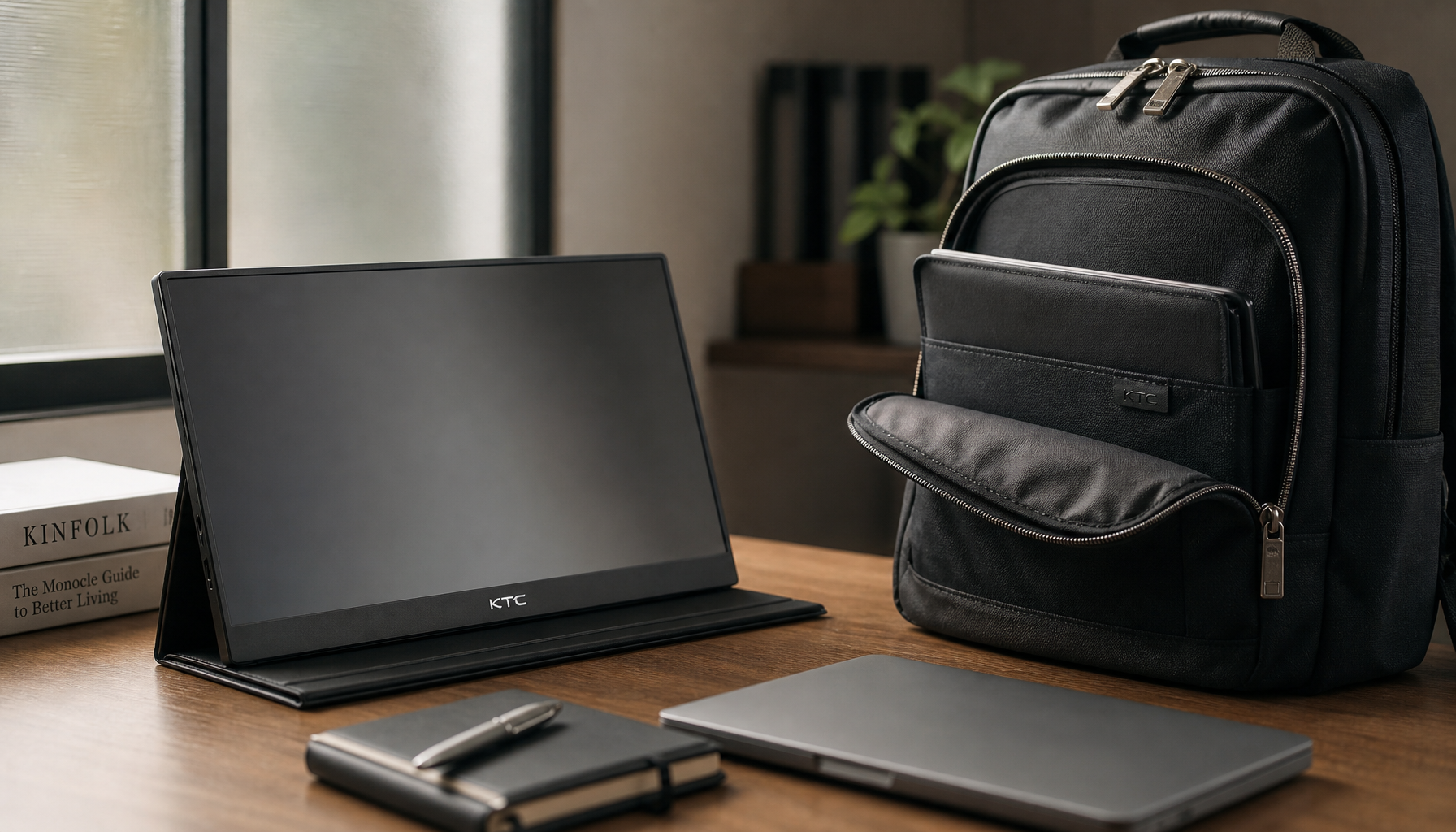
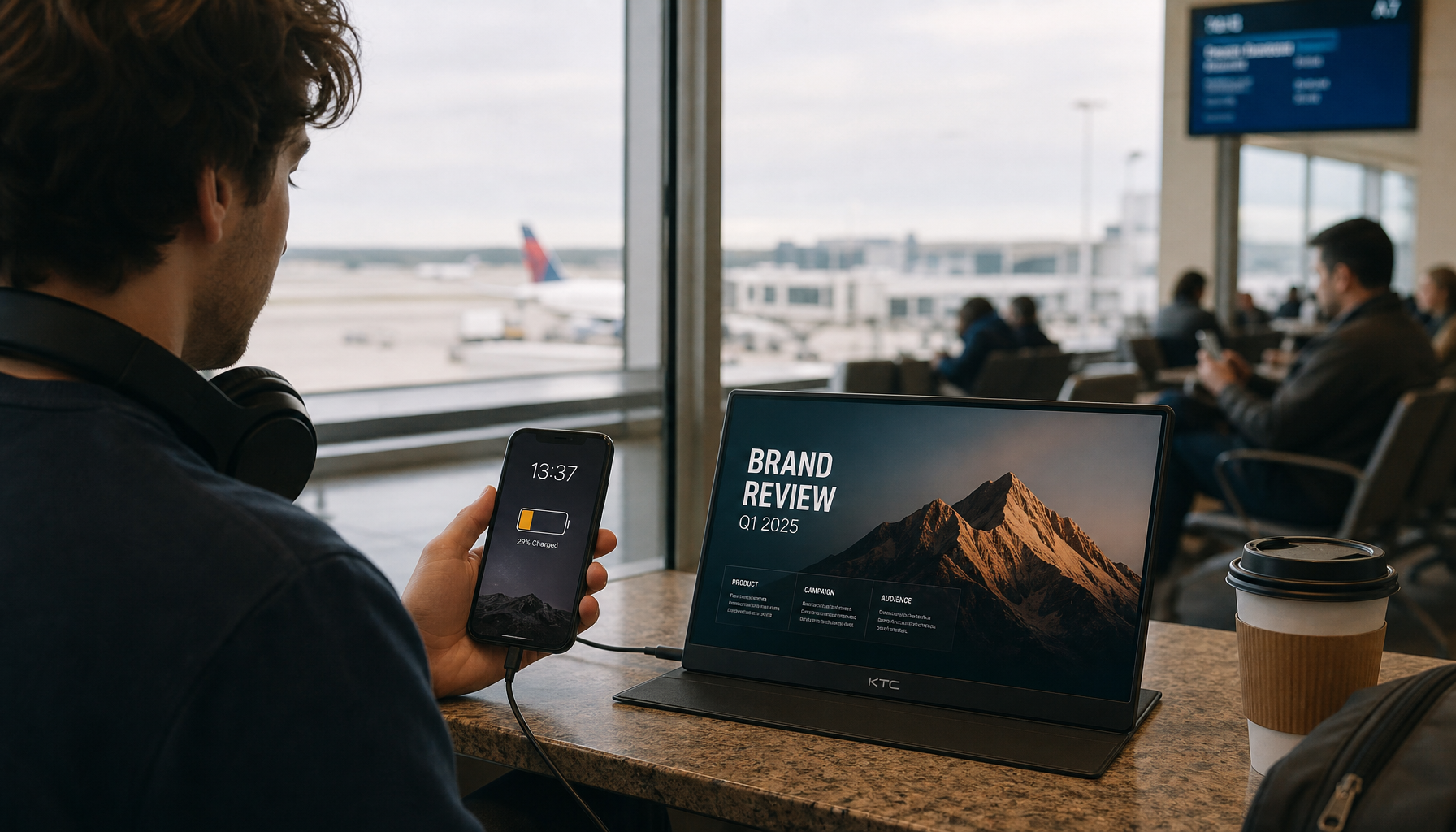
A dim room often feels best around 120 to 180 nits, while 100 nits is a common controlled-light baseline for color-sensitive work. For portable displays, 300 nits is usually enough for typical indoor use, while 400 nits or higher becomes more useful near windows, in cafes, or in other bright spaces portable display brightness.


Recommended Starting Points
Setup |
Brightness Starting Point |
What to Check |
Best Adjustment |
Dark room gaming |
25% to 40% |
Whites feel harsh; dark areas lose detail |
Lower brightness, add soft bias lighting behind the monitor |
Typical home office |
30% to 50% |
White pages look brighter than paper |
Match the screen to nearby paper or desk surface |
Bright room near window |
50% to 75% or higher |
Reflections remain visible |
Control window light before raising brightness further |
Competitive gaming |
30% to 55% |
Enemies, crosshairs, HUD, and dark corners stay readable |
Disable shifting brightness features; tune per game |
Ultrawide monitor |
Slightly lower than a similar 27-inch screen |
Large bright areas feel overwhelming |
Reduce brightness and avoid vivid retail presets |
Portable monitor with laptop |
Match by perceived whites and grays |
One display looks blue, dull, or overexposed |
Set laptop first, then match the portable display |
These ranges are most useful when you reset the monitor to a neutral picture mode first. Factory presets often use high brightness, boosted contrast, and vivid color because they look impressive on a retail shelf, not because they are comfortable for a 7-hour workday factory monitor settings.
A Fast Calibration Routine
Start with the room, not the monitor. Close blinds if sunlight hits the screen, move desk lamps so they do not reflect in the panel, and avoid working in a pitch-dark room where the display is the only bright object. Then set brightness using a white document, a dark webpage, and one real task you do often, such as a spreadsheet, code editor, video timeline, or game lobby.
For gaming, lower brightness until white menus and bright outdoor scenes stop feeling sharp or painful, then test dark scenes. If enemy outlines, UI markers, minimaps, and item prompts disappear, raise brightness slightly or adjust in-game gamma before pushing monitor contrast too far.
Gaming Monitors Need a Different Balance
Gaming monitors add a visibility problem that standard office monitors do not: you need comfort without losing motion clarity, HUD readability, or shadow detail. A very low brightness setting may feel comfortable on a desktop, but it can hide opponents in dark maps. A very high setting can make muzzle flashes, snow maps, white menus, and HDR highlights tiring over long sessions.
For many gaming displays, practical brightness often lands around 25% to 60%, with 30% to 55% as a good starting range for 24- to 27-inch screens gaming display settings. Larger ultrawides may need slightly lower settings because more bright screen area fills your view, especially with white web pages, strategy-game maps, or productivity windows stretched across the full panel.
Refresh Rate Helps, but It Does Not Replace Lighting
Higher refresh rates such as 120Hz, 144Hz, 165Hz, and 240Hz can improve motion clarity and may reduce discomfort caused by blur, tearing, flicker, or ghosting. That matters for high-refresh-rate displays because the eyes track moving targets more smoothly when motion is clear and stable. Still, a 240Hz monitor set too bright in a dark room can be uncomfortable, and a 60Hz display with good lighting can feel better than a poorly configured high-end panel.
A practical gaming setup starts with native resolution, a stable refresh rate, and a brightness level that preserves both whites and blacks. Use the monitor’s native resolution, such as 1920 x 1080, 2560 x 1440, or 3440 x 1440, so text, HUD elements, and crosshairs stay sharp. Then tune brightness and contrast in the actual games you play, not only on the desktop.
Be Careful With Auto-Brightness and HDR
Auto-brightness can be useful for casual work because it tracks room changes, but it can be distracting in competitive games. If the display or laptop shifts brightness during a dark-to-bright transition, visibility can change at the exact moment you need consistency. For ranked shooters, racing sims, and fast action games, disable auto-brightness and content-adaptive brightness unless you have tested them and know they do not interfere.
HDR is similar. True HDR content can benefit from higher peak brightness, but unsupported SDR content in HDR mode may look washed out, too bright, or inconsistent. For long SDR gaming or office sessions, SDR mode with a tuned brightness setting is often more comfortable than leaving HDR on all day.
Dark Rooms, Bright Rooms, and Glare Control
A dark room does not mean the monitor should be as dim as possible. If the display gets too dim, text loses edge clarity, blacks can crush together, and you may lean closer without noticing. A better dark-room setup uses moderate brightness plus soft ambient light, ideally behind or beside the monitor, so the screen is not the only light source.
In bright rooms, the answer is not always maximum brightness. Very bright task environments can reduce visual comfort during focused screen work, and light levels above 1,000 lux may affect comfort and performance very bright environments. If a window is reflected in your display, a brighter monitor can overpower some of the reflection, but it will not remove the reflection itself.
Fix the Light Source First
Before you raise brightness, look at the screen while it is off. Any window, lamp, ceiling light, or bright wall you can see reflected on the black screen is a glare source. Reposition the monitor so windows are to the side rather than directly in front of or behind it, adjust blinds or curtains, and aim desk lamps at the desk instead of the panel.
A professional association recommends reducing glare by positioning screens away from overhead lights and windows, using blinds or drapes, and switching to lower-wattage desk-lamp bulbs when needed reduce glare. If those changes are not enough, an anti-glare filter can reduce reflected light, especially on a glossy portable monitor or an older office display.
Use Bias Lighting for Evening Sessions
Bias lighting is a soft light behind the monitor that reduces the contrast between the display and the wall. It is helpful for dark-room gaming, movie watching on an ultrawide, and late-night work on large displays. The goal is not to flood the room; it is to make the background gently visible so white webpages and bright game scenes feel less abrupt.
For a practical setup, put a soft lamp or LED strip behind the monitor, keep it out of direct view, and lower monitor brightness until a white browser page stops feeling harsh. If you use a dual-monitor or ultrawide setup, bias lighting is often more effective than dropping brightness so low that text becomes gray and harder to read.
What to Look for When Buying a Monitor
A monitor’s brightness spec matters, but it should not be read in isolation. A 300-nit monitor can be perfectly comfortable for a controlled home office, while a brighter 400- to 500-nit display may be better near windows, for portable use, or for mixed work and entertainment. For HDR gaming, peak brightness matters more, but sustained comfort still depends on room lighting, coating, contrast, and dimming behavior.
Screen coating is equally important. Matte anti-glare coatings reduce reflections and are often easier to live with in bright offices, apartments with windows, and shared spaces. Glossy panels can look sharper and more contrasty in controlled lighting, but they show reflections more readily, so they need better room control.
Specs That Actually Affect Comfort
Prioritize these monitor features when glare and eye fatigue are part of the buying decision:
- Anti-glare coating: Helpful for rooms with windows, overhead fixtures, or shared lighting you cannot fully control.
- Brightness range: Look for enough maximum brightness for your room, but also check whether the monitor can dim comfortably at night.
- Flicker-free dimming: Useful if you are sensitive to flicker at lower brightness settings.
- Ergonomic stand: Height, tilt, and swivel help you avoid reflections and maintain better posture.
- High refresh rate: Valuable for gaming motion clarity; 120Hz or higher is a sensible target for gaming-focused displays.
- Native resolution: Higher pixel density improves text and HUD clarity, reducing the need to lean forward.
- Sensible presets: A neutral or sRGB-like mode is better for long sessions than vivid showroom modes.
Viewing position also matters. A comfortable monitor setup usually places the screen 20 to 28 inches from the eyes and about 15 to 20 degrees below eye level viewing setup. This is especially important with large ultrawides, where sitting too close can make your eyes sweep across a wide field all day.
Portable and Dual-Monitor Setups Need Matching
Portable monitors create a common comfort problem: the laptop and second display do not match. One screen looks blue, the other looks warm; one white document looks clean, the other looks gray; one display feels bright enough, the other looks overexposed. That mismatch makes your eyes adapt every time you move from one screen to the other.

Set the laptop screen first, then match the portable monitor using a white document, gray background, and a familiar skin-tone image. Disable adaptive brightness during setup, because changing brightness makes comparison unreliable. If the portable display is used near windows or in cafes, a 400-nit or brighter panel gives you more headroom, but glare control still matters.
Practical Next Steps
Use brightness as part of a complete viewing setup, not as a single comfort switch. The best monitor setting is bright enough for clear text, HUD elements, and shadow detail, but not so bright that whites glow or the display dominates the room. If you change rooms, switch from office work to gaming, or move a portable monitor beside a laptop, expect to retune.
Action checklist:
- Open a white document and compare it with white paper beside the screen.
- Lower brightness until the screen no longer looks like a light source.
- Check dark content, such as a game scene, code editor, or dark webpage, and raise brightness only if detail disappears.
- Remove glare sources by adjusting windows, lamps, and monitor angle before increasing brightness.
- Set the monitor 20 to 28 inches from your eyes and slightly below eye level.
- Use native resolution and a stable refresh rate, especially on gaming monitors.
- Recheck brightness at night; evening settings should usually be lower than daytime settings.
For long sessions, breaks still matter. People who spend 2 or more continuous hours per day on a digital screen are at higher risk for computer vision syndrome, and the average American worker spends about 7 hours per day on a computer computer vision syndrome. The 20-20-20 habit, looking about 20 ft away for 20 seconds every 20 minutes, is a simple way to reduce sustained focusing stress.
FAQ
Q: What monitor brightness percentage is best for eye strain?
A: For many indoor setups, start around 30% to 50% for office work or 30% to 55% for gaming monitors, then adjust by room lighting. If a white page looks brighter than paper beside the screen, lower brightness. If text looks dull or shadow detail disappears, raise it slightly.
Q: Should I use maximum brightness to fight glare?
A: Usually no. Maximum brightness may overpower some reflections, but it can also make the monitor feel harsher and increase contrast between the screen and the room. First move the monitor, close blinds, redirect lamps, or use an anti-glare surface; then raise brightness only as needed.
Q: Are high-refresh-rate monitors better for eye comfort?
A: They can be, especially for gaming, because higher refresh rates such as 120Hz, 144Hz, or 240Hz can make motion clearer and reduce blur or tearing. But refresh rate does not fix bad lighting, excessive brightness, reflections, or poor viewing distance.


