


Check font hinting and subpixel antialiasing first. When they match your display’s pixel layout, text edges look cleaner, so your eyes spend less effort decoding small letters.
Why Font Hinting Matters on Modern Displays
Font hinting adjusts letter outlines so they land more cleanly on the screen’s pixel grid. That is why font hinting can make small interface text look sharper without increasing the font size.
This matters most on 1080p and 1440p monitors, compact office displays, portable screens, and any panel used for dense documents, spreadsheets, code, or game launchers. If text looks slightly fuzzy, uneven, or color-fringed, your eyes may keep refocusing instead of reading smoothly.

High-DPI screens hide many rendering flaws, but plenty of productivity and gaming setups still run at pixel densities where font rendering is visible. The benefit is simple: keep the same layout, font size, and workspace density while reducing visual noise.
The Setting to Change First
On a PC, start with the built-in text tuner. It adjusts subpixel rendering so text uses the red, green, and blue parts of each pixel more effectively on LCD-style displays.
Use this quick path:
- Open Start and search for the text-tuning tool.
- Turn subpixel text smoothing on.
- Walk through the samples at your normal viewing distance.
- Pick the cleanest-looking text, not the boldest.
- Restart key apps if text does not update immediately.

For most RGB monitors, subpixel smoothing should stay on. If you use a BGR TV, a rotated monitor, a projector, or some OLED panels, grayscale antialiasing may look cleaner because the assumed pixel structure may be wrong.
If font edges show red or blue shadows, the issue may be a subpixel layout mismatch, not the font itself.
How This Reduces Eye Fatigue
Digital eye strain often comes from prolonged close-up focus, low clarity, glare, and reduced blinking. A medical overview notes that screen users may blink far less often during focused work, contributing to dryness and discomfort in computer vision syndrome.
Sharper rendering does not medically cure eye strain, but it can reduce the effort required to read dense text. For a display specialist, this is a high-value adjustment: no new monitor, no zoom penalty, and no lost spreadsheet columns.
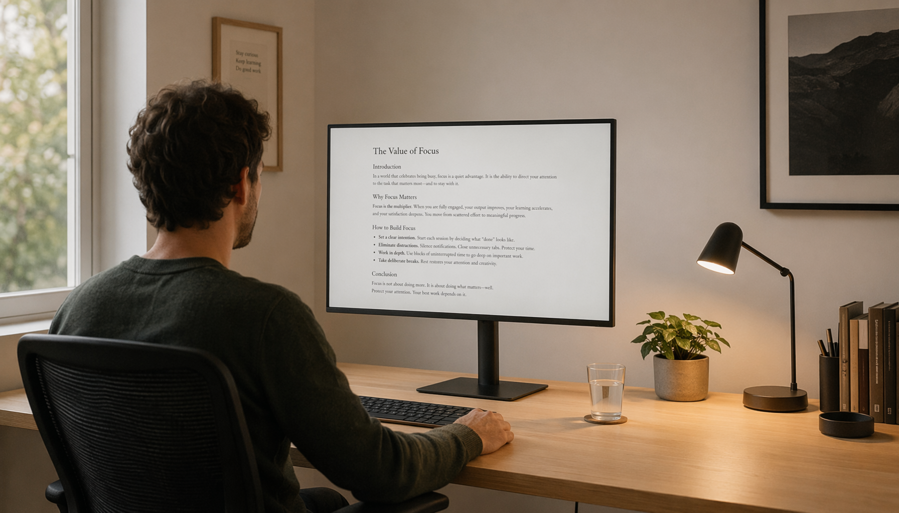
The practical benchmark is easy. Open a paragraph of 10- to 12-point text, sit at your normal distance, and check whether letters like m, n, i, l, and r stay distinct. If they blur together, rendering needs attention.

Pair It With Display Basics
Font rendering works best when the rest of the screen setup is not fighting your eyes. Health guidance recommends keeping screens roughly 20 to 26 inches from your face, with the center slightly below eye level, while also reducing glare and improving contrast through an eye-friendly workstation.

For monitor buyers and power users, this is where value compounds. A 27-inch 1440p display with correct subpixel tuning often feels cleaner for office work than a poorly tuned panel with the same resolution.
Run the display at native resolution, set scaling before tuning fonts, and match brightness to room lighting. For long reading, dark text on a light background usually preserves letter clarity best, and a clean screen helps keep text edges sharp.
Best Setup for Different Screens
For standard office and gaming monitors, use native resolution, correct scaling, and subpixel smoothing. That is the best balance of crispness, density, and comfort.
For portable smart screens, check scaling first. Small panels often ship with aggressive scaling or unusual pixel layouts, so the sharpest setting may be grayscale smoothing rather than classic subpixel rendering.
For OLED and TV-based desk setups, watch for color fringing around text. If it appears, try grayscale antialiasing in apps that allow it, or increase viewing distance slightly while keeping font size unchanged.
Before buying a larger display or increasing font size, tune font hinting and subpixel rendering. It is one of the fastest ways to make the same screen feel clearer, calmer, and more usable for long sessions.


