


Achieving consistent, professional-grade color accuracy on a high-resolution monitor requires more than vivid presets or out-of-the-box defaults. For designers, photographers, and digital artists, the twin foundations are a Delta E value under 2.0 and a stable contrast ratio of at least 1000:1. These baselines, when paired with the right white point, gamma, and brightness, deliver repeatable results across web design, print matching, and hybrid SDR/HDR workflows without constant OSD toggling.

Why Delta E and Contrast Matter for Professional Design
Many creators start with a “Vivid” or gaming-oriented monitor profile because it looks punchy on first unboxing. That approach quickly breaks down in color-critical work. Delta E (ΔE) measures the perceptual gap between the color you intended and the color the monitor actually shows. As ViewSonic’s guide to color accuracy explains, a Delta E value under 2.0 is the widely accepted professional standard—differences below this threshold are generally imperceptible in real design tasks.
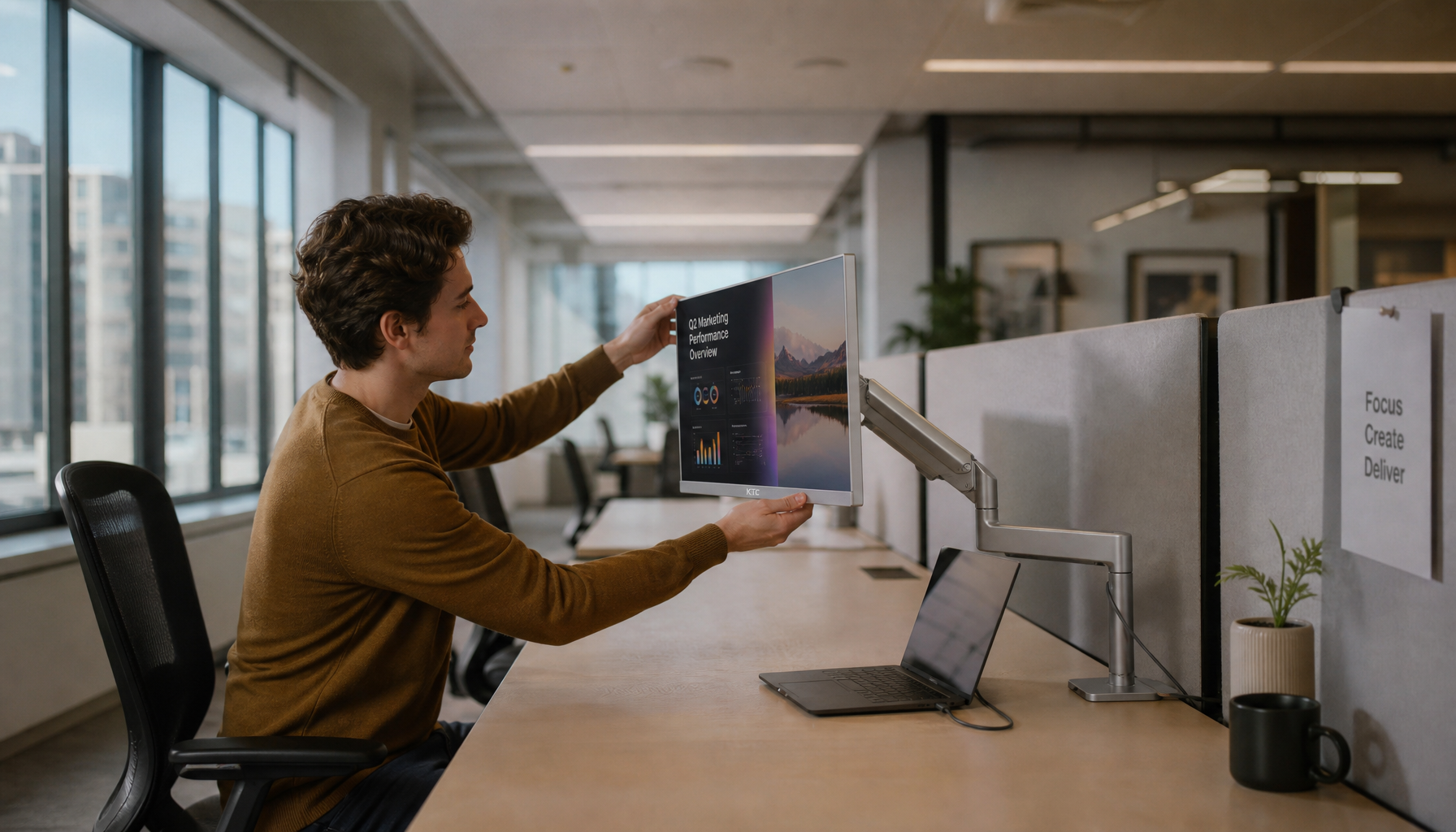
Contrast ratio determines how cleanly the monitor separates tonal values in shadows and highlights. Ratios of 1000:1 or higher, common on quality IPS and Mini-LED panels, prevent crushed blacks or blown-out whites that destroy detail in photo retouching or branding work. The current industry formula, CIEDE2000, better matches human vision than older methods, especially in neutral grays and saturated areas. This is why KTC’s 2000:1 IPS panels (such as the H27P3) or 1 000 000:1 Mini-LED models provide a strong hardware foundation once the OSD and software are correctly tuned.
In practice, chasing a perfect Delta E below 1.0 is rarely necessary for most digital workflows and can introduce the “Toggle Tax”—repeated menu diving that kills productivity. A stable baseline that stays under 2.0 across typical content is the smarter long-term choice.
Establishing a Repeatable Setup Baseline for Your Workspace
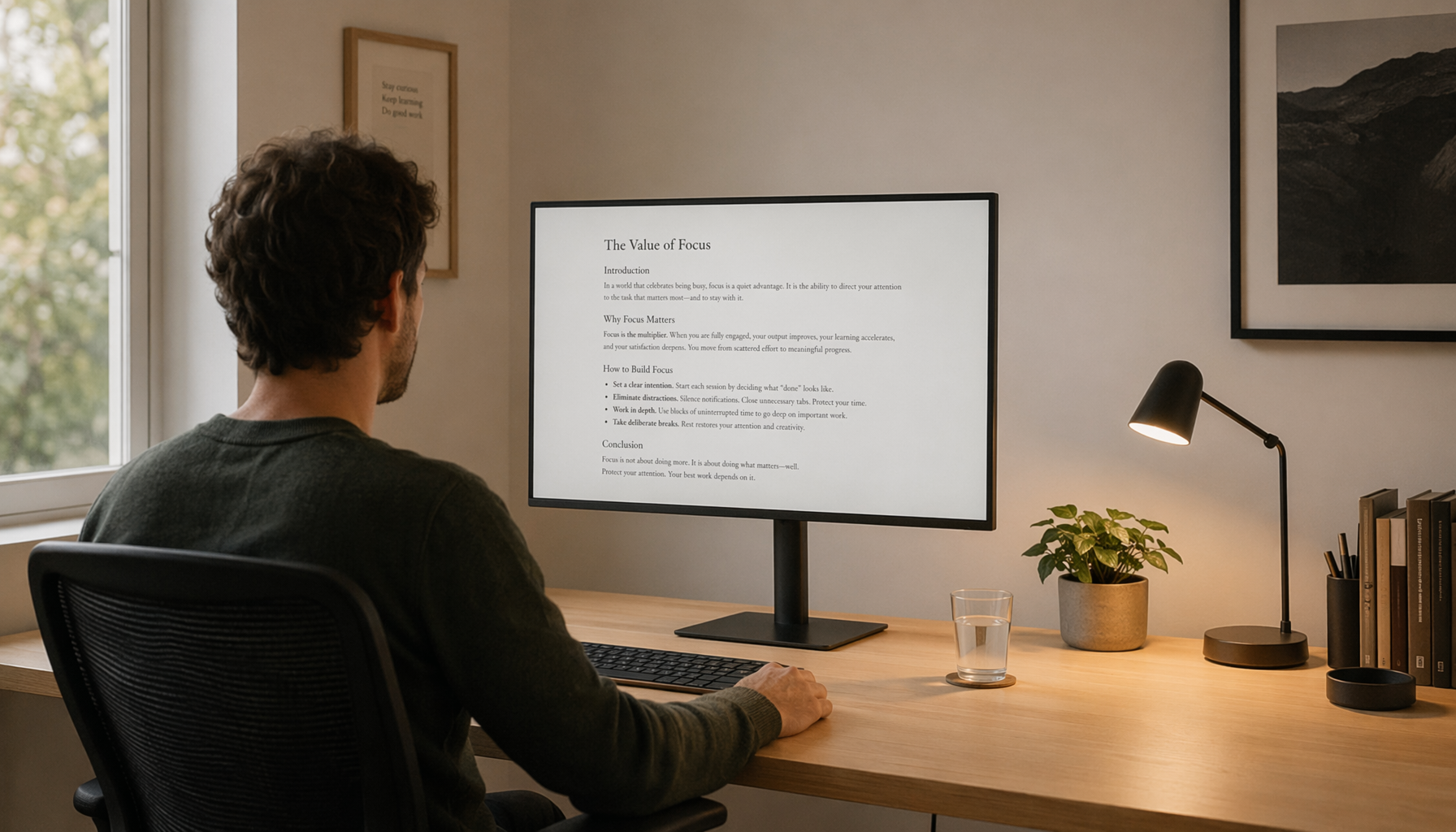
Before opening calibration software, several environmental and hardware factors must be locked in. Panels need 30–45 minutes to reach thermal equilibrium; color output drifts until the backlight and liquid crystals stabilize. Control ambient lighting to match the target white point—6500 K (D65) for digital and web design—so the room and screen share the same color temperature.
Disable Eco modes, dynamic brightness, sharpening, and any auto-adjust features in the OSD. These introduce unpredictable shifts that calibration cannot fully correct. Use DisplayPort 1.4 or HDMI 2.1 to guarantee 10-bit color depth and full chroma 4:4:4, which prevents banding in gradients. For digital designers, the repeatable starting target is a D65 white point and Gamma 2.2, according to Datacolor’s calibration guidance for digital designers.

Finding the 'Golden Mean': Best Contrast and Delta E Targets by Use Case
The correct numbers depend on whether you are doing web graphics, print production, or hybrid SDR/HDR work. For digital and web design, target D65, 120–160 nits brightness, Gamma 2.2, and Delta E under 2.0. Print-focused workflows shift to a D50 white point (to match ISO 3664 viewing booths), 80–100 nits, and the same Gamma 2.2. The comparison of display calibration tools confirms that D50 is the preferred white point when screen-to-print matching is the goal.
A practical “Zero-Toggle” hybrid baseline works well for creators who move between design software and HDR media. Lock OSD contrast at exactly 50 % to avoid digital clipping, set local dimming to Low, and calibrate SDR brightness to roughly 140 nits. Then use the Windows HDR SDR Content Brightness slider for HDR content. This keeps Delta E under 2.0 in SDR while preserving usable peak luminance in HDR without repeated OSD changes. Low local dimming acts as a bounded compromise: High mode often pushes Delta E above 4.0 with noticeable blooming on UI elements, while Off disables HDR benefits.
The chart below visualizes these practical thresholds across workflows.
Color Calibration Baselines by Workflow
Compare the safest baseline settings by use case. The chart highlights where the recommendation changes across digital, print, and hybrid SDR/HDR workflows, using conservative target ranges rather than exact device-specific values.
View chart data
| Workflow | Contrast setting | Brightness target (nits) | Delta E target | Local dimming |
|---|---|---|---|---|
| Digital / Web Design | 50 | 140 | 2 | 0 |
| Print Production | 50 | 90 | 2 | 0 |
| Hybrid SDR/HDR | 50 | 140 | 2 | 1 |
This visualization clarifies that contrast stays near 50 % across scenarios while brightness, white point, and dimming level shift with the task. Local dimming at Low (represented as 1) is the pragmatic hybrid choice that avoids the full “Toggle Tax.”
Translating Technical Specs into Practical Design Outcomes
Numbers on a spec sheet only matter when they change what you see on other screens. A small Delta E shift in hue (Delta H) is far more noticeable in branding work than an equivalent shift in lightness or saturation; the human eye is especially sensitive to hue errors. That is why the Fiery guide on Delta E, H, and T emphasizes checking hue separately during critical color matching.
Ten-bit panels (8-bit + FRC on many KTC models) reduce banding in smooth gradients that 8-bit displays often reveal. For viewing-angle stability during client reviews, the KTC 27" 5K@60Hz Home & Office Monitor H27P3 IPS panel outperforms most VA or TN options. When HDR content enters the workflow, the KTC Mini LED 27" 4K 160Hz HDR1400 Gaming Monitor M27P6 with its 1 000 000:1 contrast and 1152-zone local dimming delivers the depth needed for mastering, provided you keep the hybrid Low-dimming baseline.
The “Toggle Tax” is best managed with software tools. Use Novideo_sRGB or an ICC profile to clamp the gamut instead of relying on an OSD sRGB mode that often locks brightness. This approach lets you maintain calibrated SDR settings while still accessing HDR peak luminance when required.
Our guide on what Delta E values actually mean for creative work explores these perceptual differences in greater depth, and the article on verifying your display calibration gives practical test patterns you can run today.
Beyond the Numbers: Troubleshooting and Next Steps for Your Creative Rig
Even with correct targets, a calibration can still look “off.” Begin verification with a neutral gray ramp and shadow-detail test images; banding, color casts, or lost detail in deep blacks usually point to an incomplete warm-up or mismatched ambient light. Uniformity varies between panels, so test the display within the retailer’s return window using a full-field gray pattern.
Recalibrate every 200–500 hours or when seasonal lighting changes noticeably affect the room. For most hybrid users the OSD baseline plus software clamping is sufficient; moving to a hardware colorimeter (Spyder or Calibrite) becomes worthwhile once you need print-matching accuracy below Delta E 1.0 or tighter uniformity data.
If your current monitor struggles to hold Delta E under 2.0 or cannot reach the required contrast, consider stepping up to a panel built for creative work. The Office Monitor collection and All-Mini-LED Monitors both offer high-resolution options with factory Delta E < 2.0 and strong native contrast that respond well to the baselines described here.
For further reading on related topics, see our explanation of 8-bit versus 10-bit display bit depth and the HDR content mastering calibration guide. These resources help translate the numbers into real decisions about when to upgrade and how to maintain accuracy over time.
FAQs
What Delta E value is considered good enough for professional design work? A Delta E average under 2.0 using the CIEDE2000 formula is the accepted professional floor for most digital design, photography, and digital art. Values below 1.0 offer a competitive edge for branding or print-critical tasks but are rarely noticeable in everyday web or UI work. Always verify with your specific colorimeter rather than relying on factory claims.
Should I change the contrast setting after hardware calibration? In almost all cases, leave OSD contrast at 50 %. Higher values risk digital clipping in highlights; lower values crush shadow detail. Fine-tune perceived contrast through the ICC profile or Windows HDR SDR brightness slider instead of repeated OSD adjustments.
How often should I recalibrate my monitor for design work? Recalibrate every 200–500 hours of use or whenever ambient lighting or room temperature changes significantly. Many professionals also recalibrate at the start of a large print or branding project to ensure consistency across deliverables.
Is local dimming safe to leave on for color-critical SDR design? Low local dimming is a practical hybrid compromise for users who switch between SDR design and HDR media. It preserves usable contrast without the aggressive blooming or pulsing often seen in High mode. Pure SDR purists may still prefer it Off, accepting the loss of HDR capability.
Do I need a hardware calibrator or are software tools enough? Software tools and visual test patterns are sufficient for most digital and web designers targeting Delta E under 2.0. Photographers or print professionals who must match physical proofs usually benefit from a dedicated colorimeter to generate accurate ICC profiles and measure uniformity.
What white point should I use if my work is destined for both screen and print? Start with D65 for on-screen review and switch to D50 when preparing files for print matching under ISO 3664 conditions. Many hybrid creatives maintain two separate ICC profiles and switch via the operating system rather than changing the monitor OSD repeatedly.


