


For most 8-hour desk work, aim for a monitor brightness that visually matches your room, often around 100–150 nits in a typical office and lower in darker rooms. If your display uses only a percentage slider, start near 30%–50%, then fine-tune with a white document test.
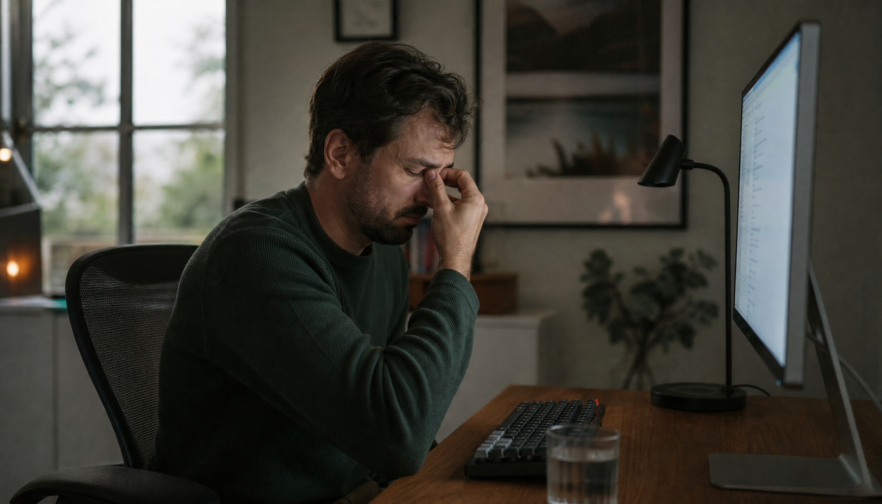
Do your eyes feel dry, heavy, or unfocused by midafternoon even though the screen looked fine in the morning? A practical brightness reset can make text easier to read, reduce squinting, and keep your display from fighting the room for eight straight hours. You’ll get a simple target range, a no-tool calibration method, and the settings that matter most for office monitors, gaming displays, and portable screens.
The Short Answer: Match Screen Brightness to the Room

The brightness level that prevents eye strain is not the highest setting, and it is not a universal percentage. The safest working rule is to make the screen look like softly lit paper in the same room. A monitor that glows like a lamp in a dim office forces your eyes to adapt constantly; a monitor that looks gray and dull in a bright room makes you lean in, squint, and lose text clarity.
For standard office lighting, display brightness around 100–150 nits is a strong starting point. That range is not a rule; it is a calibration anchor. In a darker room, 80–120 nits may feel cleaner. In a bright room with windows or overhead lighting, 120–180 nits may be more realistic, especially if the panel has a matte coating and handles reflections well.
Workspace condition |
Practical brightness target |
What it should look like |
Dark room or night work |
80–120 nits |
White backgrounds look calm, not glowing |
Typical home office |
100–150 nits |
Text is crisp without harsh contrast |
Bright office or window-side desk |
120–180 nits |
Whites stay readable instead of gray |
Portable screen near strong light |
Higher as needed, often on a brighter-capable panel |
Visibility improves without blasting highlights |
Why Brightness Causes Eye Strain During Long Sessions
Eye strain during computer work is usually temporary, but it is real. The American Academy of Ophthalmology notes that prolonged screen use can cause blurry vision, aching eyes, dryness, tearing, stinging, redness, and light sensitivity. Brightness is only one part of that problem, but it is one of the fastest settings to fix.
During screen work, blinking drops sharply. People normally blink about 15 times per minute, but during digital-device use that can fall to about 5 to 7 times per minute. When the screen is too bright, you may widen your eyes or stare harder; when it is too dim, you may squint and reduce natural blinking even more. Either way, the display is no longer supporting your work rhythm.
The better target is visual neutrality. For an 8-hour work session, your monitor should disappear into the workspace rather than dominate it. A good setting lets you read a dense spreadsheet, review a document, and scan a dashboard without feeling that the screen is either shouting or fading away.
Use the White Paper Test Before Trusting the Slider

A percentage slider is not a measurement. One monitor at 40% may be brighter than another at 70%, especially across IPS, VA, OLED, Mini-LED, portable USB-C panels, and gaming displays with vivid factory presets. That is why a visual test is more reliable than copying someone else’s number.
Open a mostly white document, then place a sheet of white paper beside the monitor under the same room lighting. Adjust brightness until the white screen resembles the paper. If the screen looks like a light source, lower brightness. If the screen looks gray, dull, or muddy, raise it. This simple matching approach reflects the same practical principle found in eye-fatigue display guidance: brightness should be adjusted to ambient light rather than left on default settings.
For example, a 27-inch QHD monitor in a home office with a desk lamp may land near 35% brightness during the day and closer to 20% at night. A portable 16-inch screen beside a laptop may need a higher slider setting to match the laptop’s white point, but that does not mean both screens should use the same percentage. Match perceived whites and mid-grays, not numbers.
Brightness, Contrast, and Sharpness Are Different Controls
Brightness controls the display’s luminance. Contrast controls the separation between dark and bright tones. Sharpness usually applies edge enhancement, not real pixel detail. Mixing these up leads to bad settings: a screen can be too bright with poor contrast, or dim but still harsh because contrast is too high.
For productivity work, keep contrast moderate enough that black text is clear without making white backgrounds feel abrasive. A practical contrast range around 60%–70% often works well, and comfortable monitor settings should still be adjusted by room lighting and personal readability. If black text blooms, halos, or looks overly hard on a white page, reduce contrast before assuming brightness is the only issue.
Lower brightness does not reduce resolution. A 4K panel remains 4K at any luminance. What changes is perceived clarity. If brightness is too low for the room, gray text and subtle interface lines blend together. If brightness is too high, glare and harsh white areas make edges feel tiring. The best work setting is the lowest comfortable brightness that preserves text clarity, shadow detail, and clean contrast.
The Best Brightness for Office Monitors

For office productivity displays, the most reliable baseline is 100–150 nits in a controlled or typical office. Pair that with a viewing distance near arm’s length, about 2 ft, because a slightly downward gaze reduces strain from both brightness and posture.
A 24-inch monitor on a compact desk may feel comfortable at a lower brightness because it occupies less of your field of view. A 27-inch or 32-inch display can feel more intense at the same luminance because more bright area is visible. Ultrawide monitors amplify this effect further. If a 34-inch ultrawide looks technically correct but feels fatiguing after two hours, try lowering brightness slightly and moving the screen farther back before changing color modes.
Monitor size also changes how much you move your eyes and head. A balanced office setup usually keeps the display roughly an arm’s length away, with the top portion at or slightly below eye level. For 24- to 27-inch displays, that often fits naturally on a standard desk; for ultrawide or dual-monitor layouts, a deeper desk and careful angle matter more than chasing extra brightness.
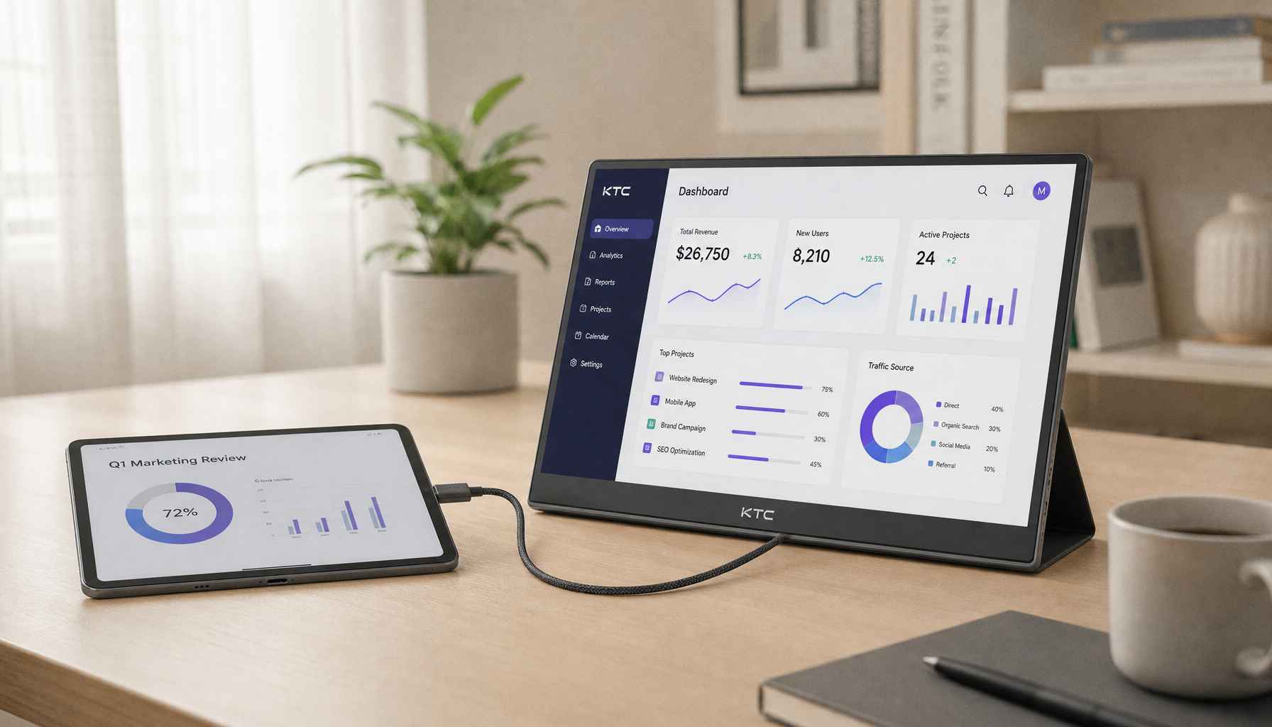
Portable Monitors Need More Frequent Brightness Checks

Portable smart screens are more exposed to changing light. A hotel desk, cafe table, office huddle room, and window-side apartment setup all demand different settings. A 300-nit portable monitor can be sufficient for many indoor situations, while brighter panels help near windows, but maximum brightness is still not the goal for 8-hour use.
If your laptop and portable display do not match, start with the laptop because it is usually your primary screen. Then adjust the portable monitor until a white document looks similar on both screens. Disable vivid modes, dynamic contrast, and automatic brightness while matching. Once the two displays agree, your eyes do less adaptation when moving between email, browser tabs, code editors, and presentation notes.
This is especially important for USB-C portable screens powered by the laptop. Full brightness can drain battery faster, and it can make the secondary screen feel visually louder than the main display. The better value is controlled visibility: enough brightness for readable text, not showroom intensity.
Gaming Monitors Used for Work Need Separate Presets
Gaming monitors often ship bright, saturated, and contrast-heavy because they are designed to look exciting under store lighting. For work, those same settings can be punishing. A 27-inch high-refresh display may be excellent for both esports and spreadsheets, but it needs separate modes.
Use a work preset with moderate brightness, neutral color temperature, and restrained contrast. Save higher brightness or HDR settings for games and media. Monitor adjustment controls may live in the display’s on-screen menu, Windows display settings, Mac display controls, or third-party utilities, depending on the panel and connection.
The tradeoff is simple. Lower work brightness improves comfort for reading and writing, but too low a setting can hide dark interface details or make gray text soft. Higher gaming brightness improves visibility in dark scenes, but it can fatigue your eyes during static work. Use the monitor’s strengths, but do not let a game preset run your 8-hour workday.
Glare Is Not a Brightness Problem

Many people raise brightness to fight glare, then wonder why their eyes still hurt. Glare is reflected light from windows, ceiling fixtures, lamps, glossy desks, or bright walls. Increasing brightness can overpower some reflections, but it also increases eye load.
The better first move is physical: turn the monitor so windows sit beside it rather than directly in front of or behind it. Use curtains, reposition a lamp, or choose a matte screen filter if reflections persist. UCLA’s eye strain prevention guidance emphasizes reducing glare and improving workstation setup, which is exactly where brightness calibration becomes more effective.
A useful example is a home office with a window behind the user. The screen reflects daylight, so the user raises brightness to 80%. The document becomes visible, but the eyes work against both backlight and reflection. Move the monitor perpendicular to the window, drop brightness to a more moderate setting, and the same text often becomes easier to read.
Color Temperature and Breaks Still Matter
Brightness handles luminance, but color temperature affects perceived comfort. A neutral daylight preset is a good daytime target for productivity and web work. Warmer settings can feel easier at night, especially in dim rooms, but very warm modes can reduce color accuracy and make white documents look yellow. For color-sensitive work, use a stable neutral preset and controlled room lighting.
Breaks are not optional when the session is truly eight hours. The 20-20-20 habit is simple: every 20 minutes, look at something 20 ft away for 20 seconds. For deep work, that can feel disruptive, but it protects focus by resetting eye muscles and encouraging blinking. A display can be well calibrated and still cause fatigue if you stare without pause.
When to Change the Monitor Instead of the Setting
Sometimes the best brightness level is blocked by the hardware. A cheap monitor may have a poor low-brightness range, visible flicker, harsh coating, weak ergonomics, or awkward controls. External displays may require the on-screen display menu rather than the laptop’s brightness keys, and some one-button monitors make basic adjustment frustrating.
For an 8-hour display, prioritize a usable brightness range, anti-glare coating, flicker-free dimming, height and tilt adjustment, sharp native resolution, and easy controls. A 24- to 27-inch office monitor with QHD resolution is often the value sweet spot, while larger 32-inch or ultrawide displays make sense for spreadsheet-heavy, coding, editing, and multi-window workflows. The right panel reduces friction; the right brightness keeps it comfortable.
A Practical 60-Second Setup
Set your room lighting first so the monitor is not the only bright object in the space. Open a white document and compare it with paper on the desk. Adjust brightness until the screen no longer glows or fades. Set contrast so text is crisp but not harsh. Place the monitor about arm’s length away, with your eyes near the top of the screen and your gaze slightly downward. Repeat the test at night, because daytime settings rarely survive a darker room.
A comfortable 8-hour monitor is not dim, bright, or cinematic by default. It is matched. Start around 100–150 nits for office work, use the white paper test, and build separate presets for daytime work, night work, portable setups, and gaming. Your best display setting is the one that keeps performance high while letting your eyes stay comfortable.


