


Match perceived brightness first, then use neutral color settings so both screens look consistent in the same room light.
Why Brightness Mismatch Creates Color Confusion
A portable monitor that is brighter than your laptop can make the same image look cleaner, cooler, and more saturated, even when the actual color profile has not changed. Brightness is measured in nits, and higher output improves visibility but also changes perceived contrast and detail in real use.
For most indoor work, a 300-nit portable display is usually enough, while brighter 400-plus nit panels are more useful near windows, in cafes, or outdoors, where ambient light can wash out the screen. A practical reference is that 300 to 500 nits generally fits indoor display use.
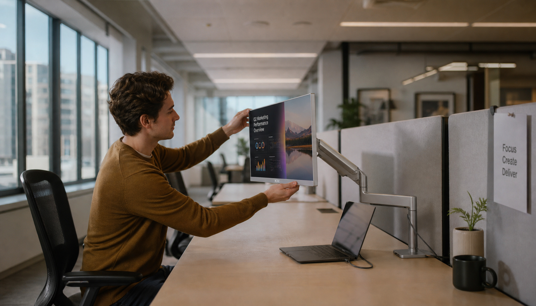
For side-by-side editing, spreadsheets, coding, or gaming dashboards, mismatched brightness forces your eyes to recalibrate every time you glance between screens. That is where color confusion starts: a gray panel on one screen looks neutral, then slightly blue, dull, or overexposed on the other.
Set the Room Before You Set the Screens
Brightness balancing starts with the environment. If one display faces a window and the other sits in shade, matching sliders will not match what your eyes see.
Use a stable lighting setup before changing settings. Avoid direct sunlight, harsh overhead glare, and a pitch-dark room where the screens become the only light source.
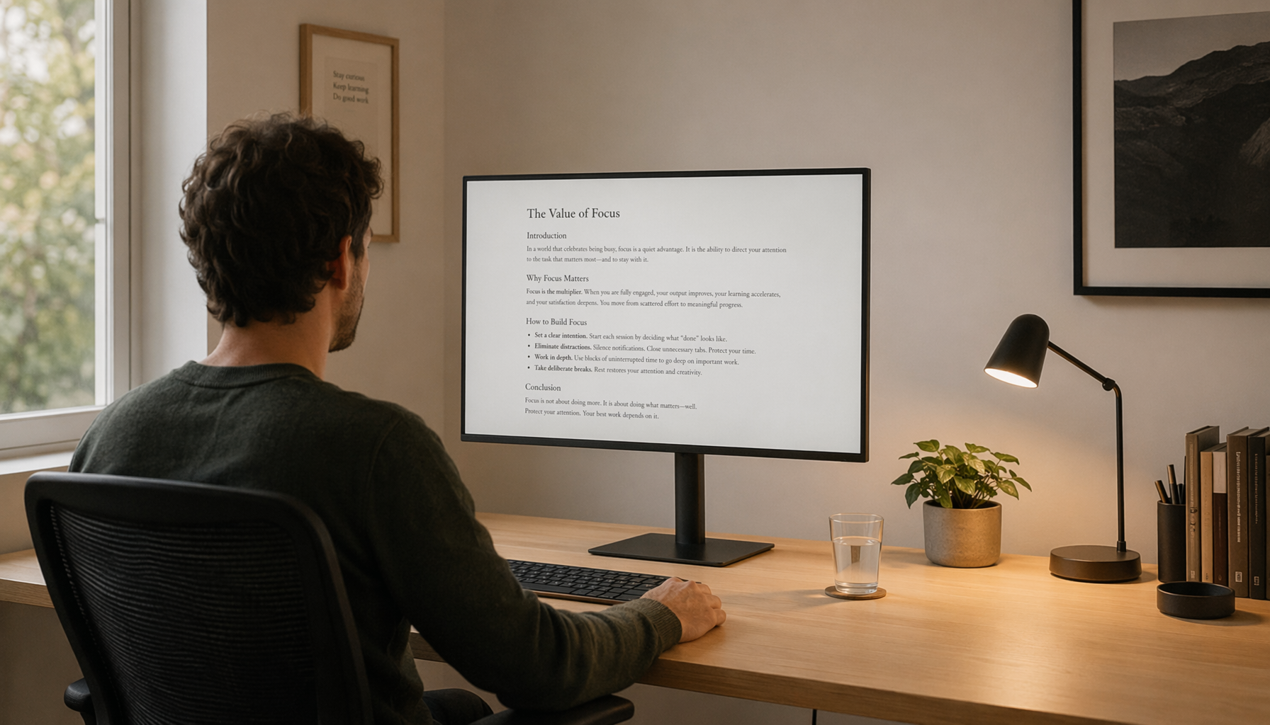
A fast field test: open the same white document on both displays. The white should look like softly lit paper, not a lamp on one screen and a gray sheet on the other.

For dim rooms, lower both displays enough that white backgrounds stop glowing. Night-use recommendations often place comfortable brightness around 120 to 180 nits, while a 100-nit baseline is common for controlled color work.
A Quick Matching Workflow That Works
Start with the laptop because its built-in screen often has fewer physical controls. Then bring the portable monitor into line.
- Turn off adaptive brightness and power-saving dimming on both screens.
- Open the same white page, neutral gray image, and skin-tone photo on both.
- Set the laptop to a comfortable brightness for the room.
- Adjust the portable monitor until whites and mid-grays look equally intense.
- Fine-tune contrast only after brightness feels balanced.
Many portable monitors use physical buttons or compact on-screen controls. Some models raise or lower brightness in small hardware steps, such as the sun-icon buttons found on certain USB-C portable displays.

Do not chase identical slider percentages. A laptop at 60% and a portable monitor at 42% may match better than both at 50%, because panels have different backlights, coatings, and calibration curves.
Color Settings: Keep Them Neutral
Once brightness is close, check color temperature. For productivity, web content, and most creative previews, 6500K is a reliable neutral target because it approximates daylight white.
Avoid Vivid, Movie, Dynamic Contrast, and heavy blue-light modes when comparing color across screens. These presets may look punchier, but they often boost saturation, shift white balance, or crush shadow detail.

For color-sensitive work, use the same color mode on both screens when possible, such as sRGB. If your portable monitor supports only basic controls, keep it simple: neutral preset, stable brightness, moderate contrast, and no automatic enhancement.
A brighter screen does not directly expand color gamut, but it can make contrast and subtle tone differences easier to see, which may still change your editing decisions.
Battery, Comfort, and Real-World Balance
Running a portable monitor at full brightness can drain a laptop faster, especially over single-cable USB-C power. Reducing display brightness is also a common battery-saving step for laptops, and energy-saving settings are especially useful when traveling.
For all-day work, choose the lowest matched brightness that still feels clear. In a controlled office, that may be around 250 to 300 nits. In a bright coworking space, a 400-nit-capable portable monitor gives more headroom without forcing the laptop screen to look dim.

The practical target is simple: match perceived white, preserve shadow detail, disable automatic shifts, and recalibrate whenever the room lighting changes. Your eyes will move faster, your edits will be more reliable, and your dual-screen setup will feel like one unified workspace.


