


Mini-LED vs OLED text clarity usually comes down to how the panel renders small text, how much scaling you need, and how your desk is lit. For coding, spreadsheets, and long reading sessions, Mini-LED is often the safer default, while OLED can still work well if you care more about contrast and can live with panel-specific text behavior.

Why Text Clarity Drives the Choice
For office use, resolution alone does not settle the question. Text can look different at the same resolution because subpixel layout, pixel density, scaling, and glare handling all change how letters feel at a desk.
That is why the most useful first check is not "which one looks better in a showroom," but "which one keeps small text clean at my actual viewing distance." As RTINGS' text clarity test shows, real-world readability depends on close-up rendering behavior, not just headline specs.
A practical rule of thumb is this: if you spend most of the day in documents, terminals, or spreadsheets, favor the panel that keeps the text edge clean before you think about contrast or HDR. If you mainly split time between work and media, OLED's contrast can matter more, but only after you check text behavior.
How Mini-LED and OLED Affect Text
OLED is the technology more likely to show visible color fringing on small text, because many OLED monitors do not use the same RGB-stripe subpixel layout found on conventional LCD panels. That difference matters most in code editors, thin UI fonts, and tight spreadsheet grids, where colored edges are easier to notice.

Mini-LED monitors usually behave more like standard LCDs for text rendering, so they tend to feel more familiar if you are coming from an office IPS display. That does not make every Mini-LED panel sharper than every OLED panel, but it does make Mini-LED the easier bet when your priority is predictable desktop text.
Higher pixel density can reduce how obvious OLED fringing looks, especially as you move to sharper 4K or 5K class displays, but it does not remove the underlying subpixel difference. As PCMonitors' discussion of OLED fringing explains, the layout issue is still there even when the visual impact becomes less noticeable.
Scrolling also changes the feel of text clarity. In real office use, a panel can look sharp on a still page and then feel less stable while moving through long documents. That is why some people judge a monitor by how it feels after a few hours of reading, not by a single still image.
For mixed natural and overhead lighting, glare handling matters too. A panel that looks impressive in a dim room may feel harsher under a bright window, so the better office choice is often the one that stays readable without constant brightness adjustments.
Where Mini-LED Usually Fits Better
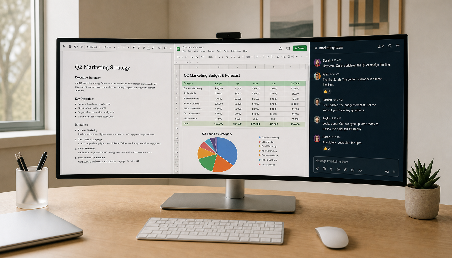
Mini-LED is usually the better starting point if your day is mostly coding in a bright or mixed-light room, working in spreadsheets with lots of small cells and thin fonts, reading documents for long stretches, or keeping a static desktop on screen for many hours. The main advantage is not just brightness, although that helps in glare-prone rooms. It is the more traditional text appearance. For many office buyers, that familiar LCD feel is the difference between "looks fine" and "I do not notice it anymore," which is what you want in a work monitor.
If you want a browse-first office category with that kind of emphasis, the Office Monitor collection is the cleanest place to compare office-oriented options.
One useful boundary: Mini-LED is not automatically the best pick if your work is heavily color-sensitive and you mostly sit in controlled lighting. In that case, OLED's contrast may be more appealing, but only if the text rendering on the specific model does not bother you.
When OLED Makes Sense
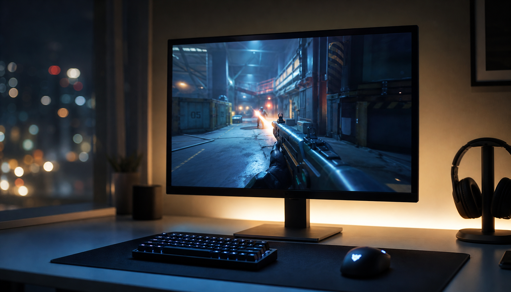
OLED makes more sense when contrast is a bigger part of your daily satisfaction than absolute text predictability. If you move between office work, media, and creative tasks, OLED can feel especially premium because blacks look deeper and transitions can feel more vivid.
That said, OLED is not the easy default for text-first office desks. If you are sensitive to colored edges on small fonts, or if you read dense material all day, OLED can become the wrong trade-off even when the image looks gorgeous in demos.
A good decision sentence here is simple: choose OLED when you want the visual payoff of contrast and you are willing to verify text behavior on the exact panel; choose Mini-LED when you want fewer surprises in long work sessions.
Choose by Workload and Desk Setup
| Workload or setup | What matters most | Better default |
|---|---|---|
| Coding and terminal work | Clean small text and stable edges | Mini-LED |
| Spreadsheets and dense tables | Predictable glyph shape and less distraction | Mini-LED |
| Long reading sessions | Low visual annoyance over time | Mini-LED |
| Bright room with windows | Glare handling and brightness headroom | Mini-LED |
| Mixed work and media | Contrast plus acceptable text behavior | OLED if text checks out |
| Controlled lighting and mostly visual work | Contrast and image punch | OLED |
The table above is a starting filter, not a verdict. If you already know you are sensitive to text fringing, that one factor can outweigh OLED's contrast advantage. If you are not sensitive and you care a lot about image depth, the recommendation can flip.
For readers who want a simple office-first path, the KTC 24"/27" 2K IPS 100Hz Home & Office Monitor is a reasonable comparison point because it sits in the predictable LCD-style lane rather than the OLED text-fringing lane. If you want to compare other desk-friendly options by size and resolution, the 2K Monitor and 4K Monitor collections are useful next stops.
Final Checks Before You Buy
- Confirm the screen size and native resolution together, not separately.
- Check how the monitor handles text at your actual desk distance.
- Prefer Mini-LED if you want the safer office default and fewer text-rendering surprises.
- Prefer OLED only if contrast matters enough to justify checking panel behavior first.
- Match the choice to your lighting, scaling, and reading habits before you look at extras.
If you want an office-first LCD-style reference model, the KTC 27" 4K IPS 60Hz Low blue Light Home&Office Monitor | H27P27 is a clean benchmark for a text-focused desk.
Related Resources
Compare these targeted resources for deeper insight into office setups and pixel behavior:
- KTC Mini LED 27" 180Hz 2K HDR1400 Gaming Monitor | M27T6
- Financial Analyst vs Designer Monitor Specs
- Dark-Theme Developer Displays
- Pixel Pitch and Viewing Distance
FAQs
Q1. Is Mini-LED or OLED Better for Coding Text Clarity?
Mini-LED is usually the safer choice for coding because it tends to deliver more familiar LCD-style text rendering. OLED can still be fine, but only if the specific panel looks clean to you at your normal viewing distance and font size.
Q2. Why Can OLED Text Look Fringed or Softer on Some Monitors?
The main reason is subpixel layout. Many OLED panels do not use the same RGB-stripe structure as conventional LCDs, so small text can show colored edges. The effect is often more noticeable in thin fonts and UI elements than in large headings.
Q3. Can Mini-LED Look Sharper Than OLED for Spreadsheets?
Yes, in many office setups it can feel sharper because it usually behaves more like a standard LCD for text rendering. That advantage is most noticeable when you are looking at small cells, thin grid lines, and long rows for hours at a time.
Q4. What Screen Size Is Best for Office Text Clarity?
The best size depends on pixel density and desk distance, not size alone. For many office buyers, 27-inch 2K or 27-inch 4K are common starting points, but the right choice is the one that keeps text readable without forcing awkward scaling.
Q5. How Do I Decide Between Mini-LED and OLED for a Mixed-Use Desk?
Pick Mini-LED if the desk is work-first and you want the least risky text experience. Pick OLED if you strongly value contrast and media quality, and you are comfortable checking whether the panel's text rendering works for your eyes and your font sizes.


