

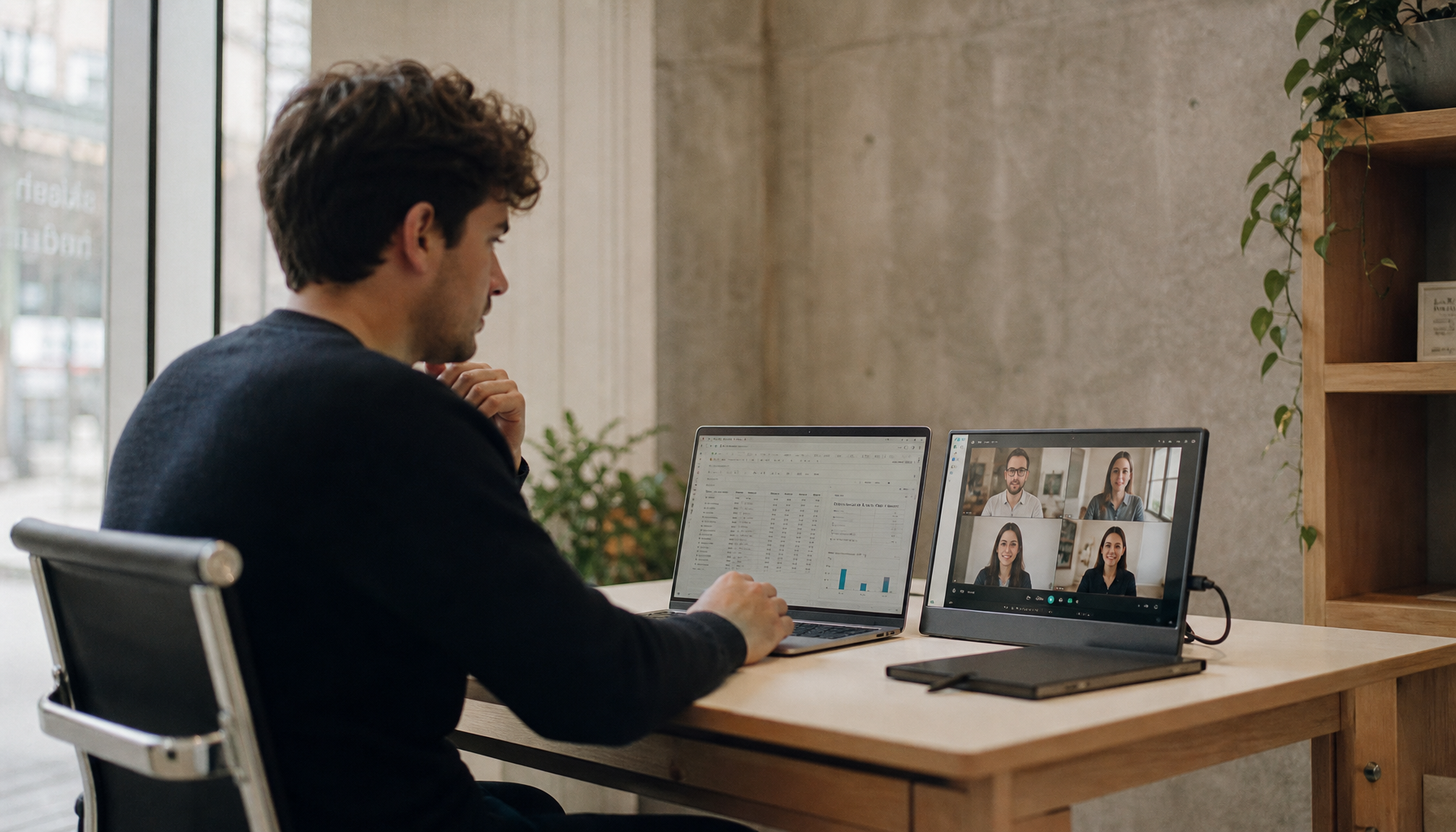
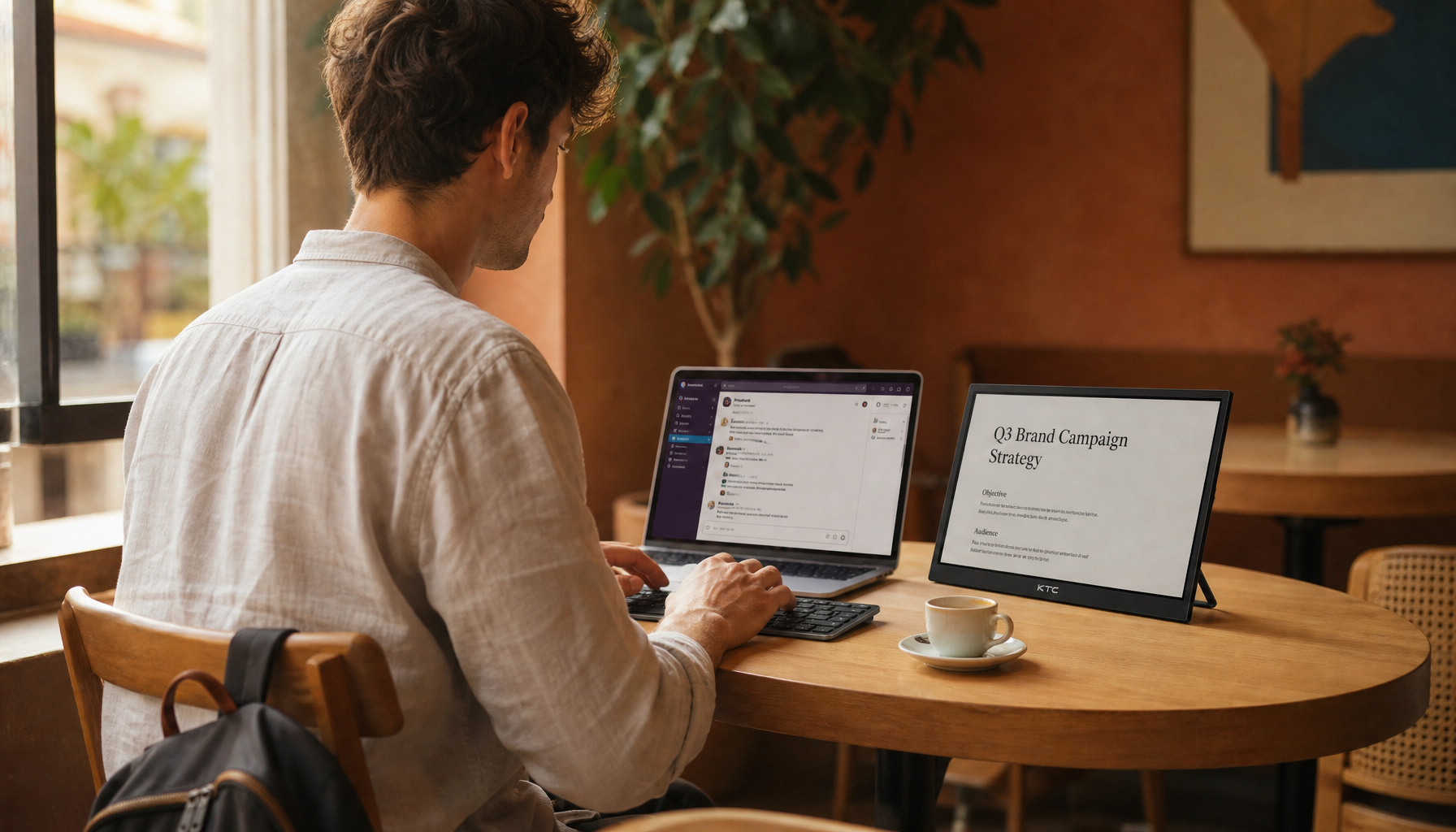
Place your landscape monitor directly in front of you for design work, then set a portrait monitor to the side for reading, references, notes, chat, or vertical layouts. The best setup balances screen orientation, eye-level alignment, viewing distance, and window placement so you gain workspace without adding neck strain.
Does your design desk feel crowded with tabs, documents, design panels, email, and reference images fighting for the same screen? A mixed portrait-and-landscape setup gives you a testable benefit right away: fewer window swaps because your main canvas and long-form reference material stay visible at the same time. Here is how to choose, position, configure, and use the two screens so reading feels calmer and design work stays precise.
Why Pair Portrait and Landscape Monitors?
A landscape monitor is the wide, default orientation most people use. It is best for design canvases, timelines, spreadsheets, presentations, video previews, and any workspace where horizontal space matters. A portrait monitor is the same display rotated 90 degrees, making it taller than it is wide, which is ideal for reading documents, web pages, code, chat feeds, research notes, and vertical creative formats.
The productivity case is not just desk folklore. In a University of Utah study comparing single, dual, and widescreen displays, dual 20-inch monitors were faster than a single 20-inch display in task completion, supported more output, and reduced errors in the tested office tasks. The same study also found that widescreen displays can outperform dual monitors for some text-editing work, which is why orientation should follow the job rather than the trend.
For designers, the pairing is especially clean. Keep a design app, image editor, or large artboard on the horizontal screen, then use the vertical screen for brand guidelines, user research, UI kits, briefs, comments, or a live prototype preview. Design workflows benefit when related tasks stay visually separate, because you are not constantly covering the thing you need to compare.

Best Layout for Reading and Design
For most people, the strongest layout is a centered landscape primary monitor with a portrait secondary monitor on the side of your dominant reference direction. If you read, compare, and drag assets from left to right, put the portrait screen on the left. If your tools, chat, or notes naturally live on the right, place it there.

Do not center the gap between the two monitors in front of your chair. That makes your neck choose a side all day. Instead, place the landscape display in front of your keyboard and chair, then angle the portrait display inward. Ergonomic setup advice consistently favors a primary display centered in front of the user, with the secondary display angled toward the body; a side display angled inward by about 15 to 20 degrees is a practical starting point.
A simple real-world example: use a 27-inch QHD or 4K landscape monitor as your main design surface, then rotate a 24-inch or 27-inch IPS monitor vertically for briefs, exported cell phone screens, chat, email, comments, and document review. If you are editing a landing page, the wide monitor can hold the design canvas and properties panel while the portrait monitor shows the live page, copy deck, or competitor reference at near-natural reading height.
Ergonomics: Make the Setup Comfortable Before You Make It Bigger
More screen area helps only if your body can use it without strain. Set both displays about an arm’s length away, then adjust height so the top edge of the main screen sits at or slightly below eye level. For larger monitors, you may need more distance; a 27-inch display often feels comfortable around 3 to 4 ft away depending on resolution, scaling, and eyesight.
Dual-monitor ergonomics should reduce twisting, not create it. If both monitors are used equally, position them close together in a shallow concave shape. If one monitor is dominant, keep that monitor centered and let the secondary screen sit off to the side. A dual-display desk can improve productivity, but poor monitor position can increase eye, neck, shoulder, wrist, and back strain.
A monitor arm is usually worth it for this layout. Factory stands often consume too much desk depth and may not rotate cleanly. Before buying an arm, confirm VESA support, usually about 3x3 in or 4x4 in, along with weight capacity, desk clamp clearance, and 90-degree rotation. Adjustable arms are especially useful because you can fine-tune height, tilt, and swivel after a week of real use instead of locking into a first-day guess.

Choosing Which Monitor Goes Portrait
Not every monitor makes a good portrait display. A flat IPS panel is generally a safe choice because portrait use often means viewing the screen from a slight side angle. A 24-inch to 27-inch size works well for reading without becoming a tower that forces too much eye travel. Higher resolution helps because text, UI labels, and design annotations stay sharper when the screen is rotated.
For reading and design, prioritize pixel density, viewing angles, and adjustability over refresh rate. A 60Hz portrait screen is usually fine for documents, code, references, email, and chat, while high refresh rates matter more on the main screen if you game, animate, or work with fast-motion media. Portrait monitors are strongest for text-heavy workflows, because they show more vertical content and reduce scrolling.
There are tradeoffs. Some websites, apps, and dashboards do not adapt elegantly to narrow vertical width. A portrait screen can also feel awkward for wide spreadsheets, complex timelines, or dense toolbars. If your day is mostly video editing, financial modeling, or wide-interface production, keep those on landscape and reserve portrait for supporting material.
Task |
Best Screen |
Why It Works |
Design canvas or image-editing workspace |
Landscape |
Wide space fits panels, layers, and artboards |
Document briefs and long files |
Portrait |
More page height means less scrolling |
Cell phone UI preview |
Portrait |
Matches phone-first visual proportions |
Spreadsheets and timelines |
Landscape |
Columns and tracks need width |
Chat, email, notes, and research |
Portrait |
Vertical feeds stay visible without crowding the canvas |
Software Setup on Desktop Operating Systems
After rotating the monitor physically, set the operating system orientation to match. On a desktop PC, open display settings, select the correct monitor, choose portrait under display orientation, and use the identify option if you are unsure which screen is which. Then drag the monitor boxes so your cursor moves naturally from one screen to the other.

On a desktop workstation, use system display settings to arrange the display positions to match the physical desk. On a lightweight laptop operating system, connect by HDMI or USB-C, open display settings, choose extended display rather than mirrored display, and arrange the screen positions. Extended display is the mode you want for productivity, because extended display expands your workspace instead of duplicating the same image.
Set each monitor to its native resolution, then tune scaling so text looks similar across both displays. Mixed 4K and 1080p setups can work, but if scaling is ignored, windows may jump in apparent size when moved between screens. Dual-monitor setup advice often notes that mismatched placement or resolution can cause cursor jumps, dead zones, and awkward transitions, so fix alignment before judging the setup.
Workflow Examples That Use Both Screens
For reading-heavy design review, put the final mockup or prototype on the landscape monitor and the brief, comments, or accessibility notes on the portrait monitor. This keeps decisions visible: you can check spacing, copy, hierarchy, and stakeholder feedback without burying the design app.
For UX research, run the interview recording, transcript, or notes on the portrait screen while mapping insights or updating personas on the landscape display. A vertical screen is also strong for comparing cell phone screenshots, because the content appears in the same orientation users see on a phone.

For learning a new tool, place the tutorial, documentation, or course page vertically and follow the steps in the design app on the horizontal monitor. This is one of the fastest ways for newer designers to reduce friction, because the lesson and the workspace stay visible together instead of taking turns.
For content creation, keep a vertical preview on the portrait display while editing source assets on the landscape monitor. This is useful for social graphics, app screens, newsletters, long landing pages, and documentation pages where the final experience scrolls vertically.
Portrait-Landscape Setup vs. Ultrawide
A single 21:9 ultrawide can be excellent for broad workspaces, especially if you want fewer bezels and a cleaner desk. An ultrawide monitor gives extra horizontal space for multiple windows, and 21:9 monitors can reduce switching for designers, developers, analysts, and users working across multiple tools.

The mixed dual-monitor layout wins when your work has two different shapes: one wide workspace and one tall reading lane. It also creates useful mental separation. The design file lives on one screen; the brief, research, preview, or communication layer lives on the other. That separation is harder to maintain on one large canvas unless you are disciplined with window management.
The practical answer is value-driven: choose ultrawide if your work is mostly horizontal and immersive, such as timelines, large canvases, or wide spreadsheets. Choose landscape plus portrait if your day blends creation with reading, review, reference, and communication.
Common Mistakes to Avoid
The first mistake is using two large landscape monitors side by side when only one is truly primary. That often spreads the setup too wide and encourages head turning. The second mistake is rotating a monitor without raising it first, which can cause the lower corner to hit the desk or push the screen into a poor viewing height.
The third mistake is leaving brightness, contrast, and color wildly different between monitors. Design decisions suffer when white looks warm on one screen and cool on the other. Match brightness and color as closely as the displays allow, then use the better-calibrated monitor for color-critical work.
The fourth mistake is buying for size alone. A cheaper oversized portrait screen with weak viewing angles can be less comfortable than a sharper, smaller IPS display. For a reliable setup, match monitor size and resolution where possible, confirm the right cables and ports, and keep cable routing clean; dual-monitor optimization tips often start with similar size and resolution because consistency makes the whole desktop feel more predictable.
FAQ
Should the portrait monitor go on the left or right?
Put it where your secondary attention naturally goes. If you drag assets from references into a canvas, place it on the side that makes that movement easiest. If you mainly glance at chat, email, or notes, place it on the side that requires the least neck rotation.
Is a vertical monitor good for graphic design?
Yes, when it supports the design workflow rather than replacing the main canvas. It is excellent for vertical references, cell phone previews, brand documents, comments, and long pages. Keep color-sensitive editing and wide artboards on the better landscape display unless the vertical monitor is equally accurate.
Do both monitors need to be the same size?
No, but similar size, resolution, and pixel density make cursor movement, scaling, and window placement feel smoother. If you mix sizes, align the displays in software based on where your eyes and cursor actually cross between screens, not just the bottom edges of the panels.
Final Setup Recommendation
For reading and design, use one centered landscape monitor as your performance workspace and one side portrait monitor as your immersion lane for long-form context. Keep the primary screen in front, angle the portrait screen inward, match brightness and scaling, and let each display do the job its shape was built to handle.


