


Choose a wide-viewing-angle panel, especially IPS or OLED, to keep color, contrast, and brightness more consistent when teammates view the screen from the side.
Why Color Shift Happens in Shared Review
Color shift appears when a display looks correct head-on but fades, warms, cools, or loses contrast from an angle. That is a real problem in design reviews, video edits, slide approvals, and dashboard walkthroughs, where nobody is sitting in the exact same spot.

Many LCD screens depend on a backlight passing through liquid crystal layers. At an angle, that light path changes, so the color you approve may not be the color your colleague sees; screen color shift is most obvious on weaker viewing-angle panels.
For fast-moving office and creative work, this is not just a visual annoyance. It slows decisions because one person sees a neutral gray, another sees a slight tint, and the conversation shifts from the work to the screen.
The Feature to Prioritize: Wide Viewing Angles
For collaboration, prioritize an IPS or OLED display with wide viewing-angle performance. IPS panels are widely used for color-critical work because they hold color more consistently off-axis, while OLED pixels emit their own light and can also maintain strong color fidelity from wide angles.
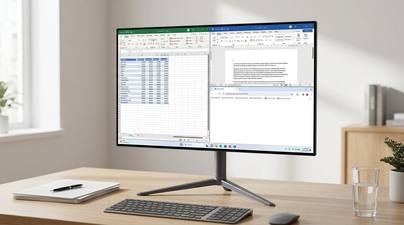
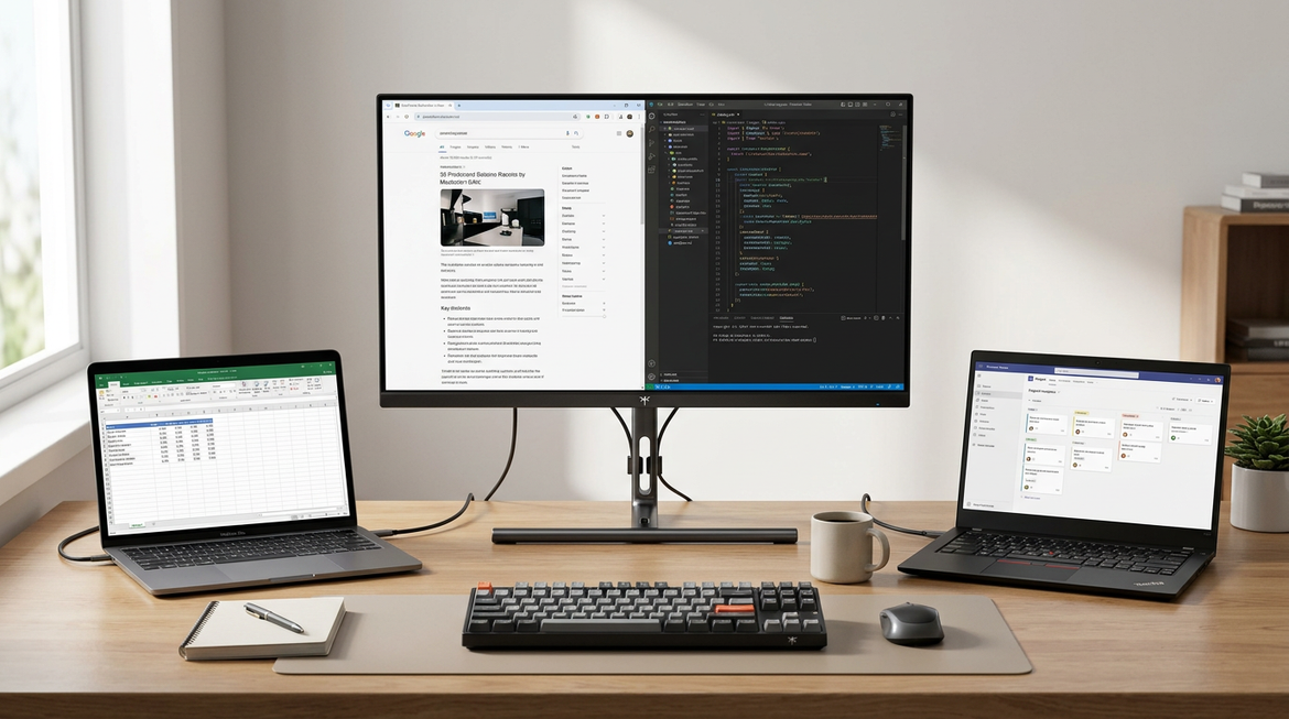
This matters most on 27-inch to 32-inch desktop monitors, ultrawides, and portable smart screens used in small group reviews. The larger the screen, the more likely someone will view part of it from an angle.

A practical buying filter is to choose IPS, IPS Black, OLED, or QD-OLED for review-heavy work and avoid basic TN panels for color approval. Check viewing angles from both sides before buying, pair wide angles with factory calibration when color matters, and control room lighting to reduce perceived tint and glare.
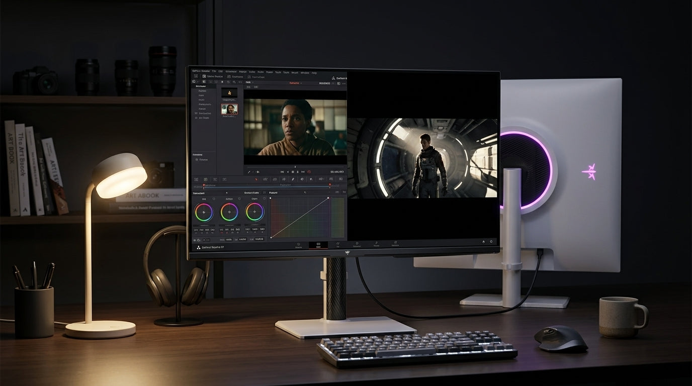
For video editing and grading, IPS panels are commonly recommended because they combine consistent color reproduction with wide viewing angles.
What Specs Still Matter
Wide viewing angle is the collaboration feature, but it should not stand alone. A monitor can look stable from the side and still be inaccurate if gamut, calibration, or color mode handling is weak.
For creative review, look for high sRGB coverage for web work, DCI-P3 for video and modern digital content, and Adobe RGB when print photography is part of the workflow. Photography-focused displays often target wide gamut and calibration because accurate photo editing depends on a screen that can reproduce colors beyond basic consumer expectations.
Resolution also helps. A 4K display gives teams enough detail to inspect typography, texture, UI spacing, and image sharpness without crowding around a single seat. For portable screens, OLED can be compelling because it offers strong contrast and off-axis visibility in a travel-friendly format.
OLED can still show mild angled tint depending on panel design, so wide viewing angles reduce color shift; they do not make every seat mathematically identical.
How to Set Up a Better Review Screen
Start by placing the monitor so the primary reviewer sits centered, with colleagues within roughly the same horizontal viewing zone. Even the best panel performs better when the room layout respects the screen.
Then lock down color behavior. Use the same color mode for the whole review, avoid switching between vivid, night, gaming, and creator presets, and disable automatic color-temperature features during approval sessions.
Keep lighting consistent. Strong side light, warm lamps, or reflections can make a good monitor look inconsistent. A neutral, evenly lit workspace helps the panel do its job.

For teams buying one shared screen, the best value is usually a color-accurate IPS or OLED monitor with wide viewing angles, solid factory calibration, and the right ports for laptops. That combination prevents side-seat color shift while keeping the workflow fast, credible, and easy to trust.


