


Color shifts happen because displays vary in gamut, profiles, presets, signal paths, and room conditions. Matching modes, brightness, white point, and color profiles can make multi-monitor color far more predictable.
Why Color Changes When a Window Moves
The biggest cause is gamut mismatch. A monitor’s color gamut is the range of colors it can reproduce, and color gamut varies across sRGB, larger RGB color spaces, DCI-P3, and other standards. A standard office display may be close to sRGB, while a wide-gamut gaming, OLED, or creator panel may produce more saturated reds and greens. When the same image appears on both, the wide-gamut display can make ordinary web colors look punchier unless color management or an sRGB clamp controls it.
The second cause is profile handling. ICC or ICM profiles describe how a device reproduces color, but they only help when the operating system and application use them correctly. Color-aware design and photo apps can use those profiles for more consistent handling, while a game launcher, older browser, or video player may not behave the same way.
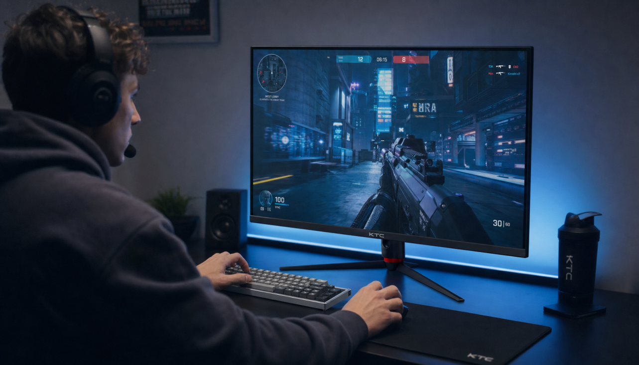
The third cause is display-side behavior. Presets do more than change color. A gaming preset can alter brightness, gamma, black level, HDR tone mapping, color temperature, overdrive, adaptive sync, or even refresh behavior. KTC’s support notes explain that switching presets can cross boundaries such as SDR to HDR, wide gamut to sRGB, or fixed refresh to VRR, which changes how the monitor interprets the signal. That means a window can look different not because the file changed, but because each display is in a different operating mode.
Gamut, Color Space, and Oversaturation
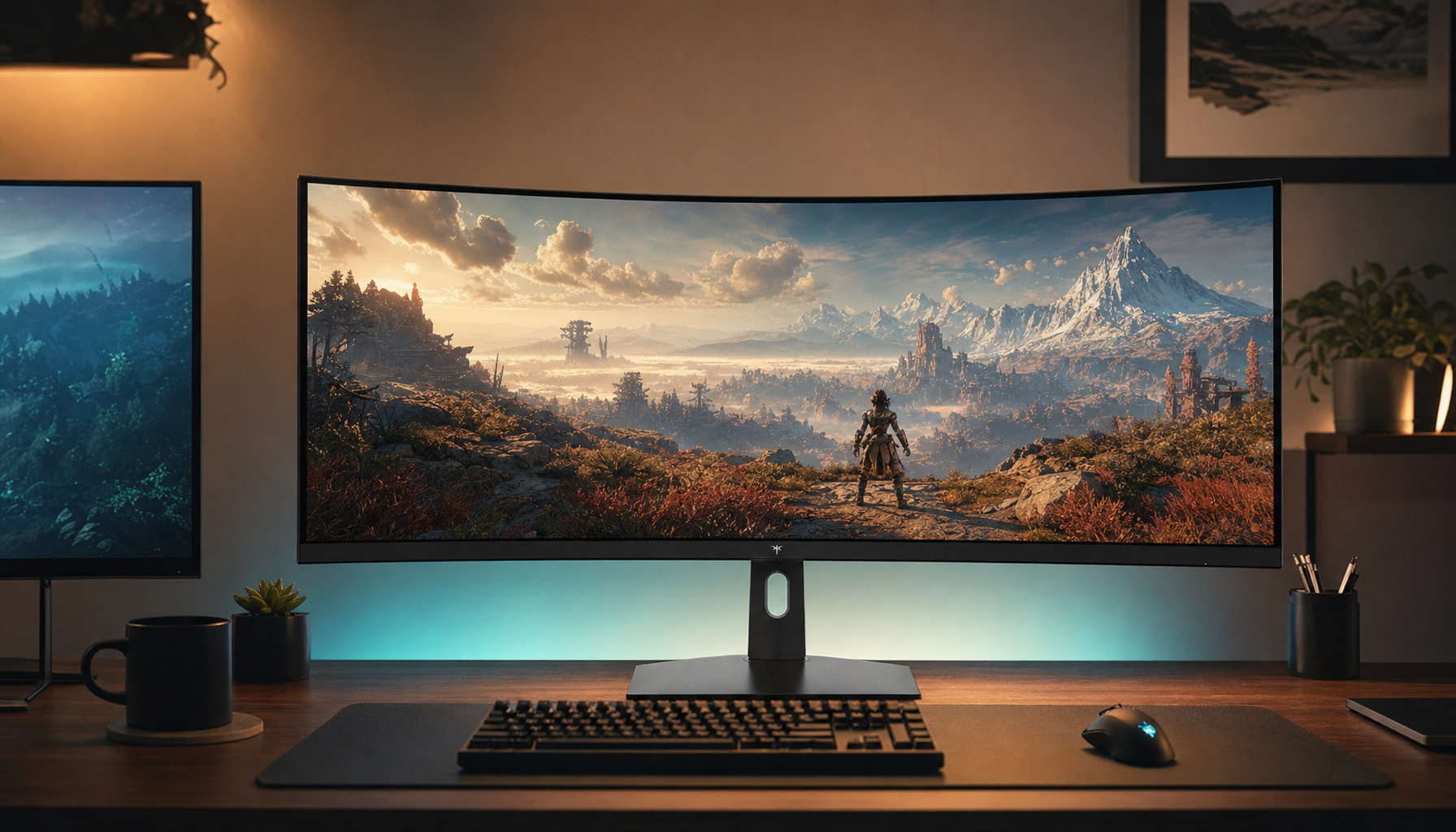
A color space is a defined target, such as sRGB or a larger RGB print-oriented space. A gamut is what a real device can actually reproduce. The practical distinction matters because a monitor advertised as wide gamut is not automatically accurate. Wide color gamut should be judged by coverage, gradation, viewing-angle stability, and uniformity, not just a large percentage on a spec sheet.

For most web, office, and esports overlay work, sRGB remains the safest reference because it is the standard for most PC, consumer camera, printer, monitor, and web workflows. For photography and print, a larger RGB color space becomes more valuable because it covers more saturated colors, especially vivid greens. The practical split is simple: photo printing workflows benefit from wider gamut, while standard office and gaming monitors usually aim closer to sRGB.
Here is the real-world effect. If your laptop panel covers near sRGB and your desktop monitor uses a wide-gamut mode without sRGB conversion, a red sale banner, health bar, or team logo can look controlled on the laptop and almost neon on the main screen. The pixels are the same. The display interpretation is not.
Workflow |
Best Default Target |
Why It Helps |
Office, web, UI review |
sRGB |
Matches most everyday content and reduces oversaturation |
Competitive gaming |
Stable native mode, often sRGB or standard |
Keeps motion settings consistent and avoids mid-game mode shifts |
Photo editing for print |
Calibrated wide-gamut mode |
Shows colors that sRGB may hide before printing |
Portable monitor work |
sRGB or accurate preset |
Reduces surprises when moving between rooms and lighting |
Why Identical Monitors Still May Not Match
Even two monitors with the same model name can show different colors. Settings may differ in brightness, contrast, RGB gain, color temperature, gamma, or selected preset. A useful diagnostic is to reset both displays to factory settings, then match the same preset, brightness target, input type, and refresh rate before judging the panel itself.
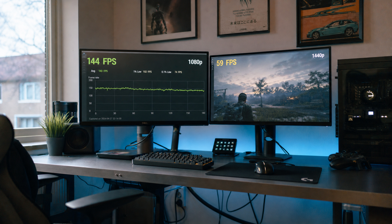
Connection path also matters. The same monitor can behave differently over VGA, HDMI, DisplayPort, USB-C, or a dock, especially if one output is driven by integrated graphics and another by a discrete GPU. Practical causes include port differences, cable quality, operating-system display settings, and monitor age. A clean test is to swap the monitors between ports. If the color cast follows the port, the signal path or GPU setting is suspect. If it stays with the panel, the monitor settings, profile, or hardware variation are more likely.
This is why high-refresh gaming desks can be tricky. One screen may run DisplayPort at 165 Hz with adaptive sync, while the side display runs HDMI at 60 Hz in a different picture mode. Gaming monitor priorities include high refresh rate, low input lag, fast response, adaptive sync, and game visual controls, while color-critical workflows prioritize a different stack of qualities. Neither priority is wrong; the mismatch becomes visible when one desktop spans both worlds.
Calibration Helps, but It Does Not Fix Everything
Calibration aligns brightness, white point, gamma, and color balance so each display has known behavior. Hardware calibration with a colorimeter is stronger because it measures the actual display instead of relying on your eyes. Before serious color work, let a monitor warm up for about 20 to 30 minutes, use native resolution, control ambient light, and assign the correct ICC profile.
For practical everyday use, start by setting each monitor to its most accurate preset, often sRGB, Standard, or a factory-calibrated mode. Then match brightness by eye or with a meter. In a normal office, display guidance often recommends screen brightness around 29 to 44 foot-lamberts under moderate room lighting, or roughly matching a white screen to white paper under the same light. For photo work, a typical calibrated editing range is about 29 to 58 foot-lamberts, with roughly 47 foot-lamberts as a practical target.
The limitation is important. Calibration cannot make a 70% sRGB portable panel reproduce colors it physically cannot display. It also cannot remove off-angle color shift, glossy reflections, weak uniformity, or panel aging. Some budget portable monitors may only reach 70% to 80% sRGB, even when marketing claims sound more ambitious. For designers, that turns portability into a tradeoff: convenient for layout, less trustworthy for final color approval.
Room Light and Viewing Angle Can Imitate a Color Problem
Sometimes the display is not changing as much as your eyes are. Ambient light changes perceived warmth, contrast, brightness, and saturation, especially when one monitor faces a window and another sits in shade. KTC’s ambient-light guidance notes that ambient lighting can make the same monitor appear warmer, cooler, flatter, darker, brighter, or more saturated even when settings stay unchanged.

Viewing angle adds another layer. IPS panels are known for stronger color consistency and wide viewing angles, while TN panels shift faster off-center and VA panels can lose shadow detail under glare. IPS monitors can maintain color and clarity at up to 178 degrees horizontally and vertically, which is one reason they work well in dual-monitor setups. With a large ultrawide or a side portrait monitor, your eyes may view the edges at a sharper angle than you realize, so the color shift can be physical rather than software-based.
For a quick desk check, sit centered about 2 to 2.5 ft from the display, keep the top of the monitor at or slightly below eye level, and avoid direct lamp or window reflections on the panel. Bias lighting behind the monitor can reduce the harsh contrast between a bright screen and a dark wall, but it will not correct poor panel contrast or an inaccurate color mode.
How to Reduce Color Shifts Across Mixed Displays
Start with the job the screen must do. If the second monitor is for chat, docs, and monitoring tools, perfect color match is less important than comfort, text clarity, and stable brightness. If it is for image review, client proofs, product color, or print decisions, the monitor needs stronger gamut coverage, calibration support, and uniformity.
Set both monitors to native resolution and a stable refresh rate. For a mixed work-and-gaming setup, a steady 144 Hz or 165 Hz desktop mode can be less disruptive than bouncing between a 60 Hz desktop and maximum gaming refresh. Keep HDR off for normal SDR desktop work unless both displays and apps are managed for HDR. Use the same connection type where possible, preferably DisplayPort or USB-C for high-refresh PC setups and consistent signaling.

Install the manufacturer’s profile for each monitor when available, then assign it in the system color-management settings by selecting the correct display, enabling custom settings for that device, and adding the matching ICM or ICC profile. This will not force every app to behave perfectly, but it gives color-aware software the right map.
For color-critical work, use a hardware colorimeter and recalibrate on a schedule. Professional workflows often benefit from recalibration every two to four weeks, with more frequent checks in demanding production environments. For gaming and office productivity, a less aggressive schedule is usually reasonable, but you should still recalibrate after major GPU driver changes, monitor firmware updates, or moving the display to a different lighting environment.
The Practical Tradeoff: Speed, Accuracy, or Mobility
A pro gaming monitor is built for response, refresh, and motion clarity. A professional photo monitor is built for gamut control, uniformity, and calibration stability. A portable smart screen is built for flexibility, not always perfect consistency. The color-shift problem often appears when one desk tries to combine all three.
The best setup is not always the most expensive one. Use the fast monitor for play, the accurate monitor for visual decisions, and the portable display for secondary work unless its measured gamut and calibration prove it can handle color approval. For most users, matching sRGB modes, brightness, white point, and connection type solves the majority of annoying window-to-window shifts. For creators, a calibrated wide-gamut monitor plus a controlled sRGB preview mode is the stronger long-term move.
FAQ
Why does my window look oversaturated on my gaming monitor?
Your gaming monitor may be running in a wide-gamut or vivid preset while the content was created for sRGB. Without proper sRGB conversion or color management, ordinary web colors can appear too intense.
Should both monitors use the same ICC profile?
No. Each monitor should use its own correct profile because each panel has different color behavior. Using one profile across two different displays can make matching worse.
Is HDR causing my color shift?
It can. HDR changes tone mapping, brightness handling, and signal interpretation. If one display is in HDR and the other is in SDR, color and contrast will often diverge sharply.
Can calibration make a cheap portable monitor match a creator display?
Calibration can improve white point, gamma, and balance, but it cannot add missing gamut, improve poor uniformity, or fix weak viewing angles. Use it for consistency, not miracles.
Color shifts are not random; they are the visible result of gamut, profiles, presets, signal paths, panel behavior, and room light interacting. Lock down the basics first, then reserve wide gamut and HDR for the workflows that truly benefit from them.


