


Panel coating changes how room light meets the screen, so it can make colors look richer, duller, cleaner, or less predictable without changing the panel’s actual color capability.
Does your expensive monitor look vivid at night but washed out by lunch, or does white text seem slightly grainy on a bright office desk? A simple screen-off reflection check and one calibration pass can separate a coating problem from a panel problem before you replace the display. Here is how coating affects saturation, accuracy, and real-world buying choices for gaming, creative work, office productivity, and portable screens.
Why Panel Coating Matters More Than Spec Sheets Suggest
Display coating is the surface finish applied over the panel, usually glossy, matte, or a lower-haze semi-gloss style. It does not rewrite the monitor’s native color gamut, Delta E, contrast ratio, or panel technology. It changes something just as practical: how much ambient light gets reflected into your eyes and how cleanly the image passes through the surface.
That distinction matters because color accuracy is about whether the screen represents intended colors faithfully, while color saturation is often about perceived punch. A monitor can measure accurately in a dark test room and still look flat beside a window. Another display can look rich in games because of deep blacks and strong contrast, yet oversaturate skin tones or product colors in a design workflow.
In daily use, coating is part of the display system. Panel type, backlight, gamut, calibration, brightness, room lighting, and coating all stack together. The coating is the part many buyers ignore until reflections, haze, or sparkle become impossible to unsee.
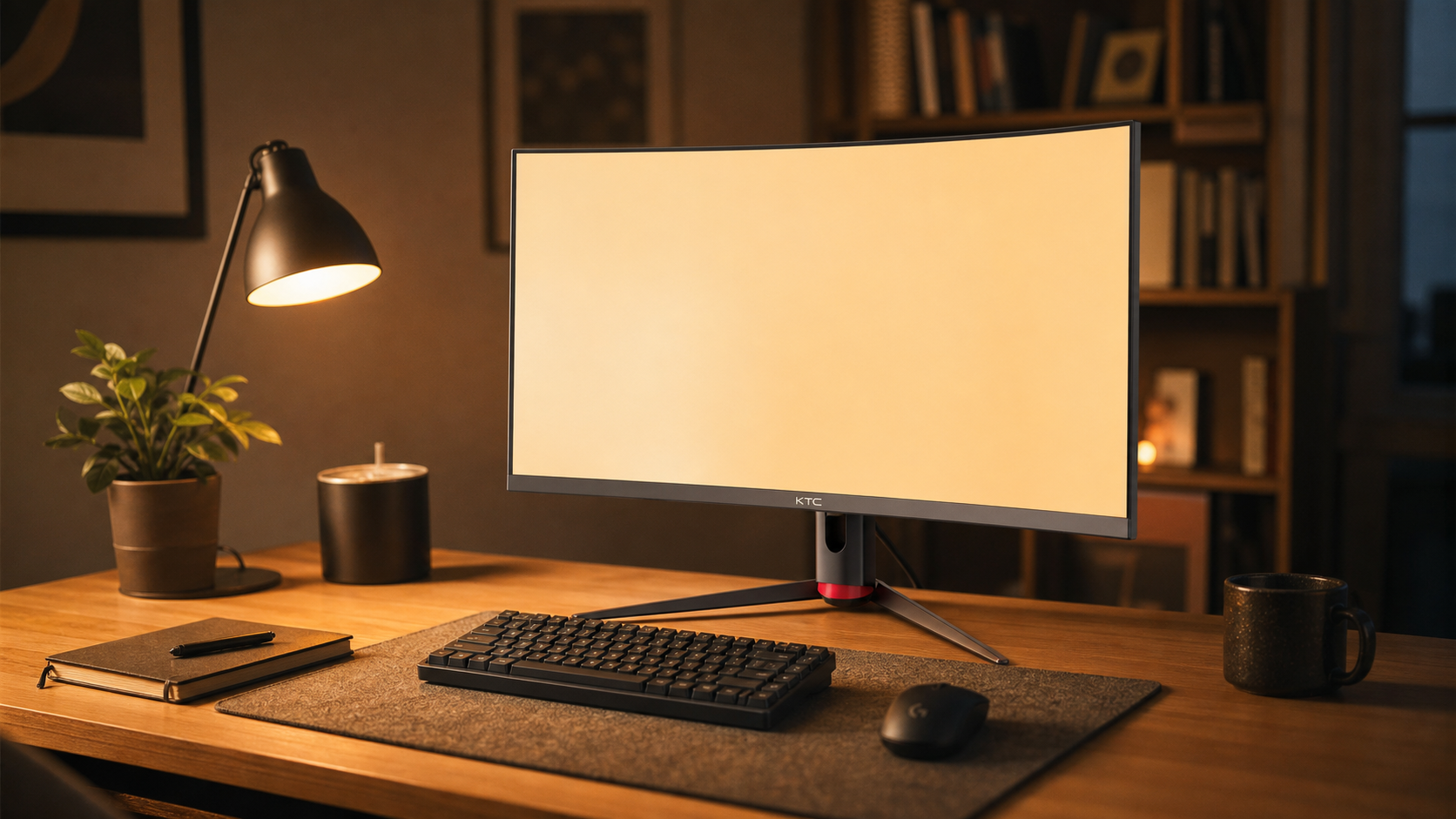
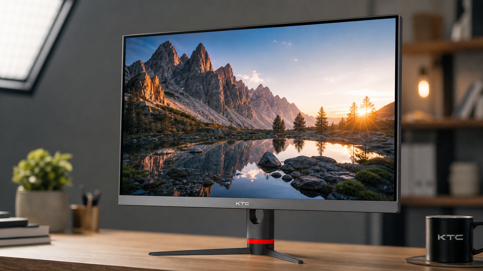
Glossy Coating: Maximum Punch, Minimum Forgiveness
Glossy screens reflect light more directly. In controlled lighting, that directness preserves edge clarity, black depth, and perceived contrast, so colors often look more saturated even when the monitor is not actually outputting a wider color gamut. This is why glossy OLED laptops, tablets, and some high-end gaming displays can look immediately more dramatic than matte office monitors.

The tradeoff is harsh in the wrong room. A lamp, bright shirt, window, or white wall can show up as a visible reflection over dark content. Once reflected light sits on top of the image, black areas lift, shadow detail becomes harder to judge, and saturation loses its advantage. A glossy screen can be spectacular for a late-night racing sim setup, but a liability on a desk facing daylight.
For color-critical work, glossy is not automatically inaccurate. It can be very clear when glare is controlled. The problem is repeatability. If your image looks different at 9:00 AM, 2:00 PM, and 9:00 PM because the room changes, you are no longer editing against a stable visual reference.
Matte Coating: Better Glare Control, Possible Haze
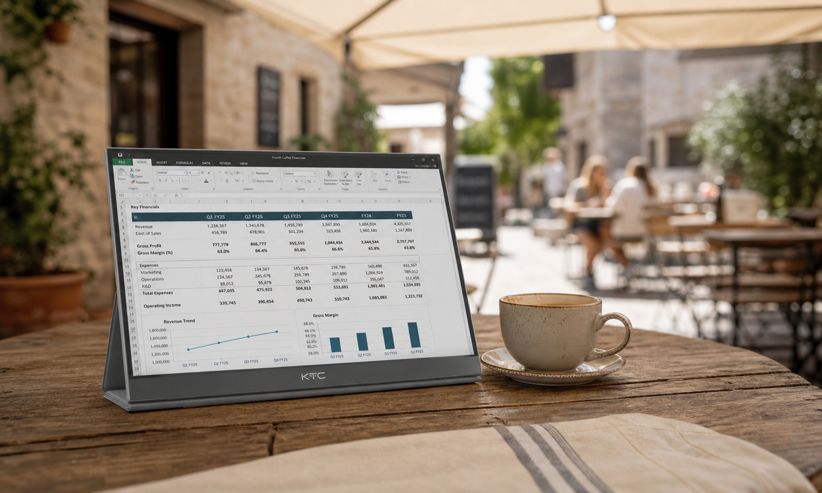
Matte coatings diffuse reflections instead of showing a sharp mirror image. That makes them practical for offices, shared desks, classrooms, airports, and portable smart screens where lighting is rarely ideal. When the goal is readable spreadsheets, code, email, dashboards, or competitive game visibility, matte often wins because it keeps glare from becoming the main thing on screen.
The cost is image purity. A stronger matte layer can scatter light across the surface, creating a mild haze that reduces perceived contrast. On white documents or pale gray UI panels, some users notice a grainy or sparkly texture. In one discussion of anti-glare coatings, a user described reading small 6-8 pt programming text on a heavily discussed 30-inch monitor without readability problems, while still noting a close-range sparkle effect that faded from attention after a few weeks anti-glare coatings.
That is a useful reality check. Close-up photos can exaggerate matte texture, but the effect is real enough to matter if you work with fine typography, pixel art, CAD lines, or 4K text all day. For office buyers, the question is not whether matte is better. It is whether the glare reduction is worth the small loss in perceived clarity.
Semi-Gloss and Light Matte: The Balanced Default
Semi-gloss and light matte finishes try to split the difference. They soften reflections more than glossy screens while preserving more contrast and clarity than heavy matte coatings. The terminology is inconsistent, so one maker’s “anti-glare” finish may behave very differently from another company’s “low haze” finish.
For a mixed desk, this is often the most reliable choice. A 27-inch 4K productivity monitor or a 34-inch ultrawide catches more room reflections than a small laptop screen, so full glossy can be difficult unless the room is controlled. At the same time, heavy matte can soften fine text and reduce the crispness that high pixel density was supposed to provide.
The practical test is simple. Turn the screen off under your normal desk lighting. If you see a sharp mirror image of a window frame or lamp, expect glossy behavior. If the reflection is broad and blurred, expect matte behavior. If the reflection is present but softened, you are likely in light matte or semi-gloss territory.
Coating type |
Perceived saturation |
Accuracy risk |
Best fit |
Glossy |
Highest in controlled light |
Reflections can change perceived blacks and colors |
Dark gaming rooms, cinematic OLED setups, controlled creative desks |
Matte |
More consistent in bright rooms, less punchy |
Haze can reduce perceived contrast and fine detail |
Office work, travel displays, bright rooms, shared workspaces |
Semi-gloss or light matte |
Balanced punch and reflection control |
Product labels vary, so testing matters |
Mixed gaming and productivity, ultrawides, 4K daily drivers |
Coating Changes Perception, Calibration Changes Output
A coating can make a display look more or less saturated, but calibration is what corrects the signal. The two are often confused. If a monitor is oversaturated in its default “Vivid” mode, changing coating will not make it accurate. If a calibrated monitor looks dull in a sunny room, recalibration alone may not fix the reflected light washing over the surface.
Monitor calibration works by measuring how the display behaves and adjusting it toward a target, often with an ICC profile, calibration curves, or hardware LUTs. One calibration explainer makes the key distinction that profiling describes current behavior, while calibration changes output to better match a target standard monitor calibration.
For print, design, and photography, hardware measurement matters more than visual guessing. Displays and printers use different color models, and calibration helps align what you see onscreen with what appears in print monitor-to-printer color mismatch. In practical terms, warm up the monitor, remove glare from the screen, set brightness for the room, then calibrate. If your desk lighting changes dramatically, your accurate profile is still fighting an unstable viewing environment.

Panel Type Still Sets the Ceiling
Coating does not turn a weak panel into a reference display. IPS, VA, OLED, and QD-OLED each bring different behavior before coating enters the picture. IPS is often valued for stable viewing angles and predictable color work. VA can look rich because of strong contrast, but off-center viewing can shift perceived gamma and color. OLED delivers deep blacks and strong HDR impact, yet it still depends on room light and surface reflections.
For strict color work, Delta E and gamut coverage matter. A display with Delta E under 2 is commonly treated as difficult to distinguish from reference for many workflows, while sRGB, wide-gamut RGB, DCI-P3, and Rec.709 coverage tell you which color spaces the monitor can reproduce. Coating affects how cleanly you perceive that performance, not whether the panel can meet the target.
For gaming, saturation often comes from contrast more than accuracy. A VA or OLED display can make explosions, neon signage, and night scenes feel more immersive because blacks sit lower and colors stand out harder. One display discussion captures the common buyer tension well: rich and accurate are not the same goal, and factory vivid modes may favor punch over faithful reproduction color accurate and color rich.
How to Choose for Your Setup
Choose glossy only when you control light. If your monitor faces a wall, lamps are off-axis, blinds are available, and you want maximum cinematic impact, glossy can deliver the strongest perceived saturation. This is especially compelling for OLED gaming, HDR movies, and single-player immersion where visual depth matters more than daytime consistency.
Choose matte when the environment is the enemy. Bright offices, window-facing desks, portable USB-C screens, classrooms, and shared workstations benefit from glare control. For productivity displays, a slightly less punchy image is usually better than constantly fighting reflections across spreadsheets, code, slides, and video calls.
Choose light matte or semi-gloss when your day shifts between work and play. This is the strongest default for many 27-inch 4K monitors, 32-inch desk displays, and ultrawides used for productivity by day and gaming by night. It keeps enough clarity for text while reducing the reflection problems that large screens naturally collect.
Before buying, ignore coating labels for a moment and think about the room. Sit where the monitor will sit. Look for windows behind you, overhead lights, glossy white desks, and bright wall reflections. A $600.00 display with the wrong coating for that room can feel worse than a cheaper monitor matched to the space.
Quick FAQ
Does Matte Coating Reduce True Color Accuracy?
Not directly. Matte coating does not change the panel’s native gamut or calibration target, but it can reduce perceived contrast and saturation through light scatter. In bright rooms, however, matte can make color judgment more consistent by reducing sharp glare.
Why Do Glossy Screens Look More Colorful?
They preserve contrast and black depth better in controlled lighting, so colors appear stronger. That perceived saturation can collapse when reflections become visible.
Should Creators Avoid Matte Monitors?
No. Many creators use matte or light-matte displays because stable viewing matters. For serious work, prioritize gamut coverage, Delta E, uniformity, calibration controls, and consistent lighting before chasing a glossy finish.
What Is Best for Portable Smart Screens?
Matte or light matte is usually safer. Portable displays move through hotels, offices, airports, and coffee shops, so reflection control is more valuable than peak showroom punch.

Final Word
Panel coating is not a cosmetic detail; it is the final optical layer between the panel’s measured performance and your eyes. For the most reliable result, match coating to your room first, choose the right panel for your workload second, and calibrate once the display is placed where you will actually use it.


