


An uneven screen can make a monitor look accurate in the center while the rest of the panel still looks wrong. Calibration helps, but it cannot fix hardware-level uniformity problems across the screen.
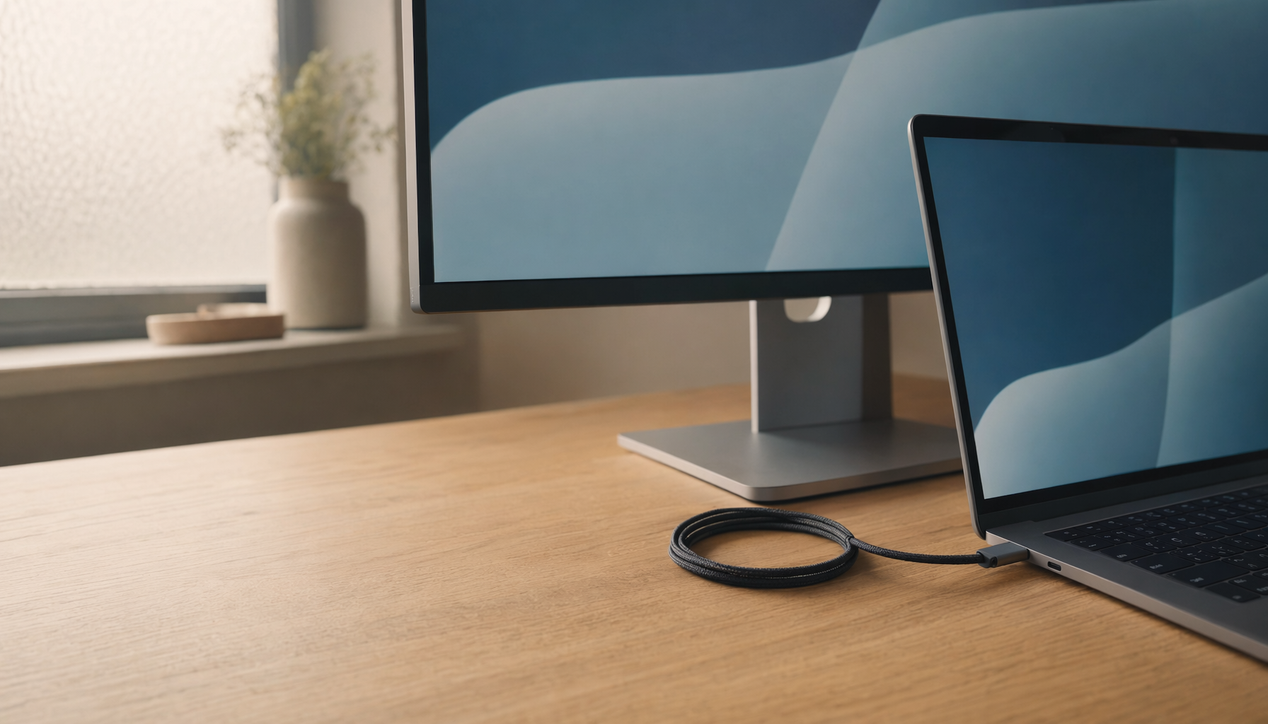
Does your monitor look perfect in the center, only for a spreadsheet to turn darker at the edges or a game scene to look hazy in the corners? A simple warm-up, gray-screen check, and center-versus-edge comparison can show whether your panel is fighting your settings and help you separate a calibration issue from a hardware limitation.
Calibration gets a lot of attention in monitor advice, but panel uniformity is the quieter variable that determines whether those settings hold up across the whole screen. If one zone runs cooler, dimmer, or hazier than another, your meter can only describe what it measured in that spot. It cannot make the rest of the panel physically behave the same way. That is why some displays can hit a target white point and gamma in a report yet still feel wrong during gaming, office work, or photo review.
Calibration and uniformity are not the same job

Calibration and profiling are separate steps for a reason. Calibration pushes the display toward targets such as brightness, white point, and gamma, while profiling records how that calibrated display actually behaves so color-managed apps can compensate correctly. Uniformity sits underneath both. It describes how evenly brightness and color hold from the center to the corners, and when that foundation is weak, the profile is accurate only for the measured area, not the entire panel.
That distinction matters in real use. A 27-inch gaming or productivity display can look neutral in the center and slightly warm on the right edge. On paper, the display may still pass a calibration check. On screen, the same white document can appear clean on one side and dirty on the other. Brightness and color consistency across the panel is the real issue, so once the panel varies by location, no single global correction can fully fix it.
Why a good calibration report can still produce a bad viewing experience
In practice, the fastest way to spot this problem is to stop staring at charts and open a full-screen gray image. White, gray, and black test screens expose the issues calibration often hides: darker corners, bright spots, cloudy blacks, and warm or cool tint patches. If those patterns stay visible after calibration, the bottleneck is the panel, not the workflow.

A second reason is that software calibration is global, not spatial. Video LUT curves in the graphics card adjust the signal sent to the monitor, but they do not tell the left edge to behave differently from the right edge. That is also why heavy software correction can become a tradeoff. When the monitor is far from the target, more correction may increase the risk of visible banding or tonal artifacts instead of delivering a cleaner image.
There is also an application gap. Accurate color still depends on color-managed software, so even a carefully profiled monitor can look off in games or apps that ignore the display profile. On a non-uniform screen, that inconsistency becomes more frustrating because you are dealing with two problems at once: the app may be unmanaged, and the panel may not be even.
Where uniformity hurts the most
Gaming and HDR
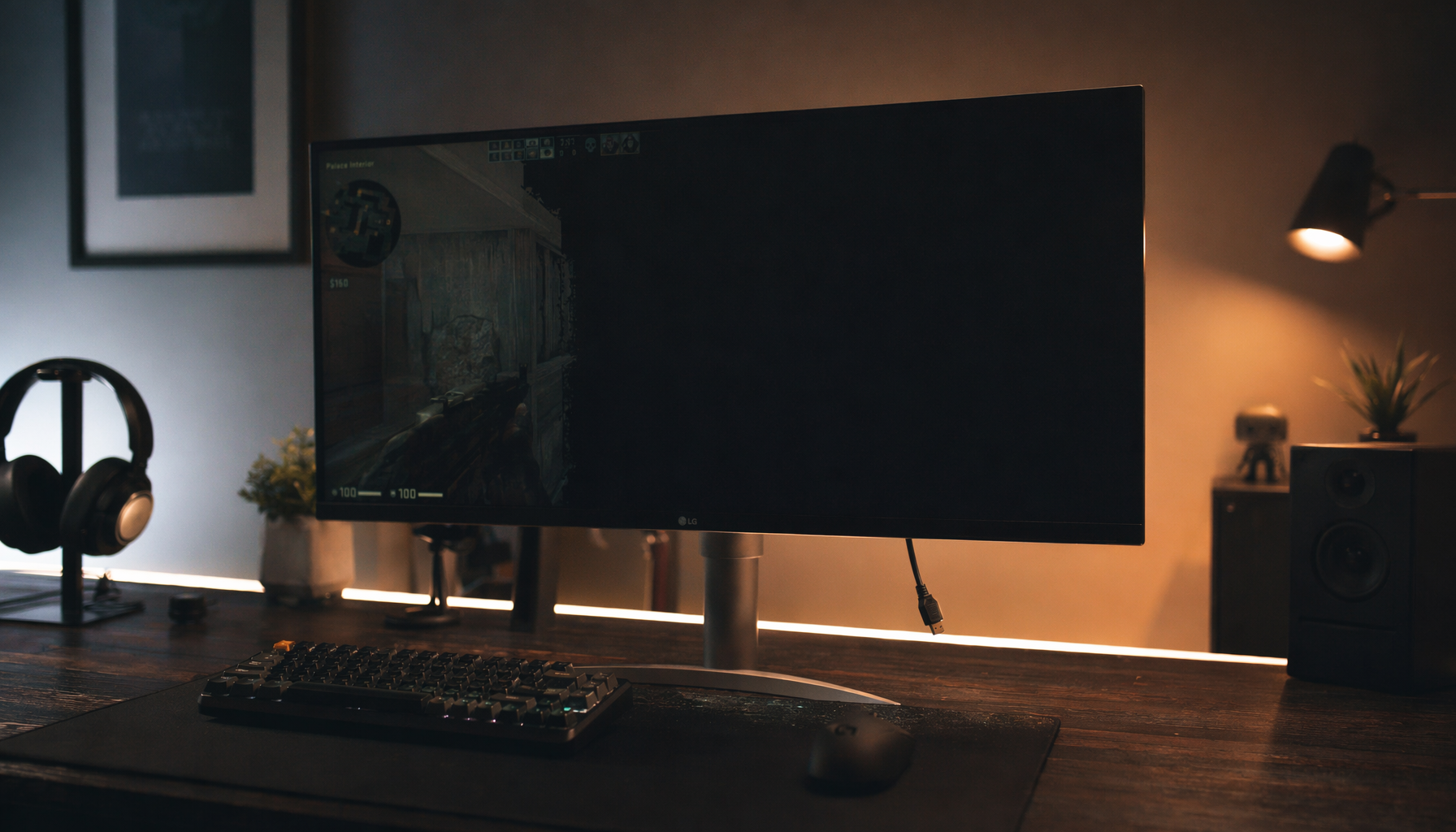
HDR makes uniformity flaws easier to see because bright highlights, shadow detail, and midtones are all pushed harder at once. If the center of the panel reaches 120 nits and a corner sits closer to 100 nits, the same scene can feel punchy in one area and flat in another. In a dark game, that can make edge detail harder to trust. In a competitive match, it can make corner information feel less readable than the center, even when refresh rate and response time are excellent.

This is why raw headline specs do not tell the full story. Refresh rate and response time often dominate monitor buying advice, but those advantages lose value if the panel looks patchy during actual play. A fast 170 Hz display with uneven corners can still feel less immersive than a slower but more even panel.
Office and productivity work
Uniformity problems are not only a creator issue. Gray desktops, spreadsheets, and word processors are some of the easiest places to notice luminance drift and tint shifts, especially on larger screens. If one side of a white page looks slightly yellow and the other looks bluish, your eyes keep readapting. Over long sessions, that can be more fatiguing than a small color error in the center.
Editing and color-critical work
For photo and video work, the damage is more direct. Consistency across devices supports reliable editing but cannot turn a weak panel into a trustworthy reference. If a shadow patch looks heavier in the bottom-left corner than in the center, you may compensate for the display rather than the image. That leads to rework, which is exactly the kind of workflow waste monitor calibration is supposed to prevent.
How to test your monitor before you blame your calibrator
The most reliable home check is simple and repeatable. Warm the display for about 30 minutes, disable auto-brightness or dynamic picture modes, and inspect full-screen white, gray, black, and basic color fields. It also helps to step back about 1 to 2 ft from your normal viewing position for a second pass, because broad gradients often become more obvious when you are not locked to the center.
A practical screen test is less scientific than a lab grid measurement, but it is effective. A dark-room color-cycle check can reveal pale patches, edge fade, or faint bands that normal desktop use hides until they become impossible to ignore. If the same defect shows up on multiple test colors and stays in the same location, that is strong evidence of a panel issue.
For buyers or mixed-use users, the following rule of thumb is useful:

What you see |
What it usually means for calibration |
Slightly uneven corners only on black screens |
Calibration may help the overall balance, but black uniformity itself is mostly a hardware trait |
Gray screen looks blotchy or one side is warmer |
Profiling can describe the center accurately, but it will not make the entire panel match |
Center looks accurate, edges still look off after calibration |
The calibration likely worked; panel uniformity is the limit |
Image looks different between a color-managed editor and a game |
You may have both a uniformity issue and an app color-management issue |
What you can improve, and what you should stop trying to fix

Good calibration practice still matters. Warming up the monitor, controlling room light, using the monitor’s own controls first, and profiling with a colorimeter all improve the result. For many displays, that is enough to make the screen dependable for daily use.
But if the panel is genuinely uneven, there is a point where more tweaking becomes wasted effort. Using the monitor’s hardware controls first and relying on lighter software correction reduces the chance of added artifacts, and standard targets such as D65, gamma 2.2, and about 80 to 120 nits remain sensible starting points. Still, those targets do not override a flawed panel. They only optimize what the panel already is.
One useful nuance is that chasing textbook accuracy is not always the best practical outcome on a weak gaming display. In the discussion of entry-level calibration methods, the broader lesson is that budget workflows often involve compromise, and simpler tools can be acceptable when the display is not a true reference monitor to begin with. The same logic applies here: if a screen is visibly non-uniform, the smarter move may be to aim for stable, usable settings instead of forcing an ideal target that looks worse in real content.
When replacement is the smarter value play
Reliable measurement against a target is the basis of calibration, and any serious calibration program depends on controlled conditions, clear procedures, and trustworthy instruments. Environment and traceability also shape calibration results. If the monitor itself is inconsistent across the panel, that chain breaks at the display.
That is why replacement is sometimes the better value. If a new monitor shows center discoloration, strong side-to-side gradients, or corner haze that keeps drawing your eye during games, spreadsheets, or editing, returning it early is usually smarter than spending hours trying to tune around it. Calibration is powerful, but it is not a repair tool for poor uniformity.
A well-calibrated display should feel coherent, not merely compliant. When the screen looks even first, calibration becomes the finishing step that unlocks immersion, accuracy, and confidence instead of serving as a patch for hardware that never had the consistency to support it.


